 Material to support teaching in Environmental Science at The University of Western Australia
Units ENVT3361, ENVT4461, and ENVT5503
Basic maps in R
Data plotted over tile backgrounds
Andrew Rate
2025-12-05
Maps / spatial pages: Maps | Spatial statistics | Spatial interpolation
Introduction 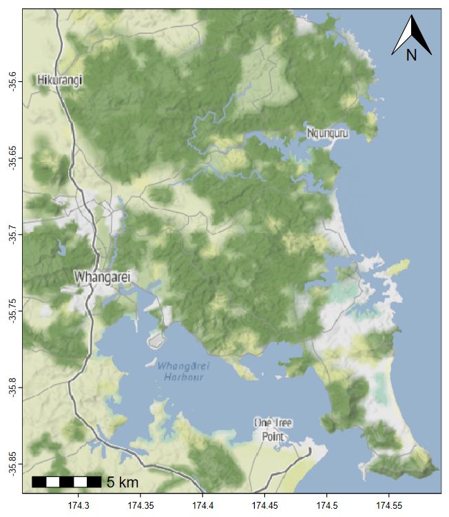
This guide shows some of the more common and/or easy ways to make
maps in R using map-tile-based backgrounds with data
plotted over the base maps. We introduce coordinate reference
systems, recommended packages which allow tile-based map
drawing, a few ways of including user data, and an Appendix on
simple coordinate conversion.
The intention is to provide
options to plot informative maps, which include the type of data
collected in this class, relatively simply. We will not cover
vector-based maps, importing GIS shapefiles, interpolation of point
data, chloropleth maps, and many other map plotting methods.
Notes about maps
[distilled from the author instructions of a few relevant journals]
- Include a scale,
and north arrow (and
where relevant, co-ordinates of latitude (°N,
°S) and longitude (°W, °E);
grid-based systems such as UTM are also ok, and can allow scale to be omitted if grid measurements are in metres). - The use of colour unnecessarily is discouraged.
- All text must be large enough to be readable. Avoid making the
lettering too large for the figure – this can result in a "cartoonish"
appearance.
- Use a clear, sans serif typeface – the R default is
Arial (Helvetica, Segoe UI,
Source Sans
Pro, Ubuntu,
etc. are all OK).
- Try to keep all text in a figure (including axis labels, contour labels, latitude and longitude, scale text, inset text, etc.) around the same size to aid reducibility and/or enlargement.
- Use a white background behind lettering that crosses a dark or textured area in a figure.
- Locality maps must show locations of any significant places/sample points, etc., mentioned in your report's text or tables. These might include cities, rivers, lakes, ponds, drains, landmarks, presumed sources of contamination, and so on. (These features are not always present on map tiles.)
- A country map is required for all studies, locating the study area. Adjacent countries must be located and named. [Optional for this class].
load packages needed to make maps
library(sf)            # Simple Features spatial data in R
library(maptiles)      # get open-source map tiles for background maps
library(prettymapr)    # add scale bar and north arrows to maps
library(viridis)       # colourblind-friendly colour palettes
library(scico)         # more colourblind-friendly colour palettes
library(ggplot2)       # plotting spatial data with ggplot syntax
library(ggspatial)     # utilities for plotting spatial data
library(ggmap)         # download and plot spatial rasters
...also read some data we need for map annotations, make some colour palettes to use later, and set any alternative Windows fonts:
git <- "https://raw.githubusercontent.com/Ratey-AtUWA/Learn-R-web/main/"
afr_map <- read.csv(file=paste0(git,"afr_map_v2.csv"), stringsAsFactors = TRUE)
places <- read.csv(file=paste0(git,"places.csv"), stringsAsFactors = TRUE)
pal4lite <- c("black", viridis::plasma(8),"white", "transparent","grey40")
pal4liteTransp <- c("black", viridis::plasma(8, alpha=0.7), "white",
                    "transparent","grey40")
pal4dark <- c("white", viridis::turbo(8, beg=0.2, end=0.9,dir=1), "black")
Preparing to make maps
"I wisely started with a map."
--- J. R. R. Tolkien
First we read the data we need: from .csv files on a
website, into an R data frame:
## afs19 <- read.csv(file=paste0(git,"afs19.csv"),
##                   stringsAsFactors = TRUE) # use this one
afs21ll <- read.csv("afs21ll.csv", stringsAsFactors = T)
Before we start downloading map data, we're going to define and save
some commonly-used coordinate reference systems which describe the map
projection of our GPS data. The function st_crs() is from
the sf package (see explanation below), and as the argument
for the st_crs() function we use the EPSG code for the
desired projection. See https://epsg.io for more information. This is
optional, but makes things a little easier - we can just call
st_crs() directly when we need to include a
crs = argument.
LongLat <- st_crs(4326) # uses Earth ellipsis specs from WGS84 datum
UTM50S <- st_crs(32750) # just for Zone 50, S hemisphere!
We will use these coordinate reference system objects later. For now we're going to work in UTM coordinates.
Next we'll convert our data frames to Simple Features
spatial data, using the R package sf
(Pebesma, 2018). Simple Features is a formal standard (ISO 19125-1:2004)
that describes how objects in the real world can be represented in
computers - see https://r-spatial.github.io/sf/articles/sf1.html.
We also make equivalents of these two sf-dataframes in the
longitude–latitude coordinate system, using the
st_transform function. We needed to know (e.g.
from summary(afs19)) that we have missing coordinate values
– always check your data!
afs19utm <- st_as_sf(afs19[-9,], # omitting row 9 where coordinates are missing
                     coords = c("Easting","Northing"),
                     crs = UTM50S)
afs21ll <- st_as_sf(afs21ll, coords=c("Longitude", "Latitude"),
                    crs=LongLat)
afs19ll <- st_transform(afs19utm, crs = LongLat)
afs21utm <- st_transform(afs21ll, crs = UTM50S)
Alternative 1 – Maps in R using the maptiles package
Defining the mapped area
We define the area we need for our map and save it in a simple
features object called extent.
An easy way to get bounding coordinates (in longitude, latitude) is
by using epsg.io, Google Maps or
Google
Earth. The desktop version of Google Earth allows the option to set
the coordinate system to UTM (but all files are saved in long–lat
(WGS84, which is the same as EPSG:4326)). If we generated
latitude–longitude coordinates, we would need to convert our Simple
Features object (see the Appendix). If our input
coordinates are Longitude–Latitude, note that south latitudes (and west
longitudes) are negative, and we want decimal degrees rather than
degrees-minutes-seconds. Also note that coordinates from Google Maps and
Google Earth (except in saved .kml files) are in
the order (Latitude, Longitude); i.e. \((y,x)\), whereas \((x,y)\) (Longitude, Latitude) seems to make
more sense.
For coordinates in the sf and maptiles
packages, \(x\) coordinates are
commonly Eastings or Longitudes, and \(y\) coordinates are commonly Northings or
Latitudes.
extent <- st_as_sf(data.frame(x=c(399900,400600),y=c(6467870,6468370)),
coords = c("x","y"), crs = UTM50S)NOTE: The projection we specify here will be the one the map plots in!
Getting the map tile data
We now need some functions from the maptiles package
(Giraud 2021). We're using one of the OpenStreetMap tile options, but
the following tile providers also work:
OpenStreetMap, OpenStreetMap.HOT, Esri.WorldStreetMap, Esri.WorldTopoMap, Esri.WorldImagery, Esri.WorldGrayCanvas,
CartoDB.Positron, CartoDB.DarkMatter, CartoDB.Voyager (all
CartoDB... tiles have variants which work), and OpenTopoMap
If you have an account with an API key, you can also use the tiles
from Thunderforest (Thunderforest 'hobby project'
accounts are free). The Stamen tiles are now available again 🤓 – you
can register for a free API key at stadiamaps.com/stamen.
The option
crop = TRUE is included to crop the tiles to our defined
area in the extent object. If we leave it out, the map may
change shape as it will use only square (uncropped) map tiles.
The map tile style we have selected is the default
OpenStreetmap style.
# NOTE: projection of input object e.g. 'extent' sets map projection
aftiles <- get_tiles(extent, provider = "OpenStreetMap", crop = TRUE)
Plotting the map
The aftiles object we created is a
SpatRaster object which needs the maptiles (or
terra) package loaded to be able to plot it – see Figure
1.
aftiles <- get_tiles(extent, provider = "OpenStreetMap",
                               crop = TRUE, zoom=16)
par(mar=c(3,3,1.3,1.2), mgp=c(1.6,0.2,0), tcl=-0.2, font.lab=2, lend="square")
plot(st_coordinates(extent), asp=1, type="n", xaxs="i", yaxs="i", cex.axis=0.8,
     xlab="Easting (UTM Zone 50, m)", ylab="Northing (UTM Zone 50, m)")
plot_tiles(aftiles, add=TRUE)
box() # re-draw box in case tiles overlap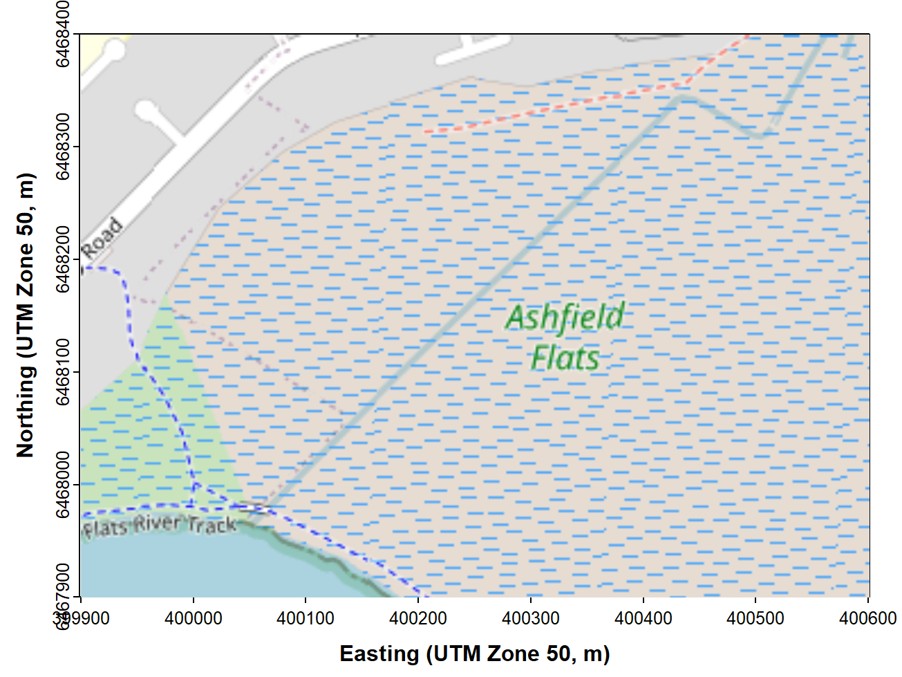
Figure 1: Map of Ashfield Flats in the UTM projection, generated using
the maptiles R package, with OpenStreetMap tiles.
At this stage, after plotting the map in RStudio, you will probably need to adjust the size and proportions of your plot area manually, so that the map tiles fill the whole plot frame.
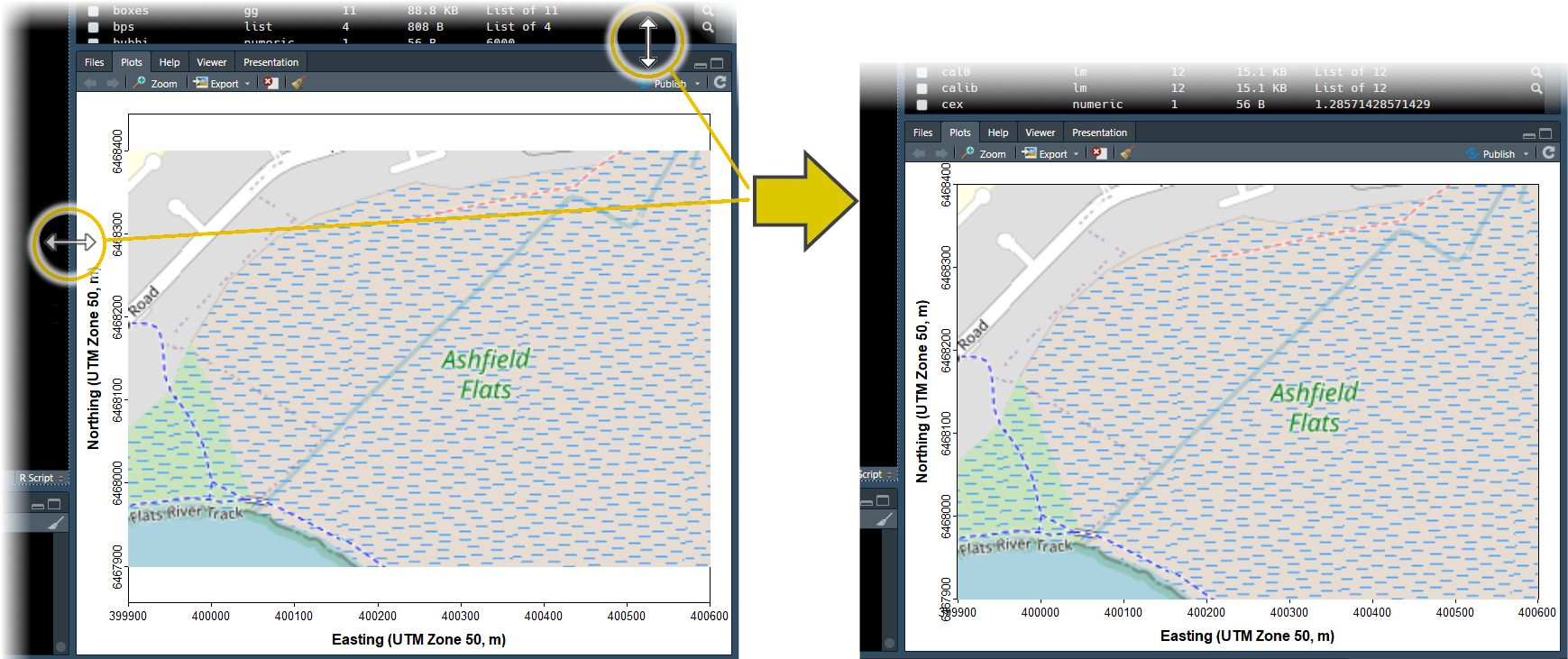
 Figure 2: Resizing the RStudio
 Plots
pane to match the size of the plot area to the maptiles
background.
Map annotations using maptiles – Hints
Plotting in the maptiles package using the
plot_tiles() function (which is actually done by the
plotRGB() from the terra package) tries to set
the plot margins based on the dimensions of the SpatRaster
map object. This can create some problems in our experience, so here are
some tips:
- Draw a
'base-R'plot which is an empty frame, over which you plot themaptilesobject. We do this by:- setting margins and so on using the
par()function - setting
asp=1as an option in theplot()function to make \(x\) and \(y\) distances equivalent on the map - setting
xaxs="i"andyaxs="i"as options in theplot()function, so axis ranges exactly match the size of the map tiles raster
- setting margins and so on using the
- use the option
add=TRUEin theplot_tiles()function
(this overplots themaptilesobject onto your empty plot frame) - adjust the height and width of the RStudio plot area to best match the map
- You may need to adjust the positions of the map annotations like
north arrow and scale bar.
- these are adjusted with the
padin=option in theaddnortharrow()andaddscalebar()functions - note that the
addscalebar()function needs the optionplotepsg=..., where the value is the EPSG code for the coordinate reference system you are using (we specifyplotepsg=32750which is the EPSG code for UTM Zone 50S using WGS84). - note also that the
addscalebar()function depends on the older spatial packagespwhich is scheduled for retirement. If it doesn't work on your computer, run the following code to create a replacementaddscalebar()function which uses thesfpackage instead ofsp:
- these are adjusted with the
The next chunk of code adds the prettymapr features
shown in Figure 2. In this code, plotepsg = 32750 refers to
the EPSG code for the UTM projection in Zone 50 (EPSG 32750), which we
need to include so that the scale bar shows the correct distances.
(Long-Lat is EPSG 4326 in WGS84)
NOTE: If the addscalebar function does
not work, run this line of code:
(This will replace the function in the prettymapr
package with a modified version that uses the sf package
for coordinate conversions instead of sp and
rgdal.)
# . . . continuing previous code . . .
addnortharrow(text.col=1, border=1)
addscalebar(plotepsg = 32750, label.col = 1, linecol = 1,
            label.cex = 1.2, htin=0.15, widthhint = 0.15)
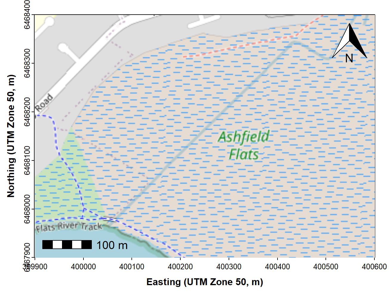
Figure 3: Map of Ashfield Flats (UTM), with added North arrow and scale
bar from the prettymapr package, over OpenStreetMap tiles
acquired using maptiles.
Adding our data and map annotations
Very often we would like to add our own information to a map, such as the location of samples, often with different sizes, shapes, or colours of symbols to represent numerical information.
Since we have a map in UTM coordinates, we can now add plots of our
data based on UTM locations (with a legend, of course – see Figure 4).
We can plot the points from the non-spatial data frame
afs19, but here we plot the points from
afs19utm, with the add=TRUE option. We add a
legend to the plot in the usual way.
# . . . continuing from previous code . . .
clrz <- plasma(15)[6:15]   # plasma is one of the viridis:: palettes
with(afs19utm, plot(geometry, add=TRUE,
                    pch = rep(21:25,2)[Group],
                    bg = clrz[Group]))
legend("bottomright", legend=levels(as.factor(afs19$Group)),
       pch = rep(21:25,2), pt.bg = clrz,
       title = "Group", inset = 0.02, ncol = 2)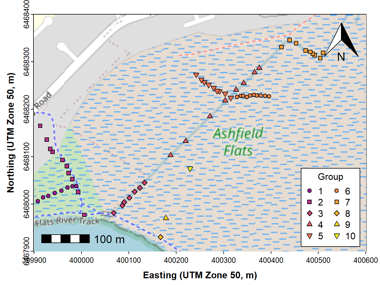
Figure 4: Map of Ashfield Flats (UTM), with user data plotted, over
OpenStreetMap tiles acquired using maptiles and North arrow
and scale bar from the prettymapr package.
We can also add digitized map features such as wetland ponds, drains, etc., if these are not on the map tiles already. Ideally we would add these before plotting the data, to avoid the type of overplotting shown in Figure 5.
# . . . continuing from previous code . . .
with(afr_map, lines(drain_E, drain_N, col = "cadetblue", lwd = 2))
with(afr_map, lines(wetland_E, wetland_N, col = "cadetblue", lwd = 1, lty = 2))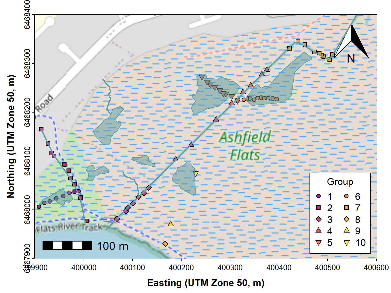
Figure 5: Map of Ashfield Flats (UTM), with added North arrow, scale
bar, user data, and additional map items, over OpenStreetMap tiles
acquired using maptiles.
Finally, we would most likely want to add some text. Text labels should also be added before plotting the data. The final map is shown in Figure 6.
# . . . continuing from previous code . . .
text(c(400263, 399962, 400047), c(6468174, 6468083, 6468237),
     labels = c("Chapman Drain","Kitchener Drain", "Woolcock Drain"),
     pos = c(2,2,4), cex = 0.8, font = 3, col = "cadetblue")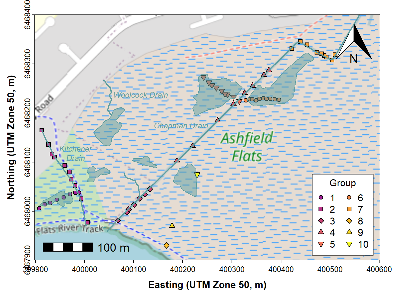
Figure 6: Map of Ashfield Flats (UTM), with added North arrow, scale
bar, user data, and additional map items plus text labels, over
OpenStreetMap tiles acquired using maptiles.
Figure 6 should be plotted with the data symbols on top of the added map features like drains. We have provided code for this in the Bonus Material at the end!
Making a bubble map
We use essentially the same code as for the maps above (except
plotting the annotations and data in the correct order!). Then we use
the symbols() function to make the 'bubbles', making sure
that we include the options add = TRUE so we overplot the
map, and inches = FALSE so we can manually scale the
bubbles. The factor s0 used to scale the circles in the
code for bubbles and legend is found using a simple algorithm to
estimate a scaling factor from the data). A map like that shown in
Figure 7 is a good exploratory data analysis tool, as even without the
legend it shows any unevenness in concentrations, including where high
concentrations are located.
palette(pal4lite)
par(mar=c(3,3,1.3,1.2), mgp=c(1.6,0.2,0), tcl=-0.2, font.lab=2, lend="square")
plot(st_coordinates(extent), asp=1, type="n", xaxs="i", yaxs="i", cex.axis=0.8,
     xlab="Easting (UTM Zone 50, m)", ylab="Northing (UTM Zone 50, m)")
plot_tiles(aftiles, add=TRUE) ; box()
addnortharrow(text.col=1, border=1)
addscalebar(plotepsg = 32750, label.col = 1, linecol = 1,
            label.cex = 1.2, htin=0.15, widthhint = 0.15)
with(afr_map,
     lines(drain_E, drain_N, col = "cadetblue", lwd = 2))
with(afr_map, polygon(wetland_E, wetland_N, border="cadetblue", col="#5F9EA080",
                    lwd = 1, lty = 1))
text(c(400263, 399982, 400047), c(6468174, 6468143, 6468237),
     labels = c("Chapman Drain","Kitchener\nDrain", "Woolcock Drain"),
     pos = c(2,1,4), cex = 0.8, font = 3, col = "cadetblue")
# plot bubbles using the symbols() function
  # first use a simple algorithm to estimate a scale factor for bubbles
  axrg <- par("usr")[2]-par("usr")[1]
  bublo <- pretty(afs19$Zn)[2]
  bubhi <- pretty(afs19$Zn)[length(pretty(afs19$Zn))]
  s0 <- signif(0.05*axrg/sqrt(bubhi),2)
with(afs19, symbols(Easting, Northing, add = TRUE, circles = s0*sqrt(Zn),
                    inches = FALSE, fg = "purple", bg = "#8000FF40"))
# manual legend
  # first make small legend bubble, checking if it's zero
  if (pretty(afs19$Zn)[1] < 0.001) {
    bublo <- pretty(afs19$Zn)[2]/2
  } else {
    bublo <- pretty(afs19$Zn)[1]
  }
symbols(c(400520,400520),c(6468040,6467980), circles=s0*sqrt(c(bublo,bubhi)), add=T,
        lwd=1, inches=F, fg = "purple", bg = "#8000FF40")
text(c(400520,400550,400550),c(6468100,6468040,6467980),
     labels=c("Zn (mg/kg)",bublo,bubhi), cex=0.85, pos = c(1,4,4))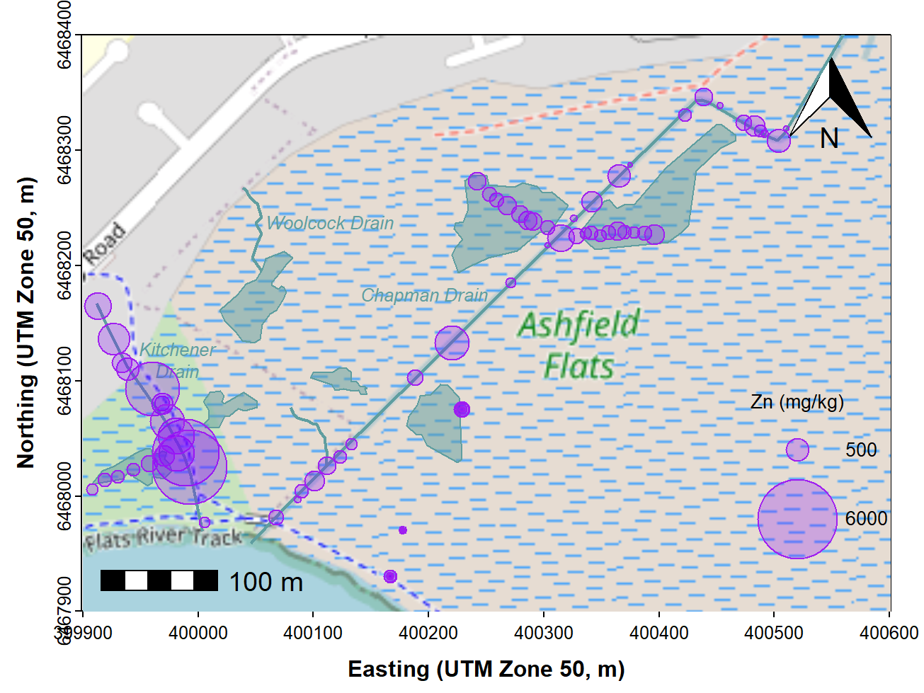
Figure 7: Bubble map of zinc concentrations in sediment and soil at
Ashfield Flats in 2019, over OpenStreetMap tiles acquired using
maptiles.
When reporting on an environmental assessment process such as a Detailed Site Investigation, we should also identify any samples where environmental guideline values are exceeded. The additional code below shows how to do this for Zn in sediments; the relevant guideline values are DGV = 200 mg/kg, DGV-high = 410 mg/kg. The re-drawn map (Figure 8) shows samples above the 410 mg/kg DGV-high threshold, and could also be adapted to show concentrations greater than the DGV, or both.
Note the double plotting of points, first with a thicker line
(lwd=4) to provide a border around the symbols for better
visual contrast.
# ... continuing most of previous code ...

# plot points exceeding guideline value...
with(afs19[which(afs19$Zn>=410),], points(Easting, Northing, pch=3,lwd=4,col=1))
with(afs19[which(afs19$Zn>=410),], points(Easting, Northing, pch=3,lwd=2,col=8))

# ...and make changes to manual legend
symbols(c(400500,400500),c(6468040,6467980), circles=s0*sqrt(c(bublo,bubhi)), add=T,
        lwd=1, inches=F, fg = "purple", bg = "#8000FF40")
points(400500, 6467920, pch=3,lwd=4,col=1)
points(400500, 6467920, pch=3,lwd=2,col=8)
text(c(400500,400530,400530,400510),c(6468100,6468040,6467980,6467920),
     labels=c("Zn (mg/kg)",bublo,bubhi,"\u2265 DGV-high"), cex=0.85, pos = c(1,4,4,4))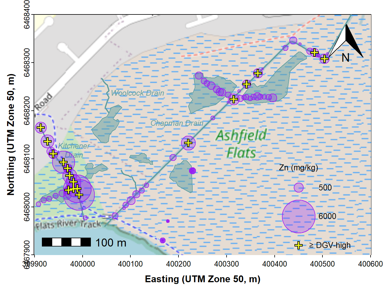
Figure 8: Bubble map of zinc concentrations in sediment and soil at
Ashfield Flats in 2019, over OpenStreetMap tiles acquired using
maptiles. Locations where Zn concentration exceeds the
DGV-high threshold are shown.
Categorized (e.g. percentile) bubble map
We make a new column in our data frame by cutting the
measurement of interest, in this example Zn, into
percentiles. The new column called QZn is a factor which
identifies which percentile of Zn concentration each sample is in. We
then use this factor to define symbols, sizes, and colours for each
sample location. We add a line break to text labels using \(\backslash\)n.
par(mar=c(3,3,1.3,1.2), mgp=c(1.6,0.2,0), tcl=-0.2, font.lab=2, lend="square")
plot(st_coordinates(extent), asp=1, type="n", xaxs="i", yaxs="i", cex.axis=0.8,
     xlab="Easting (UTM Zone 50, m)", ylab="Northing (UTM Zone 50, m)")
plot_tiles(aftiles, add=TRUE) ; box()
addnortharrow(text.col=1, border=1)
addscalebar(plotepsg = 32750, label.col = 1, linecol = 1,
            label.cex = 1.2, htin=0.15, widthhint = 0.15)
with(afr_map,
     lines(drain_E, drain_N, col = "cadetblue", lwd = 2))
with(afr_map, polygon(wetland_E, wetland_N, border="cadetblue", col="#5F9EA080",
                    lwd = 1, lty = 1))
text(c(400263, 399982, 400047), c(6468174, 6468143, 6468237),
     labels = c("Chapman Drain","Kitchener\nDrain", "Woolcock Drain"),
     pos = c(2,1,4), cex = 0.8, font = 3, col = "cadetblue")

# Percentile plot
#   make a factor column which categorizes each sample by
#   which Zn percentile it is in:
afs19$QZn <- cut(afs19$Zn, quantile(afs19$Zn,
                 p=c(0,0.02,0.05,0.25,0.5,0.75,0.95,0.98,1),
                 na.rm=T), labels=c("Q0-02","Q02-05","Q05-25","Q25-50",
                                    "Q50-75","Q75-95","Q95-98","Q98-max"))
palette(pal4liteTransp) # use colours with semi-transparency (defined near top)
# use percentile factor column to categorize points
with(afs19,
     points(Easting, Northing,
            pch = c(22,22,22,3,4,21,21,21)[QZn],
            col = c(1,1,1,4,5,1,1,1)[QZn], bg = c(2:9)[QZn],
            lwd = c(1,1,1,2,2,1,1)[QZn],
            cex = c(0.7,0.9,1.1,1.3,1.3,2,3,4)[QZn])
     )
# use rev() in the legend to reverse order to greatest values at top
legend("bottomright", legend = rev(levels(afs19$QZn)),
       title=expression(bold("Zn")),
       pch = rev(c(22,22,22,3,4,21,21,21)), col = rev(c(1,1,1,4,5,1,1,1)),
       pt.lwd = rev(c(1,1,1,2,2,1,1)), pt.bg = rev(c(2:9)),
       pt.cex = rev(c(0.7,0.9,1.1,1.3,1.3,2,3,4)),
       bty = "n", inset = c(0.01,0.01), cex = 0.85, y.intersp = 1.2)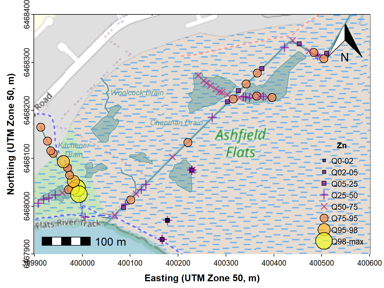
Figure 9: Map showing percentile ranges of zinc concentrations in
sediment and soil at Ashfield Flats in 2019, over OpenStreetMap tiles
acquired using maptiles.
palette(pal4lite) # change back to non-transparent palette (optional)
afs19$QZn <- NULL # to delete quantile column (optional; you can leave it in)
The resulting percentile bubble map (Figure 9) adds value to the
'standard' bubble map (Figure 7), as it adds some statistical meaning to
the bubble sizes. A similar map could be created by using the Tukey
boxplot thresholds instead of percentiles which could show potential
outliers (i.e. using the boxplot.stats() function
to generate categories instead of the quantile()
function.)
Warning:
semi-transparent colours (i.e. alpha < 1) are not supported
by metafiles in R. To use semi-transparent colours, save as
.png or .tiff, or copy as a bitmap.
Alternative 2 – Maps in R with ggplot2, ggspatial, & ggmap packages
The ggplot2 package (Wickham, 2016; we may just call it
ggplot) includes functions such as geom_sf()
which allow us to work with spatial data within sf objects.
Additional functions are available in the package ggspatial
(Dunnington, 2023), including the ability to annotate plots with rasters
obtained with the maptiles package.
The plot below (Figure 10) illustrates how we can do this, using the University of Western Australia campus as an example.
- we make a
sfobject to define the map extent, as we did above for base-R maps, then download a map tile raster based on this extent - we make a
sfobject from ourplacesdata frame, so we can add it to the map usinggeom_sf() - we make a
maptilesraster image as we've done previously, first making asfobject to define the extent, then using theget_tiles()function - we plot the raster extent object (
UWAextin this example) as a transparent layer, since the final map extent will be set bygeom_sf()functions, not the size of the raster (UWArast) - we plot the raster first in the code using
annotation_spatial(), so the subsequent layers plot on top of it - see the comments in the code for additional hints
UWAext <- st_as_sf(data.frame(X=c(115.812,115.825), Y=c(-31.987, -31.975)),
                   coords=c("X","Y"), crs=4326)
UWArast <- get_tiles(UWAext, zoom=16, provider="CartoDB.Positron",
                     forceDownload = T, crop=T)
places_sf <- st_as_sf(places, coords=c("Longitude","Latitude"), crs=4326,
                      remove=F)
ggplot() +
  # a) set the dimensions by plotting the extent object transparently
    geom_sf(data=UWAext, col="transparent") +
  # b) Plot the raster
    annotation_spatial(UWArast) +
  # c) ensure plot axes exactly fit the extent
    scale_x_continuous(expand = c(0,0)) +
    scale_y_continuous(expand = c(0,0)) +
  # d) Plot points, shape and colour by the column places_sf$Type
    geom_sf(data=places_sf, aes(shape=Type, fill=Type), size = 3) +
    scale_shape_manual(values = c(21,22)) +
  # e) Axis labels
    labs(x = "Longitude", y = "Latitude") +
  # f) North arrow + scale bar from ggspatial::
    annotation_north_arrow(location = "tr", style=north_arrow_nautical) +
    annotation_scale(location = "bl", width_hint = 0.25) +
  # g) custom theme
    theme(
      panel.border = element_rect(colour="black", fill="transparent"),
      legend.title = element_text(face="bold"),
      axis.text = element_text(size = 8),
      axis.title = element_text(size = 11, face="bold")
    )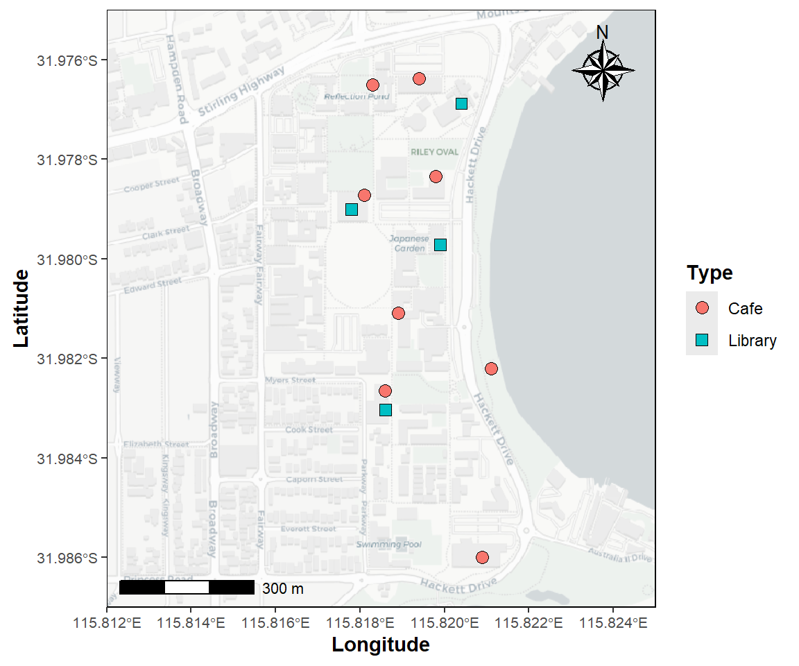
Figure 10: Map of the University of Western Australia campus at Crawley,
showing the location of libraries and cafés, plotted using the
R packages ggplot2 and ggspatial
over CartoDB map tiles acquired using the R package
maptiles.
The ggmap package (Kahle and Wickham 2013) is an
extension of ggplot, so it's easier to use if you are
familiar with ggplot and the associated family of packages.
It has functions to download map tiles from Google and other providers
You will need a Google maps API key
which you can get by registering at https://developers.google.com/maps
First we make a ggmap object, locating the map by its
central coordinate with the extent controlled by the zoom
option:
## library(ggmap)
register_google(key = secret) # you would replace secret with your API key
udubua.gg <- get_googlemap(center=c(115.8213,-31.98165),
                           zoom = 16, maptype = "roadmap", color = "bw")
This always gives a square map (Figure 11) – which
we might not always want. In theory, the map aspect ratio can be changed
using the size argument in the get_googlemap
function, but this does not work reliably. We recommend leaving the map
dimensions and aspect ratio at their default values.
Next we plot the ggmap object using ggplot grammar. It's possible to
just plot the object (i.e. run ggmap(udubua.gg)),
but it's good to have more control over plot options
and to plot some data over the base map. In the example
in Figure 9, we use the aesthetic in geom_point() to plot
different categories with different shapes and colours, with the
categories defined by the factor Type. A range of map
styles is available by selecting a combination of one of
maptype = "terrain", "satellite", "roadmap", or
"hybrid", together with color = "color" or
"bw". Note: the ggsm package
is designed to add scale bar and north arrow to ggmaps, but it seems
buggy and we currently don't recommend it - the north arrow seems OK
though.
ggmap(udubua.gg) +
  labs(y="Latitude (\u00B0S)", x = "Longitude (\u00B0E)") +
  geom_text(aes(x = 115.825, y = -31.98, label = "Swan\nRiver",
                fontface = "italic", family="sans"),
            size = 4, vjust = 0, hjust = 0, color="gray40") +
  geom_point(aes(x = Longitude, y = Latitude, col=Type, shape=Type),
             data = places, size=3) +
  theme_bw() +
  theme(axis.text=element_text(size=9, color="black"),
        axis.title=element_text(size=11,face="bold"))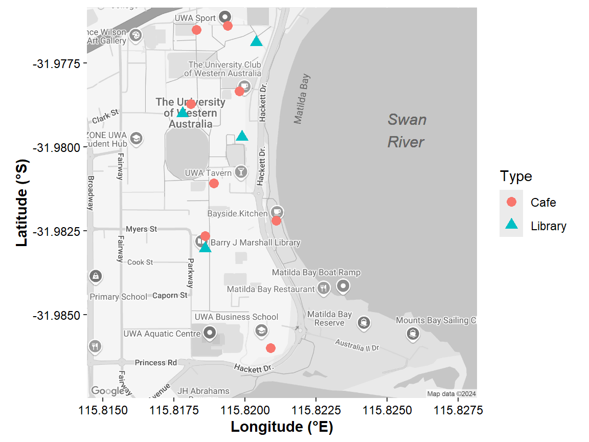
Figure 11: Map of the University of Western Australia campus at Crawley,
showing the location of libraries and cafés, plotted over Google maps
tiles acquired using the R package ggmap.
There are numerous possibilities with ggmap and the
features made possible by ggplot2 that are not illustrated
by Figure 10. For example, we could use size as an
aesthetic (i.e. include within aes(...) with
size = variableName), to generate something like a bubble
map.
Other map types using ggmap
Other options available in ggmap are some of the
Stamen map tiles from Stadia, accessible with the
get_stadiamap() function. To use the Stamen maps, you need
to first register for a free API key at stadiamaps.com/stamen.
You could also make a map based on Stamen tiles by using
maptiles to make a spatial raster, and plotting with
ggplot2 and ggspatial as we did above. You
would still need an API key for the Stadia Stamen maps API.
💡 Try it!
The next
example (Figure 12) uses the simple features information
in one of the data frames we made at the beginning. The sf
package introduces a new 'geom', geom_sf() for plotting in
ggmap. We need to use the option
inherit.aes = FALSE in geom_sf(), to override
the default aesthetics from the ggmap object. We also add
coord_sf to ensure that all layers use a common CRS
(Coordinate Reference System).
Run
help(geom_sf) for more information.
Plotting using geom_sf() when the CRS is in degrees
adds, by default, a °S/°W/°N/°E suffix to the axis values. In the code
below we suppress this using scale_x_continuous(label = I)
(same for the y axis; the limits and expand
options stop the manual scale adding space around the map tiles). We
include the information on units and hemisphere in the axis titles.
The code also has a little fun with the symbol fill colours. We set
these using scale_fill_viridis(), but instead of choosing a
single viridis palette option, we choose one at random
using option=sample(LETTERS[1:8],1). [If you don't like
this, change the code to option="D", the standard viridis
palette.]
register_stadiamaps(key=secret2)
afr.gg <-
  get_stadiamap(bbox=c(left=115.9393, bottom=-31.9203,
                       right=115.948, top=-31.916),
                maptype="stamen_terrain", zoom=17)
bb <- as.numeric(unlist(as.vector(attr(afr.gg, "bb"))))
ggmap(afr.gg) +
  labs(y="Latitude (\u00B0S)", x = "Longitude (\u00B0E)") +
  geom_text(aes(x = 115.944, y = -31.918, label = "Ashfield\nFlats",
                fontface = "italic", family="sans"),
            size = 4, color="khaki4", lineheight=0.8) +
  geom_text(aes(x = 115.942, y = -31.9199, label = "Swan River",
                fontface="italic", family="sans"), size=4, color="steelblue") +
  geom_path(aes(x = drain_lon, y=drain_lat), data=afr_map,
            color = "steelblue", size = 1.25) +
  geom_polygon(aes(x=wetland_lon, y=wetland_lat), data = afr_map,
               color = "steelblue", fill="#4682B480") +
  geom_sf(data = afs21ll, aes(fill=Zn, size=Zn), shape=21, inherit.aes=FALSE) +
  scale_x_continuous(labels = I, limits=c(bb[2],bb[4]),
                     expand = expansion(mult=c(0,0))) +
  scale_y_continuous(labels = I, limits=c(bb[1],bb[3]),
                     expand = expansion(mult=c(0,0))) +
  scale_fill_viridis_c(name="Zn", alpha = 0.7,option=sample(LETTERS[1:8],1)) +
  scale_size_area(name="Zn", breaks=c(30,100,300,1000,3000,5000), max_size = 9) +
  theme_bw() +
  theme(axis.text=element_text(size=9, color="black"),
        axis.title = element_text(size = 12, face = "bold")) +
  coord_sf(crs = st_crs(4326))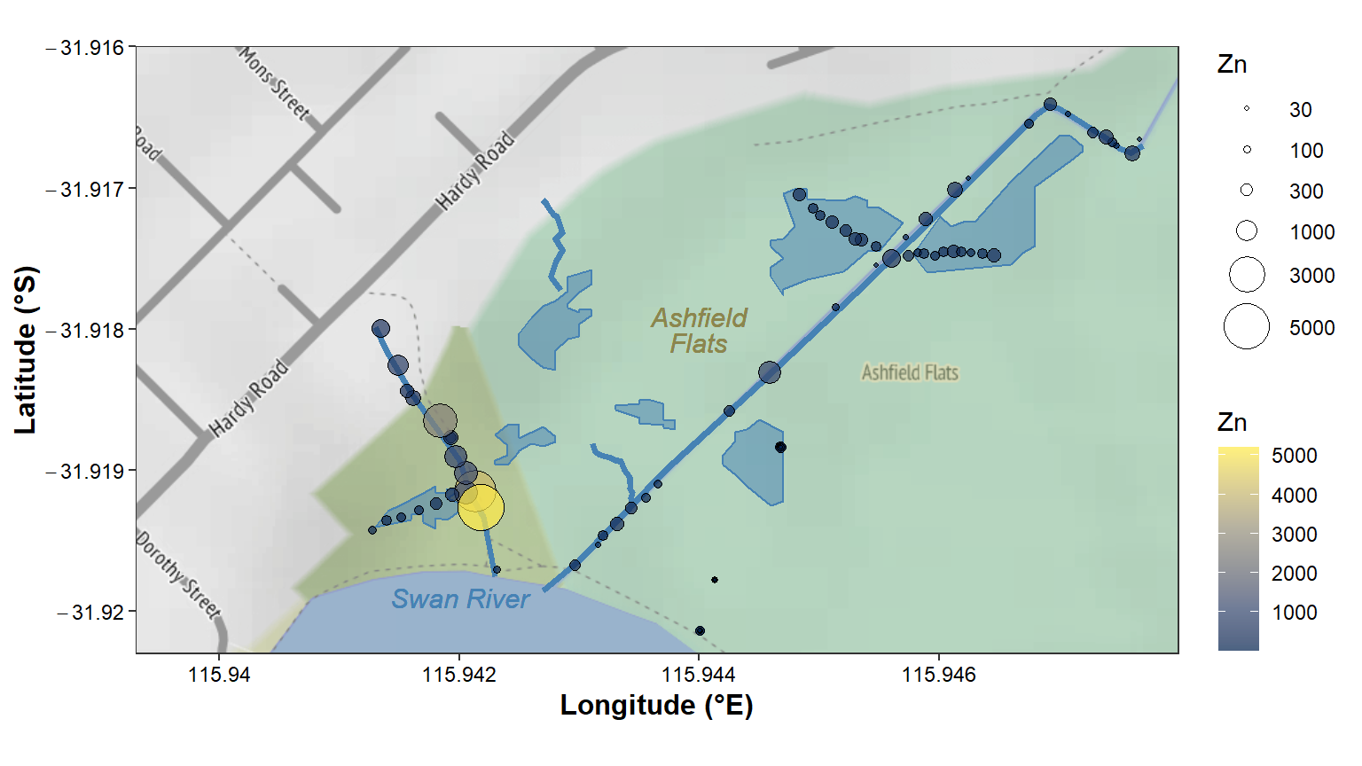
Figure 12: Zinc concentration (mg/kg) in sediment sampled in Semester 1,
2021 at Ashfield Flats, Western Australia, plotted over
stamen_terrain map tiles acquired using the R
package ggmap, with data in a simple features data frame,
and with manually added wetland pond locations.
Other tile-based mapping packages in R
The rosm package (Dunnington 2022) allows users to
produce background maps from several map tile providers. We
don't currently recommend rosm, since it's
difficult when using this package to produce axes in commonly-used
coordinate reference systems.
The OpenStreetMap R package (Fellows, 2019) can make
very good tile-based maps. Unfortunately, however, it can be difficult
to use on Apple Mac computers, and there can also be problems with
Windows-based systems due to the use of Java code in the
package. So, out of respect for MacOS users, we are not
recommending the OpenStreetMap package either.
Final Words
We recommend using either the maptiles package with
base-R, or the ggplot2 + ggspatial packages to
draw maps with tiled backgrounds (also using maptiles to
generate tiles), as they allow use of (and rely on) the state-of-the-art
simple features system via the sf
package.
read about it
Appendix - coordinate conversions
Converting UTM to LongLat
Make a simple features (package sf) object containing
the UTM coordinates
Example uses explicit values (as used previously to generate the
maptiles map), but the coordinates could also be obtained
from a data frame - edit to suit!
utm.temp <- st_as_sf(data.frame(x=c(399800,400700),y=c(6467900,6468400)),
                     coords = c("x","y"), crs = UTM50S)
We then use the st_transform() function from the
sf package to convert to long-lat (or another projection),
which results in another spatial object:
We now have two sf spatial objects which we can use (for
instance) to define the map extent for a maptiles map:
require(sf); require(maptiles) # load packages if not done already
# using the utm object
tiles_utm <- get_tiles(utm.temp, provider = "OpenStreetMap", crop = TRUE)
# using the longitude-latitude object
tiles_longlat <- get_tiles(longlat.temp, provider = "OpenStreetMap",
                          crop = TRUE)
# . . . and so on
To extract coordinates from a data frame, for example:
(NOTE - missing coordinates are not allowed!)
afs19 <- afs19[-which(is.na(afs19[,c("Easting")])==1),] # remove rows with NAs
afs19utm <-  st_as_sf(afs19, coords = c("Easting","Northing"), crs = UTM50S)
We then use the st_transform() function from the
sf package to convert to longitude-latitude, which results
in another spatial data frame:
To extract just the coordinate values in non-spatial form, we use the
function st_coordinates():
# extract sf coordinates to console (can assign to object of class "matrix")
st_coordinates(afs19utm)

# extract sf coordinates to data frame
longlat.temp <- as.data.frame(st_coordinates(afs19ll))
colnames(longlat.temp) <- c("Longitude","Latitude")
References and R packages
Dunnington, Dewey (2017). prettymapr: Scale Bar, North Arrow, and Pretty Margins in R. R package version 0.2.2. https://CRAN.R-project.org/package=prettymapr.
Dunnington D (2022). rosm: Plot Raster Map Tiles from Open Street Map and Other Sources. R package version 0.2.6, https://CRAN.R-project.org/package=rosm.
Dunnington D (2023). ggspatial: Spatial Data
Framework for ggplot2, R package version 1.1.9. doi:10.32614/CRAN.package.ggspatial
Fellows, Ian and using the JMapViewer library by Jan Peter Stotz (2019). OpenStreetMap: Access to Open Street Map Raster Images. R package version 0.3.4. https://CRAN.R-project.org/package=OpenStreetMap.
Giraud T (2021). maptiles: Download and Display Map Tiles. R package version 0.3.0, https://CRAN.R-project.org/package=maptiles.
Garnier S, Ross N, Rudis R, Camargo AP, Sciaini M, Scherer C (2021). Rvision - Colorblind-Friendly Color Maps for R. R package version 0.6.2. (viridis)
D. Kahle and H. Wickham. ggmap: Spatial Visualization
with ggplot2. The R Journal,
5(1), 144-161. http://journal.r-project.org/archive/2013-1/kahle-wickham.pdf.
Pebesma, E., 2018. Simple Features for R: Standardized Support for
Spatial VectorData. The R Journal 10 (1),
439-446, https://doi.org/10.32614/RJ-2018-009 . (package
sf)
Pebesma, E.J., R.S. Bivand, 2005. Classes and methods for spatial
data in R. R News 5 (2), https://cran.r-project.org/doc/Rnews/. (package
sp)
Wickham, H. (2016) ggplot2: Elegant Graphics for
Data Analysis. Springer-Verlag New York, 2016. https://ggplot2.tidyverse.org.
A BibTeX entry for LaTeX users is

For UWA students
Activities for this Workshop class
 There are a few items available as learning
materials for this session on using R + packages to make
maps: two short videos, and two annotated pdfs based on
- the R code and
- a PowerPoint presentation.
We suggest going through the first video first, and then trying the code, and finally viewing the second video and trying some different things. The material in the PowerPoint presentation on interpolation of point data is completely optional.
For activities today we suggest:- Try to make a map of the Ashfield Flats Reserve area which covers all our sample locations. A good place to start after watching the video/reading the annotated code PDF would be with modifying and running the R code.
Good luck!
R Mapping - supporting learning materials
↓The best code for mapping using state-of-the-art R packages is in the code in the rest of this page (below) ↓
Files to download for this workshop
![]() Ashfield Flats sediment soil data
2021
Ashfield Flats sediment soil data
2021
![]() Just the code used in this web page
Just the code used in this web page
Bonus material
![]() eezi-peazi Ashfield map (R
code)
eezi-peazi Ashfield map (R
code)
![]() R
code to use georeferenced images (e.g. from NearMap) as map
backgrounds
R
code to use georeferenced images (e.g. from NearMap) as map
backgrounds
![]() Digitising
map features from Google Earth, and R code for a function to convert
Google Earth .kml files for use in R
Digitising
map features from Google Earth, and R code for a function to convert
Google Earth .kml files for use in R
🌏 Advanced Spatial Analysis
(1️⃣spatial
autocorrelation, plus 2️⃣variograms and kriging interpolations)
par(mar=c(3,3,1.3,1.2), mgp=c(1.6,0.2,0), tcl=-0.2, font.lab=2, lend="square")
plot(st_coordinates(extent), asp=1, type="n", xaxs="i", yaxs="i", cex.axis=0.8,
     xlab="Easting (UTM Zone 50, m)", ylab="Northing (UTM Zone 50, m)")
plot_tiles(aftiles, add=TRUE); box()
addnortharrow(text.col=1, border=1, pos="topleft", scale=0.85)
addscalebar(plotepsg = 32750, label.col = 1, linecol = 1,
            label.cex = 1.1, htin=0.14, widthhint = 0.15)
clrz <- plasma(14, alpha=0.75, direction = -1)
legend("bottomright", legend=levels(as.factor(afs19$Group)),
       pch = rep(21:25,2), pt.bg = clrz,
       title = "Group", inset = 0.02, ncol = 2)
with(afr_map,
     lines(drain_E, drain_N, col = "cadetblue", lwd = 2))
with(afr_map, polygon(wetland_E, wetland_N, border="cadetblue", col="#5F9EA080",
                    lwd = 1, lty = 1))
text(c(400263, 399982, 400047), c(6468174, 6468143, 6468237),
     labels = c("Chapman Drain","Kitchener\nDrain", "Woolcock Drain"),
     pos = c(2,1,4), cex = 0.8, font = 3, col = "cadetblue")
with(afs19utm, plot(geometry, add=TRUE,
                    pch = rep(21:25,2)[Group],
                    bg = clrz[Group]))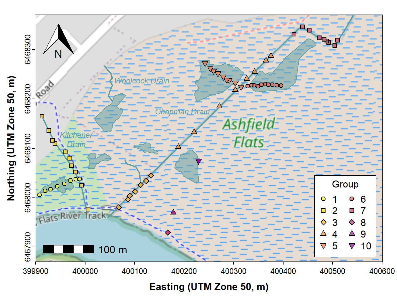
Figure 13: Map of Ashfield Flats (UTM), with added North arrow, scale
bar, additional map features, text labels, and user data (data plotted
last), over OpenStreetMap tiles acquired using maptiles.
CC-BY-SA • All content by Ratey-AtUWA. My employer does not necessarily know about or endorse the content of this website.
Created with rmarkdown in RStudio. Currently using the free yeti theme from Bootswatch.