 Material to support teaching in Environmental Science at The University of Western Australia
Units ENVT3361, ENVT4461, and ENVT5503
RStudio introduction with ggplot
Reading files, checking data, and making plots
Andrew Rate
2025-11-27
This guide gets you started with reading data into R (R Core Team, 2025) from a file, including checking that the data have been read in correctly. We will always be using R in the RStudio environment (Posit Software, 2025).
If you need or would like a more basic
introduction to R, you could first read our
Guide to R and RStudio for
absolute beginners.
Reading the data
We use the read.csv() function – we will mostly supply
data to you as .csv files. Sometimes you need to download
these into your working directory to use them, and sometimes you can
read them directly from a web URL (e.g. https://github.com/.../afs19.csv).
With the type of dataset we usually use, there are columns containing
categorical information, which R calls
factors. These are typically stored as text or character
information, i.e. character strings, or just
strings. R identifies factors
in a particular way so the categories are recognised, so we need to use
the stringsAsFactors = TRUE argument in the
read.csv() function.
The result of the read.csv() function is a data
frame object stored in the R environment. We
need a data frame, since it is a data structure in R
which allows having columns of different classes (e.g. integer,
numeric, factor, date, logical, etc.) in the same object (each
column contains just one class of data, though).
Objects we create in an R session like data frames
are only stored while we have our R session active, and
disappear when we close R. Fortunately we can save our
whole environment by clicking the 💾 icon on the Environment tab,
or by running the save.image() function. Either of these
saving methods will create a file with extension .RData
which we can then load in later R sessions using the
load() function, or clicking the 📁 icon in the Environment tab
in RStudio.
git <- "https://github.com/Ratey-AtUWA/Learn-R-web/raw/main/"
hubbard <- read.csv(file = paste0(git,"hubbard.csv"), stringsAsFactors = TRUE)
# ... and do a quick check
is.data.frame(hubbard) # check that it worked; if so, the result should be TRUE
## [1] TRUEThese data are from the Hubbard Brook Experimental Forest near Woodstock in
New Hampshire, USA (Figure 1). Geological map units used to generate the
factor Rocktype are from the US Geological Survey.
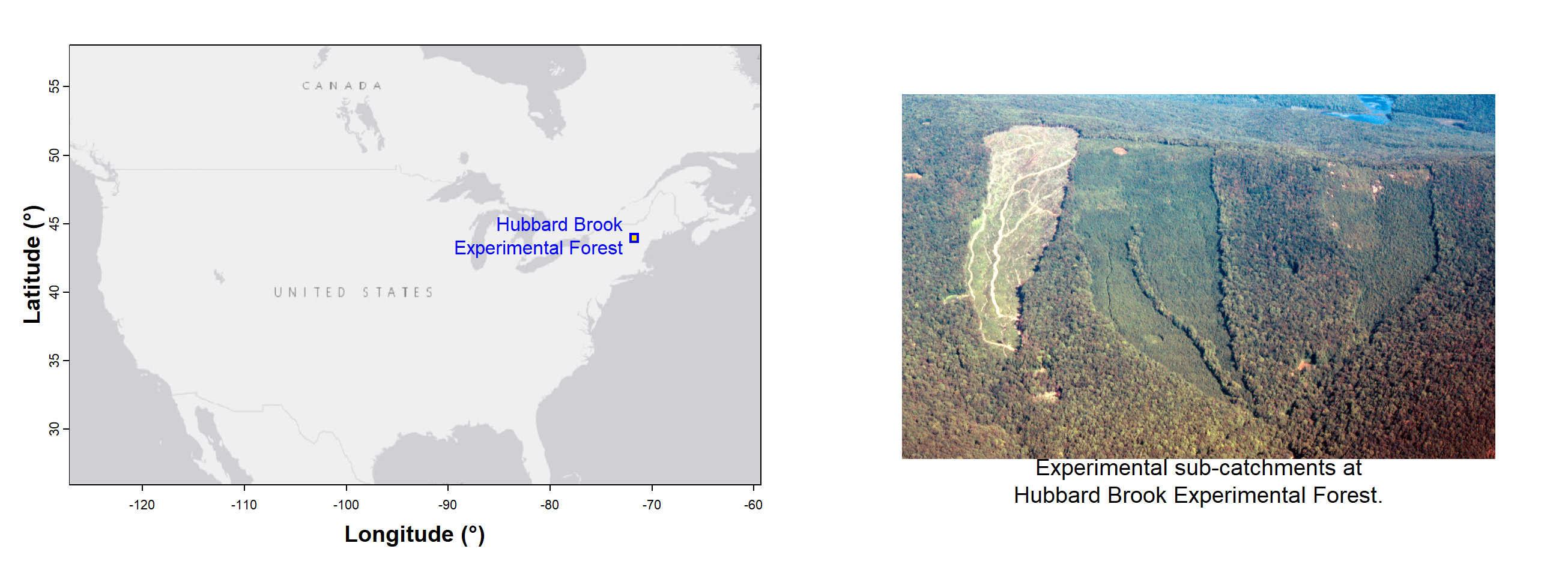
Figure 1: The Hubbard Brook Experimental Forest in New Hampshire, USA, showing location and simplified geology (inset shows location of Hubbard Brook on the continental USA). The data used in this workshop were generated at this site.
First proper check – summarise some of the data
We can use the summary() function to make a quick check
of our data, to make sure the file has read correctly (this may not
happen if the file is improperly formatted, etc.).
##       PLOT              Rocktype   Rel.To.Brook    Transect    Longitude         Latitude      UTM_EASTING
##  Min.   :  1.0   Igneous    : 95   North:135    E278000:44   Min.   :-71.79   Min.   :43.92   Min.   :276000
##  1st Qu.:126.8   Metamorphic:165   South:125    E277000:43   1st Qu.:-71.78   1st Qu.:43.93   1st Qu.:277000
##  Median :254.5                                  E280000:37   Median :-71.75   Median :43.94   Median :279000
##  Mean   :249.2                                  E276000:35   Mean   :-71.75   Mean   :43.94   Mean   :278996
##  3rd Qu.:392.2                                  E279000:34   3rd Qu.:-71.73   3rd Qu.:43.95   3rd Qu.:281000
##  Max.   :460.0                                  E282000:25   Max.   :-71.70   Max.   :43.96   Max.   :283000
##                                                 (Other):42
The summary() function creates a little table for each
column – note that these little tables do not all look the same.
Integer or numeric columns get a numeric
summary with minimum, mean etc., and sometime the number of
missing (NA) values. Categorical (Factor)
columns show the number of samples (rows) in each category (unless there
are too many categories). These summaries are useful to check if there
are zero or negative values in columns, how many missing observations
there might be, and if the data have been read correctly into R.
Note: You would usually check the whole data
frame, without restricting rows or columns, by running
summary(hubbard). We could also:
- summarise all variables, but only the first 10 rows by running
summary(hubbard[1:10,])(we also call rows 'observations' which often represent separate field samples); - summarise a defined range of both rows and columns, e.g.,
summary(hubbard[1:20,6:10]), which would summarise only the first 20 rows of columns 6 to 10.
Final checks of the data frame
Usually we would not restrict the output as done below with
[,1:15]. We only do it here so we're not bored with pages
of similar-looking output. You should look at structure for the whole
data frame using str(hubbard) (or substitute
hubbard for whatever your data object is called). The whole
hubbard data frame has 62 variables (i.e.
columns), not 15.
## 'data.frame':    260 obs. of  15 variables:
##  $ PLOT        : int  1 2 3 5 6 7 8 9 10 11 ...
##  $ Rocktype    : Factor w/ 2 levels "Igneous","Metamorphic": 2 2 2 2 2 2 2 2 2 2 ...
##  $ Rel.To.Brook: Factor w/ 2 levels "North","South": 1 1 1 1 1 1 1 1 1 1 ...
##  $ Transect    : Factor w/ 8 levels "E276000","E277000",..: 5 5 5 5 5 5 5 5 5 5 ...
##  $ Longitude   : num  -71.7 -71.7 -71.7 -71.7 -71.7 ...
##  $ Latitude    : num  43.9 43.9 43.9 43.9 43.9 ...
##  $ UTM_EASTING : int  280000 280000 280000 280000 280000 280000 280000 280000 280000 280000 ...
##  $ UTM_NORTHING: int  4868400 4868500 4868700 4869000 4869100 4869300 4869400 4869600 4869700 4869900 ...
##  $ PH          : num  4.29 4.66 4.23 4.15 4.49 4.79 4.11 4.52 4.51 4.43 ...
##  $ MOISTURE.pct: num  4.74 7.47 5.55 3.77 4.82 ...
##  $ OM.pct      : num  12.2 10.46 14.88 9.14 12.01 ...
##  $ Cd          : num  0.498 0.207 1.359 0.913 0.099 ...
##  $ Cu          : num  22.1 27.1 18.6 7 17 ...
##  $ Ni          : num  12.25 20.5 14.43 8.72 10.62 ...
##  $ Cr          : num  21.1 28.2 19.6 21.3 22.8 ...
We can see that some columns are integer (int) values
(e.g. PLOT, UTM_EASTING), some columns contain
Factor values i.e. in fixed categories
(e.g. Rocktype, Transect), and some columns are numeric
(num) (e.g. PH, OM.pct, Ni). Applying the
str() function to a data object is always
a good idea, to check that the data have read correctly into R. [NOTE
that other variable types are possible such as character
chr, date (Date or POSIXct),
logical, etc.]
"Data is like garbage. You'd better know what you are going to do with it before you collect it."
— Mark Twain
The following section describes how to make graphs and plots in
base-R and in the ggplot2 package. Go to this page if you want base-R only, without
the ggplot2 material.
Base R plotting: x-y plot using plot()
We can use either plot(x, y, ...) OR
plot(y ~ x, ...)
In R the ~ symbol means
'as a function of', so ~ indicates a formula.
In R we need to tell the program which 'object' our variables are in.
We've just made a Data Frame (a type of data object) called
hubbard.
This is how we do it in base-R (see the base-R version of this page):
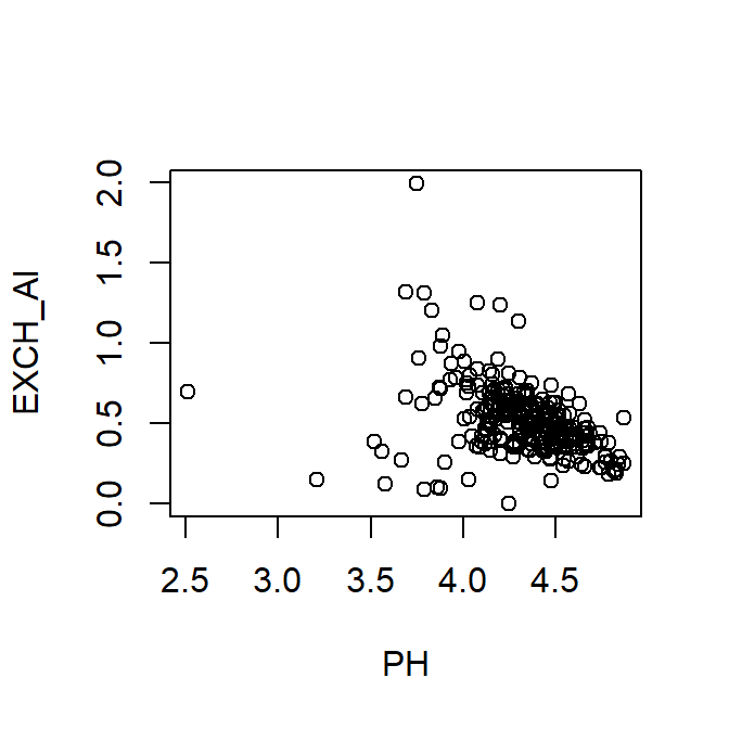
Figure 2: Plot of exchangeable Al vs. pH using base-R functions, including with() to specify the data frame.
Without changing any of the (numerous) options or parameters in the
plot() function, the base-R plot (Figure 2) is not very
attractive (e.g. axis titles!).
X-Y plot using ggplot (Wickham, 2016)
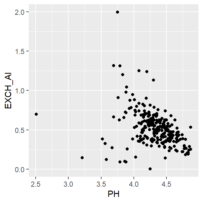
Figure 3: Basic plot of exchangeable Al vs. pH using the
ggplot2 R package.
We can also change the overall appearance of base-R plots by using
the function par() before plotting; par() sets
graphics parameters.
Setting some overall graphics parameters using
par()
mar=sets margins in 'lines' units:c(bottom,left,top,right)e.g.c(4,4,3,1)mgp=sets distance of text from axes:c(titles, tickLabels, ticks)font.lab=sets font style for axis titles: 2=bold, 3=italic, etc.
– and within theplot()function itself,xlab=andylab=set axis titles
See the base-R version of this page for details!
Plots made using ggplot2 such as Figure 3 set
par()options automatically, and come with a default table
style, or theme.
Plot points by a factor, with a legend, using
ggplot
library(ggplot2)
ggplot(data=hubbard,
       aes(x= PH, y = EXCH_Al, color=Rocktype, shape=Rocktype)) +
  geom_point(size=2.5) +
  labs(y="Exchangeable Al (cmolc/kg)", x = "Soil pH") +
  theme_bw()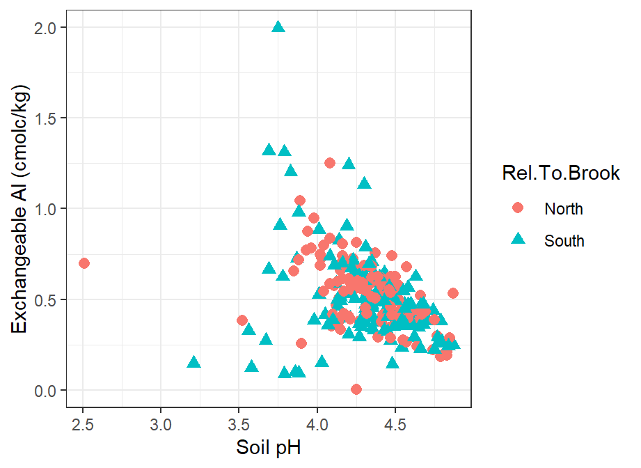
Figure 4: Plot of exchangeable Al vs. pH in the Hubbard Brook soil data
using the ggplot2 R package showing points categorized by
the factor Rocktype, and using a non-default plot theme.
In the ggplot2 example in Figure 4 we have used the
aes() option to specify different colours and symbols
depending on the value of a factor (Rocktype). A legend is
created automatically. We have also used a different theme option
(theme_bw()), which is arguably more appropriate than the
default which has a grey plot background.
ggplot points by factor with customisation, and legend
inside the plot
In Figure 5 we add some additional customisations:
- specify our own colours using
scale_color_manual() - specify our own symbols using
scale_shape_manual() - further customise the plot theme wit the
theme()function:- put the legend inside the plot with the option
legend.position = "inside" - position the legend using
legend.position.inside = c(0.2,0.85), where the vectorc(0.2,0.85)contains proportions of the plot area - make the axis titles bold font using
axis.title = element_text(face="bold")
- put the legend inside the plot with the option
ggplot(data=hubbard,
       aes(x= PH, y = EXCH_Al, color=Rocktype, shape=Rocktype)) +
  geom_point(size=2.5) +
  labs(x = "Soil pH", y="Exchangeable Al (cmolc/kg)") +
  scale_color_manual(values = c("navy","chocolate")) +
  scale_shape_manual(values = c(1,17)) +
  theme_bw() +
  theme(legend.position = "inside",
        legend.position.inside = c(0.2,0.85),
        axis.title = element_text(face="bold"))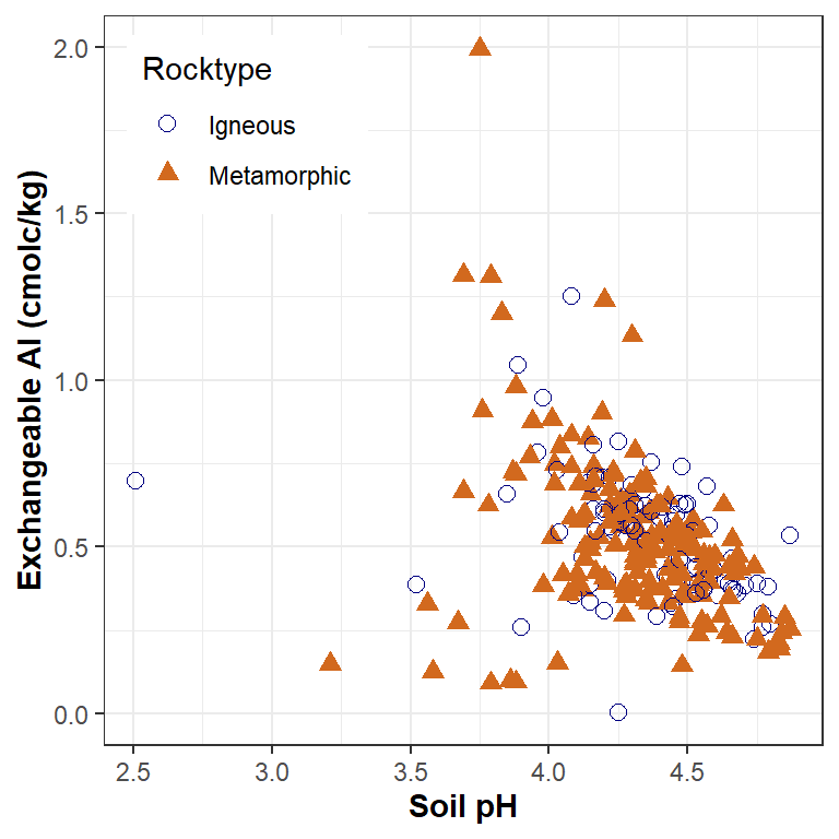
Figure 5: Plot of exchangeable Al vs. pH in the Hubbard Brook soil data
using the ggplot2 R package showing points categorized by
the factor Rocktype, and using a non-default plot theme.
Other types of data presentation: Plot types and Tables
We'll give you some starting code chunks, and the output from them. You can then use the help in RStudio to try to customise the plots according to the suggestions below each plot!
Histograms
Histograms (Figure 6) are an essential staple of statistical plots, because we always need to know something about the distribution of our variable(s). Histograms are a good visual way to assess the shape of a variable's distribution, whether it's symmetrical and bell-shaped (normal), left- or right-skewed, bimodal (two 'peaks') or even multimodal. As with any check of a distribution, the 'shape' will be clearer if we have more observations.
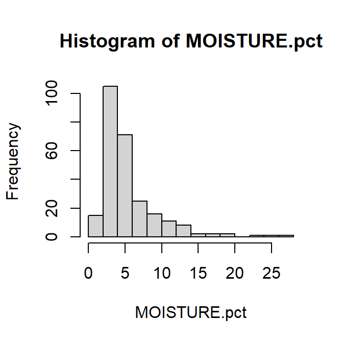
Figure 6: Histogram of percent soil moisture content at Hubbard Brook, using base-R functions.
Histogram in ggplot
The ggplot default histograms (Figure 7) are a bit
prettier than the base-R histograms...
ggplot(data = hubbard, aes(x=MOISTURE.pct)) +
  geom_histogram(fill="lightgray", color="black") +
  theme_bw()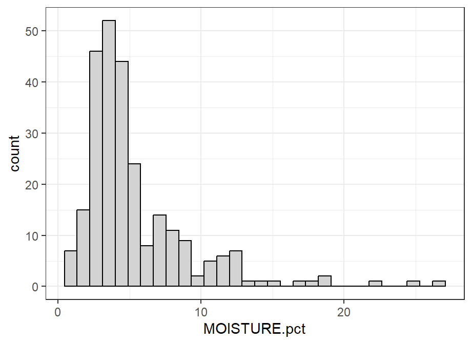
Figure 7: Histogram of water content (%) in the Hubbard Brook soil data
using ggplot2, and using a non-default ggplot theme.
For histograms, try the following:
- add suitable axis labels (titles)
- make bars a different colour (all the same)
- change the number of ‘bins’ (bars) on the histogram to give wider or narrower intervals
- log10-transform the x-axis (horizontal axis)
...and so on.
Box plots
Box plots also give us some information about a variable's distribution, but one of their great strengths is in comparing values of a variable between different groups in our data.
Tukey box plots implemented by R have 5 key values; from least to greatest these are (Figure 8):
- the lower whisker, which is the greatest of the minimum or the lower hinge − 1.5 × IQRa
- the lower hinge, which is the lower quartile (25th percentile)
- the median (i.e. the 50th percentile)
- the upper hinge, which is the upper quartile (75th percentile)
- the upper whisker, , which is the least of the maximum or the upper hinge + 1.5 × IQR
Any points less than the lower whisker, or greater than the upper whisker, are plotted separately and represent potential outliers.
aIQR is the interquartile range between the upper and lower quartiles (25th and 75th percentiles)
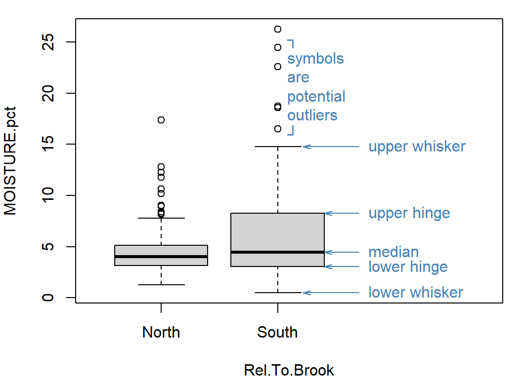
Figure 8: Basic box plot with annotations explaining the boxplot features. The plot shows percent soil moisture content at Hubbard Brook.
Boxplot in ggplot
You will probably want to change some of the default settings in
ggplot boxplots (Figure 9).
ggplot(data = hubbard, aes(x=Rocktype, y=MOISTURE.pct)) +
  geom_boxplot(fill="lightgray", color="black") +
  theme_bw()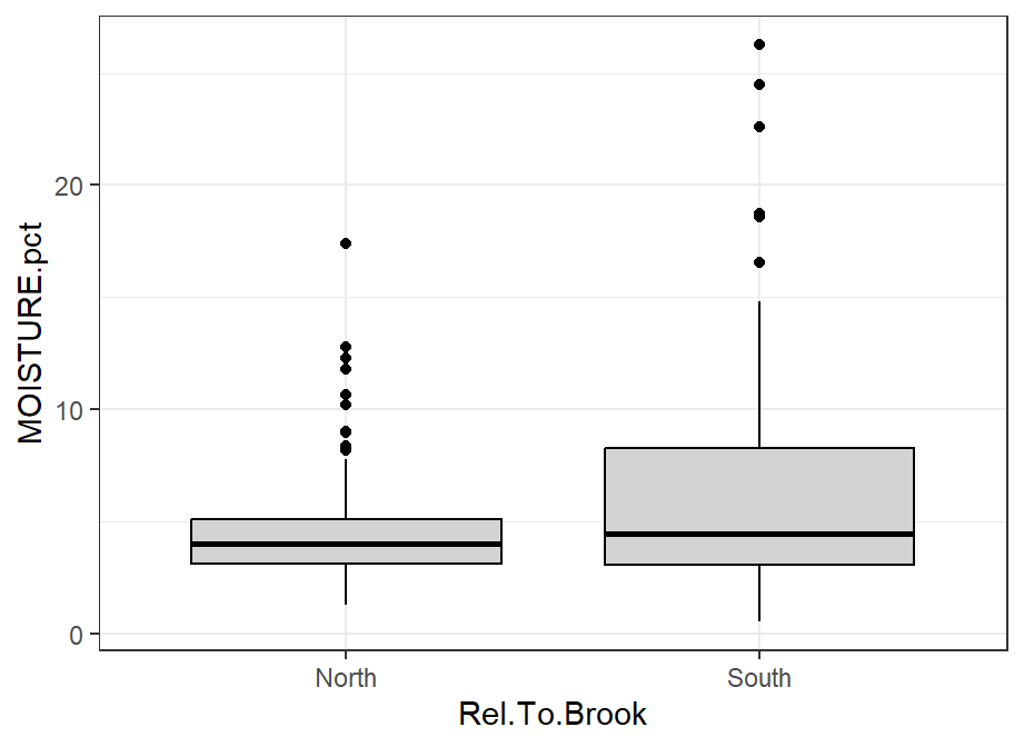
Figure 9: Boxplot of water content (%) in the Hubbard Brook soil data
using ggplot2, and using a non-default ggplot theme.
For box plots, try the following:
- include better axis labels (titles)
- make boxes a different colour (all the same, and all different!)
- add notches to boxes representing approximate 95% confidence intervals around the median
- add cap lines (“staples”) to the ends of the whiskers (not default
in
ggplot) - give the (vertical) y-axis a log10 scale
...and so on.
Strip Charts in ggplot
Strip charts, or one-dimensional scatter plots (Figure 10), can be a useful companion (or alternative) to box plots, especially when we don't have many observations of a variable.
ggplot(data = hubbard, aes(x=MOISTURE.pct, y="")) +
  geom_jitter(position=position_jitter(0.1)) +
  theme_bw()
Figure 10: Strip chart of water content (%) in the Hubbard Brook soil
data using ggplot2, and using a non-default ggplot theme.
For stripcharts, try the following:
- add suitable axis labels (titles), in bold font;
- make symbols a different shape ± colour (try a semitransparent colour);
- make the strip chart vertical instead of horizontal;
- log10-transform the numerical axis, so that overlapping points are easier to see;
- rotate the y-axis titles 90° clockwise (make sure the left margin is
wide enough!)
...and so on.
"With data collection, 'the sooner the better' is always the best answer."
Tables
There are a few ways to make useful tables in R to summarise your data. Here are a couple of examples.
Using the tapply() function in base R
We can use the tapply() function to make very simple
tables:
# use the cat() [conCATenate] function to make a Table heading
#     (\n is a line break)
cat("One-way table of means\n")
with(hubbard, tapply(X = EXCH_Ni, INDEX=Transect,
       FUN=mean, na.rm=TRUE))
cat("\nTwo-way table of means\n")
with(hubbard, tapply(X = EXCH_Ni,
       INDEX=list(Transect,Rocktype),
       FUN=mean, na.rm=TRUE))
## One-way table of means
## E276000 E277000 E278000 E279000 E280000 E281000 E282000 E283000
## 0.002588815 0.002136418 0.002827809 0.002813563 0.002528296 0.002262386 0.002221885 0.002957922
##
## Two-way table of means
## Igneous Metamorphic
## E276000 0.002477888 0.002693580
## E277000 0.002156119 0.002113763
## E278000 0.002901344 0.002374343
## E279000 0.002437618 0.003189507
## E280000 NA 0.002528296
## E281000 NA 0.002262386
## E282000 NA 0.002221885
## E283000 NA 0.002957922
For tapply() tables, try the following:
- we have used the
meanfunction (FUN=mean) – try another function to get minima, maxima, standard deviations, etc. - try copying the output to Word or Excel and using this to make a
table in that software
...and so on.
Using the numSummary() function in the 'RcmdrMisc' R
package
If you can't or don't want to install the RcmdrMisc
package, we can generate summary tables with a bit of base-R coding – see this page for
details.
require(RcmdrMisc)
# use the cat() [conCATenate] function to make a Table heading
#   (\n is a line break)
cat("Summary statistics for EXCH_Ni\n")
numSummary(hubbard$EXCH_Ni)
cat("\nSummary statistics for EXCH_Ni grouped by Rocktype\n")
numSummary(hubbard$EXCH_Ni, groups=hubbard$Rocktype)
## Summary statistics for EXCH_Ni
## mean sd IQR 0% 25% 50% 75% 100% n NA
## 0.002536502 0.001382344 0.001126141 0.00070457 0.001829135 0.002246775 0.002955276 0.01784169 257 3
##
## Summary statistics for EXCH_Ni grouped by Rocktype
## mean sd IQR 0% 25% 50% 75% 100% data:n data:NA
## Igneous 0.002558554 0.0008877544 0.001097433 0.001016643 0.001995040 0.002368455 0.003092473 0.005404474 94 1
## Metamorphic 0.002523785 0.0016021169 0.001142543 0.000704570 0.001754511 0.002174767 0.002897054 0.017841689 163 2For numSummary() tables, try the following:
- generating summary tables for more than one variable at a time (see this page)
- generating summary tables with fewer statistical parameters
(e.g. omit IQR) or more statistical parameters (e.g.
include skewness)
(use R Studio Help!) - try copying the output to Word or Excel and using this to make a
table in that software
...and so on.
Tables using print() on a data frame
Data frames are themselves tables, and if they already contain the
type of summary we need, we can just use the print()
function to get output. Let's do something [slightly] fancy (see if you
can figure out what is going on here¹):
output <-
  numSummary(hubbard[,c("PH","MOISTURE.pct","OM.pct","Al.pct","Ca.pct","Fe.pct")],
             statistics = c("mean","sd","quantiles"), quantiles=c(0,0.5,1))
mytable <- t(cbind(output$table,output$NAs))
row.names(mytable) <- c("Mean","Std.dev.","Min.","Median","Max.","Missing")
# here's where we get the output
print(mytable, digits=3)
write.table(mytable,"clipboard",sep="\t")
cat("\nThe table has now been copied to the clipboard, so you can paste it into Excel!\n")
## PH MOISTURE.pct OM.pct Al.pct Ca.pct Fe.pct
## Mean 4.322 5.37 12.01 1.641 0.208 3.163
## Std.dev. 0.293 3.83 5.17 1.478 0.214 1.112
## Min. 2.510 0.51 2.24 0.155 0.002 0.497
## Median 4.350 4.13 11.16 0.970 0.139 3.168
## Max. 4.870 26.26 50.18 7.132 1.107 7.709
## Missing 0.000 0.00 0.00 60.000 62.000 60.000
##
## The table has now been copied to the clipboard, so you can paste it into Excel!¹Hints: we have made two data frame objects, one from the output of
numSummary(); t() is the transpose function;
there are also some other useful functions which might be new to you
like: row.names(), cbind(),
print(), write.table() . . .
Report-quality tables
If you want to take this further, we can start making really nice
Tables for reports with various R packages. I sometimes
use the kable() function from the knitr
package (Table 1), but mostly use the flextable package
(Gohel & Skintzos, 2022).
knitr::kable(mytable, digits=c(2,2,2,3,3,3),
      col.names=c("Statistic","Soil pH","Water content (%)", "Org. matter (%)",
                  "Al (%)", "Ca (%)", "Fe (%)"),
caption="Table 1: A table created by the kable() function in the knitr R package.")| Statistic | Soil pH | Water content (%) | Org. matter (%) | Al (%) | Ca (%) | Fe (%) |
|---|---|---|---|---|---|---|
| Mean | 4.32 | 5.37 | 12.01 | 1.641 | 0.208 | 3.163 |
| Std.dev. | 0.29 | 3.83 | 5.17 | 1.478 | 0.214 | 1.112 |
| Min. | 2.51 | 0.51 | 2.24 | 0.155 | 0.002 | 0.497 |
| Median | 4.35 | 4.13 | 11.16 | 0.970 | 0.139 | 3.168 |
| Max. | 4.87 | 26.26 | 50.18 | 7.132 | 1.107 | 7.709 |
| Missing | 0.00 | 0.00 | 0.00 | 60.000 | 62.000 | 60.000 |
Here's an example (Table 2)) using flextable and the
table object mytable made above:
library(flextable)
flextable(data.frame(Statistic=row.names(mytable),signif(mytable,3))) |>
  bold(bold=TRUE, part="header") |>
set_caption(caption="Table 2: Table created by the flextable R package. Many more table formatting, text formatting, and number formatting options are available in this package.")Statistic | PH | MOISTURE.pct | OM.pct | Al.pct | Ca.pct | Fe.pct |
|---|---|---|---|---|---|---|
Mean | 4.320 | 5.37 | 12.00 | 1.640 | 0.208 | 3.160 |
Std.dev. | 0.293 | 3.83 | 5.17 | 1.480 | 0.214 | 1.110 |
Min. | 2.510 | 0.51 | 2.24 | 0.155 | 0.002 | 0.497 |
Median | 4.350 | 4.13 | 11.20 | 0.970 | 0.139 | 3.170 |
Max. | 4.870 | 26.30 | 50.20 | 7.130 | 1.110 | 7.710 |
Missing | 0.000 | 0.00 | 0.00 | 60.000 | 62.000 | 60.000 |
For more detail on producing high-quality tables for reports, see the relevant page on the R for Environmental Science website.
The following two excellent websites can extend your basic knowledge of using R and RStudio:
A great free resource for R beginners is An Introduction to R by Alex Douglas, Deon Roos, Francesca Mancini, Ana Couto & David Lusseau.
Getting used to R, RStudio, and R Markdown is an awesome (and free) eBook by Chester Ismay which is super-helpful if you want to start using R Markdown for reproducible coding and reporting.
References
Fox, J. and Marquez, M. (2025). RcmdrMisc: R
Commander Miscellaneous Functions. R package version 2.9-2, https://CRAN.R-project.org/package=RcmdrMisc.
Fox J, Weisberg S (2019). An R Companion to
Applied Regression, Third Edition. Thousand Oaks CA: Sage. https://www.john-fox.ca/Companion/index.html
(car package).
Gohel D, Skintzos P (2025). flextable: Functions for
Tabular Reporting. R package version 0.9.10, https://CRAN.R-project.org/package=flextable.
Posit Software (2025) RStudio 2025.09.1+401 "Cucumberleaf Sunflower" Release. https://posit.co/products/open-source/rstudio/.
R Core Team (2025). R: A language and environment for statistical computing. R Foundation for Statistical Computing, Vienna, Austria. https://www.R-project.org/.
Wickham, H. ggplot2: Elegant Graphics for Data
Analysis. Springer-Verlag New York, 2016. https://ggplot2.tidyverse.org.
CC-BY-SA • All content by Ratey-AtUWA. My employer does not necessarily know about or endorse the content of this website.
Created with rmarkdown in RStudio. Currently using the free yeti theme from Bootswatch.