 Material to support teaching in Environmental Science at The University of Western Australia
Units ENVT3361, ENVT4461, and ENVT5503
Boxplots with Extras
Enhancing basic boxplots
Andrew Rate
2025-12-04
First we load the data (an extension of the dataset described by Rate & McGrath, 2022) and the R packages we need:
git <- "https://github.com/Ratey-AtUWA/Learn-R-web/raw/refs/heads/main/"
afs1923 <- read.csv(paste0(git,"afs1923.csv"), stringsAsFactors = TRUE)

library(viridis)        # accessible colour palettes
library(rcompanion)     # utilities for pairwise comparisons
library(multcompView)   # utilities for pairwise comparisons
library(TeachingDemos)  # used only for the shadowtext() function
Boxplots with clear comparisons and intelligible scales
For exploratory data analysis it's common to draw a lot of boxplots. The data we often explore in Environmental Science often includes variables having positively skewed distributions. When drawing boxplots, this means that some categories can be hard to visualise because they have much lower concentrations than others, and the high values dominate the plot (see Figure 1(a)).
We commonly deal with this by log transformation - Figure 1(b) shows this, and the variables (and therefore boxplot boxes) now have more symmetrical distributions which are all clearly visible on the plot. But the y axis (concentration, in this case) doesn't show the actual values.
Figure 1(c) shows the plot with a log-transformed y axis scale, but this is not really satisfying either since the distribution is still skewed but plotted on the compressed log-transformed y-axis.
I think the best option, shown in Figure 1(d), is to plot the log-transformed variable, but suppress the automatic axis and manually add a y-axis with a transformed scale. It's a bit trickier, but worth it. Now we can compare all the factor levels easily, yet still have actual values on the axis (e.g. for comparison with environmental guidelines).
par(mfrow=c(2,2),mar = c(5,4,1.5,1), mgp=c(2.4,0.2,0), tcl=0.25, font.lab = 2,
    xpd = F)
library(viridis)

with(afs1923, boxplot(Zn ~ Zone, col=viridis(12, alpha=0.5),
                        las=2, xlab="", cex = 1.4, cex.lab = 1.4))
mtext("Sampling Zone",1,3,font=2)
mtext("(a)", 3, -1.2, adj = 0.03, font = 2)
mtext("Untransformed variable or axis", 3, 0.2, font=3)

with(afs1923, boxplot(log10(Zn) ~ Zone, col=viridis(12, alpha=0.5),
                        las=2, xlab="", cex = 1.4, cex.lab = 1.4,
                        ylab=expression(bold(paste(log[10],"(Zn)")))))
mtext("Sampling Zone",1,3,font=2)
mtext("(b)", 3, -1.2, adj = 0.03, font = 2)
mtext("Log-transformed variable", 3, 0.2, font=3)

with(afs1923, boxplot(Zn ~ Zone, log = "y", col=viridis(12, alpha=0.5),
                        las=2, xlab="", cex = 1.4, cex.lab = 1.4))
mtext("Sampling Zone",1,3,font=2)
mtext("(c)", 3, -1.2, adj = 0.03, font = 2)
mtext(expression(paste(italic("Log-transformed variable "),bold("axis"))),
      3, 0.2, font=3)

with(afs1923, boxplot(log10(Zn) ~ Zone, col=viridis(12, alpha=0.5),
                        las=2, xlab="", cex = 1.4, cex.lab = 1.4, yaxt="n",
                        ylab = "Zn"))
logtx <- c(0.1,0.2,0.5,1,2,5,10,20,50,100,100,200,500,1000,2000,5000,10000)
axis(2, at=log10(logtx), labels=logtx, las=2)
mtext("Sampling Zone",1,3,font=2)
mtext("(d)", 3, -1.2, adj = 0.03, font = 2, col = "blue3")
abline(h=par("usr")[4], col="gold", lwd=9)
mtext("Best option: log variable, custom axis", 3, 0.2, font=3, col = "blue3")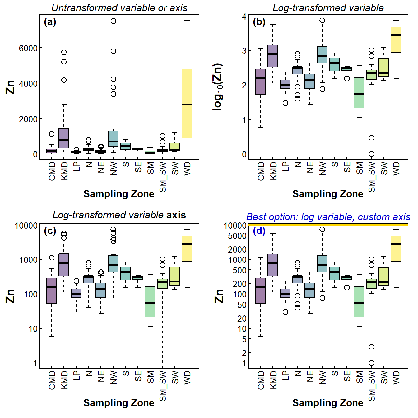
Figure 1: Four styles of boxplots based on the same data.
Boxplots with added means or observations
Of course, this is not the only modification we can make with box
plots. A box plot is a good way to compare the spread of values between
different levels of a factor, and the thick line inside boxes shows how
the medians in each group vary. Sometimes we also like to look at where
the mean values are, especially if we have a parametric statistical test
to compare these means. It's not too difficult to superimpose the means
together with some measure of variability; the following example (Figure
2(a)) shows 95% confidence intervals around each group mean. We use the
tapply() function to make columns within a new data frame
which calculate confidence intervals and mean for a variable in groups
defined by a factor. The confidence are available from the output of the
t.test() function, so we use simple custom
function statements within tapply() to
generate just the confidence interval output.
par(mfrow=c(1,2), mar=c(6,4,1,1), mgp=c(2.4,0.2,0), tcl=0.25, font.lab = 2, las=1)
# change data object, variable & factor names to suit your data
ci0 <- data.frame(lo95=with(afs1923,
                      tapply(log10(Zn), Zone, function(x){t.test(x)$conf.int[1]})),
                  mean=with(afs1923,
                      tapply(log10(Zn), Zone, function(x){mean(x, na.rm=TRUE)})),
                  hi95=with(afs1923,
                      tapply(log10(Zn), Zone, function(x){t.test(x)$conf.int[2]})))
with(afs1923,
     boxplot(log10(Zn) ~ Zone, col=viridis(nrow(ci0), alpha=0.5),
             ylab="Zn (mg/kg)",
             cex.lab=1.2, yaxt="n", xaxt = "n", xlab = "")
)
axis(1, las = 2, tcl = 0.4, at = seq(1,NROW(ci0)),
     labels = as.character(levels(afs1923$Zone)))
axis(2, at=log10(logtx), labels=logtx, las=2)
mtext("Sampling zone", side = 1, line = 3.5, font = 2, cex = 1.2)

# use arrow function to make background for [optional] error bars
arrows(x0=seq(1,nrow(ci0)), y0=ci0[,2], y1=ci0[,1],
       col="white", angle=90, length=0.1, lwd=6) # optional
arrows(x0=seq(1,nrow(ci0)), y0=ci0[,2], y1=ci0[,3],
       col="white", angle=90, length=0.1, lwd=6) # optional
#
# draw lines to join points first, so the points overplot lines
lines(seq(1,NROW(ci0)), ci0[,2], col="white", lwd=3, type="c")
lines(seq(1,NROW(ci0)), ci0[,2], col="gray40", lwd=1, type="c", lty=3)
#
# use arrow function to make actual [optional] error bars
arrows(x0=seq(1,nrow(ci0)), y0=ci0[,2], y1=ci0[,1],
       col="gray40", angle=90, length=0.1, lwd=2, lend=1)
arrows(x0=seq(1,nrow(ci0)), y0=ci0[,2], y1=ci0[,3],
       col="gray40", angle=90, length=0.1, lwd=2, lend=1)
# draw the points with white background for contrast
points(seq(1,NROW(ci0)), ci0[,2], col="white", pch=16, lwd=2, cex=1.6)
points(seq(1,NROW(ci0)), ci0[,2], col="gray40",
       pch=16, lwd=2, cex=1.2)
mtext("(a)", 3, -1.2, adj = 0.03)

nc <- nlevels(afs1923$Type)
palette(c("black",viridis(nc, alpha=0.5),
          viridis(nlevels(afs1923$Type), alpha=0.75),"white"))
with(afs1923,
     boxplot(log10(Zn) ~ Type, col=c(1:nc)+1,
             ylab="Zn (mg/kg)",
             cex.lab=1.2, yaxt="n", xlab = "",las=2))
axis(2, at=log10(logtx), labels=logtx, las=2)
mtext("Sample Type", 1, 4.5, cex=1.2, font=2)
abline(h=log10(410), col="dimgray", lty="22", lwd=2)
with(afs1923, stripchart(log10(Zn) ~ Type, add = TRUE, vertical=TRUE,
                           method="jitter", pch=19,col=c(1:nc)+(nc+1)))
mtext("(b)", 3, -1.2, adj = 0.97)
legend("bottomleft",
       legend="Upper guideline value for\nZn in  sediment (410 mg/kg)",
       bty="n", inset=c(0,0.05), lwd=2, lty="22", seg.len=3, col="dimgray")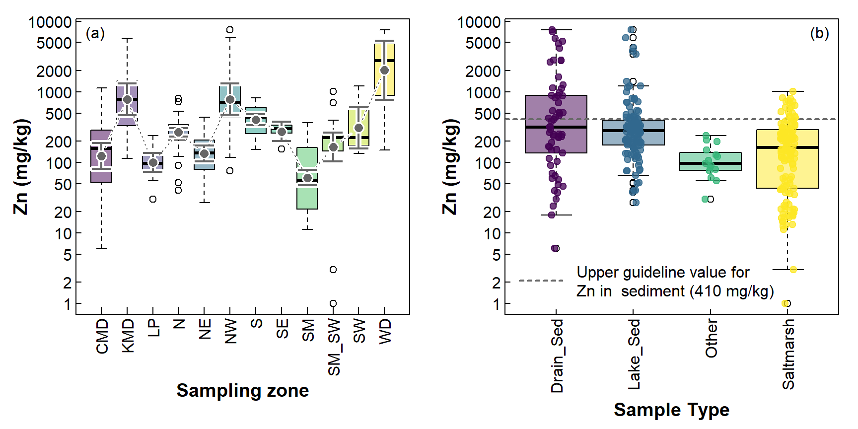
Figure 2: Including additional information on boxplots; (a) mean and CI, (b) individual observations, with the sediment GV-high concentration for Zn (410 mg/kg; Water Quality Australia 2024).
Figure 2(b) shows the actual observations, and an environmental threshold for Zn. Showing the individual values is probably more useful when there are fewer observations, in which case the boxplots themselves may not represent the distributions well. In addition, including the individual values with an environmental threshold means we can [approximately] count the number of samples exceeding the threshold.
Boxplots with pairwise comparisons
We often use a boxplot to visualise a statistical comparison of means (including non-parametric comparisons such as a Kruskal-Wallis test). If the overall test shows a significant effect (i.e. p ≤ 0.05), we follow up with a post-hoc pairwise comparison such as a pairwise t-test or Wilcoxon test. The significant pairwise differences are conveniently and concisely summarised in the “compact letter display”, in which factor levels having no letters in common have significant pairwise differences.
The compact letters are often presented as superscripts or suffixes in a table of means, but they can also be included on box plots, as shown in the code below.
par(mfrow=c(1,2), mar=c(6,4,1,1), mgp=c(2.4,0.2,0), tcl=0.25, font.lab = 2,
    las=2)
# 1. compact letters at mean values for each level
with(afs1923, boxplot(log10(Zn) ~ Type, yaxt="n",             # suppress axes
                    col=viridis(nlevels(Type), alp=0.4, end=0.9),
                    xlab="", ylab="Zn (mg/kg)"))
mtext("Sample Type", 1, 4.5, cex=1, font=2, las=1)
# manual log-transf axis
axis(2, at=log10(logtx), labels=logtx, mgp=c(1.6,0.2,0),
     tcl=0.25)
meansZn <- with(afs1923,
                tapply(log10(Zn), Type, function(x){mean(x, na.rm=TRUE)}))
pwZn <- with(afs1923, pairwise.wilcox.test(Zn, Type))
mclZn <- multcompLetters(fullPTable(pwZn$p.value))
# plot compact letters at mean values
shadowtext(c(1:4), meansZn, labels=mclZn$Letters, col=1, bg=10, r=0.2)

# 2. compact letters near axis
rgZn <- range(log10(afs1923$Zn), na.rm=TRUE)
with(afs1923, boxplot(log10(Zn) ~ Type, yaxt="n",             # suppress axes
                    col=viridis(nlevels(Type), alp=0.4, end=0.9),
                    xlab="", ylab="Zn (mg/kg)",
                    ylim=c(rgZn[1]-0.7,rgZn[2])))
mtext("Sample Type", 1, 4.5, cex=1, font=2, las=1)
# manual log-transf axis
axis(2, at=log10(logtx[-c(1:3)]), labels=logtx[-c(1:3)], mgp=c(1.6,0.2,0),
     tcl=0.25)
pwZn <- with(afs1923, pairwise.wilcox.test(Zn, Type))
mclZn <- multcompLetters(fullPTable(pwZn$p.value))
# plot compact letters at mean values
pu <- par("usr")
text(c(1:4), rep(pu[3]+0.06*(pu[4]-pu[3]),4),
           labels=mclZn$Letters, family="serif", font=3)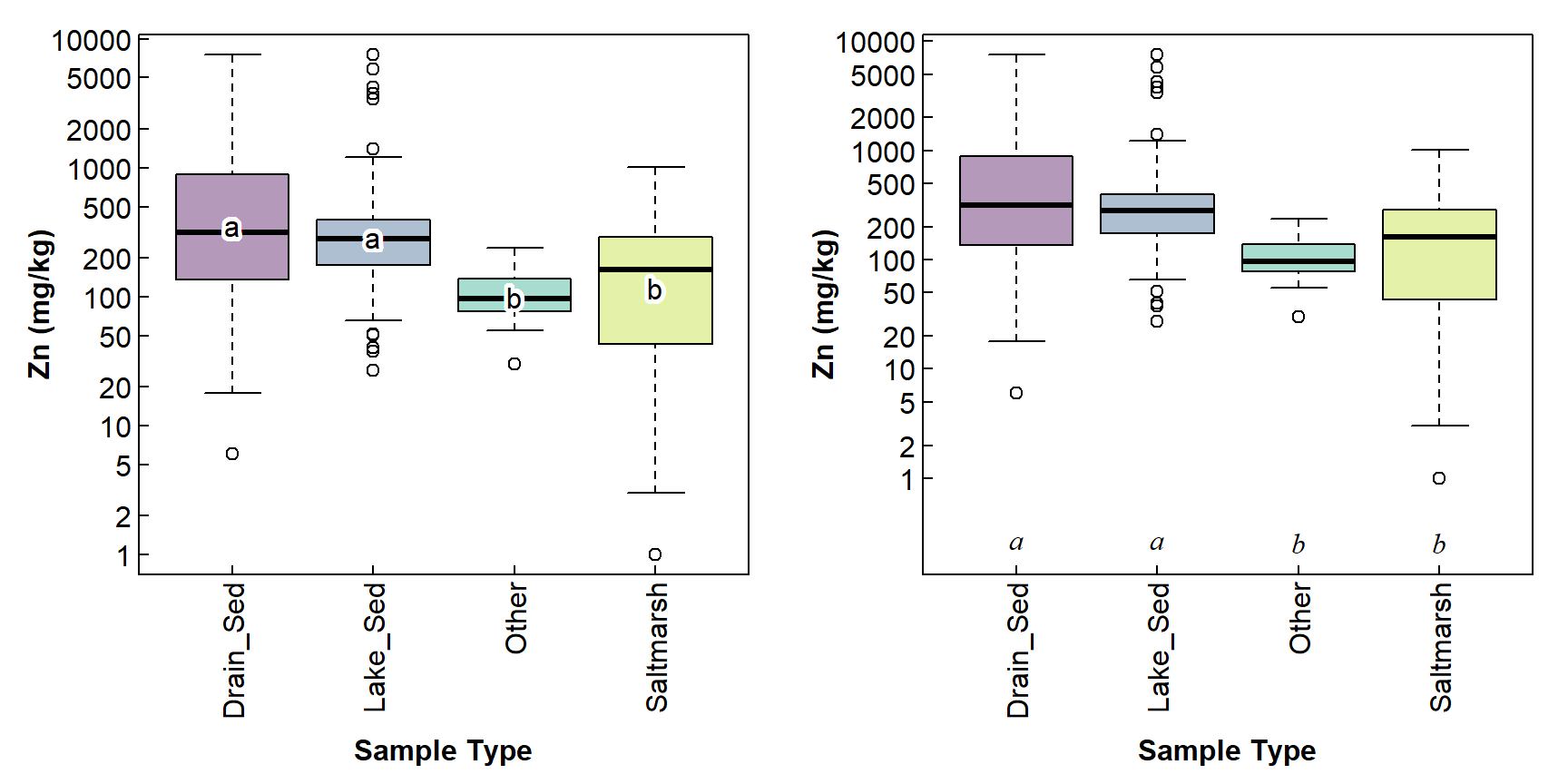
Figure 3: Including pairwise compact letters on boxplots; (a) compact letters at mean values; (b) compact letters at selected coordinates. Categories having no letters in common have significant pairwise differences (p ≤ 0.05).
Figure 3 shows two options for presenting compact letters on a boxplot. You can choose the one you like best, or adapt the code to make your own!
References and R Packages
Garnier S, Ross N, Rudis R, Camargo AP, Sciaini M, Scherer C (2021).
Rvision - Colorblind-Friendly Color Maps for R. R package
version 0.6.2. https://sjmgarnier.github.io/viridis/
(viridis package).
Graves S, Piepho H, Dorai-Raj LSwhfS (2024).
multcompView: Visualizations of Paired
Comparisons. R package version 0.1-10, https://CRAN.R-project.org/package=multcompView.
Mangiafico, Salvatore S. (2024). rcompanion:
Functions to Support Extension Education Program Evaluation.
version 2.4.36. Rutgers Cooperative Extension. New Brunswick, New
Jersey. https://CRAN.R-project.org/package=rcompanion
Rate, A. W., & McGrath, G. S. (2022). Data for assessment of sediment, soil, and water quality at Ashfield Flats Reserve, Western Australia. Data in Brief, 41, 107970. https://doi.org/10.1016/j.dib.2022.107970
Snow G (2024). TeachingDemos: Demonstrations for
Teaching and Learning. R package version 2.13, https://CRAN.R-project.org/package=TeachingDemos
Water Quality Australia. (2024). Toxicant default guideline values for sediment quality. Department of Climate Change, Energy, the Environment and Water, Government of Australia. Retrieved 2024-04-11 from https://www.waterquality.gov.au/anz-guidelines/guideline-values/default/sediment-quality-toxicants
CC-BY-SA • All content by Ratey-AtUWA. My employer does not necessarily know about or endorse the content of this website.
Created with rmarkdown in RStudio. Currently using the free yeti theme from Bootswatch.