 Material to support teaching in Environmental Science at The University of Western Australia
Units ENVT3361, ENVT4461, and ENVT5503
Statistics for Comparisons
Parametric mean comparison tests
Andrew Rate
2025-12-05
Comparisons pages: Parametric tests | Non-parametric tests
Activities for this session
- Use a single-sided t- test to compare the mean of a variable with a fixed value (e.g. an environmental guideline)
- Use a two -sided Welch's t-test to compare the means of 2 groups of a variable (i.e. categorised with a two-two-level factor)
- Calculate a Cohen's d effect size for a 2-group mean comparison
- Make a new factor using the
cut()function in R or theRecode()function (in thecarpackage) - Make relevant high-quality graphics to illustrate means
comparisons: e.g. box plots with means, and plots-of-means
[
plotMeans()]
- Repeat 1, 2, 3, & 5 above using analysis of variance
(ANOVA) via the Welch's f test
oneway.test(), to compare means for 3 or more groups
- Generate a pairwise comparison of means from the analysis in step 6 (if there's time – we can leave this until the next session).
Code and Data
🔣 R code file for this workshop session
📊 Ashfield flats water data (afw19) in CSV format
📊 Smith's Lake / Veryard Reserve data (sv2017) in CSV format
Intro: Comparisons of means between groups
Comparison of means tests help you determine whether or not your groups of observations have similar means. The groups are defined by the value of a factor (a categorical variable) for each row (observation) of our dataset.
There are many cases in statistics where you'll want to compare means for two or more populations, samples, or sample types. The parametric tests like t-tests or ANOVA compare the variance between groups with the variance within groups, and use the relative sizes of these 2 variances to estimate the probability that means are different.
The parametric mean comparison tests require the variables to have normal distributions. We also often assume that all groups of observations have equal variance in the variable being compared. If the variances in each group are not similar enough (i.e. the variable is heteroskedastic), we need to modify or change the statistical test we use.
Means comparisons based on Null Hypothesis Statistical Testing (NHST) compare the variance between groups with the variance within groups, and generate a statistic which, if large/unlikely enough (i.e. p ≤ 0.05), allows rejection of the null hypothesis (H0 = no difference between means in each/any groups).
In another session, we'll look at 'non-parametric' ways of comparing means, to be used when our variable(s) don't meet all of the requirements of conventional (parametric) statistical tests.
In this session we're going to use the 2017 Smith's Lake – Charles Veryard Reserves dataset (see Figure 1) to compare means between groups for factors having:
- only two groups (using only the soil data);
- more than two groups (using the whole dataset).
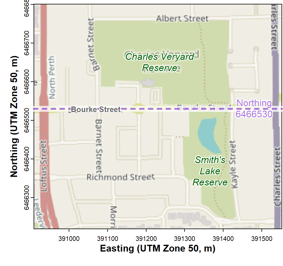
Map showing locations of Charles Veryard and Smiths Lake Reserves, North Perth, Western Australia.
Create a factor separating the two Reserves into groups AND limit the data to only soil
We split the dataset at Northing = 6466530 m, which represents Bourke Street.
require(car)
sv2017$Reserve <- cut(sv2017$Northing,
                      breaks = c(0,6466530,9999999),
                      labels = c("Smiths","Veryard"))
sv17_soil <- subset(sv2017, subset=sv2017$Type=="Soil")
cat("Number of soil samples in each reserve\n"); summary(sv17_soil$Reserve)
## Number of soil samples in each reserve## Smiths Veryard
## 21 52
Check the newly-created factor with a plot
Note that:
- we include the option
asp=1in the plot function, so that distances are the same for the x- and y-coordinates - the plot symbols, colours, and sizes are controlled by vectors of
length 2:
pch = c(1,2),col = c(2,4), andcex = c(1.25,1), followed by[Reserve]in square brackets, so that the value in each vector depends on the value of the factorReservefor each sample (row).
par(mfrow=c(1,1), mar=c(3.5,3.5,1.5,1.5), mgp=c(1.6,0.25,0),
    font.lab=2, font.main=3, cex.main=1, tcl=0.3)
with(sv17_soil, plot(Northing ~ Easting, asp=1,
     pch = c(1,2)[Reserve],
     col = c(2,4)[Reserve],
     cex = c(1.25,1)[Reserve],
     lwd = 2, xlab="Easting (UTM Zone 50, m)",
     ylab="Northing (UTM Zone 50, m)", cex.axis=0.85, cex.lab=0.9,
     main = "Samples by reserve"))
abline(h = 6466530, lty=2, col="gray")
legend("bottomleft", legend = c("Smiths Lake","Charles Veryard"),
       cex = 1, pch = c(1,2), col = c(2,4),
       pt.lwd = 2, pt.cex = c(1.25, 1), title = "Reserve",
       bty = "n", inset = 0.02)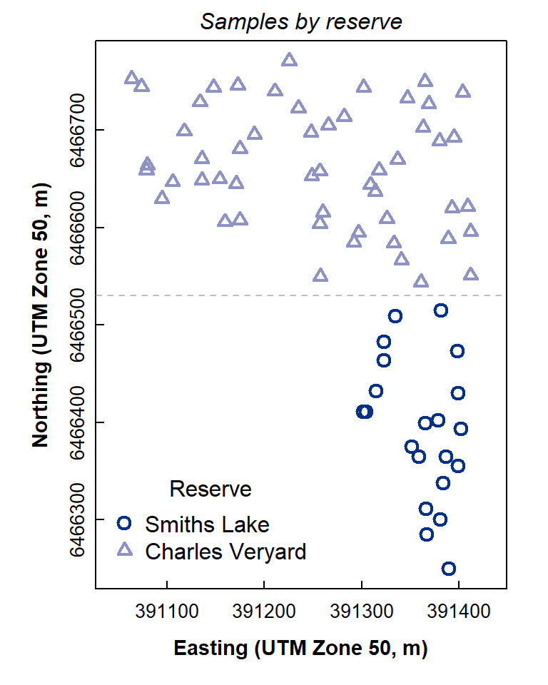
Figure 2: Map-style plot showing locations of soil samples at Charles Veryard and Smiths Lake Reserves.
The plot in Figure 2 looks OK! You may have just made your first R map!
We can also draw the plot using the ggplot2 package
(make sure to include coord-equal() to preserve a map-like
aspect ratio):
library(ggplot2)
ggplot(sv17_soil, aes(x=Easting, y=Northing, shape=Reserve, color=Reserve)) +
  geom_point(size=2) + coord_equal() +
  scale_colour_manual(values=c("darkgreen","olivedrab"))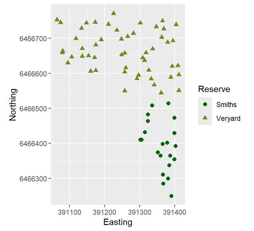
Figure 3: Map-like scatterplot made with ggplot, showing
locations of soil samples at Charles Veryard and Smiths Lake Reserves.
"...we have our work to do
Just think about the average..."--- Rush, from the song 2112 (The Temples of Syrinx)
Means comparisons for exactly two groups
For variables which are normally distributed, we can use
conventional, parametric statistics. The following example applies a
t-test to compare mean values between Reserve. By default the R function
t.test() uses the Welch t-test, which
doesn't require the variance in each group to be equal (i.e.,
the Welch t-test is OK for heteroskedastic variables, but we should
check anyway!).
Of course, we still need to use
appropriately transformed variables!
Homogeneity of variance using the variance ratio test or Bartlett's Test
We can actually check if the variances are equal in each group using
Bartlett's Test (bartlett.test()), or for this example with
exactly two groups we can use the var.test()
function (do they both give the same conclusion?):
require(car)
powerTransform(sv17_soil$Na)
sv17_soil$Na.pow <- (sv17_soil$Na)^0.127 # from results of powerTransform()

with(sv17_soil, shapiro.test(Na.pow))
with(sv17_soil, var.test(Na.pow ~ Reserve))
with(sv17_soil, bartlett.test(Na.pow ~ Reserve))
## Estimated transformation parameter
## sv17_soil$Na
## 0.1266407
##
## Shapiro-Wilk normality test
##
## data: Na.pow
## W = 0.99135, p-value = 0.9222
##
##
## F test to compare two variances
##
## data: Na.pow by Reserve
## F = 1.664, num df = 15, denom df = 51, p-value = 0.1789
## alternative hypothesis: true ratio of variances is not equal to 1
## 95 percent confidence interval:
## 0.7911095 4.2363994
## sample estimates:
## ratio of variances
## 1.663991
##
##
## Bartlett test of homogeneity of variances
##
## data: Na.pow by Reserve
## Bartlett's K-squared = 1.6001, df = 1, p-value = 0.2059Both the variance-ratio and Bartlett tests show that H0
(that variances are equal) can not be rejected. We can
visualise this with (for instance) a boxplot or density plot (Figure 4;
we need the car package for the densityPlot()
function):
require(car)
par(mfrow=c(1,2), mar=c(3.5,3.5,1.5,1.5), mgp=c(1.6,0.5,0),
    font.lab=2, font.main=3, cex.main=0.8, tcl=-0.2,
    cex.lab = 1, cex.axis = 1)
stripchart(sv17_soil$Na.pow ~ sv17_soil$Reserve, vertical=TRUE, method="jitter",
           pch=15, cex=1.3, col=c("#00008080","#a0600080"),
        xlab="Reserve", ylab="Na (power-transformed)")
mtext("(a)", 3, -1.3, adj=0.05, cex=1.2)
densityPlot(Na.pow ~ Reserve, data=sv17_soil, adjust=1.5, ylim=c(0,5),
            xlab="Na (power transformed)", col=c("#000080","#a06000"))
mtext("(b)", 3, -1.3, adj=0.05, cex=1.2)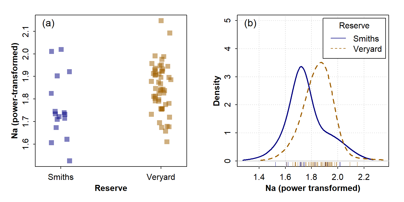
Figure 4: Graphical visulaization of variance (the 'spread' of the distribution) in each group using (a) a strip chart and (b) a density plot.
In each case it's apparent that the variance in Na in the Veryard soil is similar to that at Smith's Lake, illustrating the conclusion from the statistical tests.
The power term from powerTransform() is ≃ 0.127, so we
make a new power-transformed column Na.pow using this
value. The shapiro.test() shows that Na.pow is
normally distributed, and var.test() shows that the
variances are approximately equal, as do the boxplot and density plot.
So we can apply the t.test() with the option
var.equal=TRUE (i.e. a 'standard' two-sample
t-test).
##
##  Two Sample t-test
##
## data:  sv17_soil$Na.pow by sv17_soil$Reserve
## t = -2.6175, df = 66, p-value = 0.01097
## alternative hypothesis: true difference in means between group Smiths and group Veryard is not equal to 0
## 95 percent confidence interval:
##  -0.15360517 -0.02067153
## sample estimates:
##  mean in group Smiths mean in group Veryard
##              1.762519              1.849657
We can visualize means comparisons in a few different ways – see Figure 5. My favourite is the boxplot with means included as extra information - with a bit of additional coding we can include the 95% confidence intervals as well! (but this is not shown in this document).
Visualising differences in means - 2 groups
par(mfrow=c(1,2), mar=c(3.5,3.5,1.5,1.5), mgp=c(1.7,0.3,0),
    font.lab=2, font.main=3, cex.main=1, tcl=0.3)
boxplot(sv17_soil$Na.pow ~ sv17_soil$Reserve,
        notch=F, col="gainsboro",
        xlab="Reserve", ylab="Na (power-transformed)")
mtext("(a)", 3, -1.25, adj=0.05, font=2)
#
# the second plot is a box plot with the means overplotted
boxplot(sv17_soil$Na.pow ~ sv17_soil$Reserve,
        notch=F, col="bisque", ylim=c(1.4,2.2),
        xlab="Reserve", ylab="Na (power-transformed)")
# make a temporary object 'meanz' containing the means
meanz <- tapply(sv17_soil$Na.pow, sv17_soil$Reserve, mean, na.rm=T)
# plot means as points (boxplot boxes are centered on whole numbers)
points(seq(1, nlevels(sv17_soil$Reserve)), meanz,
       col = "royalblue", pch = 3, lwd = 2)
legend("bottomright", "Mean values",
       pch = 3, pt.lwd = 2, col = "royalblue",
       bty = "n", inset = 0.01)
mtext("(b)", 3, -1.25, adj=0.05, font=2)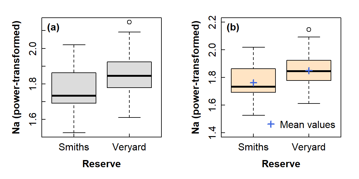
Figure 5: Graphical comparison of means between groups using: (a) a standard box plot; (b) a box plot also showing mean values in each group. You would not include both options in a report!
[skip to Figure 8 for a 3-group comparison]
The ggplot connoisseurs can also draw such a boxplot
(Figure 6):
# there's probably a more efficient way to do this in ggplot!
meanz <- data.frame(x1=levels(sv17_soil$Reserve),
                    y1=tapply(sv17_soil$Na.pow, sv17_soil$Reserve, mean, na.rm=T),
                    x2=rep("Mean",2))
shapes <- c("Mean" = 3, "Outliers" = 1)
ggplot(sv17_soil, aes(x=Reserve, y=Na.pow)) +
  labs(y="Na (power-transformed)") +
  geom_boxplot(fill="mistyrose", outlier.shape=1) + theme_bw() +
  geom_point(data = meanz, aes(x=x1, y=y1, shape=x2), size=2,
             stroke=1.2, col="firebrick") +
  scale_shape_manual(name="Legend", values=3) +
  theme(axis.title = element_text(face="bold"))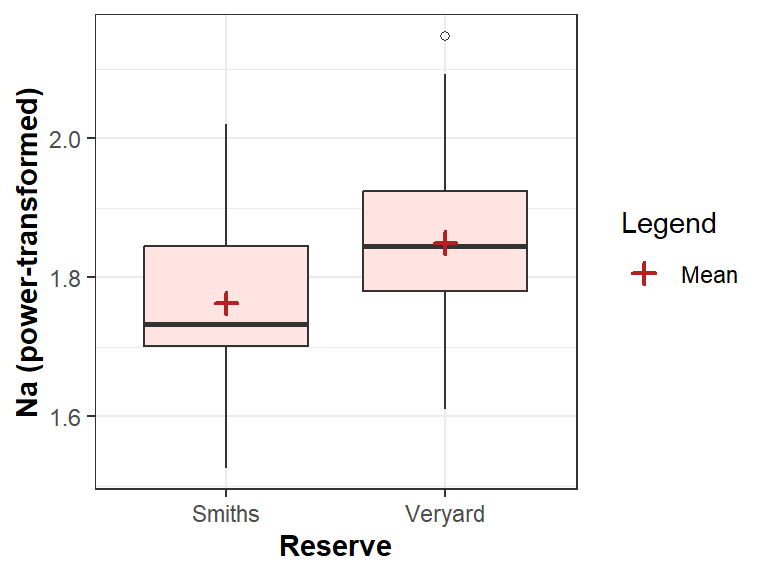
Figure 6 Boxplot for 2-group comparison, showing means, and drawn with
ggplot2.
Effect size for means comparisons: Cohens d
Statistical tests which compare means only estimate if there is a
difference or not. We would also usually like to know how big the
difference (or 'effect') is! The Cohen's d
statistic is a standardised measure of effect size available in the
effsizeh R package.
##
## Cohen's d
##
## d estimate: -0.7483083 (medium)
## 95 percent confidence interval:
##      lower      upper
## -1.3332988 -0.1633178
The calculated value of Cohen's d is 0.5 ≤ d <
0.8, which is medium. The 95% CI for the estimate of Cohen's d
(i.e. between lower and upper) does
not include zero, so we can probably rely on it.
More recently than Cohen, Sawilowsky (2009) proposed that for Cohen's d:
0.01 ≤ | d | < 0.2 | very small |
0.2 ≤ | d | < 0.5 | small |
0.5 ≤ | d | < 0.8 | medium |
0.8 ≤ | d | < 1.2 | large |
1.2 ≤ | d | < 2.0 | very large |
d | > 2.0 | huge |
Means comparisons for 3 or more groups
If we have a factor with 3 or more levels (a.k.a. groups, or
categories), we can use analysis of variance (ANOVA) to compare means of
a normally distributed variable. In this example we'll use the factor
Type (= sample type) from the complete 2017 Smith's –
Veryard data (not just soil!).
We still need to use
appropriately transformed variables, and we need to
know if group variances are equal!
Check homogeneity of variances, 3 or more groups
ANOVA also requires variance for each group to be (approximately) equal. Since there are more than 2 groups, we need to use the Bartlett test.
##
##  Shapiro-Wilk normality test
##
## data:  sv2017$Ca.pow
## W = 0.97634, p-value = 0.1073
##
##
##  Bartlett test of homogeneity of variances
##
## data:  sv2017$Ca.pow by sv2017$Type
## Bartlett's K-squared = 8.9659, df = 2, p-value = 0.0113
The shapiro.test() p-value is > 0.05, so we can
accept H0 that Ca.pow is normally distributed.
In contrast, the bartlett.test() p-value is ≤ 0.05, so we
reject H0 of equal variances (i.e.
Ca.pow is heteroscedastic).
require(car)
par(mfrow=c(1,2), mar=c(3,3,0.5,0.5), mgp=c(1.6,0.5,0),
    font.lab=2, font.main=3, cex.main=0.8, tcl=-0.2,
    cex.lab = 1, cex.axis = 1)
stripchart(sv2017$Ca.pow ~ sv2017$Type, method="jitter",
        pch=15, cex=1.3, vertical=T, col=plasma(3, alpha=0.5, end=0.5),
        xlab="Reserve", ylab="Ca (power-transformed)")
mtext("(a)", 3, -1.3, adj=0.95)
densityPlot(sv2017$Ca.pow ~ sv2017$Type, adjust=2, xlim=c(-0.1,0.6), ylim=c(0,16),
            xlab="Ca (power transformed)", legend=list(title="Type"),
            col=plasma(3, end=0.5)) ; mtext("(a)", 3, -1.3, adj=0.95)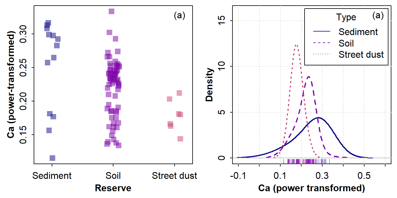
Figure 7: Graphical visualization of variance (the spread of the distribution) in 3 groups using (a) a strip chart and (b) a density plot.
In each case it seems that the variance in power-transformed Ca is
Sediment > Soil > Street dust (Figure 7). We can check the actual
variance values using tapply(), and this confirms our
interpretation:
cat("--- Variances for each factor level ---\n")
with(sv2017, tapply(Ca.pow, Type, var, na.rm=TRUE))
## --- Variances for each factor level ---
## Sediment Soil Street dust
## 0.0047080391 0.0018348117 0.0005551313
We now know that we can use a parametric test (based on
Ca.pow being normally distributed) which corrects for
unequal variance (since we found that Ca.pow is
heteroscedastic).
oneway.test(sv2017$Ca.pow ~ sv2017$Type, var.equal = FALSE)
cat("\nMeans for transformed variable\n");
meansAl <- tapply(sv2017$Ca.pow, sv2017$Type, mean, na.rm=TRUE);
print(signif(meansAl,3)) # output means with appropriate significant digits
cat("\nMeans for original (untransformed) variable\n");
meansCa <- tapply(sv2017$Ca, sv2017$Type, mean, na.rm=TRUE);
print(signif(meansAl,4)) # output means with appropriate significant digits
rm(meansCa) # tidy up
##
## One-way analysis of means (not assuming equal variances)
##
## data: sv2017$Ca.pow and sv2017$Type
## F = 10.016, num df = 2.000, denom df = 15.485, p-value = 0.001617
##
##
## Means for transformed variable
## Sediment Soil Street dust
## 0.251 0.220 0.178
##
## Means for original (untransformed) variable
## Sediment Soil Street dust
## 0.2509 0.2203 0.1785In the output above, the p-value from our oneway.test()
is less than 0.05 based on the large value for the F
statistic. This allows us to reject the null hypothesis of equal means.
As for a two-group comparison, we can visualize the differences in means
in different ways (Figure @ref(fig:meancomp-plots-3groups))
Visualising differences in means - 3 or more groups
par(mfrow=c(1,2), mar=c(3.5,3.5,1.5,1.5), mgp=c(1.7,0.3,0),
    font.lab=2, font.main=3, cex.main=1, tcl=0.2,
    cex.axis=0.9, lend = "square", ljoin = "mitre")
boxplot(sv2017$Ca.pow ~ sv2017$Type, notch=TRUE,
        cex = 1.2, col="grey92", ylim=c(0.08,0.35),
        xlab="Sample type", ylab="Ca (power-transformed)")
mtext("(a)", 3, -1.5, adj=0.97, font=2) # label each sub-plot
boxplot(sv2017$Ca.pow ~ sv2017$Type, notch=F,
        col=c("cadetblue","moccasin","thistle"),
        cex = 1.2, ylim=c(0.08,0.35),
        xlab="Reserve", ylab="Ca (power-transformed)")
mtext("(b)", 3, -1.5, adj=0.97, font=2) # label each sub-plot
meanz <- tapply(sv2017$Ca.pow, sv2017$Type, mean, na.rm=T)
points(seq(1, nlevels(sv2017$Type)), meanz,
       col = "white", pch = 3, lwd = 4, cex = 1.3)
points(seq(1, nlevels(sv2017$Type)), meanz,
       col = "firebrick", pch = 3, lwd = 2, cex = 1.2)
legend("bottomright", legend="Mean values", cex=0.9, y.int=0.2,
       pch = 3, pt.lwd = 2, col = "firebrick", pt.cex = 1.2,
       bty = "o", inset = 0.03, box.col="#00000000", bg="#d0d0d040")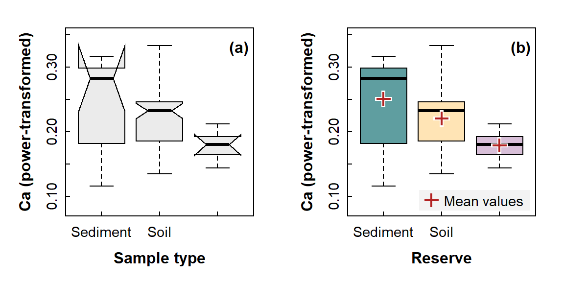
Figure 8: Graphical comparisons of means between 3 or more groups: (a) a notched box plot (notches are approximate 95% confidence intervals around the median); (b) a box plot also showing mean values in each group. You would not include both options in a report!
Note the notches in Figure 8a – these are larger than the
interquartile range boxes for 2 groups, so they look kind of weird. If
this happens, it's best to leave them out using
notch=FALSE.
Visualising 3-group differences with ggplot2
# there's probably a more efficient way to do this in ggplot!
meanz <- data.frame(x1=levels(sv2017$Type),
                    y1=tapply(sv2017$Ca.pow, sv2017$Type, mean, na.rm=T),
                    x2=rep("Mean",nlevels(sv2017$Type)))
ggplot(sv2017, aes(x=Type, y=Ca.pow)) +
  labs(y="Ca (power-transformed)") +
  geom_boxplot(fill="papayawhip", outlier.shape=1) + theme_bw() +
  geom_point(data = meanz, aes(x=x1, y=y1, shape=x2), size=2.2,
             stroke=0.8, col="slateblue") +
  scale_shape_manual(name="Key", values=10) +
  theme(axis.title = element_text(face="bold"))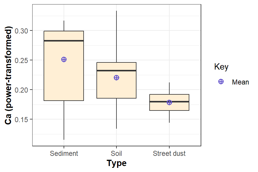
Figure 9: Boxplot for 3-group comparison, showing means, and drawn with
ggplot2.
"The analysis of variance is not a mathematical theorem, but rather a convenient method of arranging the arithmetic."
--- Ronald Fisher, the developer of ANOVA
Effect sizes for 3 or more groups
Effect sizes for ANOVAs are conceptually similar to R2
values for regression – they represent the amount of variance explained
by the factor(s). We're only covering one-way analysis of variance, so
we will end up with a single effect size which is calculated as the
η2 (eta-squared) parameter. The
effectsize package has the eta_squared()
function we need, so first we do an analysis of variance on a variable
we know is normally distributed and homoscedastic, then calculate
η2.
cat(paste("Shapiro-Wilk p =",signif(shapiro.test(sv2017$pH)$p.value,3),
  "& Bartlett p =", signif(bartlett.test(sv2017$pH ~ sv2017$Type)$p.value,3),"\n\n"))
aov_pH <- aov(pH ~ Type, data = sv2017)
cat(paste(aov_pH$call,"\n")); summary(aov_pH)
effectsize::eta_squared(aov_pH) |> effectsize::interpret_eta_squared()
## Shapiro-Wilk p = 0.0898 & Bartlett p = 0.116
##
## aov
## pH ~ Type
## sv2017
## Df Sum Sq Mean Sq F value Pr(>F)
## Type 2 15.84 7.922 17.27 4.38e-07 ***
## Residuals 91 41.74 0.459
## ---
## Signif. codes: 0 '***' 0.001 '**' 0.01 '*' 0.05 '.' 0.1 ' ' 1
## 1 observation deleted due to missingness
## # Effect Size for ANOVA
##
## Parameter | Eta2 | 95% CI | Interpretation
## ------------------------------------------------
## Type | 0.28 | [0.15, 1.00] | large
##
## - One-sided CIs: upper bound fixed at [1.00].
## - Interpretation rule: field2013As with Cohen's d, there are rules-of thumb to categorise the effect
size value into a size. The effectsize package functions
tell you which rule(s) are being used to interpret the calculated effect
size value.
Also by analogy with regression R2, the effect size can be adjusted for degrees of freedom, which can be important if we have small sample sizes. One adjusted η2 parameter is called epsilon squared (ε2):
## # Effect Size for ANOVA
##
## Parameter | Epsilon2 |       95% CI | Interpretation
## ----------------------------------------------------
## Type      |     0.26 | [0.13, 1.00] |          large
##
## - One-sided CIs: upper bound fixed at [1.00].
## - Interpretation rule: field2013
Pairwise comparisons
If our analysis of variance allows rejection of H0, we
still don't necessarily know which means are different.
The test may return a p-value ≤ 0.05 even if only one mean is different
from all the others. If the p-value ≤ 0.05, we can compute
Pairwise Comparisons (there's no point if the 'overall'
p-value from the initial test is > 0.05). The examples below show
pairwise comparisons in an analysis of variance for Ba, in groups
defined by the factor Type.
The most straightforward way to conduct pairwise comparisons is with
the pairwise.t.test() function – this is what we
recommend. We can generate the convenient 'compact letter
display' using the R packages
rcompanion and multcompView. With the compact
letter display, factor levels (categories) having the same letter are
not significantly different (pairwise p > 0.05).
Note that pairwise comparisons [should] always adjust p-values to greater values, to account for the increased likelihood of Type 1 Error (false positives) with multiple comparisons. There are several ways of making this correction, such as Holm's method.
First, we know we can apply a post-hoc pairwise test, since
the overall effect of Type on Ba is
significant (p ≈ 0.002):
with(sv2017, shapiro.test(Ba.log))
with(sv2017, bartlett.test(Ba.log ~ Type))
with(sv2017, oneway.test(Ba.log ~ Type, var.equal = TRUE))
##
## Shapiro-Wilk normality test
##
## data: Ba.log
## W = 0.9885, p-value = 0.6358
##
##
## Bartlett test of homogeneity of variances
##
## data: Ba.log by Type
## Bartlett's K-squared = 3.4694, df = 2, p-value = 0.1765
##
##
## One-way analysis of means
##
## data: Ba.log and Type
## F = 6.6595, num df = 2, denom df = 85, p-value = 0.002057How did we get Ba.log? (You need to calculate it
yourself with a line of R code!). Also,
what do the Shapiro-Wilk and Bartlett tests tell us about our choice of
means comparison test?
Next we generate the compact letters using the
fullPTable() function from the rcompanion
package and multcompLetters() from the
multcompView package as below. Note that
since Ba.log has equal variance across Type
groups (see above), we can use the default
pairwise.t.test() options. If Ba.log was
heteroscedastic, we would have used
pairwise.t.test(Ba.log, Type, pool.sd = FALSE) instead.
library(rcompanion)
library(multcompView)
(pwBa <- with(sv2017, pairwise.t.test(Ba.log, Type)))
cat("\n==== Compact letters ====\n")
pwBa_pv <- fullPTable(pwBa$p.value)                 # from rcompanion
multcompLetters(pwBa_pv)                            # from multcompView
##
## Pairwise comparisons using t tests with pooled SD
##
## data: Ba.log and Type
##
## Sediment Soil
## Soil 0.0031 -
## Street dust 0.0078 0.3634
##
## P value adjustment method: holm
##
## ==== Compact letters ====
## Sediment Soil Street dust
## "a" "b" "b"In the output above, the table of p-values shows a significant
difference (p < 0.05) between Sediment and Soil, and Sediment and
Street dust (note the use of Holm's p-value adjustment, which
is the default method). We get the same interpretation from the compact
letters; Sediment ("a") is different from Soil and Street
dust (both "b"). Since Soil and Street dust have the same
letter ("b"), they are not significantly different, which
matches the p-value (0.3634).
OPTIONAL: Pairwise compact letters alternative
This method using the cld() function is way harder to
make sense of... it's probably more rigorous, but leads to the same
conclusion. We need to load the multcomp package.
anovaBa <- aov(Ba.log ~ Type, data=sv2017)
require(multcomp)
pwise0 <- glht(anovaBa, linfct = mcp(Type="Tukey")) # anovaBa from above
cld(pwise0)
## Sediment Soil Street dust
## "a" "b" "b"Groups assigned a different letter are significantly different at the
specified probability level (p ≤ 0.05 by default). In this example, Ba
concentration in sediment (a) is significantly different
from both Soil and Street dust (both b, so not different
from each other).
We can get the confidence intervals and p-values for each pairwise
comparison using the TukeyHSD() function (HSD='Honestly
Significant Difference'):
OPTIONAL: Pairwise Tukey multiple comparisons of means
Also more complicated to understand and, like the code above, we need to have a normally-distributed, homoscedastic, variable. Usually we don't.
##   Tukey multiple comparisons of means
##     95% family-wise confidence level
##
## Fit: aov(formula = Ba.log ~ Type, data = sv2017)
##
## $Type
##                            diff         lwr       upr     p adj
## Soil-Sediment        0.20660696  0.06143156 0.3517824 0.0029746
## Street dust-Sediment 0.27953479  0.05469616 0.5043734 0.0108295
## Street dust-Soil     0.07292783 -0.11744448 0.2633002 0.6331075
The table of output from TukeyHSD() (after
$Type) shows the differences between mean values for each
pairwise comparison (diff), and the lower
(lwr) and upper (upr) limits of the 95%
confidence interval for the difference in means. If the 95% CI includes
zero (e.g. for the Street dust-Soil comparison above), there is
no significant difference.
This conclusion is supported by the last column of output, showing an
adjusted p-value of 0.633 (i.e. > 0.05) for the Street
dust-Soil comparison. Also, as indicated by the 'compact letter display'
from cld() above, any comparison including Sediment has p ≤
0.05.

References and R Packages
Cohen, J. (1988). Statistical power analysis for the behavioral sciences (2nd ed.). New York:Academic Press.
Sawilowsky, S.S. (2009). New Effect Size Rules of Thumb. Journal of Modern Applied Statistical Methods 8:597-599.
Run the R code below to get citation information for the R packages used in this document.
citation("car", auto = TRUE)
citation("ggplot2", auto = TRUE)
citation("effsize", auto = TRUE)
citation("multcomp", auto = TRUE)
citation("rcompanion", auto = TRUE)
citation("multcompView", auto = TRUE)
## To cite package 'car' in publications use:
##
## Fox J, Weisberg S, Price B (2024). _car: Companion to Applied Regression_. doi:10.32614/CRAN.package.car
## <https://doi.org/10.32614/CRAN.package.car>, R package version 3.1-3,
## <https://CRAN.R-project.org/package=car>.
##
## A BibTeX entry for LaTeX users is
##
## @Manual{,
## title = {car: Companion to Applied Regression},
## author = {John Fox and Sanford Weisberg and Brad Price},
## year = {2024},
## note = {R package version 3.1-3},
## url = {https://CRAN.R-project.org/package=car},
## doi = {10.32614/CRAN.package.car},
## }
## To cite package 'ggplot2' in publications use:
##
## Wickham H, Chang W, Henry L, Pedersen T, Takahashi K, Wilke C, Woo K, Yutani H, Dunnington D, van den
## Brand T (2025). _ggplot2: Create Elegant Data Visualisations Using the Grammar of Graphics_.
## doi:10.32614/CRAN.package.ggplot2 <https://doi.org/10.32614/CRAN.package.ggplot2>, R package version
## 4.0.0, <https://CRAN.R-project.org/package=ggplot2>.
##
## A BibTeX entry for LaTeX users is
##
## @Manual{,
## title = {ggplot2: Create Elegant Data Visualisations Using the Grammar of Graphics},
## author = {Hadley Wickham and Winston Chang and Lionel Henry and Thomas Lin Pedersen and Kohske Takahashi and Claus Wilke and Kara Woo and Hiroaki Yutani and Dewey Dunnington and Teun {van den Brand}},
## year = {2025},
## note = {R package version 4.0.0},
## url = {https://CRAN.R-project.org/package=ggplot2},
## doi = {10.32614/CRAN.package.ggplot2},
## }
## To cite package 'effsize' in publications use:
##
## Torchiano M (2020). _effsize: Efficient Effect Size Computation_. doi:10.32614/CRAN.package.effsize
## <https://doi.org/10.32614/CRAN.package.effsize>, R package version 0.8.1,
## <https://CRAN.R-project.org/package=effsize>.
##
## A BibTeX entry for LaTeX users is
##
## @Manual{,
## title = {effsize: Efficient Effect Size Computation},
## author = {Marco Torchiano},
## year = {2020},
## note = {R package version 0.8.1},
## url = {https://CRAN.R-project.org/package=effsize},
## doi = {10.32614/CRAN.package.effsize},
## }
## To cite package 'multcomp' in publications use:
##
## Hothorn T, Bretz F, Westfall P (2025). _multcomp: Simultaneous Inference in General Parametric Models_.
## doi:10.32614/CRAN.package.multcomp <https://doi.org/10.32614/CRAN.package.multcomp>, R package version
## 1.4-28, <https://CRAN.R-project.org/package=multcomp>.
##
## A BibTeX entry for LaTeX users is
##
## @Manual{,
## title = {multcomp: Simultaneous Inference in General Parametric Models},
## author = {Torsten Hothorn and Frank Bretz and Peter Westfall},
## year = {2025},
## note = {R package version 1.4-28},
## url = {https://CRAN.R-project.org/package=multcomp},
## doi = {10.32614/CRAN.package.multcomp},
## }
## To cite package 'rcompanion' in publications use:
##
## Mangiafico S (2025). _rcompanion: Functions to Support Extension Education Program Evaluation_.
## doi:10.32614/CRAN.package.rcompanion <https://doi.org/10.32614/CRAN.package.rcompanion>, R package
## version 2.5.0, <https://CRAN.R-project.org/package=rcompanion>.
##
## A BibTeX entry for LaTeX users is
##
## @Manual{,
## title = {rcompanion: Functions to Support Extension Education Program Evaluation},
## author = {Salvatore Mangiafico},
## year = {2025},
## note = {R package version 2.5.0},
## url = {https://CRAN.R-project.org/package=rcompanion},
## doi = {10.32614/CRAN.package.rcompanion},
## }
## To cite package 'multcompView' in publications use:
##
## Graves S, Piepho H, Dorai-Raj LSwhfS (2024). _multcompView: Visualizations of Paired Comparisons_.
## doi:10.32614/CRAN.package.multcompView <https://doi.org/10.32614/CRAN.package.multcompView>, R package
## version 0.1-10, <https://CRAN.R-project.org/package=multcompView>.
##
## A BibTeX entry for LaTeX users is
##
## @Manual{,
## title = {multcompView: Visualizations of Paired Comparisons},
## author = {Spencer Graves and Hans-Peter Piepho and Luciano Selzer with help from Sundar Dorai-Raj},
## year = {2024},
## note = {R package version 0.1-10},
## url = {https://CRAN.R-project.org/package=multcompView},
## doi = {10.32614/CRAN.package.multcompView},
## }
##
## ATTENTION: This citation information has been auto-generated from the package DESCRIPTION file and may need
## manual editing, see 'help("citation")'.
CC-BY-SA • All content by Ratey-AtUWA. My employer does not necessarily know about or endorse the content of this website.
Created with rmarkdown in RStudio. Currently using the free yeti theme from Bootswatch.