 Material to support teaching in Environmental Science at The University of Western Australia
Units ENVT3361, ENVT4461, and ENVT5503
Spatial interpolation in R
Data analysis and visualization
Andrew Rate
2025-12-09
Maps / spatial pages: Maps | Spatial statistics | Spatial interpolation
Introduction
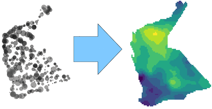 For many assessments of environmental data, it is
desirable to predict an environmental measurement at locations where
samples have not been taken. To do this we need some sort of model which
represents how the measurement we're interested in varies with distance.
Such a model is actually provided by the variogram. In simple
terms a variogram is the relationship between the variance in our
variable of interest between sample points, and the distance separating
those sample points. In many cases a mathematical function can describe
the variogram relationship quite well. The variogram function can then
be used to interpolate between points – a process known as kriging
(named after the pioneer of geostatistics and inventor of the kriging
method, Professor Danie Krige). Excellent summaries of spatial
interpolation using variograms and kriging are presented by Oliver and
Webster (2014) and Reimann et al. (2008). According to Webster
and Oliver (1993), at least 100 observations (and preferably more) are
needed for kriging interpolation.
We will again use a subset of the National Geochemical Survey of
Australia (NGSA) data (Caritat and Cooper (2011)) as an example to show the
various concepts and methods involved. Any data we need will be
available in .csv files which we can read into
R.
In this Chapter we use a range of R packages for different functions, shown in Table 1.
Package | Purpose | Reference |
|---|---|---|
sf | Spatial data handling, formatting, and storing spatial data | Pebesma (2018) |
gstat | Geostatistics (variograms and variogram models, kriging) | Pebesma (2004) |
maps | Simple map outlines | Becker et al. (2021) |
spdep | Spatial autocorrelation, LISA | Pebesma and Bivand (2023) |
sp | Older spatial package needed by spdep | Pebesma and Bivand (2005) |
lctools | Spatial autocorrelation | Kalogirou (2020) |
maptiles | Retrieving and plotting tile-based map data | Giraud (2021) |
prettymapr | Map annotations | Dunnington (2022) |
fields | Visualizing spatial data with irregular grids | Nychka et al. (2021) |
viridis | Colourblind-friendly colour palettes for maps | Garnier et al. (2021) |
Read data and set up base map
# define coordinate reference systems
LongLat <- st_crs(4326) # uses Earth ellipsis specs from WGS84 datum
UTM50S <- st_crs(32750) # just for Zone 50, S hemisphere!
# import the data
git <- "https://raw.githubusercontent.com/Ratey-AtUWA/Learn-R-web/main/"
ngsaWA <- read.csv(paste0(git,"ngsaWA.csv"), stringsAsFactors = TRUE)
NGSAWA_border <- read.csv(paste0(git, "NGSAWA_border.csv"))
# make spatial data objects
ngsaWAsf <- st_as_sf(x = ngsaWA, coords = c("LONGITUDE","LATITUDE"),
                     crs = LongLat)
ngsaWAbord_sf <- st_as_sf(NGSAWA_border, coords = c("Long.est","Lat.est"),
                          crs = LongLat)
# define map extent
WA_extent <- st_as_sf(data.frame(Longitude = c(108, 129),
                                 Latitude = c(-38, -13)),
                      coords=c("Longitude","Latitude"), crs=LongLat)
WAtiles <- get_tiles(WA_extent, provider = "OpenStreetMap",
                     crop = TRUE, zoom = 5) # make map object
Using the gstat package for Geostatistics: variograms, kriging, and visualization
Make a 'Simple Features' spatial data object from a data frame
In this example (as for Moran's I) we log10-transform our variable as its distribution is highly positively skewed. (Using the untransformed variable would result in too many apparent upper outliers.)
As.AR_sf <- st_as_sf(ngsaWA[,c("LONGITUDE","LATITUDE","As.AR")],
                     coords = c("LONGITUDE","LATITUDE"),
                     crs = LongLat)
As.AR_sf$As.log <- log10(As.AR_sf$As.AR)
summary(As.AR_sf)
## As.AR geometry As.log
## Min. : 0.050 POINT :305 Min. :-1.30103
## 1st Qu.: 0.800 epsg:4326 : 0 1st Qu.:-0.09691
## Median : 1.600 +proj=long...: 0 Median : 0.20412
## Mean : 2.869 Mean : 0.15464
## 3rd Qu.: 3.300 3rd Qu.: 0.51851
## Max. :50.200 Max. : 1.70070
Plot the spatial object for checking
To quickly check our data, we use the function bubble()
from the sp package to make a bubble map (Figure
1) of our variable, where the symbol area is proportional to
the variable value (in this case, log10 arsenic
concentration). We use the as_Spatial() function to convert
our sf object to an sp object, so we can use
sp::bubble().
As.AR_sp <- as_Spatial(As.AR_sf)
sp::bubble(As.AR_sp, "As.log", col=c("#ff000088", "#0000ff88"), main = "",
       scales = list(draw = TRUE), xlab = "Longitude", ylab = "Latitude")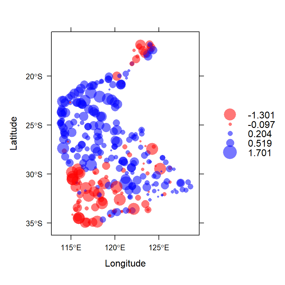
Figure 1: Visualization of spatial point data object for log10-transformed arsenic (As) concentrations in the WA subset of the NGSA data. Negative log10-values are red, positive blue.
Variograms and Kriging
Figure 2 shows some of the key concepts of variogram analysis. In practice, the large number of points representing all possible distances between pairs of locations are 'binned' into distance ranges, and the mean square variance in each 'bin' is used as the estimated semivariance for each bin distance. There is some semivariance that exists even for samples which are very closely-spaced (tending to zero distance), and this is called the nugget. This semivariance increases with increasing distance between samples to a limiting value called the sill. At some distance there is no increase in semivariance (which then approaches the variance of the complete dataset), and this distance is called the range, the value of which depends on the mathematical model used to describe the semivariance-distance relationship. The practical range, the distance at which samples are independent, is related to the model range by a factor dependent on the model equation.
The practical range, rε, is defined as the distance at which semivariance is 95% of the sill. It is related to the model range a by:
- For an exponential model, rε = 3 × a
- For a Gaussian model, rε = √3 × a
- For a spherical model, rε ≅ 0.8 × a
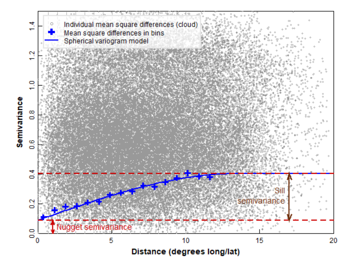
Figure 2: Some of the key concepts of variogram analysis (see text for definitions).
Make a binned simple variogram object
We calculate the semivariance within bins (distance
intervals) which combine the mean square difference within a set of
intervals of sample separation distances (Figure 3). This allows both
visualization of the trend in semivariance with distance, and fitting of
a model variogram equation to the semivariance–distance relationship.
The number of bins can be determined "automatically" by an algorithm, or
can be specified by the user. We usually constrain the maximum
separation distance (max.dist) to be less than the maximum
spatial extent of the data – Reimann et al. (2008) suggest that
the maximum distance for the variogram should be ≈ 40% of the maximum
dataset distance, which for these data is 19.66 ° longitude or
latitude.
par(mar = c(3,3,1,1), mgp = c(1.7,0.3,0), font.lab=2, tcl=0.3)
variog_As.log <- variogram(As.log~1, As.AR_sf) # , cressie = TRUE
plot(variog_As.log, xlab = "Distance (km)", pch=19, col="blue2")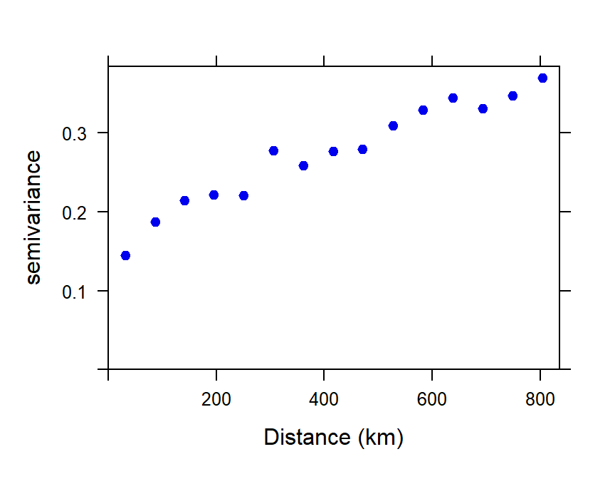
Figure 3: Plot of experimental binned variogram for arsenic (As) in the WA subset of the NGSA data, -2mm tosoil fraction.
The experimental variogram and variogram models
From the experimental (or 'empirical') variogram, we can generate a
variogram model by fitting a function to the binned
semivariance-distance relationship.
Common variogram model functions include exponential, spherical, and
Gaussian, and there are numerous others (run vgm() for a
list).
Fit a variogram model using weighted least squares
We need to choose the type of model (e.g. exponential, spherical, etc.), and make decisions about whether to include a nugget. In Figure 4 we show a model with a fitted value for the nugget semivariance.
The exponential model we use is defined by:
γ = b + C0 × (1 −
e−x/a), where:
- γ = semivariance
- x = distance (as defined by the binned values)
- b = nugget (Nug in gstat; also called τ2 (tau squared))
- C0 = partial sill (psill in gstat; also called σ2 (sigma squared))
- a = range (also called φ (phi); a is NOT the ‘practical range’)
vmodel_As.log <- fit.variogram(variog_As.log,
                              model = vgm(psill = NA, model = "Exp",
                                          nugget = 0.1,
                                          cutoff = max(variog_As.log$dist)))
vmodel_As.log
## model psill range
## 1 Nug 0.1299945 0.000
## 2 Exp 0.2480348 407.132with(variog_As.log, plot(dist, gamma, ylim = c(0, max(gamma)), cex.lab=1.2,
lwd=2, xlab = "Distance (km)",
ylab = expression(bold(paste("Semivariance (",gamma,")")))))
# plot model
x0 <- variog_As.log$dist
y0 <- vmodel_As.log$psill[1] +
vmodel_As.log$psill[2]*(1 - exp(-1*x0/vmodel_As.log$range[2]))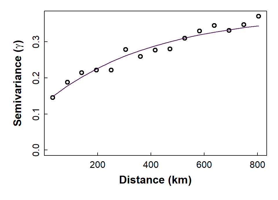
Figure 4: Plot of experimental binned variogram, and exponential variogram model, for arsenic (As) in the WA subset of the NGSA data, -2mm topsoil fraction.
Perform kriging interpolation
Now that we have a variogram model, we can use it in the kriging
interpolation process to make a map of predicted values of our variable,
as shown later in Figure 7. To perform an interpolation, we need to
provide a grid of locations that we want to predict values at. This is
done using the expand.grid() function from base
R – we are using ≈ 0.2 degree increments, but these can
be changed (e.g., larger increments for a coarser grid).
So, the first step is to make the grid of locations at which to make
our kriging predictions. Starting with a rectangular grid using the
st_make_grid() function from the sf package,
we restrict this grid to only the points in the NGSA sampling area,
using the st_intersection() function from
sf.
ngsa_poly <- st_polygon(list(as.matrix(NGSAWA_border[c(1:91,1), 1:2])))
ngsaWA_poly <- st_multipolygon(list(ngsa_poly)) |> st_sfc()
st_crs(ngsaWA_poly) <- LongLat
grid_big <- st_make_grid(ngsaWA_poly,
                         cellsize = c(0.2,0.2),
                         offset = st_bbox(ngsaWA_poly)[c("xmin", "ymin")],
                         what = "centers")

# # use `st_intersection()` function from `sf` package to mask initial grid
NGSAgrid <- st_intersection(ngsaWA_poly, grid_big)

cat("Prediction grid:\n"); NGSAgrid
## Prediction grid:
## Geometry set for 3500 features
## Geometry type: POINT
## Dimension: XY
## Bounding box: xmin: 113.4034 ymin: -34.96724 xmax: 128.8034 ymax: -16.76724
## Geodetic CRS: WGS 84
## First 5 geometries:We then use the krige() function from gstat
to make predictions of our variable and its variance at the grid
locations, based on our variogram model. (Note: if we do not specify a
model, krige() will make predictions using inverse
distance interpolation, which does not allow estimation of
variance.) Here we use the idw() function so we can specify
the inverse distance weighting parameter idp =.
kriged_As.log <- krige(formula = As.log~1, locations = As.AR_sf,
                      newdata = NGSAgrid, model = vmodel_As.log)
summary(kriged_As.log)
cat("_____________________________________________________________________\n\n")
idpower <- 2.5
idw_As.log <- idw(formula = As.log~1, locations = As.AR_sf,
                  newdata = NGSAgrid, idp = idpower) # idp = 2 is the default
summary(idw_As.log)
## [using ordinary kriging]
## var1.pred var1.var geometry
## Min. :-0.95613 Min. :0.1575 POINT :3500
## 1st Qu.:-0.04899 1st Qu.:0.1720 epsg:4326 : 0
## Median : 0.23887 Median :0.1763 +proj=long...: 0
## Mean : 0.20047 Mean :0.1777
## 3rd Qu.: 0.48836 3rd Qu.:0.1816
## Max. : 1.01392 Max. :0.2311
## _____________________________________________________________________
##
## [inverse distance weighted interpolation]
## var1.pred var1.var geometry
## Min. :-1.30072 Min. : NA POINT :3500
## 1st Qu.:-0.03455 1st Qu.: NA epsg:4326 : 0
## Median : 0.23292 Median : NA +proj=long...: 0
## Mean : 0.19244 Mean :NaN
## 3rd Qu.: 0.47952 3rd Qu.: NA
## Max. : 1.63438 Max. : NA
## NA's :3500Simple plot of kriging output
We can then us the spplot() function from
sp to visualise the kriging predictions and variance, but
without a background map (Figure 5).
png(file="krigpred.png", width = 600, height=600)
plot(kriged_As.log[1], pch=15, cex=1.2, main="Kriging predictions",
     breaks = pretty(kriged_As.log$var1.pred,10),
     pal = viridis(length(pretty(kriged_As.log$var1.pred,10))-1),
     cex.main=2)
dev.off()
png(file="krigvar.png", width = 600, height=600)
plot(kriged_As.log[2], pch=15,cex=1.1, main="Kriging variance",
     breaks = pretty(kriged_As.log$var1.var,10),
     pal = cividis(length(pretty(kriged_As.log$var1.var,10))-1),
     cex.main=2)
dev.off()par(oma=c(0,0,0,0),mar=c(0,0,0,0))
p1 <- readPNG("krigpred.png")
plot(c(0,1),c(0,1), axes=F, type="n",xaxt="n", yaxt="n",ann=F)
addImg(p1, x = 0.25, y = 0.5, width = 0.5)
p2 <- readPNG("krigvar.png")
addImg(p2, x = 0.75, y = 0.5, width = 0.5)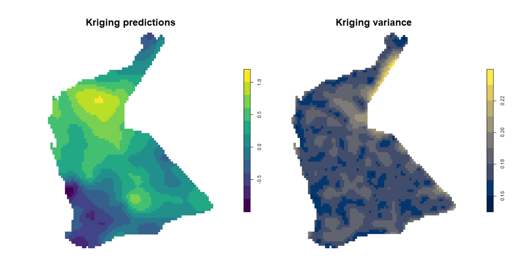
Figure 5: Plots of simple kriging predictions (left) and variance (right) for log-transformed arsenic (As) in the WA subset of the NGSA data, -2mm topsoil fraction.
Compare Figure 5 with the output from inverse distance weighted (IDW)
interpolation (Figure 6). The kriged prediction shows a 'smoother'
spatial pattern, but note that the IDW interpolation can be smoothed
differently by changing the weighting parameter idp = ...
in the idw() function (see relevant code above).
plot(idw_As.log[1], pch=15,
     # pal = viridis(7),
     pal = viridis(length(pretty(idw_As.log$var1.pred))-1),
     main = paste("Inverse Distance Weighting (IDW) power =", idpower),
     font.main=1, cex.main=0.85)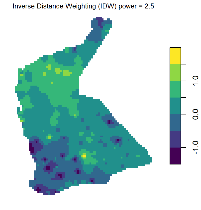
Figure 6: Plots of inverse distance weighted (IDW) interpolation predictions for log-transformed arsenic (As) in the WA subset of the NGSA data, -2mm topsoil fraction.
Plot a map with overlay of the kriging predictions
We use the base map created before, and plot the kriging predictions
over this (Figure 7a). Since the locations for kriged predictions are no
longer a rectangular grid (we trimmed off locations not in the NGSA
sampling area), we need to use the quilt.plot() function
from the fields package to plot from an irregular grid. We
set the options for the colour-scale legend based on the options in the
image.plot() function, also from fields.
[The fields package also contains the function
bubblePlot(), which is also useful for mapping data from
irregular grids with a smooth colour gradient, such as that used here
from the viridis package.]
The second part of the code creates a map of the estimated variance
at each point on our interpolation grid (Figure 7b), so the code is very
similar, except that we specify …data[,2] instead of
…data[,1].
Note: The output of the krige()
function is an object of classes sf and
data.frame, essentially a list which includes vectors
$var1.pred, containing the interpolated predictions, and
$var1.var which contains the estimated variance, at each
interpolated point on the grid (the grid is saved in the
$geometry column of the output object).
par(mfrow=c(1,2), oma=c(0,0,0,0), mar=c(3,3,0.5,0.5), mgp=c(1.4,0.3,0),
    lend=2, ljoin=1, tcl=0.3)
plot_tiles(WAtiles, axes=TRUE, mar=c(3,3,0.5,0.5))
mtext(side=1, line=1.4, text="Longitude (\u00B0 E)",
      font=2, cex=1.6)
mtext(side=2, line=1.6, text="Latitude (\u00B0 S)",
      font=2, cex=1.6)
axtx <- c(0.01,0.02,0.05,0.1,0.2,0.5,1,2,5,10,20,50,100)
quilt.plot(st_coordinates(NGSAgrid)[,1],
           st_coordinates(NGSAgrid)[,2],
           kriged_As.log$var1.pred,
           add = T, horizontal=T, col = viridis::cividis(64),
           legend.lab = expression(bold(paste(log[10],"(As.AR)"))),
           legend.mar = 7, legend.cex = 1.2, legend.line = 1.5,
           axis.args = list(mgp=c(1.5,0.2,0)))
addnortharrow(pos="topleft", border=1, lwd=1, text.col=1,
              padin=c(0.4,0.4), scale=1)
mtext("(a)",3,-2.8,font=2,cex=1.5)
# start plot of kriging variance
plot_tiles(WAtiles, axes=TRUE, mar=c(3,3,0.5,0.5))
mtext(side=1, line=1.4, text="Longitude (\u00B0 E)", font=2, cex=1.6)
quilt.plot(st_coordinates(NGSAgrid)[,1],
           st_coordinates(NGSAgrid)[,2],
           kriged_As.log$var1.var,
           add = T, horizontal=T, col = viridis::cividis(64,alpha = 0.75),
           legend.lab = expression(bold(paste("Variance in ",log[10],"(As.AR)"))),
           legend.mar = 7, legend.cex = 1.2, legend.line = 1.5,
           axis.args = list(mgp=c(1.5,0.2,0)))
addnortharrow(pos="topleft", border=1, lwd=1, text.col=1,
              padin=c(0.4,0.4), scale=1)
points(st_coordinates(As.AR_sf), pch=3, col = "white", cex = 0.7)
mtext("(b)",3,-2.8,font=2,cex=1.5)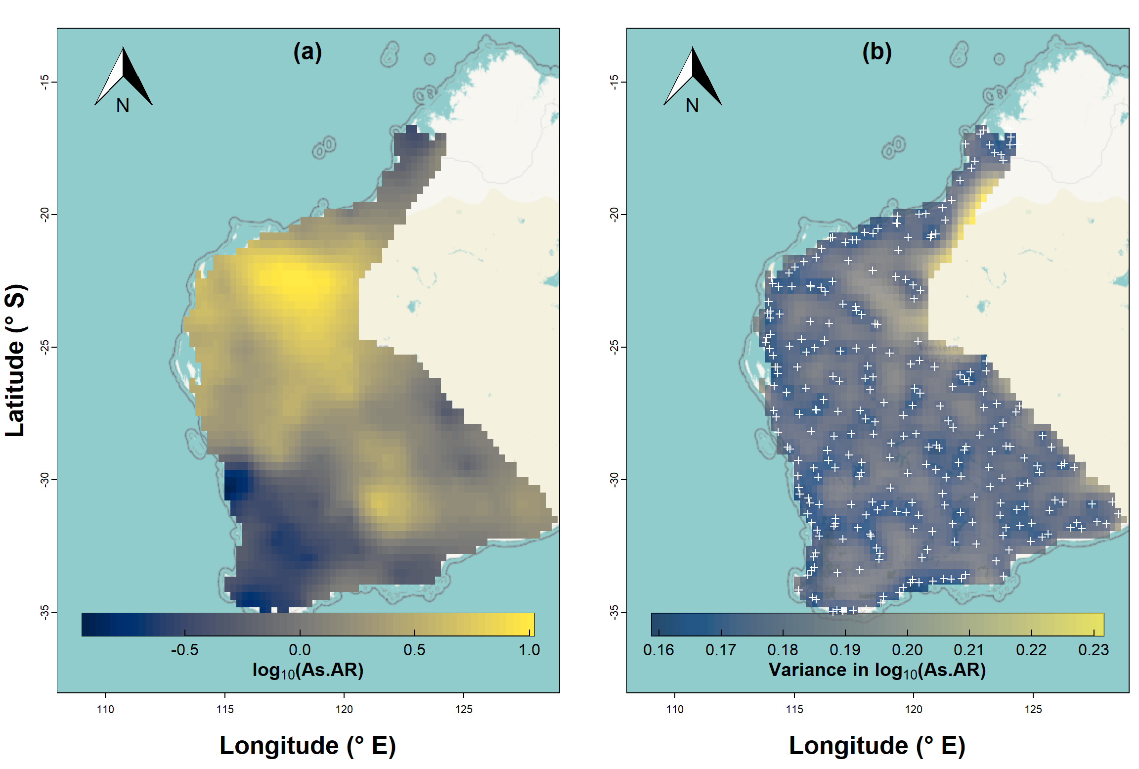
Figure 7: Map showing kriging predictions for arsenic (As) in the WA subset of the NGSA data, -2mm topsoil fraction.
It's also useful to map the estimated variance at each point on our prediction grid, and we can see the output of such a map in Figure 7b. You should notice that the low variance (darker colours) is close to the actual sample points, and greater variance (lighter colours) is in locations further from sample points. As we would expect, predictions are more precise the closer we are to locations having actual measurements!
We can perform a similar set of procedures for a variable which does not show significant spatial autocorrelation (example in Figure 8 at the end of this page). In this case, we have (i) an experimental variogram which has high intrisic variance (i.e., a high nugget) with low spatial variance (partial sill), and (ii) greater kriging relative to kriging predictions. Try it!
Additional Issues for Variograms and Kriging
the semivariance distance relationship may not be the same in all directions (anisotropic). In such cases we need a directional variogram – in
gstatthis can be done with parameters in thevariog()function (see also http://www.leg.ufpr.br/geoR/geoRdoc/geoRintro.html#exploratory).The mean value of our mapping variable may show a systematic variation across our sampling area, such as a linear trend. This is a lack of "stationarity", and such a trend should be incorporated into a variogram model to apply universal kriging (see http://www.leg.ufpr.br/geoR/geoRdoc/geoRintro.html#estimation).
In most natural systems, the variable of interest will not just change from place to place, but will also be dependent on on or more other variables. In these cases, we need to use more advanced interpolation methods such as co-kriging (see http://chris35wills.github.io/geostats/ for some good explanations).
References and R Package Citations
Caritat, P., Cooper, M., 2011. National Geochemical Survey of Australia: The Geochemical Atlas of Australia. GA Record 2011/20 (2 Volumes). Geoscience Australia, Canberra, 557 pp.
Dunnington, D. 2017. prettymapr: Scale Bar, North Arrow, and Pretty Margins in R. R package version 0.2.2. https://CRAN.R-project.org/package=prettymapr
Garnier, Simon, Noam Ross, Robert Rudis, Antônio P. Camargo, Marco Sciaini, and Cédric Scherer (2021). viridis - Colorblind-Friendly Color Maps for R. R package version 0.6.2.
Giraud T (2021). maptiles: Download and Display Map Tiles. R package version 0.3.0, https://CRAN.R-project.org/package=maptiles.
Gräler B., Pebesma E., Heuvelink G., 2016. Spatio-Temporal Interpolation using gstat. The R Journal 8(1), 204-218.
Nychka D., Furrer R., Paige J., Sain S. (2021). fields: Tools for spatial data. R package version 13.3, https://github.com/dnychka/fieldsRPackage.
Oliver, M.A., Webster, R., 2014. A tutorial guide to geostatistics: Computing and modelling variograms and kriging. Catena, 113: 56-69, https://doi.org/10.1016/j.catena.2013.09.006.
Pebesma, E., 2018. Simple Features for R: Standardized Support for Spatial Vector Data. The R Journal 10 (1), 439-446, https://doi.org/10.32614/RJ-2018-009. (package sf)
Pebesma, E.J., R.S. Bivand, 2005. Classes and methods for spatial data in R. R News 5 (2), https://cran.r-project.org/doc/Rnews/. (package sp)
Pebesma E, Bivand R (2023). Spatial Data Science With Applications in R. Chapman & Hall. https://r-spatial.org/book/. (package spdep)
Reimann, C., Filzmoser, P., Garrett, R.G., Dutter, R., 2008. Statistical Data Analysis Explained: Applied Environmental Statistics with R. John Wiley & Sons, Chichester, England, 343 pp.
Webster, R., Oliver, M.A., 1993. How large a sample is needed to estimate the regional variogram adequately? Geostatistics Troia '92. Vol. 1: 155-166.
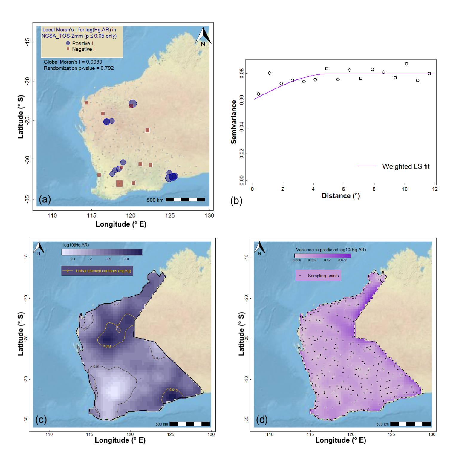
Figure 8: Geostatistics for Hg (mercury) in the WA subset of the NGSA data: (a) spatial autocorrelation, (b) experimental (binned) and model variograms, (c) kriging predictions, and (d) kriging uncertainties.
CC-BY-SA • All content by Ratey-AtUWA. My employer does not necessarily know about or endorse the content of this website.
Created with rmarkdown in RStudio. Currently using the free yeti theme from Bootswatch.