 Material to support teaching in Environmental Science at The University of Western Australia
Units ENVT3361, ENVT4461, and ENVT5503
Statistical Relationships
Correlation
Andrew Rate
2025-12-05
Relationships pages: Correlations | Simple linear regression | Grouped linear regression | Multiple linear regression
Suggested activities
Using the R code file provided and the sv2017
dataset:
- Run different correlation methods (Pearson’s, Spearman’s) on untransformed and transformed variables,
- Generate a correlation matrix (or two),
- Try making a correlation heatmap,
- Try the additional suggestions at the end of the R code file, and
- Make sure you understand the concepts for all the statistical methods you use, and can interpret all the output!
If you need to install packages like car or
psych this should be done first, either:
- from the RStudio packages tab;
- running some code like the example below for each package you need
to install.
install.packages("psych")
Basic correlation analyses
# load packages we need
library(car)        # for various plotting and regression-specific functions
library(viridis)    # colour palettes for improved graph readability
library(psych)      # utility functions
library(RcmdrMisc)  # utility functions
library(corrplot)   # plotting of correlation heatmaps
Let's look at the relationship between Cd and Zn in the Smiths Lake
and Charles Veryard Reserves data from 2017.
For Pearson's
correlation we need variables with normal distributions, so first
log10-transform Cd and Zn...
git <- "https://raw.githubusercontent.com/Ratey-AtUWA/Learn-R-web/main/"
sv2017 <- read.csv(paste0(git,"sv2017_original.csv"), stringsAsFactors = TRUE)
sv2017$Cd.log <- log10(sv2017$Cd)
sv2017$Zn.log <- log10(sv2017$Zn)
...and test if the distributions are normal. Remember that the null hypothesis for the Shapiro-Wilk test is that "the distribution of the variable of interest is not different from a normal distribution". So, if the P-value ≥ 0.05, we can't reject the null and therefore our variable is normally distributed.
shapiro.test(sv2017$Cd)
shapiro.test(sv2017$Cd.log)
shapiro.test(sv2017$Zn)
shapiro.test(sv2017$Zn.log)
##
## Shapiro-Wilk normality test
##
## data: sv2017$Cd
## W = 0.63001, p-value = 1.528e-12
##
##
## Shapiro-Wilk normality test
##
## data: sv2017$Cd.log
## W = 0.97272, p-value = 0.1006
##
##
## Shapiro-Wilk normality test
##
## data: sv2017$Zn
## W = 0.6155, p-value = 7.75e-14
##
##
## Shapiro-Wilk normality test
##
## data: sv2017$Zn.log
## W = 0.9828, p-value = 0.295
Pearson's r changes with transformation
cor.test(sv2017$Cd, sv2017$Zn, alternative="two.sided",
         method="pearson") # is Pearson valid?
cor.test(sv2017$Cd.log, sv2017$Zn.log, alternative="two.sided",
         method="pearson") # is Pearson valid?
##
## Pearson's product-moment correlation
##
## data: sv2017$Cd and sv2017$Zn
## t = 9.8415, df = 74, p-value = 4.357e-15
## alternative hypothesis: true correlation is not equal to 0
## 95 percent confidence interval:
## 0.6353031 0.8363947
## sample estimates:
## cor
## 0.7529165
##
##
## Pearson's product-moment correlation
##
## data: sv2017$Cd.log and sv2017$Zn.log
## t = 7.696, df = 74, p-value = 4.859e-11
## alternative hypothesis: true correlation is not equal to 0
## 95 percent confidence interval:
## 0.5193717 0.7756160
## sample estimates:
## cor
## 0.6667536For the Pearson correlation we get a t statistic and
associated degrees of freedom (df), for which there is a
p-value. The null hypothesis is that there is "no
relationship between the two variables", which we can reject if p ≤
0.05. We also get a 95% confidence interval for the correlation
coefficient, and finally an estimate of Pearson's r
(cor).
A Spearman coefficient doesn't change with transformation, since it is calculated from the ranks (ordering) of each variable.
cor.test(sv2017$Cd, sv2017$Zn, alternative="two.sided",
         method="spearman") # can we use method="pearson"?
cor.test(sv2017$Cd.log, sv2017$Zn.log, alternative="two.sided",
         method="spearman") # can we use method="pearson"?
##
## Spearman's rank correlation rho
##
## data: sv2017$Cd and sv2017$Zn
## S = 25750, p-value = 2.494e-10
## alternative hypothesis: true rho is not equal to 0
## sample estimates:
## rho
## 0.6479832
##
##
## Spearman's rank correlation rho
##
## data: sv2017$Cd.log and sv2017$Zn.log
## S = 25750, p-value = 2.494e-10
## alternative hypothesis: true rho is not equal to 0
## sample estimates:
## rho
## 0.6479832For the Spearman correlation we get an S statistic and associated p-value. The null hypothesis is that there is no relationship between the two variables, which we can reject if p ≤ 0.05. We also get an estimate of Spearman's rho (analogous to Pearson's r).
Simple scatterplot by groups
We're using base R to plot - you might like to try
using scatterplot() from the car
package or the ggplot2
package.
Before plotting, we first set our desired colour palette (optional) and graphics parameters (optional, but useful and recommended!). We end up with the plot in Figure 1 which helps us interpret the correlation coefficient.
palette(c("black",viridis::plasma(8)[2:7],"white"))
par(mfrow=c(1,1), mar=c(3,3,1,1), mgp=c(1.5,0.3,0), oma=c(0,0,0,0), tcl=0.2,
    lend="square", ljoin="mitre", font.lab=2)

# . . . then plot the data
with(sv2017, plot(Cd~Zn, col=c(5,3,1)[Type], log="xy",
     pch=c(16,1,15)[Type], lwd=c(1,2,1)[Type],
     cex=c(1.2,1,1)[Type], xlab="Zn (mg/kg)", ylab="Cd (mg/kg)"))
abline(lm(sv2017$Cd.log~sv2017$Zn.log)) # line of best fit using lm() function
legend("topleft", legend=c(levels(sv2017$Type),"Best-fit line ignoring Type"),
       col=c(5,3,1,1), pch=c(16,1,15,NA), pt.lwd=c(1,2,1), lwd = c(NA,NA,NA,1),
       pt.cex=c(1.2,1,1), bty="n", y.intersp = 0.75,
       title=expression(italic("Sample Type")))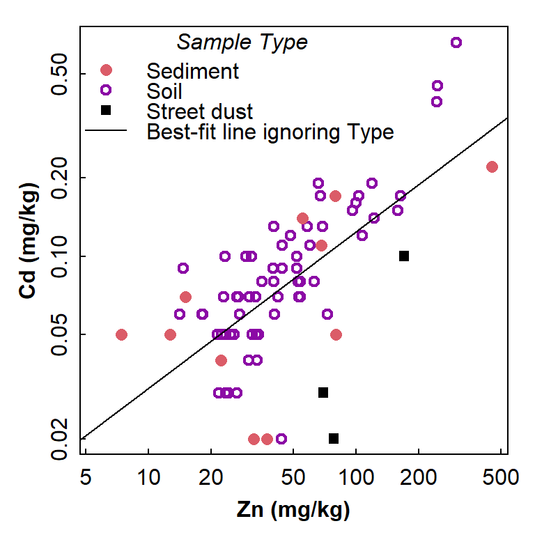
Figure 1: Scatterplot showing the relationship between Cd and Zn, with observations identified by Type but showing the regression line for all data independent of grouping.
"The invalid assumption that correlation implies cause is probably among the two or three most serious and common errors of human reasoning."
Correlation matrix
We'll generate Spearman correlation matrices in these examples, but
it's easy to change the code to generate Pearson (or other) correlation
matrices.
The p-values give the probability of the observed
relationship if the null hypothesis (i.e. no relationship) is
true.
library(psych) # needed for corTest() function
corr_table <- corTest(sv2017[, c("pH","Al","Ca","Fe","Cd","Pb","Zn")],
                    method="spearman")
print(corr_table)
## Call:corTest(x = sv2017[, c("pH", "Al", "Ca", "Fe", "Cd", "Pb", "Zn")],
## method = "spearman")
## Correlation matrix
## pH Al Ca Fe Cd Pb Zn
## pH 1.00 0.31 0.68 0.29 0.23 0.13 0.12
## Al 0.31 1.00 0.32 0.45 0.19 0.07 0.16
## Ca 0.68 0.32 1.00 0.42 0.25 0.21 0.35
## Fe 0.29 0.45 0.42 1.00 0.47 0.63 0.73
## Cd 0.23 0.19 0.25 0.47 1.00 0.69 0.65
## Pb 0.13 0.07 0.21 0.63 0.69 1.00 0.77
## Zn 0.12 0.16 0.35 0.73 0.65 0.77 1.00
## Sample Size
## pH Al Ca Fe Cd Pb Zn
## pH 94 87 87 87 75 87 87
## Al 87 88 88 88 76 88 88
## Ca 87 88 88 88 76 88 88
## Fe 87 88 88 88 76 88 88
## Cd 75 76 76 76 76 76 76
## Pb 87 88 88 88 76 88 88
## Zn 87 88 88 88 76 88 88
## Probability values (Entries above the diagonal are adjusted for multiple tests.)
## pH Al Ca Fe Cd Pb Zn
## pH 0.00 0.03 0.00 0.06 0.32 0.72 0.72
## Al 0.00 0.00 0.03 0.00 0.51 0.72 0.51
## Ca 0.00 0.00 0.00 0.00 0.25 0.32 0.01
## Fe 0.01 0.00 0.00 0.00 0.00 0.00 0.00
## Cd 0.05 0.10 0.03 0.00 0.00 0.00 0.00
## Pb 0.24 0.50 0.05 0.00 0.00 0.00 0.00
## Zn 0.26 0.13 0.00 0.00 0.00 0.00 0.00
##
## To see confidence intervals of the correlations, print with the short=FALSE optionThe output from psych::corTest()has three
sub-tables:
- the correlation coefficients for each pair of variables (note symmetry)
- the number of pairs of observations for each relationship (some observations may be missing)
- the p values for each relationship (raw p-values are reported below the diagonal and p-values adjusted for multiple comparisons above the diagonal (by default based on Holm's correction.)
[Note that for Pearson correlations we instead use
method="pearson" in the corTest function.]
It can be a little tricky to compare raw and adjusted p-values, so we can tidy it up with a bit of code:
corr_pvals <- corr_table$p
corr_pvals[which(corr_pvals==0)] <- NA
cat("----- Adjusted (upper) and raw (lower) p-values for correlations -----\n")
print(round(corr_pvals, 3), na.print = "")
## ----- Adjusted (upper) and raw (lower) p-values for correlations -----
## pH Al Ca Fe Cd Pb Zn
## pH 0.033 0.000 0.061 0.316 0.716 0.716
## Al 0.003 0.030 0.000 0.514 0.716 0.514
## Ca 0.000 0.003 0.001 0.250 0.316 0.010
## Fe 0.007 0.000 0.000 0.000 0.000 0.000
## Cd 0.052 0.103 0.031 0.000 0.000 0.000
## Pb 0.239 0.500 0.045 0.000 0.000 0.000
## Zn 0.262 0.128 0.001 0.000 0.000 0.000As above,the p-values give the probability of the observed relationship if the null hypothesis (i.e. no relationship) is true. Corrections are to reduce the risk of Type 1 Errors (false positives) which is greater when multiple comparisons are being made. We should always use the adjusted p-values to interpret a correlation matrix.
Since a correlation coefficient is a standardised measure of
association, we can treat it as an 'effect size'.
Cohen (1988)
suggested the following categories:
| Range in r | Effect size term | ||
| 0 < | |r| | ≤ 0.1 | negligible |
| 0.1 < | |r| | ≤ 0.3 | small |
| 0.3 < | |r| | ≤ 0.5 | medium |
| 0.5 < | |r| | ≤ 1 | large |
|r| means the absolute value of r (i.e. ignoring whether r is positive or negative)
Correlation heatmaps
These are a handy visual way of displaying a correlation matrix. We
use the corrplot() function from the R
package corrplot. We'll use some different data to show a
plot with both positive and negative correlations, and display the text
correlation matrix after the heatmap (Figure 2) for reference.
afs23 <- read.csv(paste0(git,"afs23.csv"), stringsAsFactors = TRUE)
library(corrplot)
cormat1 <- corTest(afs23[,c("pH","EC","Al","Ca","Fe","Cu","Gd","Pb","Zn")],
                        method="spearman")
print(cormat1$r, digits=2)
corrplot(cormat1$r,
         method="ellipse", diag=FALSE, addCoef.col = "black",
         tl.col = 1, tl.cex = 1.2, number.font = 1, cl.cex=1)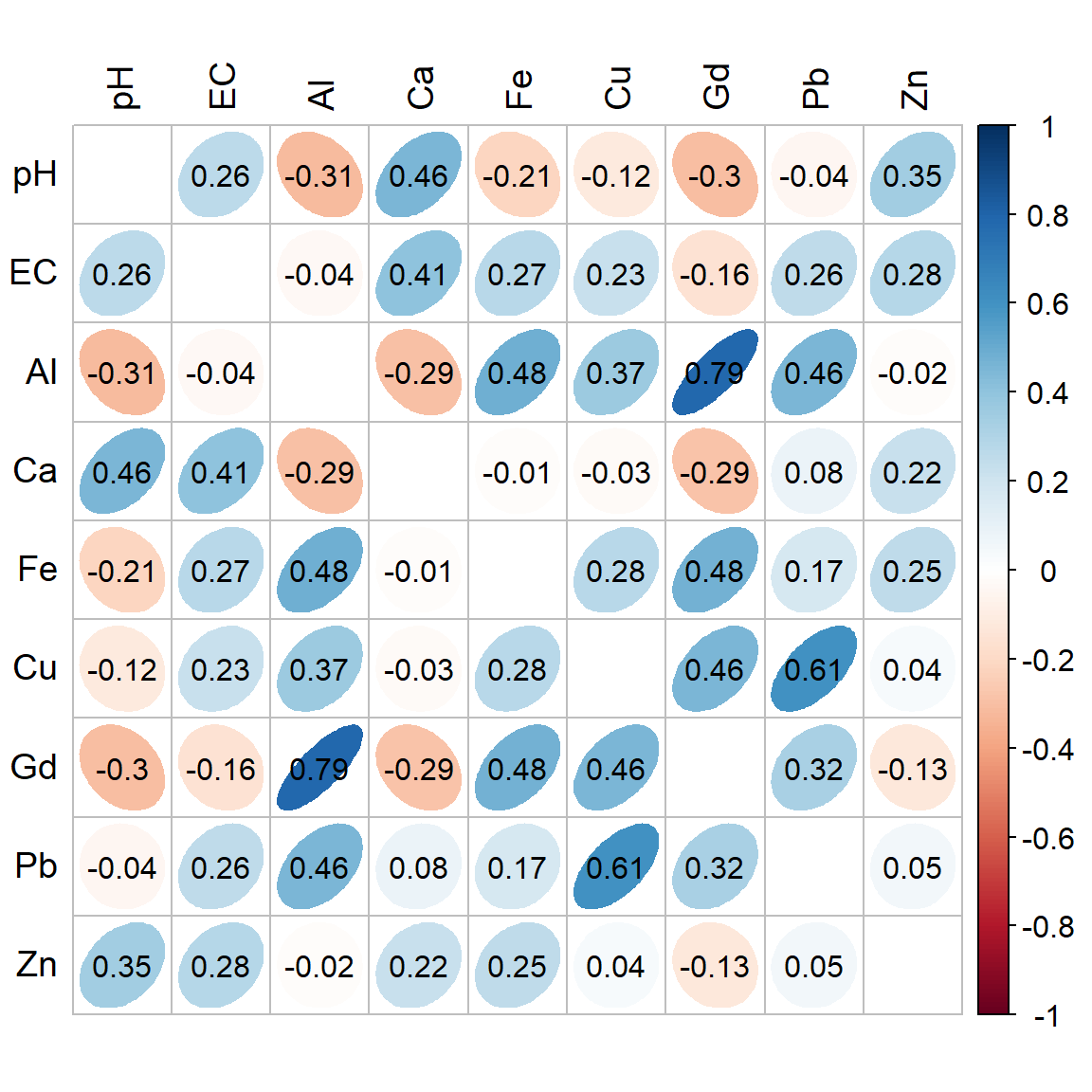
Figure 2: Correlation heatmap (Spearman) for selected variables in the 2023 Ashfield Flats sediment data. The numeric correlation matrix is below.
##        pH     EC     Al     Ca     Fe     Cu    Gd     Pb     Zn
## pH  1.000  0.265 -0.311  0.456 -0.214 -0.117 -0.30 -0.043  0.350
## EC  0.265  1.000 -0.039  0.405  0.272  0.228 -0.16  0.258  0.281
## Al -0.311 -0.039  1.000 -0.292  0.481  0.369  0.79  0.457 -0.015
## Ca  0.456  0.405 -0.292  1.000 -0.014 -0.028 -0.29  0.080  0.220
## Fe -0.214  0.272  0.481 -0.014  1.000  0.278  0.48  0.173  0.253
## Cu -0.117  0.228  0.369 -0.028  0.278  1.000  0.46  0.606  0.039
## Gd -0.302 -0.158  0.786 -0.288  0.478  0.459  1.00  0.321 -0.126
## Pb -0.043  0.258  0.457  0.080  0.173  0.606  0.32  1.000  0.051
## Zn  0.350  0.281 -0.015  0.220  0.253  0.039 -0.13  0.051  1.000
[There is also a simpler correlation heatmap function in the
psych package, cor.plot().]
We can also (with a bit of manipulation of the correlation matrix
using the reshape2 package) make a heatmap in
ggplot2 using geom_tile(), as shown below in
Figure 3. We use the correlation matrix cormat1 generated
above.
library(reshape2)
cormelt <- melt(cormat1$r) # convert mtrix to long format
cormelt$value[which(cormelt$value>=0.999999)] <- NA # remove diagonal values=1
# draw the ggplot heatmap
library(ggplot2)
ggplot(data=cormelt, aes(x=Var1, y=Var2, fill=value)) +
  geom_tile(na.rm=T, color="white", linewidth=1) + labs(x="", y="") +
  geom_text(aes(label = round(value,2)), size = 4) +
  scale_fill_gradient2(high="steelblue", mid="white", low="firebrick",
                       na.value="white", name="r scale") +
  theme_minimal() + theme(aspect.ratio = 1)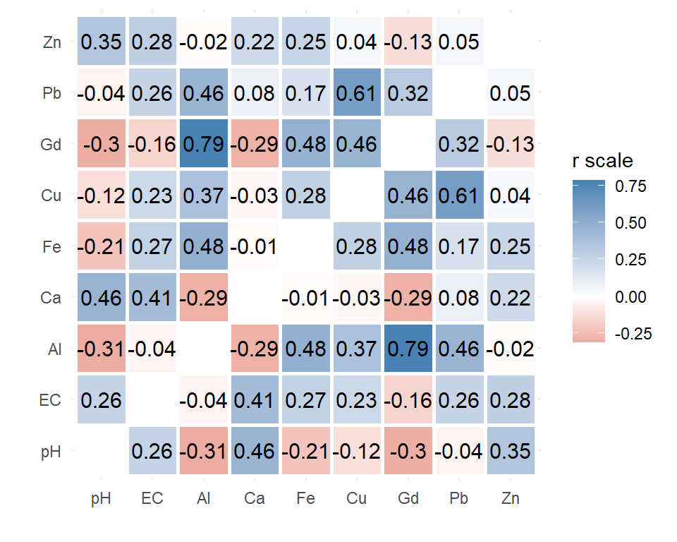
Figure 3: Correlation heatmap (Spearman) drawn using
ggplot2 for selected variables in the 2023 Ashfield Flats
sediment data.
Scatter plot matrix to check correlation matrix
It's always a good idea to plot scatterplots for the relationships we are exploring. Scatter (x-y) plots can show if:
- a correlation coefficient is unrealistically high due to a small number of outliers, or because there are aligned (or only 2) groups of points
- a correlation coefficient is low, not because of a lack of relationship, but because relationships differ for different groups of points;
- there is a consistent relationship for all groups of observations.
require(car) # needed for scatterplotMatrix() function
palette(c("black",viridis::plasma(8)[2:7],"white")); carPalette(palette())
scatterplotMatrix(~pH+ log10(Al)+ log10(Ca)+ log10(Cd)+
                    log10(Fe)+ log10(Pb)+ log10(Zn) | Type,
                  smooth=FALSE, ellipse=FALSE, by.groups=TRUE,
                  col=c(4,2,1), pch=c(16,1,15), cex.lab=1.5, data=sv2017,
                  legend=list(coords="bottomleft"))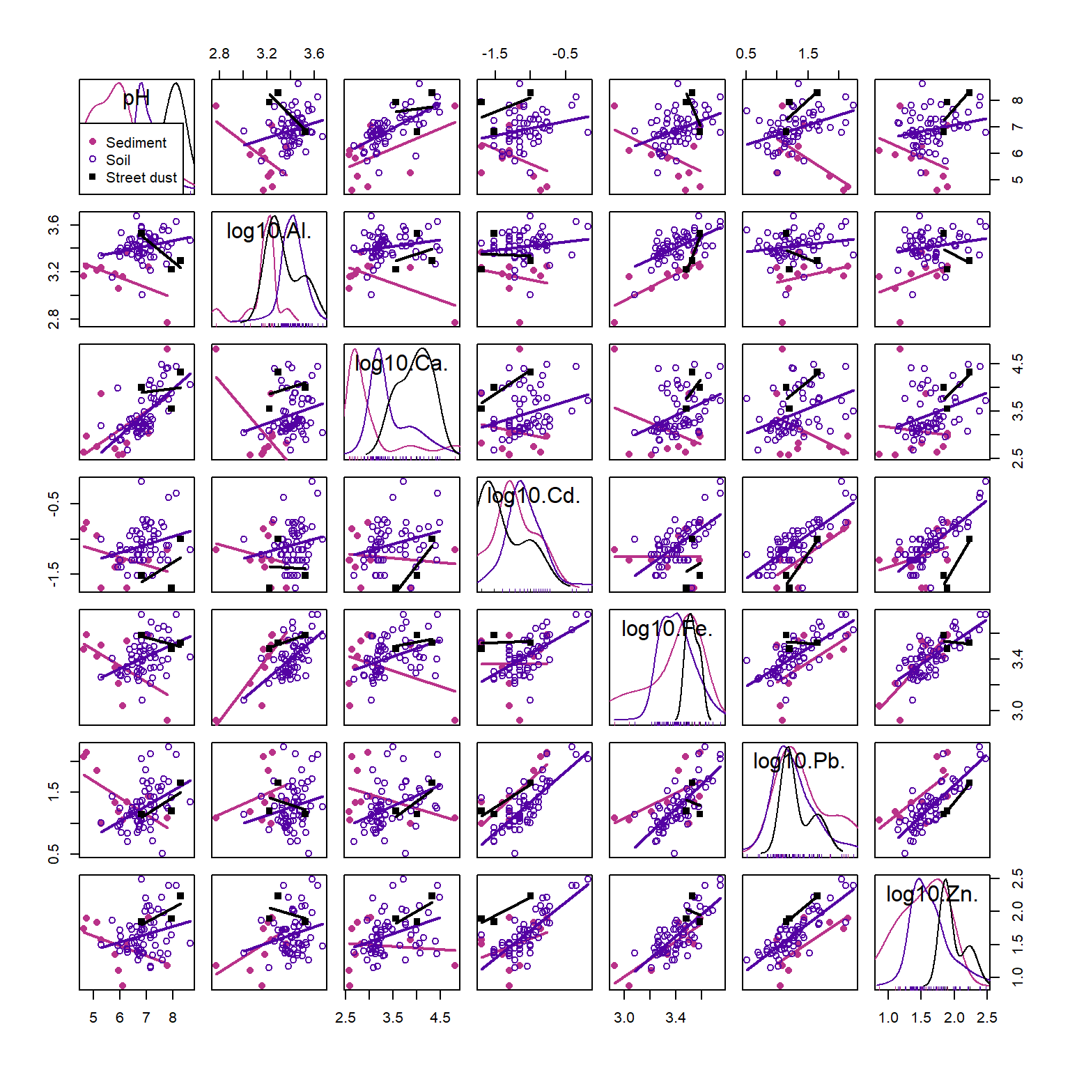
Figure 4: Scatter plot matrix for selected variables in the 2017 Smiths-Veryard sediment data, with observations and regression lines grouped by sample Type. Scatter plot matrices are a powerful exploratory data analysis tool.
(See Figures 18 and 19 in the
ggplot page if you want to make scatter plot matrices
in ggplot2.)
In Figure 4, Pb and Zn are positively related (Pearson's r = 0.77, p<0.0001) independent of which group (Sediment, Soil, or Street dust) observations are from. Conversely, the relationship between pH and Cd is weak (r=0.23, adjusted p=0.32), but there appear to be closer relationships between observations from individual groups. Finally, the relationship between Al and Ca may be influenced by a single observation with low Al and high Ca. All issues like this should be considered when we explore our data more deeply.
The classic example of correlations which need plots to interpret them is the somewhat famous Anscombe's Quartet. This is shown below in Figure 5:
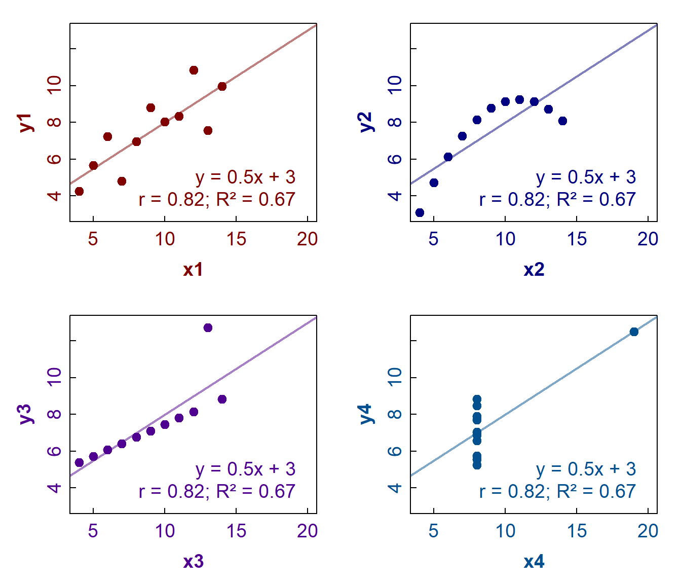
Figure 5: Anscombe's Quartet – plots of 4 distinct x-y data sets with
regression lines, all having the same slope, intercept, Pearson's r, and
R² values. The data are available in R via
datasets::anscombe.
References
Cohen, J. 1988. Statistical Power Analysis for the Behavioral Sciences, Second Edition. Erlbaum Associates, Hillsdale, NJ, USA.
Reimann, C., Filzmoser, P., Garrett, R.G., Dutter, R., (2008). Statistical Data Analysis Explained: Applied Environmental Statistics with R. John Wiley & Sons, Chichester, England (see Chapter 16).
CC-BY-SA • All content by Ratey-AtUWA. My employer does not necessarily know about or endorse the content of this website.
Created with rmarkdown in RStudio. Currently using the free yeti theme from Bootswatch.