 Material to support teaching in Environmental Science at The University of Western Australia
Units ENVT3361, ENVT4461, and ENVT5503
Locality and Site Plan maps in R
Maps for Environmental reporting
Andrew Rate
2025-12-05
Maps / spatial pages: Maps | Spatial statistics | Spatial interpolation
Introduction
We prepare maps for environmental reporting for two main reasons:
To show the site being investigated in its context, such as site boundaries, surrounding land use, potential broader sources of contamination, proximity to receiving environments, and so on. This is called a “Locality Map”.
To show the relevant details of the site being investigated: relevant infrastructure, specific suspected sources of contamination, sample types and locations, samples with contaminant conentrations exceeding guideline values, etc. This is called a “Site Plan map”.
This page presents a simple workflow to prepare both Locality and Site Plan maps using relevant packages in R.
Load the R packages we need for plotting maps (install first if needed)
Install the required packages to your device if you don't have them already (only do this once, not every R session):
if(!require(sf)) install.packages("sf")
if(!require(maptiles)) install.packages("maptiles")
if(!require(prettymapr)) install.packages("prettymapr")
if(!require(TeachingDemos)) install.packages("TeachingDemos")
if(!require(viridis)) install.packages("viridis")
if(!require(ggmap)) install.packages("ggmap")
if(!require(ggplot2)) install.packages("ggplot2")
if(!require(ggspatial)) install.packages("ggspatial")
You will need to load the installed packages each time you start RStudio.
library(sf)            # essential for maps and spatial analysis in R
library(maptiles)      # for downloading map tile images
library(prettymapr)    # for making north arrow and scale bar
library(TeachingDemos) # for shadowtext() function (outlined text)
library(viridis)       # for accessible colour palettes
palette(c("black", viridis(8), "royalblue",
          "white", "transparent", "firebrick", "grey25")) # custom colours
library(ggmap)
library(ggplot2)
library(ggspatial)
Read some external data for adding info to maps
This code uses some functions from the sf R package(
)Pebesma, 2018) to import some data from .kml files (Google
Earth format), and transform the resulting spatial sf
objects to the projection we are using. For more detail on the
sf package, map projections, etc., look at the Introduction to Maps in R
page.
The st_read() function can import data from numerous
formats such as ESRI shapefiles and Google Earth .kml
files. The st_transform function converts the
longitude-latitude coordinates in the .kml files (units of
degrees) to the coordinate reference system (CRS) specified by the
function st_crs() called within st_transform.
The CRS is specified by the EPSG code, where 32750 indicates UTM
Zone 50 S based on the WGS84 datum, with units of metres.
git <- "https://github.com/Ratey-AtUWA/Learn-R-web/raw/refs/heads/main/"

LC_site <- st_read(paste0(git, "LC_UWA_study_area.kml"))
LC_site <- st_transform(LC_site, crs=st_crs(32750)) # convert to UTM Zone 50S

Claremont_drains <- st_read(paste0(git, "Town-of-Claremont-Drains.kml"))
(Claremont_drains <- st_transform(Claremont_drains,
                                 crs=st_crs(32750))) # convert to UTM Zone 50S
LOCALITY MAP
Australian guidelines for reporting on contaminated site investigations (NEPC 2011, DWER 2021) specify including a locality map "...showing site location, site boundary, cadastral boundary or boundaries, surrounding area and any key nearby features..." (DWER, 2021).
The first part of this code shows a method for producing a locality
map in R, relying on the sf spatial R package (Pebesma and
Bivand, 2023) together with the packages maptiles (Giraud,
2024) and prettymapr (Dunnington, 2024).
next define a rectangle for a locality map
Find coordinates by:
- locating the bottom-left and top-right corners of the desired rectangle using the maps at the EPSG site (https://epsg.io/map – make sure the Coordinate system at the bottom is changed to EPSG:32750).
- using Google Earth with ⊙ Universal Transverse Mercator selected
under
Show Lat/Longafter clicking Tools/Options... , then Add Placemark 📌
⚠ THESE COORDINATES 👇 ARE NOT REAL! - PLEASE FIND YOUR OWN!
locality <- st_as_sf(data.frame(x=c(123456,123456), y=c(1234567,1234567)),
                     coords=c("x","y"), crs=st_crs(32750))
locality # check it worked: should include 'Projected CRS: WGS 84 / UTM zone 50S'
Use the get_tiles() function with options to download
map tiles
The code above made an object locality which defined our
map rectangle in our chosen coordinate system. The locality
object then becomes an input for the get_tiles() function
from the maptiles R package. We specify some other options
as well: provider= sets the map tile style, and
zoom= sets the level of detail. At each zoom level, map
tiles are squares, so we use crop=TRUE to trim any unneeded
parts of the map tile images.
Then plot the map
The best option for plotting seems to be to:
Plot an empty map frame based on the extent object (
locality), adding axis labels and specifyingxaxs="i", yaxs="i"to suppress axis padding.Use the
plot_tiles()function from themaptilesR package to add the map tile layer. We include the optionadd=TRUEto plot on top of the previous plot.
# first setting graphics parameters with par()
par(mar=c(3,3,1,1), mgp=c(1.5,0.3,0), font.lab=2)
# first an empty plot frame based on the map extent
plot(st_coordinates(locality), type="n", asp=1, xaxs="i", yaxs="i",
     xlab="Easting", ylab="Northing")
plot_tiles(claremontMap, add=TRUE)
box() # redraw plot frame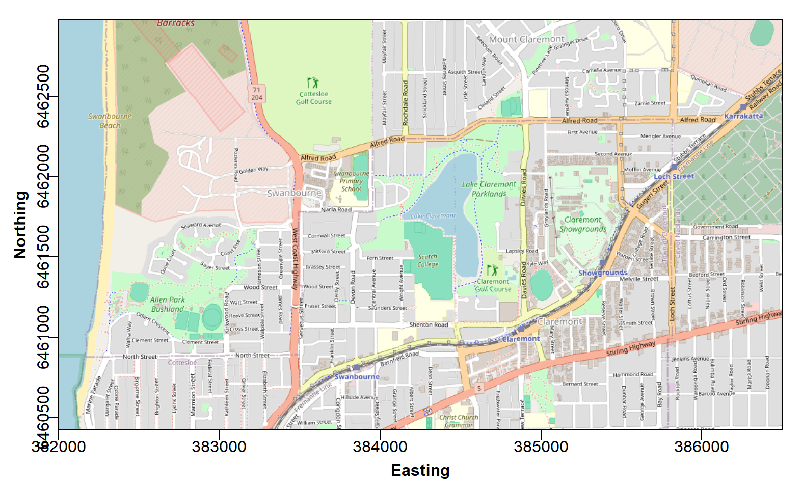
Figure 1: Georeferenced map tile image obtained with the
maptiles R package to use as a base locality map.
After plotting the map in RStudio, you will probably need to adjust the size and proportions of your plot area manually, so that the map tiles fill the whole plot frame.
Next, add the necessary map and plot features and annotations
The guidelines state that a North arrow and scale bar should be included on maps, as well as the locations of significant geographical features (natural or anthropogenic).
# ...continuing code from above
addnortharrow()
addscalebar(plotepsg = 32750, pos="bottomleft", label.col = 1, linecol = 1,
            label.cex = 1.2, htin=0.15, widthhint=0.3, padin=c(0.15,0.25))
mtext("CRS:UTM Zone 50S, WGS84 (EPSG:32750)", side=1, line=-1.2,
      font=2, col=14, cex=0.75, adj=0.02)
shadowtext(384350,6461820, labels="Lake\nClaremont", col=3, bg=11, cex=0.85, font=2)
shadowtext(385000,6461120, labels="Fremantle Railway", col=5, bg=11, cex=0.85, srt=25)
shadowtext(382900, 6462250, labels="Military\nFacility", col=5, bg=11, cex=0.85)
shadowtext(382100, 6462200, labels="Indian Ocean", col=3, bg=11, font=3, srt=90, cex=0.85)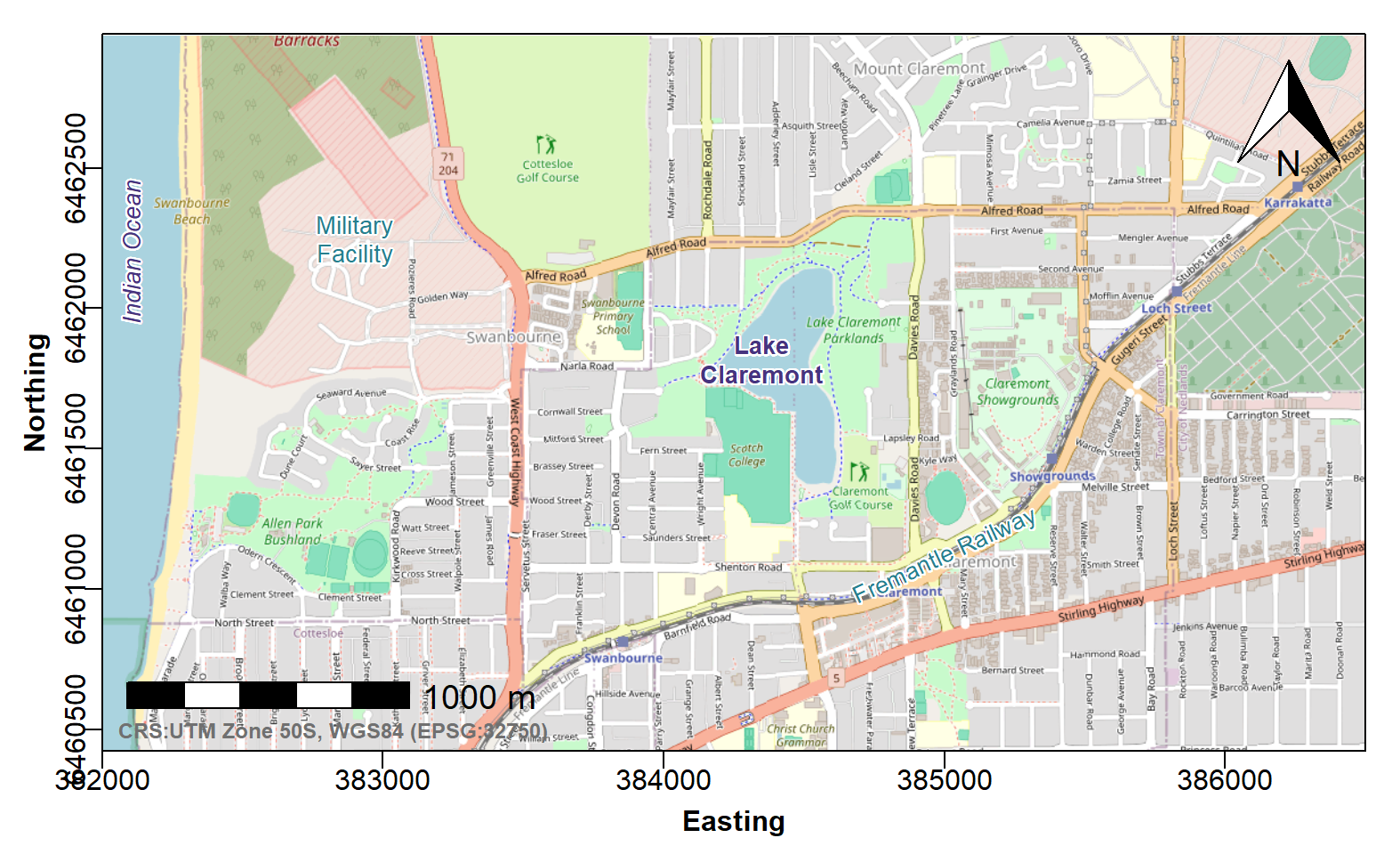
Figure 2: Georeferenced map tile image obtained with
maptiles, with prettymapr north arrow and
scale bar, and text annotations using the shadowtext()
funtion from the TeachingDemos package.
Finally add the data we imported earlier, and a legend
We should always indicate the location of the site under investigation on our Locality Map. We also include stormwater drains on this map, since stormwater may affect water quality in Lake Claremont. Adding a legend helps readers with map interpretation.
# ...continuing code from above
plot(Claremont_drains[1], add=TRUE, type="l", col=10, lwd=2)

plot(LC_site[1], add=T, type="l", col=13, lwd=3)

legend("topleft", bg="#ffffffa0", box.col=12, inset=0.02,
       legend=c("Lake Claremont study site",
                "Town of Claremont stormwater drains"),
       lwd=c(3,2), col=c(13,10))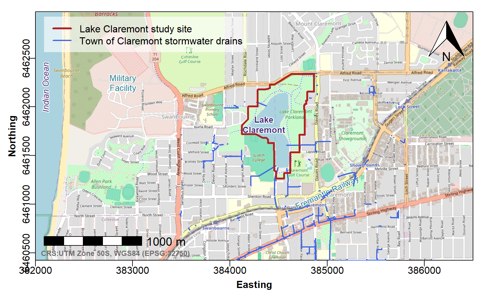
Figure 3: Georeferenced map tile image obtained with
maptiles, with annotations as in Figure 2, and third-party
data used to plot stormwater drain locations and show the extent of the
study area.
Alternative: plotting using
ggmap/ggplot2
The ggplot2 R package is a popular alternative to base-R
plotting (when using maptiles and sf we are
still essentiall using base R graphics). The relevant functions for
ggplot2 are geom_sf() and
annotation_raster(), as the code below shows. We also make
use of:
get_map()and related functions in theggmappackage, to obtain georeferenced raster images based on tiles from map servers;annotation_scale()andannotation_north_arrow()functions in theggspatialpackage to add essential map annotations.
As with maptiles maps, we need to specify a rectangle
for our map background raster. In this example we're going to use the
object locality that we made previously, and convert it to
WGS84 Long-Lat (EPSG:4326) using st_transform(), as this is
the CRS required by ggmap.
## Find long-lat bounding coordinates for ggmap raster background:## [1] 115.75149 -31.98605 115.79942 -31.96360# transform the site boundary data to new CRS
LC_siteLL <- st_transform(LC_site, crs=st_crs(4326))
# convert to sf:: object of class `polygon`
study <- st_polygon(list(as.matrix(st_coordinates(LC_siteLL)))) |>
st_sfc(crs=st_crs(4326)) This example uses stamen_terrain map tiles from Stadia.
In ggmap, the Stadia maps can be specified from a
user-defined rectangle (which is usually what we want), but other map
tiles (e.g. google) yield square maps around a central coordinate. The
get_stadiamap() function creates a georeferenced raster
image from Stadia Stamen map tiles, which can be plotted directly using
ggmap(). We're going to use ggplot() instead,
as it is then easier to add additional map layers such as the
investigation site boundary, stormwater drains, land use polygons, and
so on. In this case we use annotation_raster to add the
ggmap raster to our map plot.
You will need to register for a (free) API key if you want to use Stadia Stamen map tiles.
register_stadiamaps(key = smapskey) # do this before getting Stadia Stamen maps
localgg <-
  get_stadiamap(bbox=c(left=ll[1], bottom=ll[2], right=ll[3], top=ll[4]),
                     maptype = "stamen_terrain", zoom=15)
Here's how we plot the map background, additional map layers, and annotations (Figure 4).
# make an object to contain custom plot colours
cols <- c("Storm_Drains"="darkcyan", "Study_Area"="#800080b0")
# plot the `ggmap` raster starting with an empty `ggplot()`
ggplot() +
  annotation_raster(localgg, xmin=ll[1], ymin=ll[2], xmax=ll[3], ymax=ll[4]) +
  scale_x_continuous(expand = c(0,0), limits=c(ll[1],ll[3])) +
  scale_y_continuous(expand = c(0,0), limits=c(ll[2],ll[4])) +
  # xlim(c(ll[1],ll[3])) + ylim(c(ll[2], ll[4])) +
  geom_sf(data=study, mapping=aes(col="Study_Area"), fill=NA, lwd=1.3) +
  geom_sf(data=Claremont_drains, mapping=aes(col="Storm_Drains"),
          lwd=0.8, lty="21") +
  geom_text(aes(x = c(115.76,115.778), y = c(-31.968,-31.973),
                label = c("Military\nFacility","Study\nArea"),
                fontface="italic", family="sans"),
            size=12, vjust=0.5, hjust=0.5, color="steelblue4", size.unit="pt") +
  geom_text(aes(x = 115.771, y = -31.9818,
                label = c("Fremantle Railway"),
                fontface="italic", family="sans"), angle=18,
            size=10, vjust=0.5, hjust=0.5, color="steelblue4", size.unit="pt") +
  geom_text(aes(x = c(115.752), y = c(-31.9725),
                label = c("Indian Ocean"),
                fontface="italic", family="sans"), angle=90,
            size=12, vjust=0.5, hjust=0.5, color="navy", size.unit="pt") +
  labs(x="Longitude", y="Latitude") +
  scale_color_manual(name="", values=cols,
                     guide=guide_legend()) +
  annotation_scale(location="tl", width_hint=0.25, text_cex=1,
                   pad_x=unit(2, "cm")) +
  annotation_north_arrow(location = "tl", which_north = "true",
                         pad_x = unit(0.2, "cm"), pad_y = unit(0.2, "cm"),
                         style = north_arrow_fancy_orienteering) +
  theme_bw() +
  theme(axis.title = element_text(face="bold", size=14),
        axis.text = element_text(size=12),
        legend.text = element_text(size=12))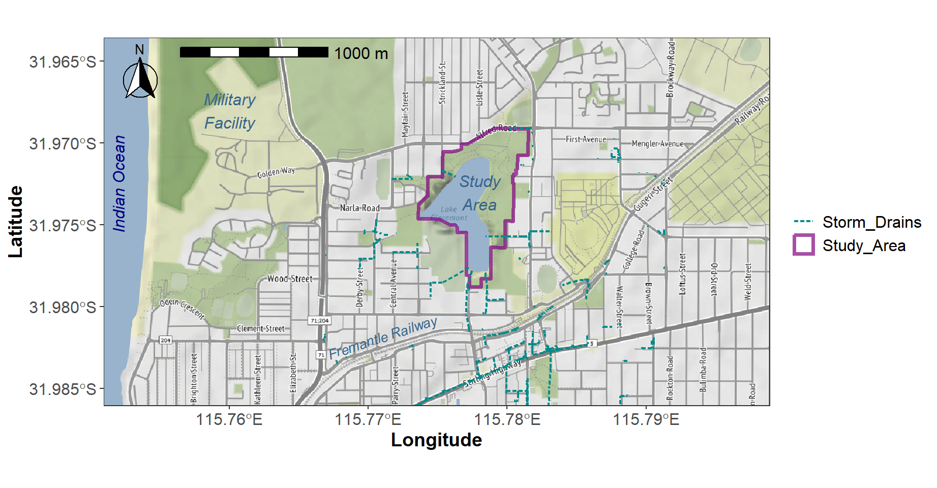
Figure 4: Locality map for Lake Claremont made using
ggplot2 and ggmap.
Some additional notes on this ggmap code:
scale_x_continuous(expand = c(0,0), limits=c(ll[1],ll[3]))(andscale_y_continuous()) allow us to have axis limits that exactly fit theggmaprastergeom_sf()allows us to add layers. The layer information eeds to be in asfobject- we can add text annotations using
geom_text() - we set axis labels using
labs() scale_color_manual()creates the legend to the right of the mapannotation_scale()adds a scale bar (based on the CRS of the raster)annotation_north_arrow()adds a north arrowtheme_bwis a good choice for maps- we often want to customise the appearance further by calling
theme()directly and setting some additional options.
SITE PLAN MAP
Australian guidelines for reporting on preliminary (PSI) and detailed (DSI) site investigations (NEPC, 2011) also specify including a Site Plan drawn to a scale appropriate to project size and required detail. This plan is essentially a map showing features such as site boundary, sample locations, actual installed locations of monitoring wells, boreholes and/or pits, and so on (DWER, 2021). The Site Plan should also be used for reporting results, including “… a clear representation of contamination issues associated with the site…” (NEPC, 2011).
This section will explain the creation of such a more detailed Site map in R, including information on potential contamination at discrete sampling points.
We already have an object LC_site that defines the
boundaries of the site so we can use that to specify the area of map
tiles to download. Note that we are choosing a different map tile style
- the CartoDB tiles have lighter colours, so are good for showing data
on.
LC_siteMap <- get_tiles(LC_site, provider="CartoDB.Voyager", crop=TRUE,
                          zoom=16)
par(mar=c(3,3,1,1), mgp=c(1.5,0.3,0), font.lab=2)
plot(st_coordinates(LC_site), type="n", asp=1, xaxs="i", yaxs="i",
     xlab="Easting", ylab="Northing")
plot_tiles(LC_siteMap, add=TRUE)
box()
addnortharrow()
addscalebar(plotepsg = 32750, pos="bottomright", label.col = 1, linecol = 1,
            label.cex = 1.2, htin=0.15, widthhint=0.3, padin=c(0.15,0.2))
mtext("UTM Zone 50S, WGS84 (EPSG:32750)", side=1, line=-1.1,
      font=2, col=14, cex=0.7, adj=0.98)
shadowtext(c(384450), c(6462180), labels=c("Rehabilitated bushland"),
           bg=11, col=6, srt=30)
shadowtext(c(384300,384650,384680), c(6461500,6461850,6461440),
           labels=c("Scotch College\nsports fields","Grassed\nParkland",
                    "Golf\ncourse"), bg=11, col=c(14,6,6), font=3)
plot(Claremont_drains[2], add=T, type="l", col=4, lwd=1.5, lty=3)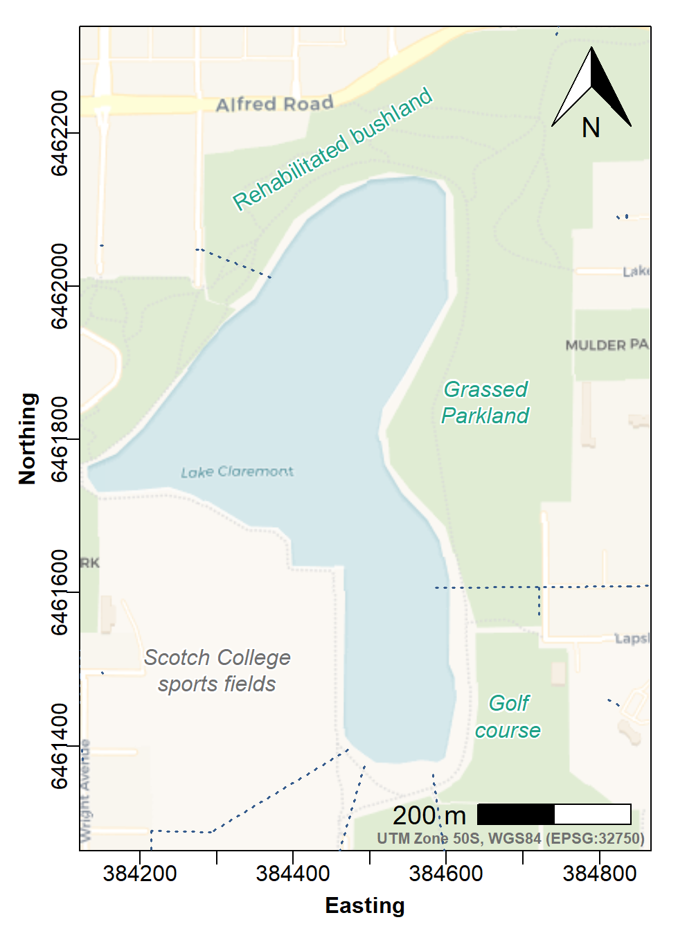
Figure f: Site Plan map made with georeferenced tiles obtained with
maptiles, with prettymapr north arrow and
scale bar, and stormwater drains.
We need to read-in our data:
(this is the same one used for the
regression assignment – save it to your working directory in
RStudio!)
## 'data.frame':    51 obs. of  11 variables:
##  $ Lab.Field.Group: chr  "Group-01" "Group-01" "Group-01" "Group-01" ...
##  $ Sample_ID      : chr  "LCW24_01" "LCW24_02" "LCW24_03" "LCW24_04" ...
##  $ Location       : chr  "North-west lake" "North-west lake" "North-west lake" "North-west lake" ...
##  $ Easting        : int  384411 384405 384402 384411 384415 384346 384559 384568 384576 384585 ...
##  $ Northing       : int  6462067 6462067 6462065 6462075 6462080 6461978 6461907 6461927 6461947 6461967 ...
##  $ Zone           : chr  "NW" "NW" "NW" "NW" ...
##  $ pH             : num  7.43 7.51 7.57 7.46 7.46 8.56 7.76 7.4 7.72 7.64 ...
##  $ As             : num  0.166 0.158 0.148 0.182 0.14 0.158 NA NA 0.043 NA ...
##  $ Fe             : num  0.283 0.168 0.109 0.073 0.054 0.021 0.174 0.065 0.699 0.334 ...
##  $ P              : num  0.353 0.295 0.292 0.461 0.359 0.043 0.028 0.014 0.061 0.056 ...
##  $ Pb             : num  NA NA NA 0.0246 NA NA NA NA NA NA ...
We can optionally check sample locations (small +
symbols):
# ...continuing previous code for Figure 4...
with(lcw24, points(Easting, Northing, pch=3, col=14, cex=0.7))
legend("topleft", bg="#ffffffb0", box.col=12,
       legend=c("Storm drains","Water samples"), lty=c(3,NA), pch=c(NA,3),
       col=c(4,14), pt.cex=c(NA,0.7))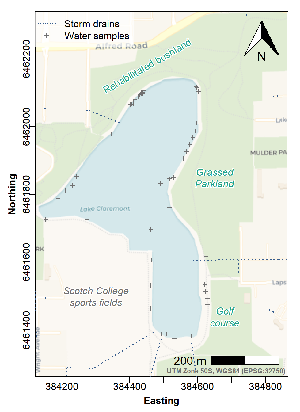
Figure 6: Site Plan map made with georeferenced tiles obtained with
maptiles, with prettymapr north arrow and
scale bar, stormwater drains, and locations of water samples.
Plot the P (phosphorus) concentrations as ‘bubbles’ using the
symbols() function
The base-R symbols() function allows us to add the
scaled circle symbols ("bubbles"). Note that we make bubble radius
proportional to square root concentration – this makes bubble
area proportional to concentration, since human perception
considers size as area rather than diameter or radius.
Make sure you use these option in the symbols()
function: add=TRUE, inches=FALSE.
We also identify and plot the samples with P concentrations greater than the threshold for total P in wetlands in SW Australia (ANZECC, 2000), which is 60 µg/L = 0.06 mg/L
First we read in the water quality guidelines:
wqg <- WQ[1:19,]
row.names(wqg) <- wqg$Element
stressors <- WQ[20:29,]
colnames(stressors)[2:5] <- c("Upland river", "Lowland River", "Lakes", "Wetlands")
row.names(stressors) <- stressors$Element
row.names(stressors)[2] <- "P" # rename to match our data (OPTIONAL)
stressors$Note <- NULL # we don't need this any more
cat("■ WQA Water Toxicants ■\n"); wqg; cat("\n■ SW-WA Stressors ■\n"); stressors
## ■ WQA Water Toxicants ■## Element GV99 GV95 GV90 GV80 Note Reference
## Ag Ag 2.0e-05 0.00005 0.0001 0.0002 <NA> WQA website
## Al Al 2.7e-02 0.05500 0.0800 0.1500 pH>6.5 WQA website
## As As 8.0e-04 0.01300 0.0420 0.1400 As(V) WQA website
## B B 3.4e-01 0.94000 1.5000 2.5000 <NA> WQA website
## Cd Cd 6.0e-05 0.00020 0.0004 0.0008 <NA> WQA website
## Co Co 5.0e-06 0.00100 0.0140 0.1500 marine WQA website
## Cr Cr 1.0e-05 0.00100 0.0060 0.0400 Cr(VI) WQA website
## Cu Cu 1.0e-03 0.00140 0.0018 0.0025 <NA> WQA website
## Hg Hg 6.0e-05 0.00060 0.0019 0.0054 <NA> WQA website
## Mn Mn 1.2e+00 1.90000 2.5000 3.6000 <NA> WQA website
## Mo Mo NA 0.03400 NA NA LOSP unknown WQA website
## Ni Ni 8.0e-03 0.01100 0.0130 0.0170 <NA> WQA website
## Pb Pb 1.0e-03 0.00340 0.0056 0.0094 <NA> WQA website
## Sb Sb NA 0.00900 NA NA LOSP unknown WQA website
## Se Se 5.0e-03 0.01100 0.0180 0.0340 <NA> WQA website
## Tl Tl NA 0.00003 NA NA LOSP unknown WQA website
## U U NA 0.00050 NA NA LOSP unknown WQA website
## V V 5.0e-02 0.10000 0.1600 0.2800 marine WQA website
## Zn Zn 2.4e-03 0.00800 0.0150 0.0310 <NA> WQA website##
## ■ SW-WA Stressors ■## Element Upland river Lowland River Lakes Wetlands Reference
## Chl_a Chl_a NA 0.004 0.004 0.03 ANZECC (2000) Table 3.3.6
## P TP 0.02 0.065 0.010 0.06 ANZECC (2000) Table 3.3.6
## FRP FRP 0.01 0.040 0.005 0.03 ANZECC (2000) Table 3.3.6
## TN TN 0.45 1.200 0.350 1.50 ANZECC (2000) Table 3.3.6
## NOx NOx 0.20 0.150 0.010 0.10 ANZECC (2000) Table 3.3.6
## NH4 NH4 0.06 0.080 0.010 0.04 ANZECC (2000) Table 3.3.6
## DO DO 90.00 80.000 90.000 90.00 ANZECC (2000) Table 3.3.6
## DO_high DO_high NA 120.000 NA 120.00 ANZECC (2000) Table 3.3.6
## pH pH 6.50 6.500 6.500 7.00 ANZECC (2000) Table 3.3.6
## pH_high pH_high 8.00 8.000 8.000 8.50 ANZECC (2000) Table 3.3.6# ...continuing previous code...
# first use a simple algorithm to estimate a scale factor `s0` for the bubbles
axrg <- par("usr")[2]-par("usr")[1]
# first make small legend bubble, checking if it's zero
if (pretty(lcw24$P)[1] < 0.001) {
bublo <- pretty(lcw24$P)[2]/2
} else {
bublo <- pretty(lcw24$P)[1]
}
bubhi <- pretty(lcw24$P)[length(pretty(lcw24$P))]
s0 <- signif(0.05*axrg/sqrt(bubhi),2)
# add the scaled symbols ("bubbles")
# note we make bubble radius proportional to square root concentration
# this makes bubble area proportional to concentration, since human perception
# considers size as area rather than diameter or radius
with(lcw24, symbols(Easting, Northing, add=TRUE, circles=sqrt(P)*s0,
inches=FALSE, fg=2, bg="#A020F080"))
# next we identify and plot the samples with P concentrations greater than
# the ANZECC threshold for total P in wetlands in SW Australia, which is
# 60µg/L = 0.06mg/L
trigger <- stressors["P","Wetlands"]
with(lcw24[which(lcw24$P >= trigger),c("Easting","Northing","P")],
points(Easting, Northing, pch=3, col=1, lwd=2.5))
# manual legend
rect(384400, 6462190, 384620, 6462330, lwd=2,
col="#ffffffd8", border="#80808080")
symbols(c(384450,384550),c(6462250,6462250), circles=s0*sqrt(c(bublo,bubhi)), add=T,
lwd=1, inches=F, fg = "purple", bg = "#8000FF40")
text(c(384500,384450,384550),c(6462320,6462230,6462250), cex=0.85,
labels=c("P (mg/L)",bublo,bubhi), pos = c(1,1,1), font=c(2,1,1),
offset=0)
# "normal" legend
legend("topleft", inset=0.01, bg="#ffffffd8", box.col=12, y.intersp=1.75,
legend=c("Water\nsamples", paste("Samples\nP ≥",trigger,"mg/L"),
"Stormwater\ndrains"),
pch=c(21,3,NA), lty=c(NA,NA,3), col=c(2,1,4), lwd=c(NA,NA,1.5),
pt.cex=c(3,1,NA), pt.lwd=c(1,2.5,NA), pt.bg="#A020F080", cex=0.85)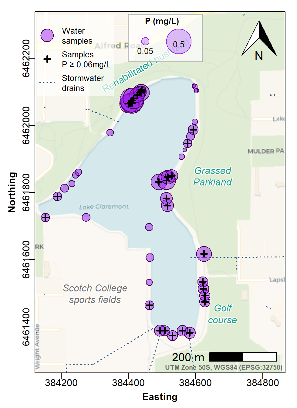
Figure 7: Site Plan map made with georeferenced tiles obtained with
maptiles, with prettymapr north arrow and
scale bar, and stormwater drains. Phosphorus concentrations in water are
shown as area-proportional circle symbols at sample locations, with
samples having phosphorus concentrations exceeding the Water Quality
Australia guideline shown by bold plus (+) symbols.
This final map could be included in an environmental investigation report.
To plot a different element (e.g. Al) you would need to
- Replace 'P' with 'Al' in ALL the right places in the code
- Change the guideline concentration from 0.06 to the relevant value for the next element (see Water Quality Australia, 2024)
Another option is to present the points in categories, such as those defined by Tukey boxplots, or by percentiles. We'll look at how to do this further down this page.
Site plan map using ggplot2 and ggmap
We have already converted our site polygon to the correct CRS
(i.e. Long-Lat WGS84), storing it in LC_siteLL. To
make a background map we add some space around the site polygon – we
could do this manually, but I've made a custom function pad_bbox() to do this
simply (pad_bbox() expands the bounding box by 5% in all
directions by default; we can change the expansion factor).
#    (pad_bbox() is a custom function to expand a sf:: object in
#     all directions by a specified proportion)
source("https://github.com/Ratey-AtUWA/Learn-R-web/raw/refs/heads/main/FUNCTION-pad_bbox.R")
l2 <- st_bbox(pad_bbox(LC_siteLL)) |> as.numeric()
sitegg <-
  get_stadiamap(bbox=c(left=l2[1], bottom=l2[2], right=l2[3], top=l2[4]),
                     maptype = "stamen_terrain", zoom=16)
We need our data in the right format, so we need to do some
conversions (data frame to sf data frame, and UTM Zone 50
(EPSG 32750) to Longitude-Latitude WGS 84 (EPSG:4326):
lcw24LL <- st_as_sf(lcw24, coords=c("Easting", "Northing"),
                    crs=st_crs(32750), remove=FALSE) |>
  st_transform(crs=st_crs(4326))
Here's how we use ggplot to plot the map background,
additional map layers, annotations, and data (Figure
8).
# make an object to contain custom plot colours
cols <- c("Storm_Drains"="darkcyan", "Study_Area"="#800080b0")
# plot the `ggmap` raster starting with an empty `ggplot()`
ggplot(LC_siteLL) +
  annotation_raster(sitegg, xmin=l2[1], ymin=l2[2], xmax=l2[3], ymax=l2[4]) +
  scale_x_continuous(expand = c(0,0), limits=c(l2[1],l2[3])) +
  scale_y_continuous(expand = c(0,0), limits=c(l2[2],l2[4])) +
  geom_sf(data=study, fill=NA, lwd=1.3, color="#800080b0") +
  geom_sf(data=Claremont_drains, lwd=0.8, lty="21", col="darkcyan") +
  geom_sf(data=lcw24LL, mapping=aes(size=P, fill=P), pch=21, color="#00000080") +
  geom_sf(data=subset(lcw24LL, lcw24LL$P>=0.06), pch=3, col="#ffffff40", stroke=2) +
  geom_sf(data=subset(lcw24LL, lcw24LL$P>=0.06), pch=3) +
  scale_fill_viridis_c(alpha=0.7, option="plasma",
                       breaks=c(0.01,0.02, 0.05,0.1,0.2,0.4),
                       guide="legend", name="P (mg/L)") +
  scale_size_continuous(range=c(0,12), breaks=c(0.01,0.02, 0.05,0.1,0.2,0.4),
                        name="P (mg/L)") +
  labs(x="Longitude", y="Latitude") +
  geom_text(aes(x=115.7755, y=-31.9765, label = "Sports\nFields"),
            fontface="italic", family="sans", color="#205000",
            size.unit="pt", size=10, vjust=0.5, hjust=0.5) +
  geom_text(aes(x=115.78, y=-31.9775, label = "Golf and\nSwimming\nComplex"),
            fontface="italic", family="sans", color="#205000",
            size.unit="pt", size=10, vjust=0.5, hjust=0.5) +
  annotation_scale(location="bl", width_hint=0.25, text_cex=0.9,
                   height = unit(0.25, "cm")) +
  annotation_north_arrow(location="tl", which_north="true",
                         pad_x=unit(0.2, "cm"), pad_y=unit(0.2, "cm"),
                         width=unit(1, "cm"), height=unit(1.2, "cm")) +
  theme_bw() +
  theme(axis.title = element_text(face="bold", size=11),
        axis.text = element_text(size=9),
        legend.text = element_text(size=9))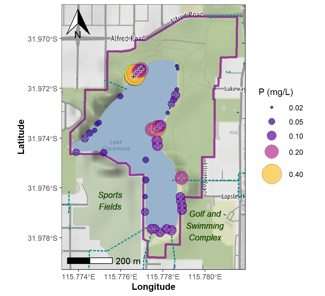
Figure 8: Site Plan map for Lake Claremont made using
ggplot2 and ggmap, showing concentration of P
as area-proportional symbols. Samples for which total P concentration
exceed the stressor value (ANZECC/ARMCANZ 2000) are identified with +
symbols.
Notes on the ggplot Site Plan map code:
- some code features perform the same function as for trhe locality map in Figure 4
- to make a "bubble" plot we include
aes(size=P, fill=P)withingeom_sf(data=lcw24LL, ...) - we plot the symbols twice for the subset of data
where our variable (
P) exceeds the guideline concentration – this is to improve visibility, since the underlying symbol has a thicker line width (stroke) and contrasting semitransparent colour - we have done some careful matching of
scale_fill_viridis_c()andscale_size_continuous()so that we just get a single legend instead of one for size and one for fill colour
Site Plan map with concentration classes
The alternative to area-proportional bubbles is to plot data on a map using different symbols which represent statistical classes of the data (Reimann et al., 2008, Chapter 5). The classes may be based on percentiles, but we think a better option is to use the thresholds defined by Tukey box plots, since this can identify potential outliers – the upper outliers in particular are interesting as these may represent contamination.
We do this by adding a new factor column to our data using the
cut() function, with the breaks for cut()
defined using the boxplot.stats() function.
Some other things to note about the code:
We use the water quality guidelines read previously to plot points exceeding the relevant guideline –
wqg["As","GV95"]is the arsenic concentration allowing 95% species protection (Water Quality Australia, 2024)The legend reverses the order of symbols, labels, etc. so we can have the higher concentrations at the top (this is probably more intuitive)
par(mar=c(3,3,1.3,1.2), oma=c(0,0,0,0), mgp=c(1.6,0.2,0), tcl=-0.2,
    font.lab=2, lend="square")
plot(st_coordinates(LC_site), asp=1, type="n", xaxs="i", yaxs="i", cex.axis=0.8,
     xlab="Easting (UTM Zone 50, m)", ylab="Northing (UTM Zone 50, m)")
plot_tiles(LC_siteMap, add=TRUE) ; box()
addscalebar(plotepsg=32750, htin=0.125, label.cex=1.1)
addnortharrow(pos="topleft", scale=0.85)
plot(Claremont_drains[2], add=T, type="l", col=4, lwd=1.5, lty=3)
shadowtext(c(384450), c(6462180), labels=c("Rehabilitated bushland"),
           bg=11, col=6, srt=30, cex=0.9)
shadowtext(c(384300,384650,384680), c(6461500,6461850,6461440),
  labels=c("Scotch College\nsports fields","Grassed\nParkland", "Golf\ncourse"),
  bg=11, col=c(14,6,6), font=3, cex=0.9)
data0 <- st_drop_geometry(na.omit(lcw24[,c("Easting","Northing","As")]))
data0[which(data0$As<=0),"As"] <- NA
b0 <- boxplot.stats(data0$As)$stats # extract just the boxplot thresholds
data0$q0 <- cut(data0$As, # new factor based on boxplot statistics
                breaks=c(-1,b0,999999),
                labels=c("lowOutliers","lowWhisk","Q1-median",
                         "median-Q3","upperWhisk","upperOutliers"))
# points with different symbol shape/size/colour depending on factor level
with(data0,
     points(Easting, Northing, pch=c(25,25,22,22,24,24)[q0],
            bg=plasma(6, end=0.7, alpha=0.5)[q0],
            cex=seq(0.7,2.8,0.4)[q0])
     )
trigger <- ifelse(!is.na(c), wqg["As","GV95"], NA) # guideline value

with(data0[which(data0$As>trigger),], # use just the points exceeding guideline
     points(Easting, Northing, pch=21,
            lwd=1.5, col="#ffffffc0", bg="#ff0000c0")
)
legend("topright", inset=0.002, bg="#ffffffc0", box.col=12, cex=0.85,
       legend=c(paste(rev(levels(data0$q0)),
                    c(paste0(">",b0[5]),
                      paste0(b0[4],"-",b0[5]),
                      paste0(b0[3],"-",b0[4]),
                      paste0(b0[2],"-",b0[3]),
                      paste0(b0[1],"-",b0[2]),
                      paste0("<",b0[1]))),
                paste0("Exceeds trigger (",trigger,")")),
       pch=c(24,24,22,22,25,25,21), pt.cex=c(seq(2.7,0.7,-0.4,),1),
       col=c(rep(1,6),"#ffffffc0"), pt.lwd=c(rep(1,6),1.5),
       pt.bg=c(plasma(6, dir=-1, end=0.7, alpha=0.5),"#ff0000c0"),
       title = expression(bold("As (mg/L)")), y.intersp=1.25)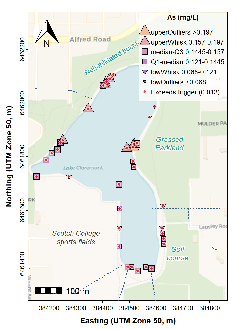
Figure 9: Site Plan map made with georeferenced tiles obtained with
maptiles, with prettymapr north arrow and
scale bar, and stormwater drains. Phosphorus concentrations in water are
shown in ranges defined by Tukey boxplot thresholds, with samples having
phosphorus concentrations exceeding the Water Quality Australia
guideline shown by red circle (○) symbols.
The map in Figure 9 shows that all of the water sampled in Lake Claremont had arsenic concentrations exceeding the guideline, with unusually high concentrations near the north-western and central eastern margins. We don't know the reason for high As concentrations, but it may be related to the historical use of the Lake Claremont basin for waste disposal by landfill (Simpson and Newsome, 2017).
References and R packages
ANZECC/ARMCANZ. (2000). Australian and New Zealand Guidelines for Fresh and Marine Water Quality (Volume 1, The guidelines). Australian and New Zealand Environment and Conservation Council, Agriculture and Resource Management Council of Australia and New Zealand https://www.waterquality.gov.au/sites/default/files/documents/anzecc-armcanz-2000-guidelines-vol1.pdf – see Table 3.3.6.
Dunnington, Dewey (2017). prettymapr: Scale Bar,
North Arrow, and Pretty Margins in R. R package version 0.2.2. https://CRAN.R-project.org/package=prettymapr.
Dunnington, D. (2023). ggspatial: Spatial Data
Framework for ggplot2. R package version 1.1.9, https://CRAN.R-project.org/package=ggspatial.
DWER (2021). Assessment and management of contaminated sites. Department of Water and Environment Regulation, Government of Western Australia, Joondalup. https://www.wa.gov.au/system/files/2023-05/guideline-assessment-and-management-of-contaminated-sites.pdf.
Giraud T (2021). maptiles: Download and Display Map
Tiles. R package version 0.3.0, https://CRAN.R-project.org/package=maptiles.
Garnier S, Ross N, Rudis R, Camargo AP, Sciaini M, Scherer C (2024).
viridis(Lite) - Colorblind-Friendly Color Maps for
R. viridis package version 0.6.5. https://sjmgarnier.github.io/viridis/.
Kahle, D. and Wickham, H. ggmap: Spatial Visualization
with ggplot2. The R Journal,
5(1), 144-161. http://journal.r-project.org/archive/2013-1/kahle-wickham.pdf.
NEPC (National Environment Protection Council). (2011). Schedule B2: Guideline on Site Characterisation, National Environment Protection (Assessment of Site Contamination) Measure (Amended). Commonwealth of Australia, Canberra. https://www.nepc.gov.au/.../schedule-b2-guideline-site-characterisation-sep10.pdf.
Pebesma, E., 2018. Simple Features for R: Standardized Support for
Spatial VectorData. The R Journal 10 (1),
439-446, https://doi.org/10.32614/RJ-2018-009 . (package
sf)
Reimann, C., Filzmoser, P., Garrett, R. G., & Dutter, R. (2008). Statistical Data Analysis Explained: Applied Environmental Statistics with R (First ed.). John Wiley & Sons, Chichester, UK.
Simpson, G., & Newsome, D. (2017). Environmental history of an urban wetland: from degraded colonial resource to nature conservation area. Geo: Geography and Environment, 4(1), e00030 https://doi.org/10.1002/geo2.30
Water Quality Australia. (2024). Search for toxicant default guideline values for the protection of aquatic ecosystems. Department of Climate Change, Energy, the Environment and Water, Government of Australia. https://www.waterquality.gov.au/anz-guidelines/guideline-values/default/water-quality-toxicants/search.
Wickham, H. (2016). ggplot2: Elegant Graphics for
Data Analysis. Springer-Verlag New York, 2016. https://ggplot2.tidyverse.org.
For UWA students
Activities for this Workshop class
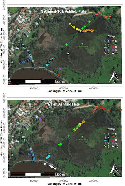 There are a few items available on
the UWA LMS as learning materials for this session on
using R + packages to make maps: two short videos, and
two annotated pdfs based on
- the R code and
- a PowerPoint presentation.
We suggest going through the first video first, and then trying the code, and finally viewing the second video and trying some different things. The material in the PowerPoint presentation on interpolation of point data is completely optional.
For activities today we suggest:- Try to make a map of our field site area which covers all our sample locations. A good place to start after watching the video/reading the annotated code PDF would be with modifying and running the R code.
Good luck!
Bonus material
(Currently on another Github site)
![]() R
code to use georeferenced images (e.g. from NearMap) as map
backgrounds
R
code to use georeferenced images (e.g. from NearMap) as map
backgrounds
![]() Digitising
map features from Google Earth, and R code for a function to convert
Google Earth .kml files for use in R
Digitising
map features from Google Earth, and R code for a function to convert
Google Earth .kml files for use in R
Advanced
Spatial Analysis (spatial autocorrelation, variograms, and kriging
interpolations)
(Currently on UWA LMS, so you will need to be logged in)
CC-BY-SA • All content by Ratey-AtUWA. My employer does not necessarily know about or endorse the content of this website.
Created with rmarkdown in RStudio. Currently using the free yeti theme from Bootswatch.