 Material to support teaching in Environmental Science at The University of Western Australia
Units ENVT3361, ENVT4461, and ENVT5503
RStudio graphics and plotting
The ggplot version
Andrew Rate
2025-12-05
Suggested Activities
Using data previously provided (on LMS)
and the ggplot2 R package, produce presentation quality
graphs of:
-
Different probability
distributions
- Cumulative distribution function, histogram, Q-Q plot
-
Scatterplots
- Grouped by one or more factors
- Histogram, Q-Q plot, Boxplot
-
A scatterplot matrix
require(car) »» scatterplotMatrix() - (grouped by one or more factors)
- Apply principles of graphical excellence
More basic information on plots in R
This is a complement to the other preliminary material on
R graphics with a focus on using the
ggplot2 package. We have tried to avoid
too much overlap with other sessions.
For the videos and other materials, you can visit
the UWA LMS page for the unit you're enrolled in. Or, go to the base-R graphics page if you're not interested in
using ggplot2.
Graphical Excellence
In Environmental Science at UWA we try to promote the principles of "graphical excellence". This means:
- Show the data – that is, the data are the important thing we want to communicate in graphics; "looking good" is only useful if it shows the data better!.
- Give your viewer the greatest number of ideas in the shortest time with the least ink in the smallest space (Tufte, 1983)1
- Graphical excellence is
- almost always multivariate...
- ...requires telling the truth about the data (no distortions, fair comparisons, etc.).
Some practical tips:
- Increase the default text and symbol sizes
- Remove unnecessary lines (e.g.
smooth,spreadincar::scatterplot()) - In RStudio, use the Export▾ button » Copy to clipboard » select ◉Metafile (best pasting into Word, etc.)
- Don't use screen shots, and avoid
.jpgfiles, as both can be blurry or grainy - Graph plus caption should be self-contained – we should only need to refer to these to fully understand the graph
- Don't include a title above the plot (in many
R plots, use the option
main="") – any information describing the plot should be in the caption - Transform axes if necessary (using arguments in R plotting functions)
- Use appropriate proportions (width/height) for the plot you are creating
- Change the default colour palette to a colourblind-friendly palette,
e.g. from the R packages
viridisorscico(see examples for viridis here and for scico here)
1 Tufte, E.R., 1983. The visual display of quantitative information. Graphics Press, Cheshire, Connecticut, USA.
Getting started
Before we start we load some packages (which we need to have installed previously). We also need to load a dataset that we may have seen before (the Smith's Lake & Charles Veryard Reserves data from 2017 – we use it a lot for illustrating environmental statistics and plotting – the code below reads it directly from github).
library(ggplot2)  # the plotting package used in this page
library(viridis)  # colourblind-friendly colour palettes
library(scico)    # 'scientific' colour palettes
git <- "https://github.com/Ratey-AtUWA/Learn-R-web/raw/main/"
sv2017 <- read.csv(file=paste0(git,"sv2017_original.csv"), stringsAsFactors = TRUE)
sv2017$Group <- as.factor(sv2017$Group)
The components of a ggplot plot
With any plot using ggplot, we add layers or properties
to the plot with successive functions; each layer needs the preceding
line to finish with +. The data to plot is controlled by
options in the initial ggplot() function, particularly
data= and aes(). The type of plot is
controlled by different geom_... functions, as in the
example below (Figure 1).
ggplot(data=sv2017, mapping=aes(x=pH, y=Ca, col=Type, shape=Type)) +
  geom_point(size=2.2) +
  scale_y_log10() +
  scale_color_viridis_d(option="inferno", end=0.55) +
  stat_ellipse(level=0.95) +
  theme_bw()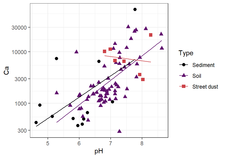
Figure 1: X-Y (scatter) plot of calcium (Ca) vs. pH for different sample
types from Smith's Lake and Charles Veryards Reserves in 2017
(sv2017), showing regression lines by Type.
In Figure 1, we use the ggplot2 package to:
- specify the data to be plotted in the
ggplot()function, including- a data frame with the
data=option - which variables control the location and appearance of points with
the options in
mapping=aes(...)
(aesis short for “aesthetic”)
- a data frame with the
- make an xy-plot layer using the
geom_point()function - log10-transform the y-axis scale using
scale_y_log10() - use a custom palette by including
scale_color_viridis_d() - add a layer of data ellipses using
stat_ellipse() - style the plot using the non-default
theme_bw()
We will cover these concepts in the examples to follow.
Customising ggplot2 features
In contrast with base-R plotting, we don't use the
par() function to control any plotting features. One of the
ideas of ggplot2 is to produce plots which look good
without customisation – but we still often need to “tweak” the output.
Actually, we have done this with Figure 1 above already.
In the plots that follow, our "default setting" will be to use the
theme_bw() theme to set the plot appearance. Otherwise we
will build on the usual ggplot2 default settings. The most
basic plot is in Figure 2.
1. Using xy-plot (geom_point) to explore ways
of changing plot features
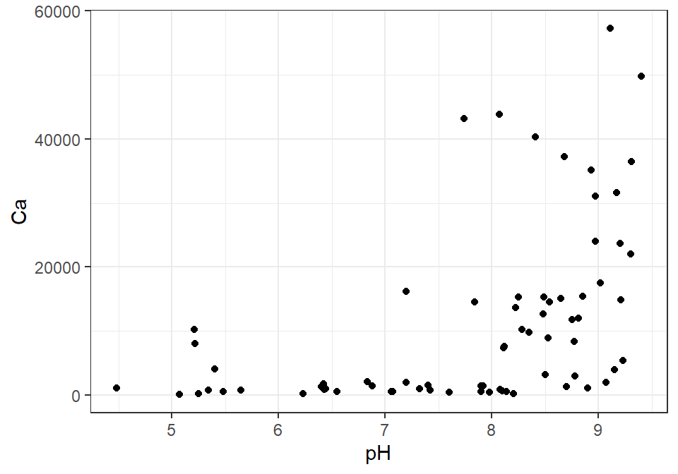
Figure 2: Default ggplot of Ca vs. pH.
2. Resizing axis labels in ggplot2
For many plot features in ggplot2 we need to customise
the plot theme. An axis label is referred to as an
axis.title in ggplot2. The
resized (and recoloured) axis titles are shown in Figure 3.
ggplot(data=sv2017, mapping=aes(x=pH, y=Ca)) +
    geom_point() +
theme_bw() +
theme(axis.title = element_text(size=18, colour="red2")) # size in points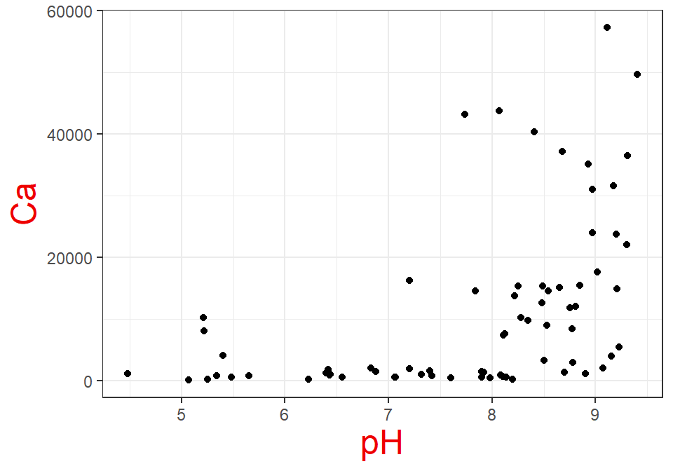
Figure 3: Plot of Ca vs. pH using ggplot2, showing
how to resize axis labels (we've also made them a different colour to be
really obvious).
3. Resizing axis labels, tick labels, and symbol sizes in
ggplot2
To get the larger symbol sizes shown in Figure 4, we have included
size=2.5 in geom_point(),
outside aes() so it applies to all
symbols.
ggplot(data=sv2017, mapping=aes(x=pH, y=Ca)) +
  geom_point(size=2.5) + # default size = 1.5
  theme_bw() +
  theme(axis.title = element_text(size=18), # axis.title is axis label
        axis.text = element_text(size=16)) # axis.text is the tick labels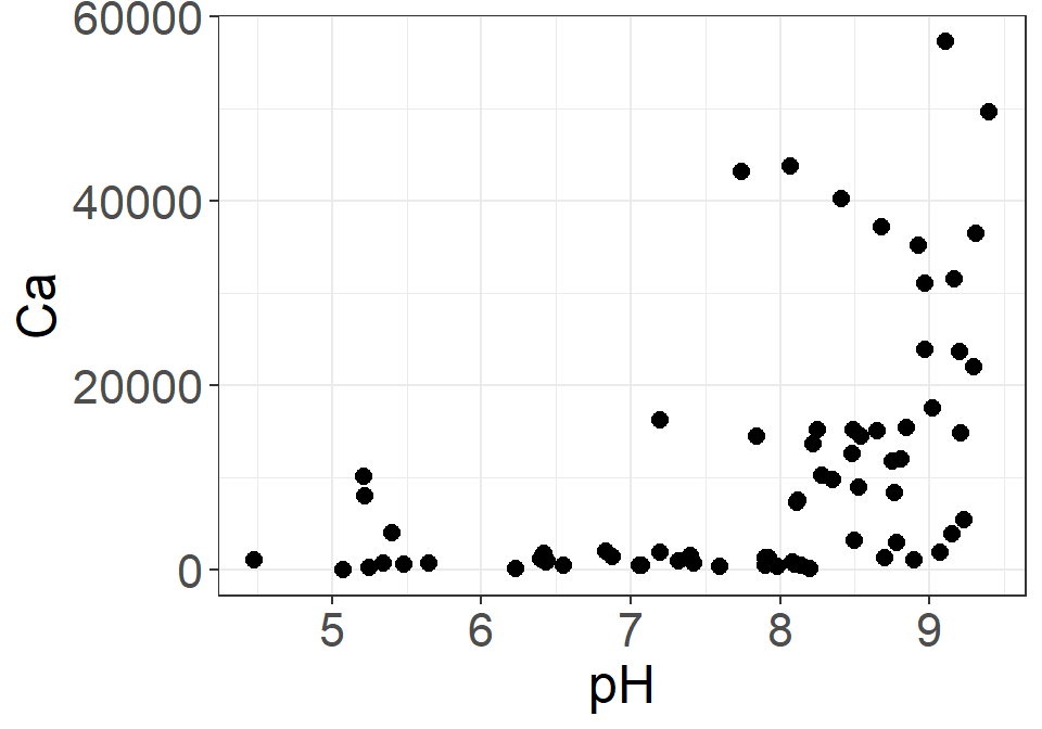
Figure 4: Plot of Ca vs. pH using ggplot2, showing
how to resize axis labels (and symbol sizes).
4. Transforming plot axes in ggplot2
To log10-transform axis scales in ggplot2
(Figure 5) we add a statement using the scale_x_log10()
and/or the scale_y_log10() functions. There are several
different types of scaling function available, e.g.,
scale_x_sqrt(), scale_y_reverse().
ggplot(data=sv2017, mapping=aes(x=pH, y=Ca)) +
  geom_point(colour="dodgerblue") + # changing the default symbol colour too!
  scale_y_log10() +
  theme_bw() +
  theme(axis.title = element_text(face="bold")) # # axis.title is axis label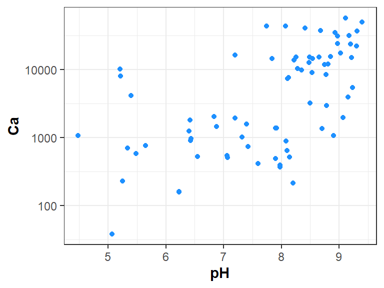
Figure 5: Plot of Ca vs. pH using ggplot2, showing
how to log10-transform an axis scale.
5. Plots in ggplot2 which show grouping by factor
levels
To group points or other plot features by a factor, we need to
associate that factor with the property we want to change (e.g.
colour, shape, size) in the
aes() statement. In Figure 6 below, we plot zinc (Zn)
vs. iron (Fe), showing points in different sample types by
including colour=Type, shape=Type in the aes()
statement.
If we associate a variable with size, we can create a
bubble plot – this is useful for making distribution maps of variables. Try it!
ggplot(data=sv2017, mapping=aes(x=Fe, y=Zn, colour=Type, shape=Type)) +
  geom_point() +
  scale_x_log10() + scale_y_log10() +
  theme_bw() +
  theme(axis.title = element_text(face="bold"))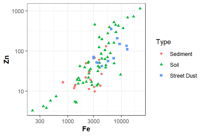
Figure 6: Plot of Zn vs. Fe using ggplot2, showing
how to separate points into different groups based on factor levels.
Plot symbols
R has a set of 26 built-in plotting symbols which
can be specified using the shape = argument in many
ggplot2 functions.
In base-R, the
outline colour is set for symbols 0-20 using the argument
col =. For symbols 21-25 col = sets the border
colour, and the fill colour is set with bg =.
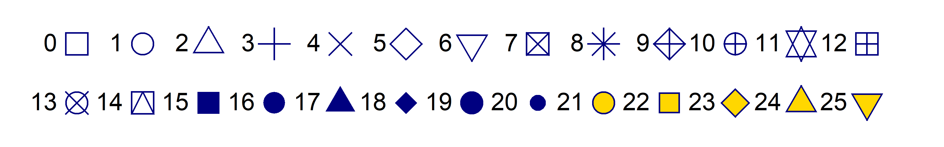
col="navy" and for pch 21-25
bg="gold".
6. Using custom colours in ggplot2
If we're not happy with the default colours, there are many different
ways to customise plot colours in ggplot2. The statements
needed are all of the type scale_color_xxxxx(), depending
on what type of colour scale or palette is needed.
The code for the plot in Figure 7 uses
scale_color_manual to specify custom colours for the
points. If we didn't include enough colours for the levels in the factor
(i.e. 3 levels in Type), we would get an error
message.
ggplot(data=sv2017, mapping=aes(x=Fe, y=Zn, colour=Type, shape=Type)) +
  geom_point(size=2) +
  scale_color_manual(values=c("darkred","gold3","royalblue")) +
  scale_x_log10() + scale_y_log10() +
  theme_bw() +
  theme(axis.title = element_text(face="bold"))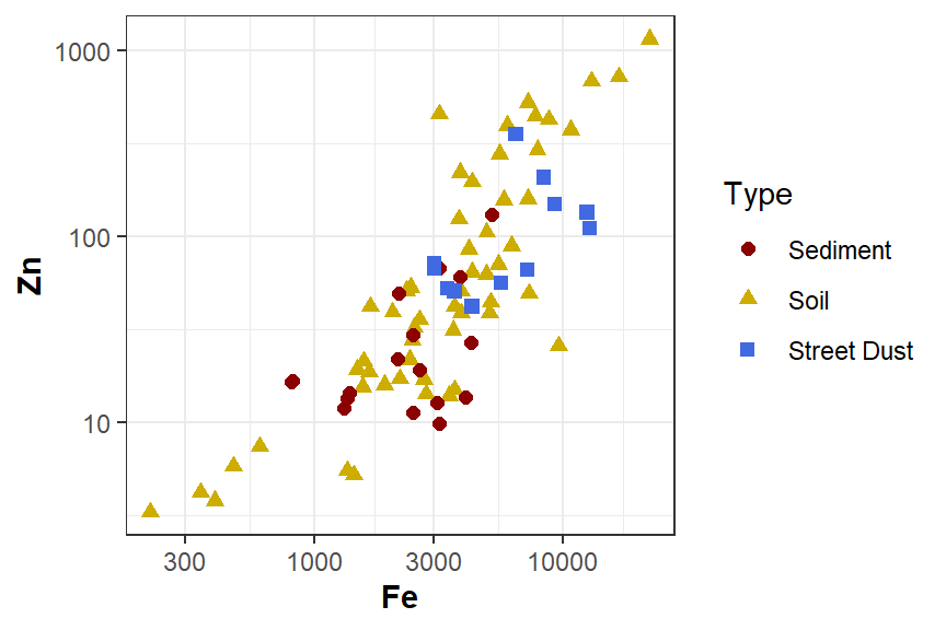
Figure 7: Plot of Zn vs. Fe using ggplot2, showing
how to separate points into different groups based on factor levels and
define custom colours.
Colours in R
The palette() function needs a vector of colour names or
codes, which we can then refer to by numbers in subsequent functions.
R has over 600 built-in colours, some with nifty names
like "burlywood",
"dodgerblue",
and "thistle"
– to see these, run the function colors() or run
demo("colors").
Colour codes are a character string with 6 or 8 digits or letters
after the # symbol, like "#A1B2C3". In the
6-digit version (the most common), the first 2 characters after
# are a hexadecimal number specifying the intensity of the
red component
of the colour, the next 2 specify green , and the next 2 blue . #rrggbb
The greatest 2-digit hexadecimal number is FF, equal to
the decimal number 255. Since we can include zero, this means there will
be 2563 = 16,777,216 unique colours in
R.
Optionally we can use an 8-character colour code, such as
"#A1B2C399", where the last 2 characters define the
alpha value, or colour transparency.
"#rrggbb00" would be fully transparent, and
"#rrggbbFF" would be fully opaque. We can also use the
colour name "transparent" in R which can
sometimes be useful.
Warning:
semi-transparent colours (i.e. alpha < 1; anything other
than "#rrggbb" or "#rrggbbFF") are not
supported by metafiles in R. To use semi-transparent colours, save as
.png or .tiff, or copy as a bitmap.
(Some of this information refers to
base-R, but can also be useful for fine-tuning colours
using ggplot2.)
7. Adding a regression (“best fit”) line
Sometimes adding a regression line is useful to confirm trends (in a
later session we'll cover linear regression in more detail). We use the
function geom_smooth(method="lm") in ggplot to
add a regression line (Figure 8):
ggplot(data=sv2017, aes(x= Fe, y = Zn)) +
  geom_point() +
  geom_smooth(method="lm") +
  labs(x="Fe (mg/kg)", y="Zn (mg/kg)") +
  scale_x_log10() + scale_y_log10() +
  theme_bw() +
  theme(axis.title = element_text(face="bold"))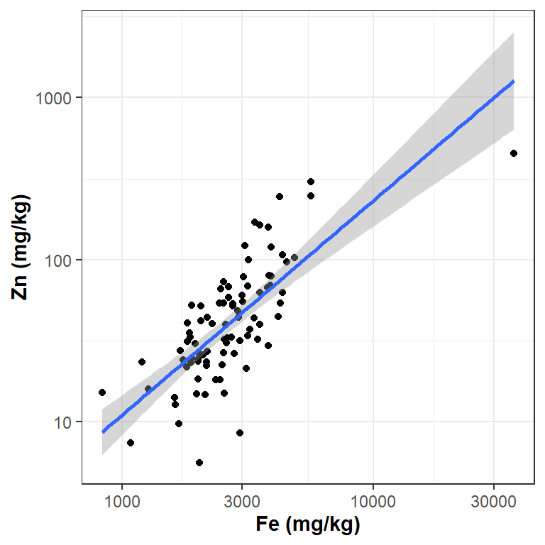
Figure 8: Plot of Zn vs. Fe, with no grouping and an added regression line.
The grey shaded area around the regression line in Figure 8 is the 95% confidence interval, which is included by default.
We can also include trend lines for grouped scatterplots (Figure 9):
ggplot(data=sv2017, aes(x=Fe, y=Zn, colour=Type, shape=Type)) +
  geom_point(size=2.5) +
  geom_smooth(method="lm") +
  labs(x="Fe (mg/kg)", y="Zn (mg/kg)") +
  scale_x_log10() + scale_y_log10() +
  theme_bw() +
  theme(axis.title = element_text(face="bold"))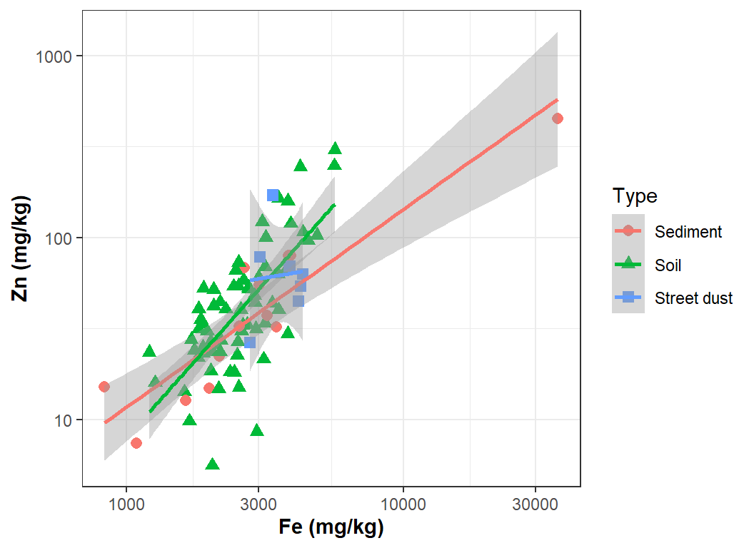
Figure 9: Plot of Zn vs. Fe, with added regression lines for data grouped by a sample Type.
8. Multiple-frame plots in ggplot2
If we want to plot multiple plots on a page, we can't do this in
ggplot2 using the mfrow argument in
par().
Instead, we would need to use another R package in
the gg family called ggpubr, which has the
ggarrange function allowing multiple ggplots on the same
page. An example is shown in Figure 10.
library(ggpubr)
scatter <- ggplot(data=sv2017, mapping=aes(x=Al, y=Fe)) + scale_x_log10() +
  scale_y_log10() + geom_point()
boxes <- ggplot(data=sv2017, mapping = aes(x=Type, y=Fe)) + scale_y_log10() +
  geom_boxplot()
histo <- ggplot(data=sv2017, mapping=aes(x=Al)) + geom_histogram()
ggarrange(scatter, boxes, histo, nrow=1)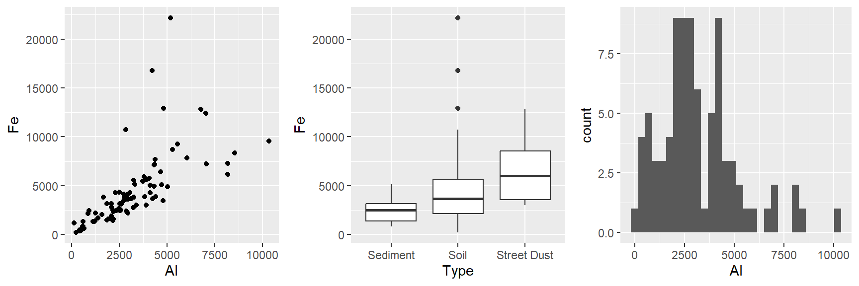
Figure 10: Example of multiple ggplot2 plots per frame
using ggarrange() from the ggpubr package.
Histogram with density line
Adding a density line to a histogram like the one in Figure 11 can help us identify bimodal distributions, or see more easily if the distribution is symmetrical or not.
We use geom_histogram(), including the option
mapping = aes(y=after_stat(density)) so that the y-axis
scale is changed from frequency to density (~ relative frequency).
ggh <- ggplot(data = sv2017, mapping = aes(x=log10(EC))) +
  geom_histogram(mapping=aes(y = after_stat(density)),
                 fill="lightgray", color="black", linewidth=0.3,
                 binwidth = 0.1, boundary=0) +
  theme_bw()
ggh + geom_density(col="blue3")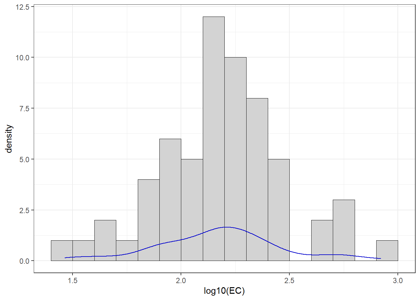
Figure 11: Histogram of EC from the sv2017 data with density line plot added.
Boxplot by groups
We also made a grouped box plot like the one in Figure 12 in a previous session.
# make an object containing a table of means
Cu_means <- data.frame(meanCu=tapply(log10(sv2017$Cu), sv2017$Type, mean, na.rm=T))
# plot the boxplot with nice axis titles etc.
ggbx <- ggplot(data=sv2017, mapping = aes(x=Type, y=log10(Cu))) +
  geom_boxplot(fill="seashell",staplewidth = 0.2)
ggbx <- ggbx + geom_point(data=Cu_means, mapping=aes(x=c(1:nrow(Cu_means)),
                  y=meanCu), shape=3, size=2.5, col="royalblue", stroke=1.5)
ggbx + geom_hline(yintercept = log10(65), col="red3",size=0.3,
                  linetype="dashed") +
  labs(y=expression(paste("log"[10],"(Cu)"))) +
  annotate("text", x=2.9, y = log10(65), label = "Sediment DGV Cu 65 mg/kg",
           vjust = -0.5, col="red3", size=3) +
  annotate("text", x=2.2, y=0.4, label = "+",
           hjust = 0, col="royalblue", size=6.5) +
  annotate("text", x=2.2, y=0.4, label = " \u00a0 \u00a0 Mean Cu concentrations",
           hjust = 0, col="royalblue", size=3.5) +
  theme_bw()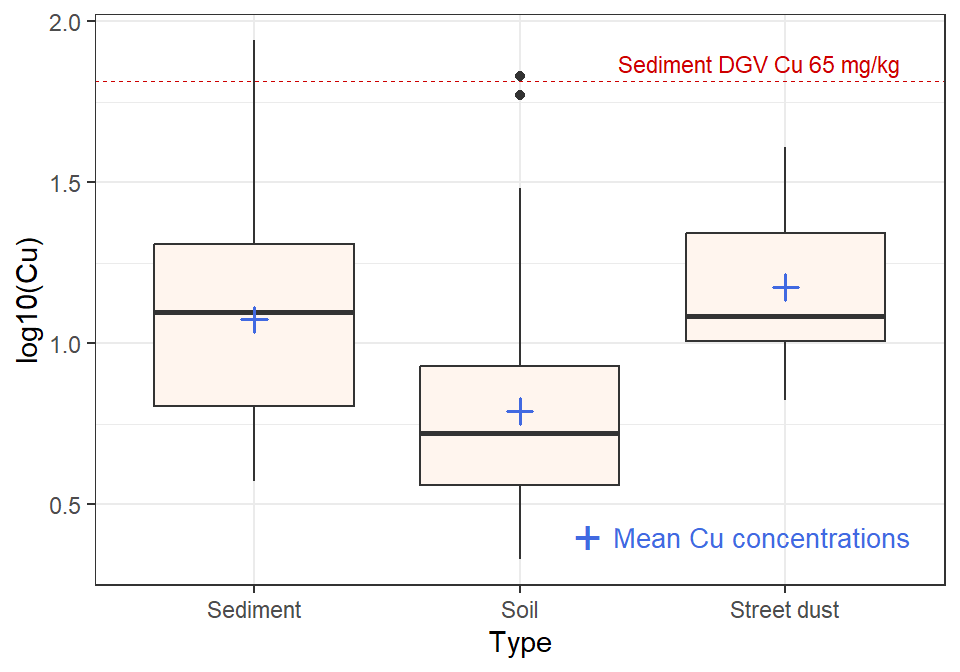
Figure 12: Boxplot of Cu by Type created using ggplot2,
showing mean values as blue plus (+) This version is drawn to resemble a
base-R plot.
The default box plots made with 'geom_boxplot()' in
ggplot (e.g. Figure 13) don't have caps
(“staples”) on the lines above and below the interquartile range
box.
# make an object containing a table of means
Cu_means <- data.frame(meanCu=tapply(log10(sv2017$Cu), sv2017$Type, mean, na.rm=T))
# plot the boxplot with nice axis titles etc.
cols <- c("Mean"="royalblue", "DGV"="red3")
lineTypes <- c("DGV"=2)
ggplot(data=sv2017, mapping = aes(x=Type, y=log10(Cu))) +
  geom_boxplot(fill="seashell", shape=1) +
  labs(y=expression(paste(log[10],"[Cu]"))) +
  geom_point(data=Cu_means, mapping=aes(x=c(1:nrow(Cu_means)),
                  y=meanCu, col="Mean"), shape=3, size=2.5, stroke=1) +
  geom_hline(yintercept = log10(65), col="red3", size=0.3,
                  linetype=2) +
  scale_color_manual(name="", values=cols,
                     guide=guide_legend()) +
  annotate("text", x=2.9, y = log10(65), label = "Sediment DGV\nCu 65 mg/kg",
           vjust = 0.5, col="red3", size=3.5) +
  theme_bw()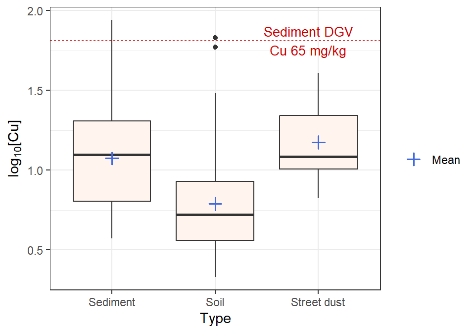
Figure 13: Boxplot of Cu by Type created using ggplot2,
showing mean values as blue plus (+) This version is drawn in a style
more closely resembling a ggplot2 style.
Scatterplot of water sample points by group
First read the water data (from Smith's Lake, North Perth, sampled in
2018). We convert to a spatial object to use the geom_sf()
function in ggplot2, as this makes the most sense for these
data (we need to load the sf package first).
SL_water <- read.csv(file=paste0(git, "SL18.csv"), stringsAsFactors = TRUE)
SL_water$Group <- as.factor(SL_water$Group)
library(sf)
SL_water_sf <- sf::st_as_sf(SL_water, coords=c("Easting","Northing"),
                            remove=FALSE, crs=sf::st_crs(32750))
We can then use geom_sf() from the ggplot2
package to plot the points. Other important statements in the
ggplot2 code in this example (Figure 14) are:
- use
fill=Groupinstead ofcolor=Groupsince we are using fillable symbols (numbers 21-25, see Plot symbols section above) coord_sf(...)to use UTM Zone 50S coordinates (otherwisegeom_sf()will convert to Longitude-Latitude)scale_shape_manual(...)to manually set which plot symbols we want (otherwise some groups will be omitted byggplot2)scale_x_continuous(...)to ‘declutter’ the x-axis labelsannotate(...)to add text labelsscale_color_viridis_d()to choose our colour palettetheme_bw()to use a plot theme other than theggplot2default
ggplot(data=SL_water_sf,
       mapping=aes(x=Easting, y=Northing, fill=Group, shape=Group)) +
  geom_sf(size=2.5) + # set symbol size and outline width
  coord_sf(datum=st_crs(32750)) +
  scale_shape_manual(values=c(21:25,21:24)) +
  scale_x_continuous(breaks=seq(391325,391450,25)) +
  annotate("text", x=c(391385,391390), y = c(6466515,6466403),
           label = c("Inlet","Outlet"),
           vjust = 0.5, col="steelblue4", size=3.5) +
  scale_fill_viridis_d(alpha=0.8) + theme_bw()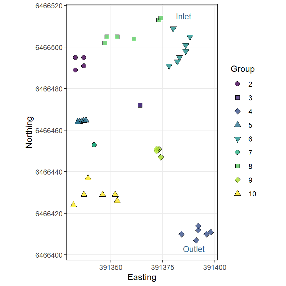
Figure 14: Map-style plot of water sampling points in Smith's Lake in 2018.
"...when we look at the graphs of rising ocean temperatures, rising carbon dioxide in the atmosphere and so on, we know that they are climbing far more steeply than can be accounted for by the natural oscillation of the weather ... What people (must) do is to change their behavior and their attitudes ... If we do care about our grandchildren then we have to do something, and we have to demand that our governments do something."
— David Attenborough
Plots of variable distributions
Cumulative Distribution Function using plot.ecdf(). The
custom y-axis label explains the plot in Figure 15!
(note
use of \u to insert a Unicode character by its 4-digit code
[Unicode character 2264 is 'less than or equal to' (≤)] )
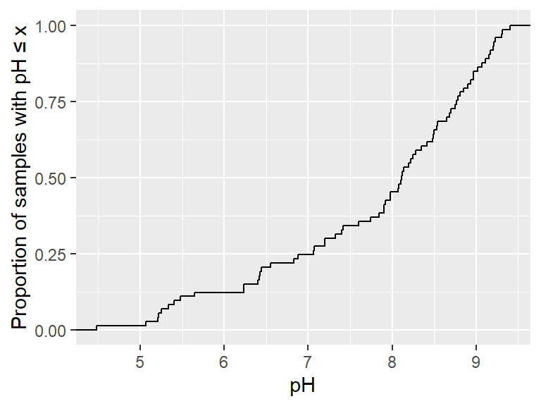
Figure 15: Cumulative distribution of pH in the sv2017 dataset.
A better cumulative plot is the normal quantile or 'q-q' plot (Figure
16). Specially transformed axes mean that a normally distributed
variable will plot as a straight line. We use geom_qq() to
add the points and geom_qq_line() to show the theoretical
line for a normal distribution.
ggplot(data=sv2017, aes(sample=pH)) + geom_qq() + geom_qq_line() +
  labs(x="Theoretical normal distribution quantiles", y="pH") + theme_bw()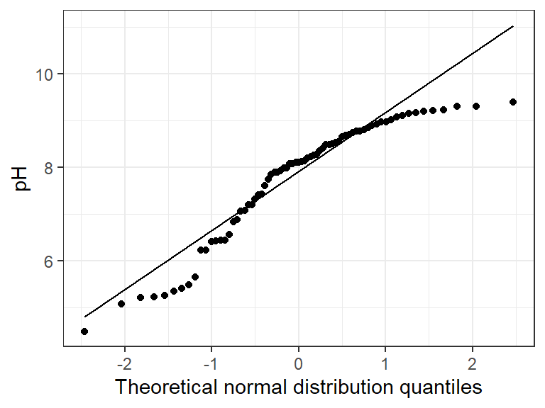
Figure 16: Normal quantile (QQ) plot of soil pH in the sv2017 dataset.
We can group q-q–plots by a factor:
ggplot(data=sv2017, aes(sample=pH, col=Type)) + geom_qq() + geom_qq_line() +
  labs(x="Theoretical normal distribution quantiles",
       y="pH") + theme_bw()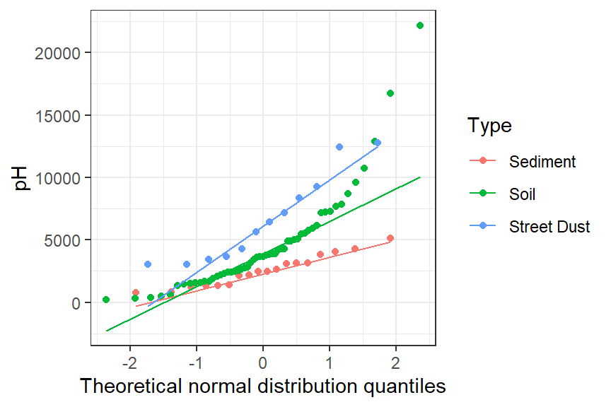
Figure 17: Normal quantile (QQ) plots of soil pH for different sample types in the sv2017 dataset.
Here's another customization of histograms – we've seen these in a previous Workshop. Adding a reference concentration like that we see in Figure 18 shows what proportion of samples have concentrations exceeding this value (or not).
ggplot(data=sv2017, aes(x=log10(Zn))) +
  geom_histogram(fill="lightgray", color="black", linewidth=0.3,
                 binwidth = 0.2, boundary=0) +
  labs(x = expression(paste(log[10],"Zn")), y = "Frequency") +
  geom_vline(xintercept = log10(410), col="red3", size=0.3,
                  linetype="dashed") +
  annotate("text", x=log10(400), y = 15, label = "Sediment DGV\nZn 410 mg/kg",
           hjust = 1, col="red3", size=3) +
  theme_classic()
## Warning: Removed 7 rows containing non-finite outside the scale range (`stat_bin()`).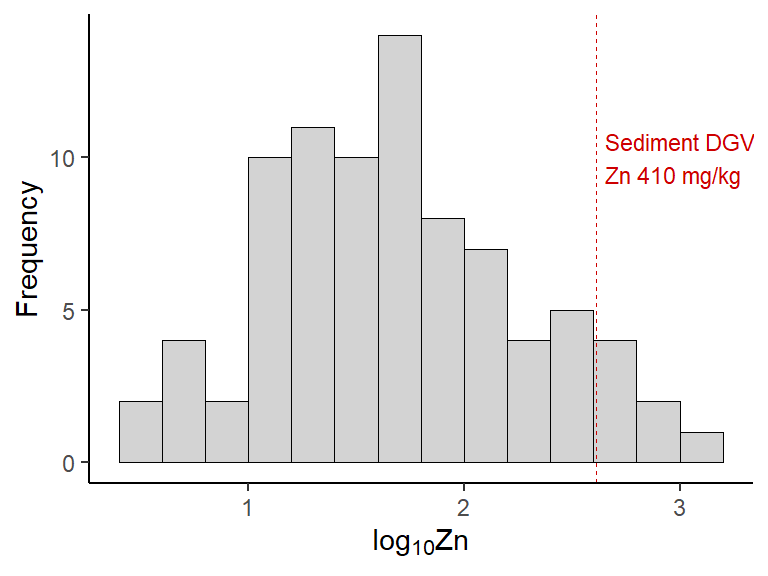
Figure 18: Histogram of Zn in the sv2017 data with a vertical line representing an environmental threshold.
Depth profile scatter plots in ggplot2
First we read some more data which includes depth as a variable:
sv18 <- read.csv(paste0(git, "sv18.csv"), stringsAsFactors = TRUE)
sv18$Group <- as.factor(sv18$Group)
In the plot in Figure 19, we show one way to informatively plot a concentration vs. sediment/soil depth, with depth displayed vertically, and increasing downwards, as we would expect in the real world. Note:
x=Fe, y=Depth.meanto have our dependent variable (Fe) on the x-axiscol=Group, fill=Groupto have colours and symbols differ by group- use of the
scico 'lajolla'palette for nice soil-y colours! scale_shape_manual(values=c(21:25,21:24))filled plot symbols are 21-25scale_y_reverse()so depth increases downwardsscale_x_continuous(position="top")gets the x-axis on the top
par(lend="square")
sv18$Depth.mean <- (sv18$Depth_upper+sv18$Depth_lower)/2
ggplot(data=sv18, mapping=aes(x=Fe, y=Depth.mean)) +
  labs(x="Fe (mg/kg)", y="Mean sample depth (cm)") +
  geom_point(aes(fill=Group, shape=Group), size=2.5, stroke=0.5) +
  scale_shape_manual(values=c(21:25,21:24)) +
  scale_fill_scico_d(palette = "lajolla", direction=-1, begin=0.2, end=0.9) +
  scale_y_reverse(limits=c(100,0)) +
  scale_x_continuous(position="top") +
  theme_bw() + theme(axis.title = element_text(face="bold"))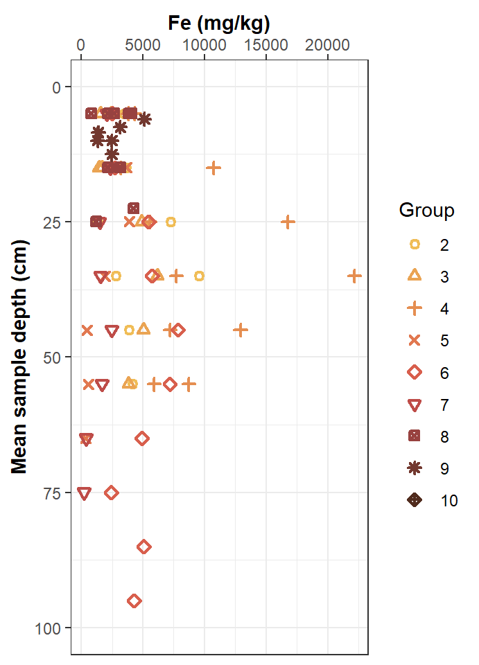
Figure 19: ‘Depth profile’ plots of Fe concentration vs. depth measurements in the sv18 data.
For more advanced options for plotting depth profiles in R, click this link.
Scatterplot matrices
A scatterplot matrix can be a very useful data exploration tool (for the most effective visualization, you might need to change the default colours).
Scatterplot matrices are available using the ggpairs()
function from the GGally package.
The most basic implementation is plotting without grouping by a
Factor variable. Note the different way in which the variables are
specified (i.e. including a vector of columns, in this example
columns = c("Al","Ca","Fe","S") – the vector can be of
column names or column indices/numbers).
A very useful feature of scatter plot matrices is the display of each
variable's distribution along the diagonal of the plot matrix.
In the example in Figure 20, we can see from the diagonal of density
plots that all variables have approximately symmetrical distributions
when log10-transformed). The scatter plot matrix drawn by
GGally::ggpairs() also includes another useful feature –
the correlation coefficients for each pair of variables in the upper
triangle of the matrix.
library(GGally)
ggpairs(sv2017, columns = c("Al","Ca","Fe","S")) +
  scale_x_log10() + scale_y_log10() + theme_bw()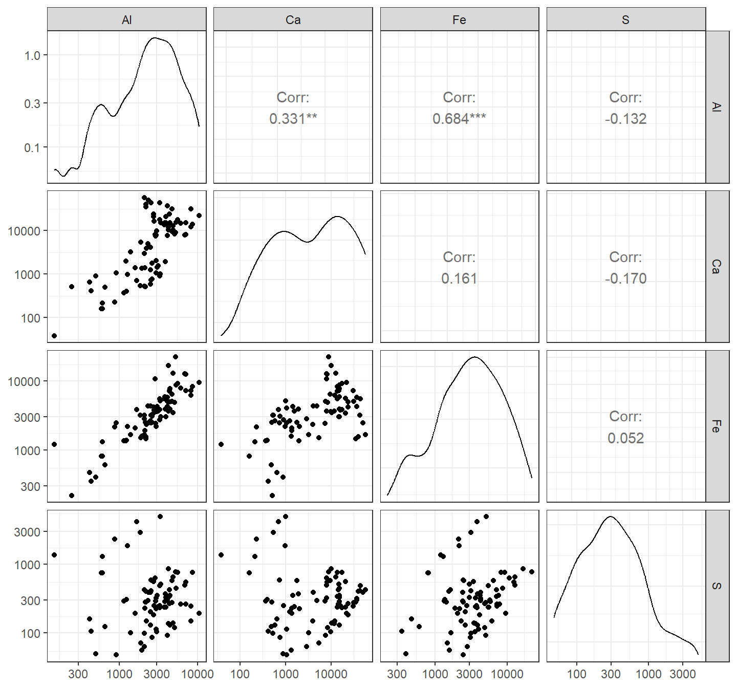
Figure 20: Scatter plot matrix of Al, Ca, Fe, and Na concentrations in sediment + soil + street dust samples from Smith's Lake and Charles Veryard Reserves, North Perth, WA, sampled in 2017. Note the log10-transformed axes.
To distinguish the points according to the categories in a Factor
variable, we (as usual) associate the factor with plot properties within
aes(...). We also see the distributions separated by group
along the diagonal, but this looks a bit weird (Figure 21),
unfortunately (probably because we used scale_?_log10() for
both x and y axes).
Separating the plots by a factor allows us to see if trends are
consistent between groups, or if groups behave very differently. [If you
don't want to bother with the viridis package to use the
plasma palette, use
scale_color_manual(values = c("#6A00A8", "#BF3984", "#F1844B"))
for the same result.]
ggpairs(sv2017, columns = c("Al","Ca","Fe","S"), aes(color=Type, shape=Type)) +
  scale_color_viridis_d(option="magma", begin=0.2, end=0.7) +
  scale_x_log10() + scale_y_log10() + theme_bw()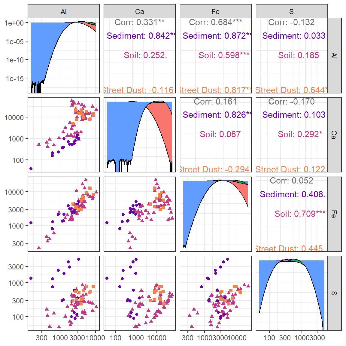
Figure 21: Scatter plot matrix of Al, Ca, Fe, and Na concentrations in samples from Smith's Lake and Charles Veryard Reserves, North Perth, WA, sampled in 2017 and grouped by sample type (sediment, soil, or street dust). Note the log10-transformed axes.
Simple maps

Maps are [mostly] just scatterplots with a map background – we will
spend a separate session on maps in R later
making use of the ggmap R package, which
has a lot in common with ggplot2 including use of
geom_sf().
References and R Packages
Garnier S, Ross N, Rudis R, Camargo AP, Sciaini M, Scherer C (2021).
Rvision - Colorblind-Friendly Color Maps for R. R package
version 0.6.2. https://sjmgarnier.github.io/viridis/
(viridis package).
Kahle, D. and Wickham, H. ggmap: Spatial Visualization
with ggplot2. The R Journal,
5(1), 144-161. http://journal.r-project.org/archive/2013-1/kahle-wickham.pdf.
Kassambara, A. (2020). ggpubr: ggplot2
Based Publication Ready Plots. R package version 0.4.0, https://CRAN.R-project.org/package=ggpubr.
Pebesma, E., 2018. Simple Features for R: Standardized Support for
Spatial VectorData. The R Journal 10 (1),
439-446, https://doi.org/10.32614/RJ-2018-009 . (package
sf)
Pedersen T, Crameri F (2023). scico: Colour Palettes Based on the Scientific Colour-Maps. R package version 1.4.0, https://CRAN.R-project.org/package=scico.
Schloerke B, Cook D, Larmarange J, Briatte F, Marbach M, Thoen E,
Elberg A, Crowley J (2021). GGally: Extension to
ggplot2. R package version 2.1.2, https://CRAN.R-project.org/package=GGally.
Wickham, H. (2016). ggplot2: Elegant Graphics for
Data Analysis. Springer-Verlag New York. https://ggplot2.tidyverse.org.
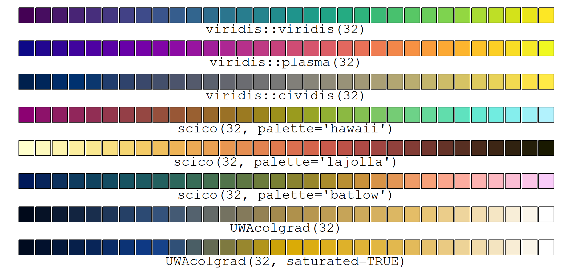
# first load and run code to make UWAcolgrad() function
# for help download the UWAcolgrad.R file itself and look inside!
source("https://github.com/Ratey-AtUWA/Learn-R/raw/main/UWAcolgrad.R")
np <- 32
par(mar=rep(0.5,4), xpd=TRUE)
plot(0:1, 0:1, ann=F, axes = F, type="n", ylim=c(-0.1,1))
points(seq(0,1,l=np),rep(1,np),pch=22,bg=viridis(np),cex=4)
text(0.5,0.98,labels=paste0("viridis::viridis(",np,")"),pos=1, cex=1.4, family="mono")
points(seq(0,1,l=np),rep(0.85,np),pch=22,bg=plasma(np),cex=4)
text(0.5,0.83,labels=paste0("viridis::plasma(",np,")"),pos=1, cex=1.4, family="mono")
points(seq(0,1,l=np),rep(0.7,np),pch=22,bg=cividis(np),cex=4)
text(0.5,0.68,labels=paste0("viridis::cividis(",np,")"),pos=1, cex=1.4, family="mono")
points(seq(0,1,l=np),rep(0.55,np),pch=22,bg=scico(np, palette = "hawaii"),cex=4)
text(0.5,0.53,labels=paste0("scico(",np,", palette='hawaii')"),pos=1, cex=1.4, family="mono")
points(seq(0,1,l=np),rep(0.4,np),pch=22,bg=scico(np, palette = "lajolla"),cex=4)
text(0.5,0.38,labels=paste0("scico(",np,", palette='lajolla')"),pos=1, cex=1.4, family="mono")
points(seq(0,1,l=np),rep(0.25,np),pch=22,bg=scico(np, palette = "batlow"),cex=4)
text(0.5,0.23,labels=paste0("scico(",np,", palette='batlow')"),pos=1, cex=1.4, family="mono")
points(seq(0,1,l=np),rep(0.1,np),pch=22,bg=UWAcolgrad(np),cex=4)
text(0.5,0.08,labels=paste0("UWAcolgrad(",np,")"),pos=1, cex=1.4, family="mono")
points(seq(0,1,l=np),rep(-0.05,np),pch=22,bg=UWAcolgrad(np, saturated = TRUE),cex=4)
text(0.5,-0.07,labels=paste0("UWAcolgrad(",np,", saturated=TRUE)"),pos=1, cex=1.4, family="mono")
CC-BY-SA • All content by Ratey-AtUWA. My employer does not necessarily know about or endorse the content of this website.
Created with rmarkdown in RStudio. Currently using the free yeti theme from Bootswatch.