 Material to support teaching in Environmental Science at The University of Western Australia
Units ENVT3361, ENVT4461, and ENVT5503
Spatial statistics in R
Global and local spatial autocorrelation
Andrew Rate
2025-12-09
Maps / spatial pages: Maps | Spatial statistics | Spatial interpolation
Introduction

When we have data with a spatial component, which environmental data usually do, an important spatial analysis is to investigate the effect of sample distance on environmental variables. This could be considered a test of “Tobler’s first law of geography” (Tobler, 2004), stating:
Everything is related to everything else,
but near things are more related than distant things.
Whether the values of an environmental variable are spatially related (or not) is expressed by the spatial autocorrelation or Moran’s I (Zhang et al. 2008). The Moran’s I statistic is based on comparison of the values of a variable at one point with neighbouring point – either a specified number of neighbours, or the neighbours within a specified distance. A positive Moran’s I autocorrelation suggests that locations with similar values of the variable considered tend to cluster together. A Moran’s I close to zero (no autocorrelation) suggests values of the variable considered are randomly located, and a larger negative Moran’s I suggests that similar values of the variable considered tend to be further apart than expected from a random spatial distribution. The null hypothesis for the Moran’s I statistic is that there is no spatial autocorrelation. Moran's I will vary with the number of neighbouring points in the calculation, with more points giving Moran's I values closer to zero (Kalogirou 2019).
Moran’s I is a global autocorrelation, across the whole spatial dataset being analysed. A local Moran’s I shows the extent of significant spatial clustering of similar values (of the variable considered) around each observation. We will look at both Global and Local Moran's I.
This Chapter will make simple maps with added data (see mapData.html if you haven't already), and help you to understand and analyse spatial autocorrelation using R.
We will use a subset of the National Geochemical Survey of Australia
(NGSA) data documented by Caritat and Cooper (2011) to illustrate the various
concepts and procedures involved. We supply data in .csv
files for importing into R.
In this Chapter we use a range of R packages for different functions, shown in Table 1.
Package | Purpose | Reference |
|---|---|---|
sf | Spatial data handling, formatting, and storing spatial data | Pebesma (2018) |
gstat | Geostatistics (variograms and variogram models, kriging) | Pebesma (2004) |
maps | Simple map outlines | Becker et al. (2021) |
spdep | Spatial autocorrelation, LISA | Pebesma and Bivand (2023) |
lctools | Spatial autocorrelation | Kalogirou (2020) |
maptiles | Retrieving and plotting tile-based map data | Giraud (2021) |
prettymapr | Map annotations | Dunnington (2022) |
viridis | Colourblind-friendly colour palettes for maps | Garnier et al. (2021) |
Making a base map
We saw how to do this in mapData.html. The comments in the code below should help to remind us what the purpose of the code is.
# define coordinate reference systems

LongLat <- st_crs(4326) # uses Earth ellipsis specs from WGS84 datum
UTM50S <- st_crs(32750) # just for Zone 50, S hemisphere!

# import the data
git <- "https://raw.githubusercontent.com/Ratey-AtUWA/Learn-R-web/main/"
ngsaWA <- read.csv(file=paste0(git,"ngsaWA.csv"),
                   stringsAsFactors = TRUE)
NGSAWA_border <- read.csv(paste0(git,"NGSAWA_border.csv"))

# make spatial data objects

ngsaWAsf <- st_as_sf(x = ngsaWA, coords = c("LONGITUDE","LATITUDE"),
                     crs = LongLat)
ngsaWAbord_sf <- st_as_sf(NGSAWA_border, coords = c("Long.est","Lat.est"),
                          crs = LongLat)

# define map extent

WA_extent <- st_as_sf(data.frame(Longitude = c(108, 129),
                                 Latitude = c(-38, -13)),
                      coords=c("Longitude","Latitude"), crs=LongLat)
Getting and plotting the map tile data
We now need some functions from the maptiles package
(Giraud 2021). The get_tiles function downloads map tiles
from the provider selected into an object of class
SpatRaster. Then we plot using the plot_tiles
function, specifying axes=TRUE and setting margins using
mar=. We use a map tile style with minimal detail, so that
we can more easily see our data on the map (Figure 1).
WAtiles <- get_tiles(WA_extent, provider="CartoDB.Voyager",
                     crop = TRUE, zoom = 5) # make map object

par(oma=c(0,0,0,0), mar=c(3,3,0.5,0.5), mgp=c(1.4,0.3,0),
    lend=2, ljoin=1, tcl=0.3, cex.lab=1.2, font.lab=2, xpd=F)
plot(st_coordinates(WA_extent), type="n", asp=1.1, xaxs="i", yaxs="i",
     xlab="Longitude (\u00B0 E)", ylab="Latitude (\u00B0 S)")
plot_tiles(WAtiles, add=TRUE) ; box()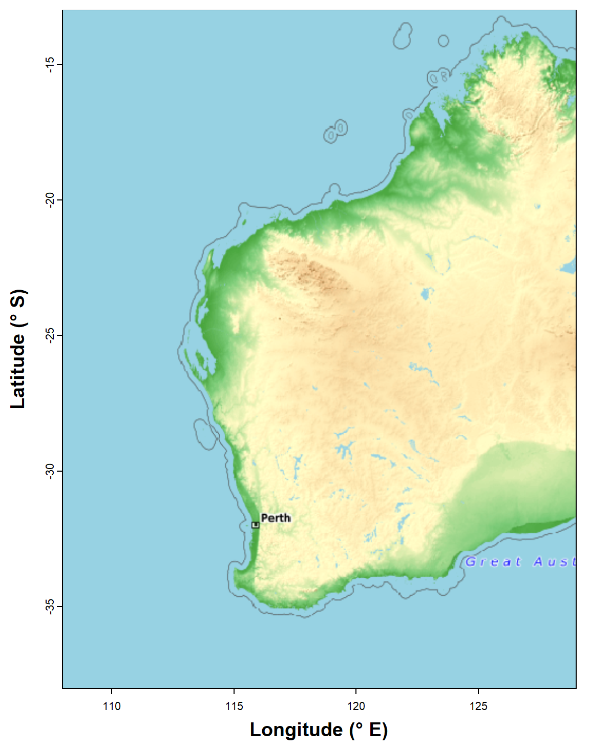
Figure 1: Map of Western Australia (rectangular Long-Lat projection)
used subsequently as the base map for spatial analyses. Generated using
the maptiles R package, with CartoDB Voyager tiles.
Simple line-based base map
We can also make a very simple base map at country scales using the
maps package (Figure 2). The code makes use of the native
R pipe operator |> to sequence R
functions without nesting. Map objects made using the sf
package also work well with ggplot2.
wa_sf <- map(regions = "Australia", plot=F) |>
  st_as_sf(coords = c("x","y"), crs = LongLat) |>
  st_crop(xmin=108,ymin=-38,xmax=129,ymax=-13)
library(ggplot2)
ggplot() +
  geom_sf(data=wa_sf) +
  labs(y="Latitude (\u00B0S)", x = "Longitude (\u00B0E)") +
  theme_bw()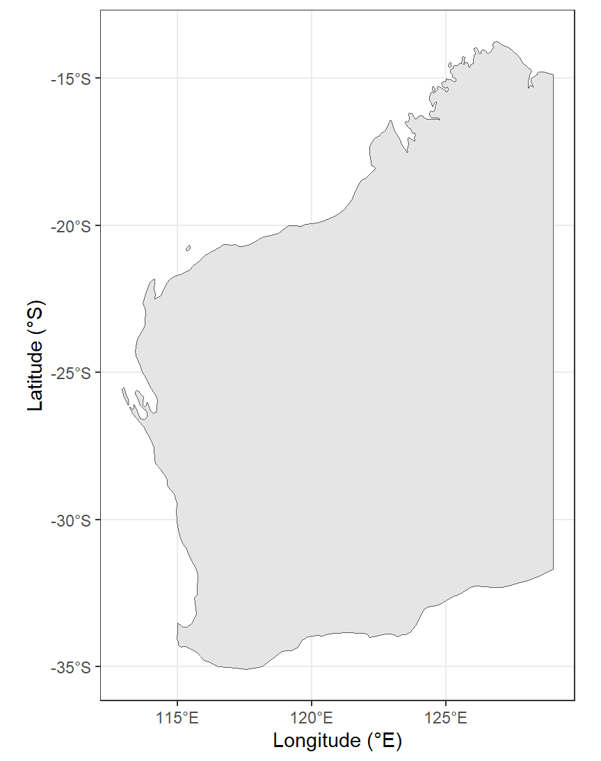
Figure 2: Map of Western Australia (rectangular Long-Lat projection) as
a simple alternative base map for spatial analyses. Generated using the
maps, sf, and ggplot2 R packages.
A first look at the data
plot the locations of samples in the NGSA data (Figure 3):
par(oma=c(0,0,0,0), mar=c(3,3,0.5,0.5), mgp=c(1.4,0.3,0),
    lend=2, ljoin=1, tcl=0.3, cex.lab=1.2, font.lab=2, xpd=F)
plot(st_coordinates(WA_extent), type="n", asp=1.1, xaxs="i", yaxs="i",
     xlab="Longitude (\u00B0 E)", ylab="Latitude (\u00B0 S)")
plot_tiles(WAtiles, add=TRUE) ; box()
## Warning in mean.default(out$ext[3:4]): argument is not numeric or logical: returning NApoints(st_coordinates(ngsaWAsf)[,1:2], pch=21, bg="#00308780", lwd=1.5)
legend("topleft", bty="n", inset=c(0.2,0.01),
y.intersp=1.2, legend="Sample locations for\nNGSA data in WA",
pch = 21, pt.bg="#00308780")
addnortharrow(pos="topleft", border=1, lwd=1, text.col=1, padin=c(0.2,0.2))
legend("bottom", bty="n", inset=0.005,
legend = c(" Omitting scale bar, as scale on map varies by","more than 5%, so scale bar may be inaccurate"),
y.intersp=0.9)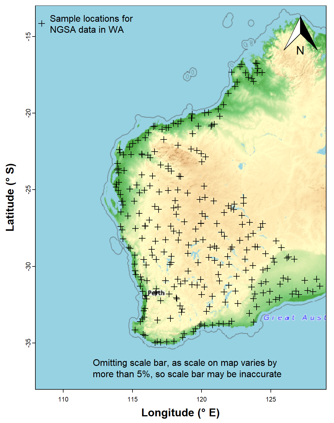
Figure 3: Sample locations for the Western Australia subset of the NGSA
data plotted over a maptiles raster background.
We can also use ggplot/ggmap to plot the
data using geom_sf(). In the example in Figure 4, we also
add information on soil pH by including aes(col=pH) and
scale_colour_viridis_c() in the code.
xlabs = seq(115,125, 5)
ylabs = seq(-35, -15, 5)
ggplot() +
  geom_sf(data=wa_sf, fill="grey80") +
  geom_sf(data=ngsaWAsf, aes(col=pH, size=2)) +
  labs(y="Latitude", x = "Longitude") +
  scale_colour_viridis_c(option="H", direction=-1) +
  scale_x_continuous(breaks = xlabs, labels = paste0(xlabs,'°E')) +
  scale_y_continuous(breaks = ylabs, labels = paste0(-1*ylabs,'°S')) +
  theme_bw() +
  theme(axis.text=element_text(size=14, color="black"),
        axis.title=element_text(size=16,face="bold"),
        legend.title=element_text(size=16),
        legend.text=element_text(size=14),
        legend.key.height=unit(2.4, units="cm")) +
  guides(col=guide_colourbar(title="Soil\npH"), size="none")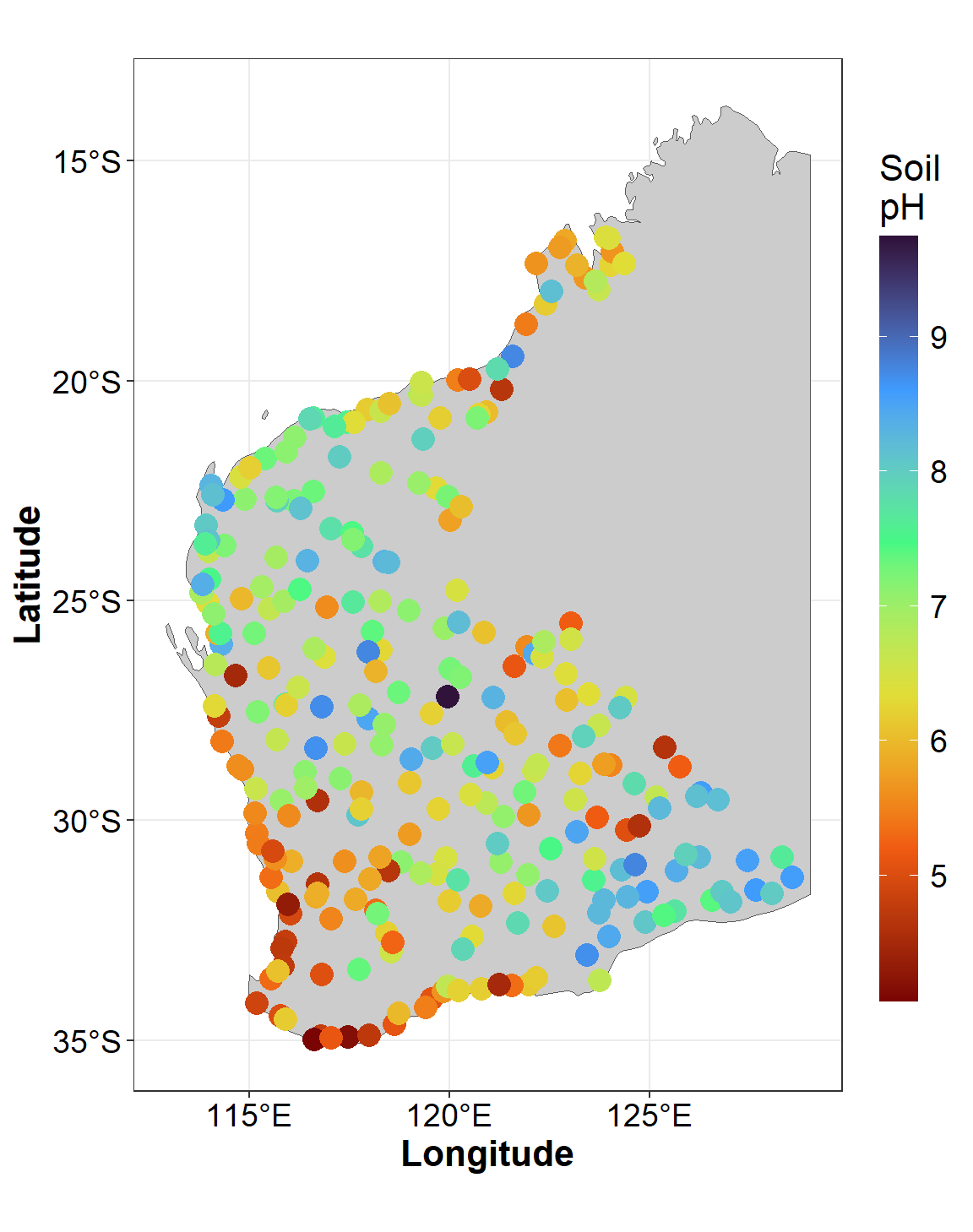
Figure 4: Sample locations and soil pH for the Western Australia subset
of the NGSA data plotted usiing ggmap over a simple
background.
Plot a map with range-class symbols
First we make a simple features spatial data object:
As.AR_sf <- st_as_sf(ngsaWA[,c("LONGITUDE","LATITUDE","As.AR")],
                     coords = c("LONGITUDE","LATITUDE"),
                     crs = LongLat)
Identifying each point as belonging to a range, if suitable ranges are chosen, is a convenient and relatively simple way to explore the spatial distribution of values of a variable. In this example we use the Tukey boxplot thresholds as these are specifically designed for exploratory data analysis and can easily identify potentially unusual values (outliers). Percentile classes can also be used, and there is a good discussion of the options in Chapter 5 of Reimann et al. (2008). In this example we log10-transform As concentration, as its untransformed distribution has a substantial positive skew.
palette(c("black",viridis::turbo(6, alp=0.7, end=0.9),"grey92", "white"))
par(oma=c(0,0,0,0), mar=c(3,3,0.5,0.5), mgp=c(1.4,0.3,0),
    lend=2, ljoin=1, tcl=0.3)
plot_tiles(WAtiles, axes=TRUE, mar=c(3,3,0.5,0.5))
mtext(side=1, line=1.6, text="Longitude (\u00B0 E)",
      font=2, cex=1.2)
mtext(side=2, line=1.6, text="Latitude (\u00B0 S)",
      font=2, cex=1.2)
addnortharrow(pos="topleft", border=1, lwd=1, text.col=1,
              padin=c(0.2,0.2))
legend("bottomright", bty="n",
       legend = c("Omitting scale bar, as scale","on map varies by more than 5%",
                  "so scalebar may be inaccurate"),
       y.intersp=0.9)
# construct and plot range classes in Tukey boxplot thresholds
As.AR_sf$As.log <- log10(As.AR_sf$As.AR)
As.AR_sf$tukey <- cut(As.AR_sf$As.log,
    breaks = c(-999999,boxplot.stats(As.AR_sf$As.log)$stats,999999),
    labels = c("lo-outliers","loWx-LQR","LQR-med","med-UQR","UQR-upWx","hi+outliers"))
polygon(NGSAWA_border$Long.est, NGSAWA_border$Lat.est, lty=3, lwd=2,
        border="gray")
points(st_coordinates(As.AR_sf), pch = 21,
       cex=(c(.5,.65,.85,1,1.4,1.8)*2)[As.AR_sf$tukey],
       bg=seq(2,7)[As.AR_sf$tukey])

legend("bottomleft", legend = rev(c("lo-outliers","loWx-LQR","LQR-med",
                                "med-UQR","UQR-upWx","hi+outliers")),
       cex = 1.2, pch=21, pt.cex=rev(c(.5,.65,.85,1,1.4,1.8))*2, inset = 0.07,
       bty="n", y.intersp=1.2, pt.bg=seq(7,2,-1), x.intersp = 1.)
text(par("usr")[1], par("usr")[3]+(0.38*(par("usr")[4]-par("usr")[3])),
     labels=expression(bold("TOS -2mm\nAs.AR ranges")), pos = 4, cex = 1)
par(new=TRUE, fig=c(0.08,0.18,0.19,0.36), mar=c(0,0,0,0)+0.1,
    col.lab=1, col.axis=1, mgp=c(.9,0.2,0), xaxt="n", yaxt="n", bty="n", ann=F)
boxplot(log10(As.AR_sf$As.log), col = "#A0A0A080")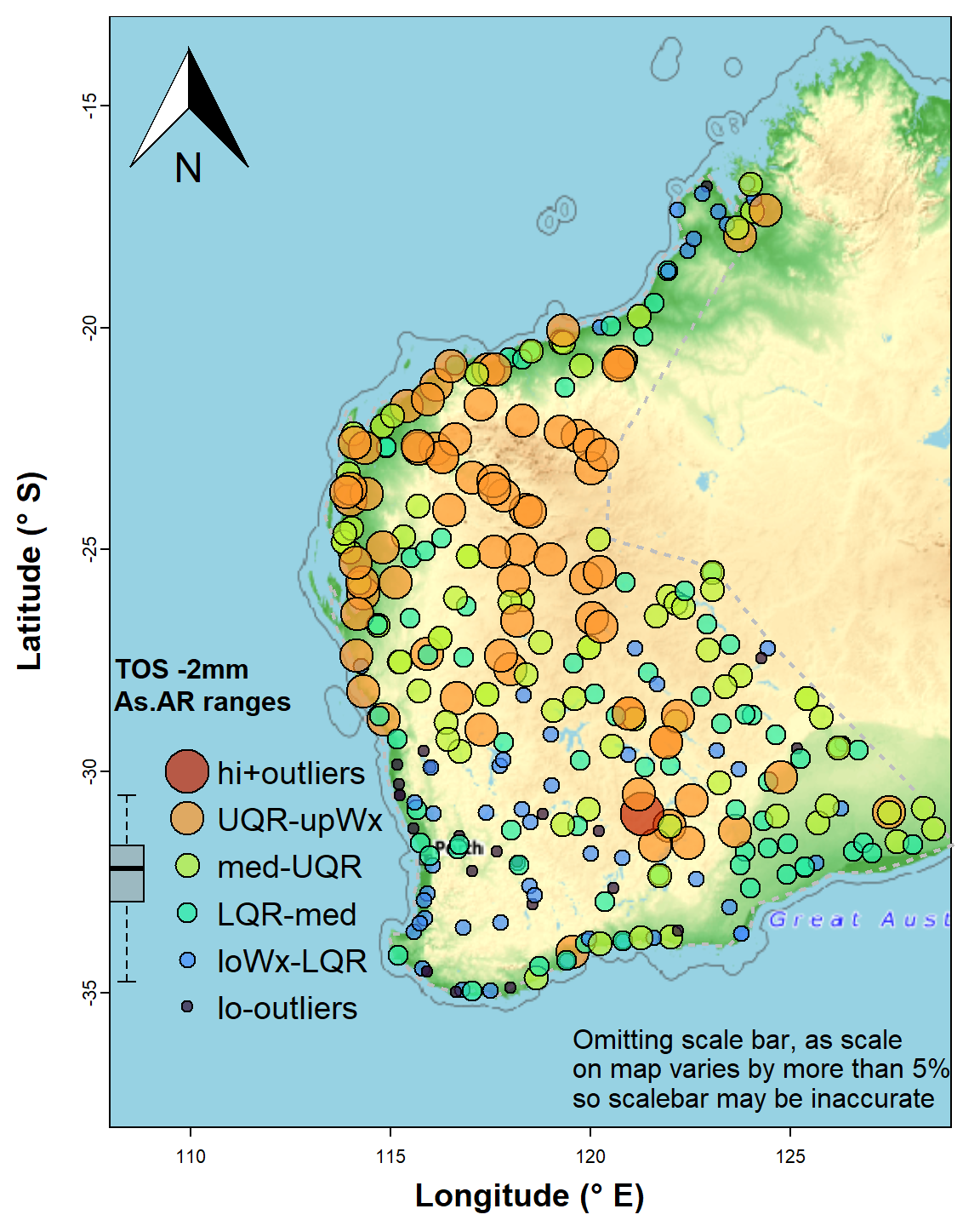
Figure 5: Map of arsenic (As) concentrations expressed as symbols for concentration ranges (UQR is 75th percentile, upWx is upper whisker, med is median, LQR is 25th percentile, loWx is lower whisker). Data are from from the WA subset of the NGSA data, -2mm tosoil fraction.
The map's symbol classes in Figure 5 are separated by the standard Tukey box plot thresholds (minimum, lower-hinge, median, upper-hinge, maximum) – the legend is roughly aligned with the relevant box plot. We see a wide range of As concentration, with greater As probably associated with iron-rich rocks in the Pilbara (northwest WA) and central Yilgarn (central south WA).
Spatial Autocorrelation
Whether samples are spatially related or not, in terms of a particular measured variable, is expressed by the spatial autocorrelation or Moran's I (Zhang et al., 2008). The Moran's I statistic is based on comparison of the values of a variable at one point with a specified number (or within a specified distance) of neighbouring points. A positive Moran I autocorrelation suggests that locations with similar values of the variable considered tend to cluster together. A Moran's I close to zero suggests no autocorrelation (values of the variable considered are randomly located), and a larger negative Moran's I suggests that similar values of the variable considered tend to be further apart than expected from a random spatial distribution. The Moran's I statistic is tested against the null hypothesis of no spatial autocorrelation, and will vary with the number of neighbouring points in the calculation, with more points giving weaker autocorrelations (Kalogirou, 2019).
The basic Moran's I is a global autocorrelation, across the whole spatial dataset being analysed. The Local Moran's I can also be calculated, and shows the extent of significant spatial clustering of similar values (of the variable considered) around each observation.
Spatial autocorrelation statistics, usually Moran's I, can be
calculated using various GIS and statistical software, including several
packages which add functionality to R (we use the spdep
package).
Calculate Global Moran's I
The subset of the National Geochemical Survey of Australia (NGSA)
data we are using is in the object ngsaWAsf.
We first use the knearneigh() function from the
spdep R package to create a matrix with the row numbers of
points belonging to the set of the k nearest neighbours of each other.
We don't actually save the output but use the native R
pipe operator |> to run the output through (1) the
knn2nb() function to convert to an object of class
nb which includes neighbour region numbers, then (2) the
nb2listw to create a list of weights (we can see what these
look like by running str(ngsaWA_nbwt), or
print(ngsaWA_nbwt) for a summary).
Next we use the moran.test() function to generate our
Moran's I statistic. The null hypothesis is that the observations are
random with no spatial correlation.
ngsaWA_nbwt <- knearneigh(x=ngsaWAsf, k=8) |> knn2nb() |> nb2listw()
ngsaWAsf$As.log <- log10(ngsaWAsf$As.AR)
(mI <- moran.test(ngsaWAsf$As.log, ngsaWA_nbwt)) # ; str(mI) # if needed
##
## Moran I test under randomisation
##
## data: ngsaWAsf$As.log
## weights: ngsaWA_nbwt
##
## Moran I statistic standard deviate = 17.055, p-value < 2.2e-16
## alternative hypothesis: greater
## sample estimates:
## Moran I statistic Expectation Variance
## 0.4604199496 -0.0032894737 0.0007392565The Expectation in the output is the estimated value of
Moran's I if the null hypothesis is correct. We can try running the test
with different numbers of neighbour points, or use a distance-based
criterion for defining neighbours.
Calculate local Moran's I
In this example we use the localmoran() function from
the spdep R package. Once again we use the
knearneigh() function to define which points are neighbours
(with k=4 this time), and convert these to weights.
It's easy to modify the code to calculate Local Moran's I for another
variable, by editing the text string which is assigned to
var0. For a list of variables in the original data subset
we could run names(ngsaWA).
To make it easier to extract and map the output, we combine our data
coordinates st_coordinates(ngsaWAsf) with two extracts of
our local Moran's I output object lmi_As:
as.data.frame(lmi_As), which contains the values of local Moran's I (Ii), expectedIiif H0 is true (E.Ii), variance in Ii (Var.Ii), the standard normal score forIi(Z,Ii), and the p-value (Pr(z != E(Ii)));
attributes(lmi_As)$quadr, which contains the Local Indicators of Spatial Association (LISA) categories ('quadrants') for each observation.
var0 <- "As.log"
lmi_data <- na.omit(ngsaWAsf[,var0])
# lmi_data$As.log <- log10(lmi_data$As.AR)
lmi_wts <- knearneigh(ngsaWAsf,k=4) |> knn2nb() |> nb2listw()

lmi_As <- localmoran(lmi_data$As.log, lmi_wts)
lmiDF_As <- cbind(st_coordinates(ngsaWAsf),as.data.frame(lmi_As), attributes(lmi_As)$quadr)
colnames(lmiDF_As) <- c("Longitude","Latitude",
                        "Ii", "E.Ii", "Var.Ii", "Z.Ii", "Pvalue",
                        "mean", "median", "pysal")
print(head(lmiDF_As[,3:10]), digits=3)
## Ii E.Ii Var.Ii Z.Ii Pvalue mean median pysal
## 1 0.0478 -2.43e-05 0.00183 1.116 0.2646 High-High Low-High High-High
## 2 1.1874 -5.32e-03 0.39918 1.888 0.0591 High-High High-High High-High
## 3 1.0937 -3.13e-03 0.23538 2.261 0.0238 High-High High-High High-High
## 4 -0.2016 -3.50e-04 0.02641 -1.238 0.2156 High-Low High-Low High-Low
## 5 -0.2630 -3.99e-04 0.03008 -1.514 0.1300 Low-High Low-High Low-High
## 6 0.7082 -2.10e-02 1.55425 0.585 0.5586 Low-Low Low-Low Low-LowPlot local Moran's I
We only want to display points having significant local Moran's I, so
we subset the results data frame from above using the
which() function. We subset these data further into
positive and negative values of local Moran's I (using the
subset() function), since the symbols()
function cannot input negative values. Symbols are plotted with
sqrt() values since human perception compares areas better
than diameters.
lmi_signif <- lmiDF_As[which(lmiDF_As$Pvalue <= 0.05),c(1:3,7,9)]

par(oma=c(0,0,0,0), mar=c(4,4,1.5,1.5), mgp=c(1.4,0.3,0),
    lend=2, ljoin=1, tcl=0.3, tcl = 0.5, lwd = 1, font.lab=2)
wa_outline <- subset(st_coordinates(wa_sf)[,c(1:2)],
                     st_coordinates(wa_sf)[,4]==5) # subset omits islands
plot(wa_outline, asp=1.05, pch=".", col="grey", xlim=c(110,129), ylim=c(-38,-13),
     xlab="Longitude (\u00b0E)", ylab="Latitude (\u00b0S)",xaxs="i")
polygon(rbind(wa_outline,wa_outline[1,]), col="grey88", border = "grey")
points(st_coordinates(ngsaWAsf),pch=3,col="grey60",cex=0.6)
neg_lmi <- subset(lmi_signif, lmi_signif$Ii<0)
pos_lmi <- subset(lmi_signif, lmi_signif$Ii>=0)
symbols(pos_lmi[,1:2], inches=F, circles=sqrt(pos_lmi$Ii*0.4), add=T,
        fg="blue3", bg="#0000FF40")
symbols(neg_lmi[,1:2], inches=F, squares=sqrt(neg_lmi$Ii*-0.4), add=T,
        fg="lightgoldenrod1", bg="#FFE00080")
addnortharrow(pos="topright", border=1, lwd=1, text.col=1,
              padin=c(0.1,0.1), scale=0.5)
textMI=paste0("Global Moran's I = ",signif(mI$estimate[1],4))
legend("topleft", cex=0.9, bg="grey88", box.col = "grey", inset=0.02,
       legend=c("Local Moran's I \u2265 0","Local Moran's I < 0",
                "Sample locations"),
       pch=c(21,22,3), col=c("blue3","lightgoldenrod1","grey60"),
       pt.bg=c("#0000FF40","#FFE00080",NA),
       pt.cex=c(3,3,0.5), title = textMI)
legend("bottomright", bty="n", inset = 0.01,
       legend = c("Not plotting scale bar as scale",
                  "on map varies by more than 5%,",
                  "so scalebar may be inaccurate"),
       y.intersp=0.9, cex = 0.8, text.col = "grey60")
box()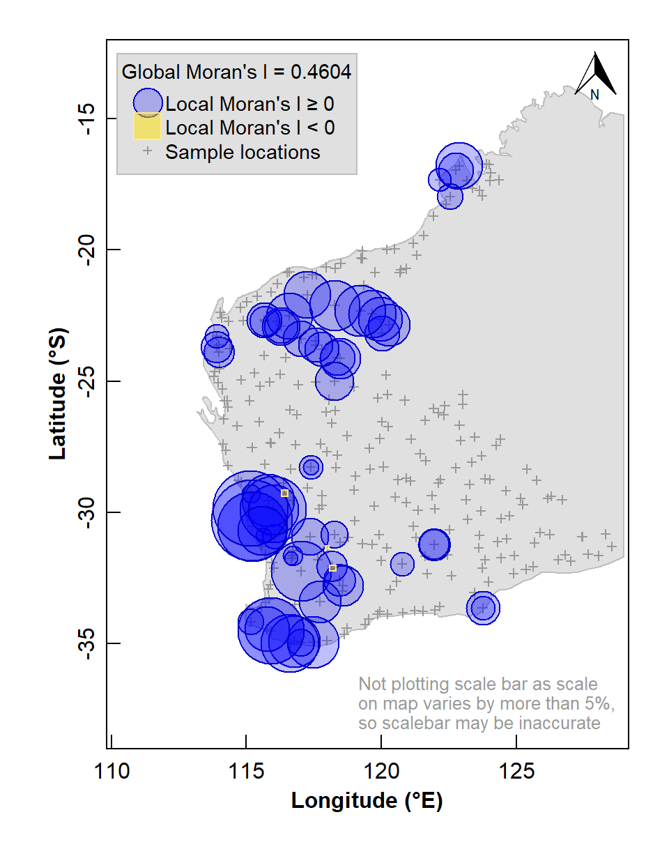
Figure 6: Map of Local Moran's I for arsenic (As) concentrations in the WA subset of the NGSA data, -2mm tosoil fraction. The Global Moran's I parameter is also shown above the legend.
The map in Figure 6 shows numerous sample locations having positive Local Moran's I for the selected variable, and a significant global spatial autocorrelation (Moran's I ≅ 0.46, with a very low p-value).
We can also use the information stored in our local Moran's I data frame to plot a map of local indicators of spatial association (LISA; see Table 2).
LISA quadrant | Variable valuea | Local Moran's I |
|---|---|---|
Low-Low | < median | positive |
High-Low | > median | negative |
Low-High | < median | negative |
High-High | > median | positive |
aLISA quadrants can also be defined relative to the mean. | ||
lmi_signif <- lmiDF_As[which(lmiDF_As$Pvalue <= 0.05),]
palette(c("black",RColorBrewer::brewer.pal(7,"RdBu")))
par(oma=c(0,0,0,0), mar=c(4,4,1.5,1.5), mgp=c(1.4,0.3,0),
    lend=1, ljoin=0, tcl=0.3, tcl = 0.5, lwd = 1, font.lab=2)
wa_outline <- subset(st_coordinates(wa_sf)[,c(1:2)],
                     st_coordinates(wa_sf)[,4]==5) # subset omits islands
plot(wa_outline, asp=1.05, pch=".", col="grey", xlim=c(110,129), ylim=c(-38,-13),
     xlab="Longitude (\u00b0E)", ylab="Latitude (\u00b0S)",xaxs="i")
polygon(rbind(wa_outline,wa_outline[1,]), col="grey88", border = "grey")
points(st_coordinates(ngsaWAsf),pch=3,col="grey60",cex=0.6)
with(lmi_signif,
     points(Longitude, Latitude, lwd=2,
            pch=c(21,25,24,22)[median],
            col=c(8,8,2,2)[median],
            bg=c(7,3,7,3)[median],
            cex = c(1.2,1,1,1.2)[median])
     )
addnortharrow(pos="topright", border=1, lwd=1, text.col=1,
              padin=c(0.1,0.1), scale=0.5)
legend("topleft", cex=0.9, bg="grey88", box.col = "grey", inset=0.02,
       legend=levels(lmi_signif$median), title="LISA Quadrants",
       pch=c(21,25,24,22), col=c(8,8,2,2),
       pt.bg=c(7,3,7,3), pt.cex = c(1.2,1,1,1.2))
legend("bottomright", bty="n", inset = 0.01,
       legend = c("Not plotting scale bar as scale",
                  "on map varies by more than 5%,",
                  "so scalebar may be inaccurate"),
       y.intersp=0.9, cex = 0.8, text.col = "grey60")
box()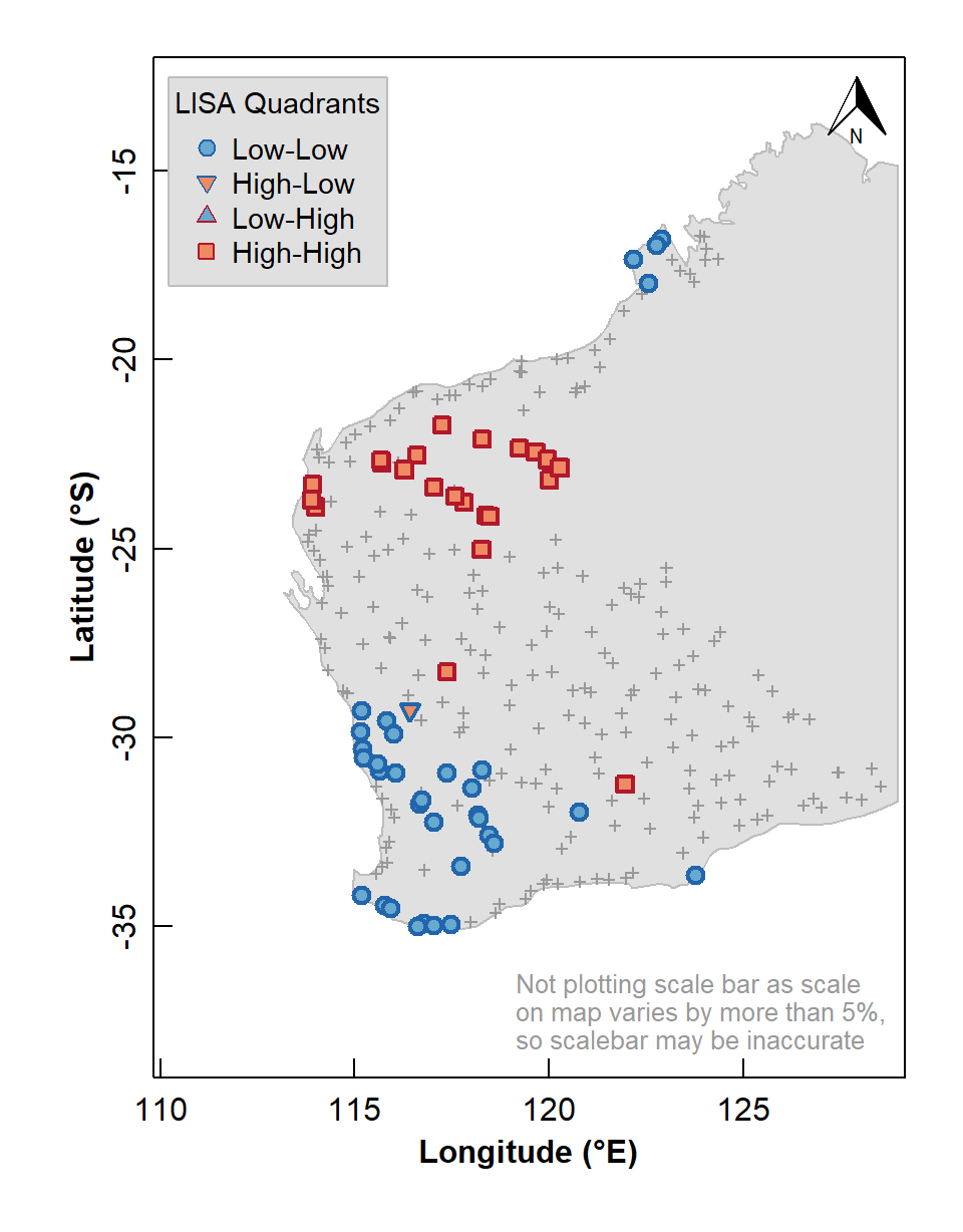
Figure 7: Map of Local Indicators of Spatial Association (LISA) relative to median for arsenic (As) concentrations in the WA subset of the NGSA data, –2 mm topsoil fraction.
The LISA map enables us to identify localized map regions where values of the chosen variable in or data are strongly positively or negatively associated with one another, that is, different spatial clusters. Usually locations having significant Low-High or High-Low association are isolated and less common, as we see in Figure 7.
What's next?
In the next Session, we build on the understanding of spatial autocorrelation to introduce spatial interpolation, in particular the concepts of variograms and kriging.
References
Caritat, P., Cooper, M., 2011. National Geochemical Survey of Australia: The Geochemical Atlas of Australia. GA Record 2011/20 (2 Volumes). Geoscience Australia, Canberra, 557 pp. https://www.ga.gov.au/about/projects/resources/national-geochemical-survey/atlas
Dunnington, D. 2017. prettymapr: Scale Bar, North Arrow, and Pretty Margins in R. R package version 0.2.2. https://CRAN.R-project.org/package=prettymapr
Garnier, Simon, Noam Ross, Robert Rudis, Antônio P. Camargo, Marco Sciaini, and Cédric Scherer (2021). viridis - Colorblind-Friendly Color Maps for R. R package version 0.6.2. https://sjmgarnier.github.io/viridis/
Giraud T (2021). maptiles: Download and Display Map Tiles. R package version 0.3.0, https://CRAN.R-project.org/package=maptiles.
Kalogirou, S., 2019. Spatial Autocorrelation, Vignette for R package 'lctools', https://cran.r-project.org/web/packages/lctools/vignettes/SpatialAutocorrelation.pdf.
Kalogirou, S. 2020. lctools: Local Correlation, Spatial Inequalities, Geographically Weighted Regression and Other Tools. R package version 0.2-8. https://CRAN.R-project.org/package=lctools.
Nychka D., Furrer R., Paige J., Sain S. (2021). fields: Tools for spatial data. R package version 13.3, https://github.com/dnychka/fieldsRPackage.
Pebesma, E., 2018. Simple Features for R: Standardized Support for
Spatial Vector Data. The R Journal 10 (1),
439-446, https://doi.org/10.32614/RJ-2018-009. (package
sf)
Pebesma E, Bivand R (2023). Spatial Data Science With
Applications in R. Chapman & Hall. https://r-spatial.org/book/. (package
spdep)
Reimann, C., Filzmoser, P., Garrett, R.G., Dutter, R., 2008. Statistical Data Analysis Explained: Applied Environmental Statistics with R. John Wiley & Sons, Chichester, England, 343 pp.
Tobler, W., 2004. On the First Law of Geography: A Reply. Annals of the Association of American Geographers, 94(2): 304-310. doi:10.1111/j.1467-8306.2004.09402009.x
Zhang, C., Luo, L., Xu, W., Ledwith, V., 2008. Use of local Moran's I and GIS to identify pollution hotspots of Pb in urban soils of Galway, Ireland. Science of the Total Environment, 398: 212-221, https://doi.org/10.1016/j.scitotenv.2008.03.011.
CC-BY-SA • All content by Ratey-AtUWA. My employer does not necessarily know about or endorse the content of this website.
Created with rmarkdown in RStudio. Currently using the free yeti theme from Bootswatch.