depth profile plots
Using R for soil profile diagrams -- A selection of methods
We're going to illustrate all the methods using some made-up data. You would need to adapt the R code examples to match your dataset and variable names.
Just so we don't need to read in a file, we're going to make a dataframe using R code:
profile <- data.frame(Sample = seq(1,10),
                      Horizon = c("A","A","A2","A2","B1","B1","B1","B2","B2","B3"),
                      Depth_upper = c(0,5,9,14,20,26,31,35,43,49),
                      Depth_lower = c(5,9,14,20,26,31,35,43,49,55),
                      Sand = c(81.8, 89.6, 80.4, 72.9, 45.1, 65.5, 56.6, 55.9, 39.4, 37.9),
                      Silt = c(13.8, 4.3, 5.8, 6.0, 18.2, 13.8, 15.8, 14.0, 21.7, 19.5),
                      Clay = c(4.4, 6.1, 13.8, 21.1, 36.7, 20.7, 27.6, 30.1, 38.9, 42.6))
profile$Horizon <- as.factor(profile$Horizon)
str(profile)
cat("\nSum of sand + silt + clay in each sample:\n")
with(profile, Sand+Silt+Clay)
## 'data.frame': 10 obs. of 7 variables:
## $ Sample : int 1 2 3 4 5 6 7 8 9 10
## $ Horizon : Factor w/ 5 levels "A","A2","B1",..: 1 1 2 2 3 3 3 4 4 5
## $ Depth_upper: num 0 5 9 14 20 26 31 35 43 49
## $ Depth_lower: num 5 9 14 20 26 31 35 43 49 55
## $ Sand : num 81.8 89.6 80.4 72.9 45.1 65.5 56.6 55.9 39.4 37.9
## $ Silt : num 13.8 4.3 5.8 6 18.2 13.8 15.8 14 21.7 19.5
## $ Clay : num 4.4 6.1 13.8 21.1 36.7 20.7 27.6 30.1 38.9 42.6
##
## Sum of sand + silt + clay in each sample:
## [1] 100 100 100 100 100 100 100 100 100 100Inverted scatter plot (the most basic option)
To invert a scatter plot t make it suitable for soil depth profile plotting, we:
- use par(mar = c( . . . )) to make the upper margin larger to fit in axis and tick labels
- calculate mean depth for each sample = (upper + lower)/2
- plot Depth vs. variable (which is inverted)
- suppress the x axis (xaxt="n") and have no x-axis label (xlab="")
- plot the depth axis backwards by putting the deepest limit first (ylim=c(55,0))
- rotate the labels using the las = 1 option in par() or plot()
- add a manual x axis at the top using axis(3)
- add a manual x axis title at top using the mtext() function
# omit axis plotting and axis label...
# ... then plot axis manually, first adjusting plot margins
par(mar=c(1,3,3,1), mgp = c(1.6,0.3,0), tcl = 0.3, font.lab = 2) # won't change anything except margins
plot(profile$Clay, ((profile$Depth_upper+profile$Depth_lower)/2),
     xlab="", xaxt="n", type = "b", las = 1,
     xlim = c(0,90), ylim = c(55,0),
     ylab="Mean depth (cm)")
# we need two functions / code lines for manual axis, plus label
axis(3)
mtext(side=3, line=1.6, font=2, text="Clay (% of <2mm fraction)")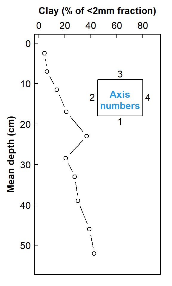
Figure 1. Depth profile of clay in soil as a scatter plot with inverted axes
The depth profile plot in Figure 1 is quite a common way to represent soil profile data. It has the advantage of being relatively simple, but implies a continuous change in the variable (Clay in Figure 1) which we usually do not have data for, since we collect samples in discrete depth increments. We will address how to deal with discrete increments later.
Unless we have replicate samples from the same depth increment, we don't have an estimate of sampling+measurement uncertainty. The next section uses an interpolation method to generate a standard error around a smoothed depth profile relationship.
Smoothed Depth Profiles with uncertainties
To generate smoothed curves of soil properties down a profile, we:
- first plot just the measurements vs. mean depth as above
- create an 'empty' data frame to hold the smoothed interpolated results
- for each series, create a smoothing model using the loess() function (LOESS is Locally Estimated Scatterplot Smoothing)
- generate an object containing predictions and standard errors from the LOESS models using the predict() function
- plot the smooth (interpolated) lines and their standard errors
- add a legend
par(mar=c(1,3,3,1), mgp = c(1.6,0.3,0), tcl = 0.3, font.lab = 2, lend=2, ljoin=1)
profile$Depth_mean <- (profile$Depth_upper + profile$Depth_lower)/2
with(profile, plot(Depth_mean ~ Clay, xaxt = "n", xlab = "", ylab = "Mean depth (cm)",
                   pch = 19, col = 4, ylim = c(55,0), xlim = c(0,90),
                   cex = 1.2, cex.lab = 1.5))
with(profile, points(Depth_mean ~ Sand, pch = 0, col = 2, lwd=2))
grid()
axis(3)
mtext(expression(bold(paste("Size fraction (%)"))),
      side = 3, line = 1.5, font = 2)

# set up data.frame to store interpolation results
interps <- data.frame(fixdepth = seq(2.5,60,5),
                      Clay = rep(NA, length(seq(2.5,60,5))),
                      Clay_lo = rep(NA, length(seq(2.5,60,5))),
                      Clay_hi = rep(NA, length(seq(2.5,60,5))),
                      Sand = rep(NA, length(seq(2.5,60,5))),
                      Sand_lo = rep(NA, length(seq(2.5,60,5))),
                      Sand_hi = rep(NA, length(seq(2.5,60,5))))

# generate Clay values interpolated to fixed depth using LOESS
loessMod1 <- loess(Clay ~ Depth_mean, data = profile)
loessPred1 <- predict(loessMod1, newdata=interps$fixdepth, se = TRUE)
interps$Clay <- loessPred1$fit
interps$Clay_lo <- loessPred1$fit - loessPred1$se.fit
interps$Clay_hi <- loessPred1$fit + loessPred1$se.fit

# generate Core 2 values interpolated to fixed depth using LOESS
loessMod2 <- loess(Sand ~ Depth_mean, profile)
loessPred2 <- predict(loessMod2, newdata=interps$fixdepth, se = TRUE)
interps$Sand <- loessPred2$fit
interps$Sand_lo <- loessPred2$fit - loessPred2$se.fit
interps$Sand_hi <- loessPred2$fit + loessPred2$se.fit

# add interpolations to plot
lines(interps$Clay, interps$fixdepth, col = 4)
lines(interps$Clay_lo, interps$fixdepth, col = 4, lty = 2, lwd = 2)
lines(interps$Clay_hi, interps$fixdepth, col = 4, lty = 2, lwd = 2)

lines(interps$Sand, interps$fixdepth, col = 2)
lines(interps$Sand_lo, interps$fixdepth, col = 2, lty = 2, lwd = 2)
lines(interps$Sand_hi, interps$fixdepth, col = 2, lty = 2, lwd = 2)

legend("top", bty = "o", inset = 0.02,
       cex = 0.8, box.col = "gray", box.lwd = 1,
       legend = c("Clay", "", "Sand",""),
       col = c(4,4,2,2), lty = c(1,2,1,2), lwd = c(1,2,1,2), pt.lwd = 2,
       pch = c(19,NA,0,NA), pt.cex = c(1.2,NA,1,NA))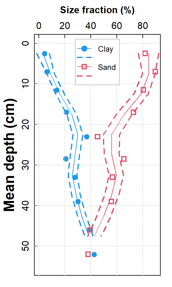
Figure 2. Depth profiles of clay and sand in soil as smoothed scatter plots with standard error intervals; actual measurements are shown by plot symbols.
The depth profile plot in Figure 2 is a nice way to represent soil profile data. It tries to predict the uncertainty in measurement with depth, assuming a continuous smooth relationship (which might not be a valid assumption!). We can plot our depth profile with no assumptions about how out variable(s) change between measurements using a variation on a bar plot.
Soil depth profile plots as cumulative stepped plots
To make stepped plots makes use of the type = "s" option in the functions plot() or lines():
par(mar=c(1,3,3,1), mgp = c(1.6,0.3,0), tcl = 0.3, font.lab = 2, lend=2, ljoin=1, las = 1)
plot(c(0, profile$Depth_mean) ~ c(profile$Clay[1], profile$Clay),
     type = "s", xlim = c(0,105), ylim = c(70,0),
     pch = 16, xaxt = "n", ylab = "Depth (cm)")
lines(c(0,profile$Depth_mean) ~ c(c(profile$Silt[1],profile$Silt) +
                                    c(profile$Clay[1], profile$Clay)),
      type="s", col="red3", lty = 2)
lines(c(0,profile$Depth_mean) ~ c(c(profile$Sand[1],profile$Sand) +
                                    c(profile$Silt[1],profile$Silt) +
                                    c(profile$Clay[1], profile$Clay)),
      type="s", col="blue3", lty = 3, lwd = 2, lend="round")
axis(3); mtext("Cumulative (%)", side=3, line=1.6, font=2, cex=1)
legend("bottom", legend = c("Clay","Clay+Silt","Clay+Silt+Sand"),
       lty = c(1,2,3), lwd = c(1,1,2), col = c("black","red3","blue3"), bty = "n")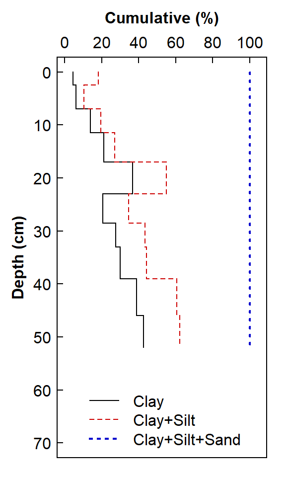
Figure 3. Depth profile of clay, silt, and sand in soil as a stepped line plot.
The plot in Figure 3 is a more "honest" representation of the way that we typically present soil profile data, but it is somewhat hard to interpret as drawn (a cumulative composition plot), and the legend is messy. It would be better to represent the stepped lines as polygons, similar to stacked bars.
Soil depth profile plots as filled cumulative stacked plots
This type of plot obviously works best for fixed-sum compositions, where we have measured all the components, such as soil texture (sand, silt, clay).
The basis of this plot is to use loops to draw rectangles for each series using the rect() function. Except for the first series, we add the previous series so the rectangles 'stack' horizontally. We add stepped lines with type = "s" to outline the adjoined boxes for each series. We use a layout so we can plot in frames of different sizes (in this example, 2 frames, with the left twice as wide as the right). In the right frame we plot a dummy plot with no plot elements drawn, and over this we draw a nice legend (it's probably also possible with a wide right margin, if xpd = TRUE is set in par()).
par(mar=c(1,3.5,3.5,1), mgp = c(1.7,0.3,0), tcl = 0.25, font.lab = 2,
    las = 1, xaxs="i", yaxs="i", xpd = TRUE)
palette(c("black",
          colorRampPalette(c("antiquewhite","chocolate4"), space = "rgb")(3),"sienna",
          colorRampPalette(c("blue3","white"), space = "rgb")(4),"transparent"))
layout(matrix(c(1,1,2), ncol = 3))
plot(c(0, profile$Depth_lower) ~ c(profile$Clay[1], profile$Clay),
     type = "n", xlim = c(0,100), ylim = c(55,0), ylab = "Depth (cm)",
     cex.lab = 1.5, cex.axis = 1.2, pch = 16, xaxt = "n")
axis(3, cex.axis = 1.2, mgp=c(1.7,0.3,0))
mtext("Fraction of fine earth (%)", side=3, line=1.6, family="sans", font=2, cex=1)

for (i in 1:NROW(profile)) {
  rect(0, profile[i, "Depth_lower"],
       profile[i,"Clay"], profile[i, "Depth_upper"],
       col = 2, border = 10)}

for (i in 1:NROW(profile)) {
  rect(profile[i,'Clay'], profile[i, "Depth_lower"],
       profile[i,"Clay"]+profile[i,"Silt"], profile[i, "Depth_upper"],
       col = 3, border = 10)}

for (i in 1:NROW(profile)) {
  rect(profile[i,'Clay']+profile[i,"Silt"], profile[i, "Depth_lower"],
       profile[i,"Clay"]+profile[i,"Silt"]+profile[i,"Sand"], profile[i, "Depth_upper"],
       col = 4, border = 10)}

box()
axis(2, at = seq(10,50,10), labels = rep(NA, length(seq(10,50,10))), tcl=0.4)
axis(3, at = seq(20,80,20), labels = rep(NA, length(seq(20,80,20))), tcl=0.4)
lines(c(0, profile$Depth_lower) ~ c(profile$Clay[1], profile$Clay),
      type = "s")
lines(c(0,profile$Depth_lower) ~ c(c(profile$Silt[1],profile$Silt) +
                                  c(profile$Clay[1], profile$Clay)),
      type="s", lty = 1)
lines(c(0,profile$Depth_lower) ~ c(c(profile$Sand[1],profile$Sand) +
                                  c(profile$Silt[1],profile$Silt) +
                                  c(profile$Clay[1], profile$Clay)),
      type="s", lty = 1)

plot(c(0, 1), c(0, 1), axes=F, ann=F, type="n")
legend(0.05, 0.65, legend = c("Clay","Silt","Sand"),
       cex = 2, pch = 22, pt.bg=c(2,3,4), pt.cex = 8,
       bty="n", bg = 9, box.col = 1, inset=0,
       xjust=0.5, x.intersp=1.2, y.intersp=1.5)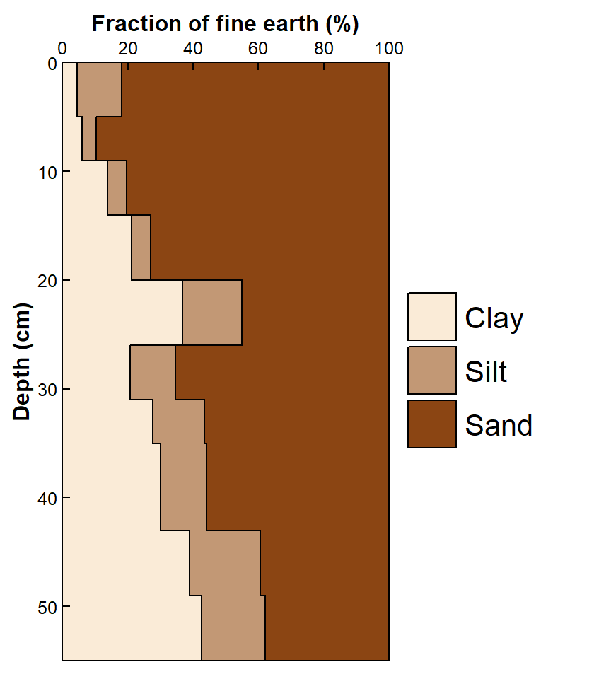
Figure 4. Depth profiles of clay, silt, and sand in soil as a horizontal stacked plot.
The resulting horizontally stacked plot in Figure 4 also presents a more "honest" representation of soil profile data, and it is easier to interpret than Figure 3, with a much tidier legend. It would be hard to indicate measurement variability on this type of plot, but it's potentially an attractive option.
Some soil-themed geneRative R art (Rtistry) just for fun and decoration.
CC-BY-SA • All content by Ratey-AtUWA. My employer does not necessarily know about or endorse the content of this website.
Created with rmarkdown in RStudio using the cyborg theme from Bootswatch via the bslib package, and fontawesome v5 icons.