Spatial data analysis and visualization

Geostatistics and Data Mapping in R
In this guide we use a range of R packages for different functions, shown in Table 1.
Package | Purpose | Reference |
sf | Spatial data handling, formatting, and storing spatial data | Pebesma (2018) |
gstat | Geostatistics (variograms and variogram models, kriging) | Pebesma (2004) |
sp | Handling, formatting, and storing spatial data; some graphical functions | Pebesma and Bivand (2005) |
maps | Simple map outlines | Becker et al. (2021) |
spdep | Spatial autocorrelation, LISA | Pebesma and Bivand (2023) |
lctools | Spatial autocorrelation | Kalogirou (2020) |
maptiles | Retrieving and plotting tile-based map data | Giraud (2021) |
prettymapr | Map annotations | Dunnington (2022) |
fields | Visualizing spatial data with irregular grids | Nychka et al. (2021) |
viridis | Colourblind-friendly colour palettes for maps | Garnier et al. (2021) |
library(sf)
library(spdep)
library(gstat)
library(lctools)
library(sp)
library(maps)
library(maptiles)
library(prettymapr)
library(fields)
library(viridis)
Introduction
This section will show you how to make simple maps with added data, how to analyse spatial autocorrelation, and make a geostatistical kriging model to interpolate point georeferenced data based on the autocorrelation structure. It builds on the concepts presented in the first page on maps in R.
We will use a subset of the National Geochemical Survey of Australia
(NGSA) data documented by Caritat and Cooper (2011) to illustrate the various
concepts and procedures involved. We supply data in .csv
files for importing into R.
Import data and convert to spatial object format
First we define some commonly-used coordinate reference systems which define the projection of our GPS data
LongLat <- st_crs(4326) # uses Earth ellipsis specs from WGS84 datum
UTM50S <- st_crs(32750) # just for Zone 50, S hemisphere!
We may use these coordinate reference system objects later. For now we're going to work in Longitude-Latitude coordinates.
We read our data using read.csv(), and convert the
resulting data frames to Simple Features spatial data, using
the R package sf (Pebesma, 2018). Simple
Features is a formal standard (ISO 19125-1:2004) that describes how
objects in the real world can be represented in computers - see https://r-spatial.github.io/sf/articles/sf1.html.
ngsaWA <- read.csv(file="ngsaWA.csv", stringsAsFactors = TRUE)
NGSAWA_border <- read.csv("NGSAWA_border.csv")
# make spatial data objects
ngsaWAsf <- st_as_sf(x = ngsaWA, coords = c("LONGITUDE","LATITUDE"),
                     crs = LongLat)
ngsaWAbord_sf <- st_as_sf(NGSAWA_border, coords = c("Long.est","Lat.est"),
                          crs = LongLat)
Check the data using the str(),
summary(), or head() functions!
We also need a base map (Figure 1), and to obtain and plot an
aesthetically pleasing map we use the maptiles R package
(Giraud, 2021).
Making our base map of Western Australia
There are several options and things to remember when making maps
using maptiles:
typecan also be one ofOpenStreetMap,OpenStreetMap.HOT,Esri.WorldStreetMap,Esri.WorldTopoMap,Esri.WorldImagery,Esri.WorldGrayCanvas,Stamen.Toner(plus its variants),Stamen.TonerLite,CartoDB.Positron,CartoDB.DarkMatter,CartoDB.Voyager(allCartoDB...tiles have variants which work),OpenTopoMap- The
spTransform()function from the R packagespallows conversion to various map projections (= coordinate reference systems, CRS).
Preparing to make maps
We define the area we need for our map and save it in an object
called extent. The object named extent is a
'simple features' object which refers to a formal standard (ISO
19125-1:2004) that describes how objects in the real world can be
represented in computers - see https://r-spatial.github.io/sf/articles/sf1.html (this
is why we need the sf or 'Simple Features' package by
Pebesma (2018)).
The easiest way to get bounding coordinates (in latitude, longitude)
is by using Google Maps or Google Earth. Google Earth also allows the
option to set the coordinate reference system to UTM. Otherwise we would
need to convert our sf object. If our input coordinates are
Longitude–Latitude, note that south latitudes (and west longitudes) are
negative, and we want decimal degrees rather than
degrees-minutes-seconds.
For coordinates in the sf, sp and
maptiles packages, x coordinates are Longitudes
or Eastings, and y
coordinates are Latitudes or Northings.
WA_extent <- st_as_sf(data.frame(Longitude = c(108, 129),
                                 Latitude = c(-38, -13)),
                      coords=c("Longitude","Latitude"), crs=LongLat)
str(WA_extent)          ;     cat("-------------------\n")
head(WA_extent)
## Classes 'sf' and 'data.frame': 2 obs. of 1 variable:
## $ geometry:sfc_POINT of length 2; first list element: 'XY' num 108 -38
## - attr(*, "sf_column")= chr "geometry"
## - attr(*, "agr")= Factor w/ 3 levels "constant","aggregate",..:
## ..- attr(*, "names")= chr(0)
## -------------------
## Simple feature collection with 2 features and 0 fields
## Geometry type: POINT
## Dimension: XY
## Bounding box: xmin: 108 ymin: -38 xmax: 129 ymax: -13
## Geodetic CRS: WGS 84
## geometry
## 1 POINT (108 -38)
## 2 POINT (129 -13)The output of str(WA_extent) shows that simple features
objects have classes sf and data.frame, and
always contain the special column geometry
which stores the spatial coordinates. In addition, the output of
head(WA_extent) identifies the coordinate limits of the
sf object, and also the coordinate reference system (CRS) –
both useful checks.
NOTE: The projection we specify here will be the one the map plots in!
Getting and plotting the map tile data
We now need some functions from the maptiles package
(Giraud 2021).
WAtiles <- get_tiles(WA_extent, provider = "OpenTopoMap",
                     crop = TRUE, zoom = 5) # make map object

par(oma=c(3,3,1,1), mar=c(4,4,1.5,1.5), mgp=c(1.4,0.3,0),
    lend=2, ljoin=1, tcl=0.3)
plot(WAtiles)
axis(1)
mtext(side=1, line=1.6, text="Longitude (\u00B0 E)",
      font=2, cex=1.2)
axis(2)
mtext(side=2, line=1.6, text="Latitude (\u00B0 S)",
      font=2, cex=1.2)
box()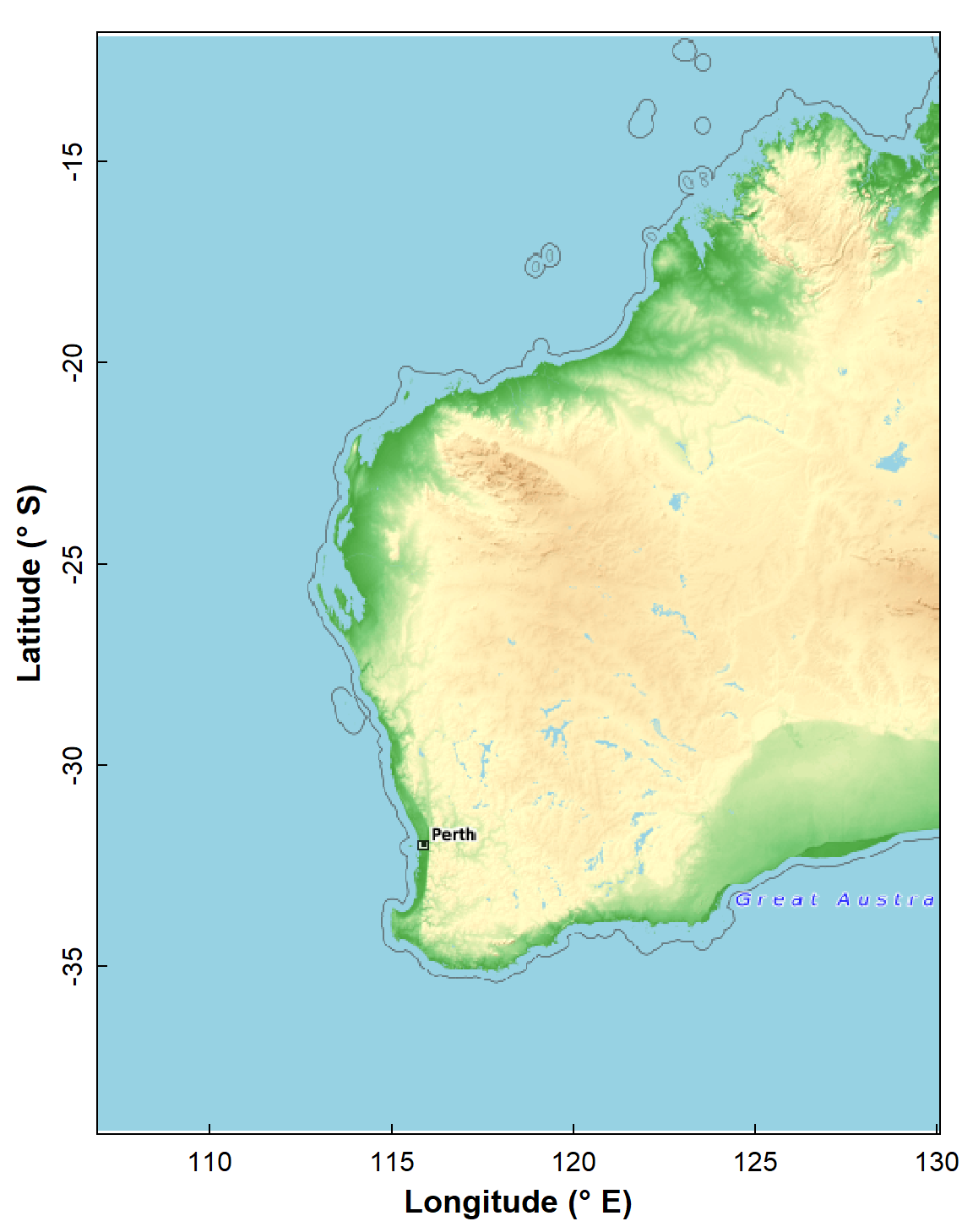
Figure 1: Map of Western Australia (rectangular Long-Lat projection)
used subsequently as the base map for spatial analyses. Generated using
the maptiles R package, with OpenTopoMap tiles.
Simple line-based base map
We can also make a very simple base map at country scales using the
maps package (Figure 2). The code makes use of the native
R pipe operator |> to sequence R
functions without nesting. Map objects made using the sf
package also work well with ggplot2.
wa_sf <- map(regions = "Australia", plot=F) |>
  st_as_sf(coords = c("x","y"), crs = LongLat) |>
  st_crop(xmin=108,ymin=-38,xmax=129,ymax=-13)
library(ggplot2)
ggplot() +
  geom_sf(data=wa_sf) +
  labs(y="Latitude (\u00B0S)", x = "Longitude (\u00B0E)") +
  theme_bw()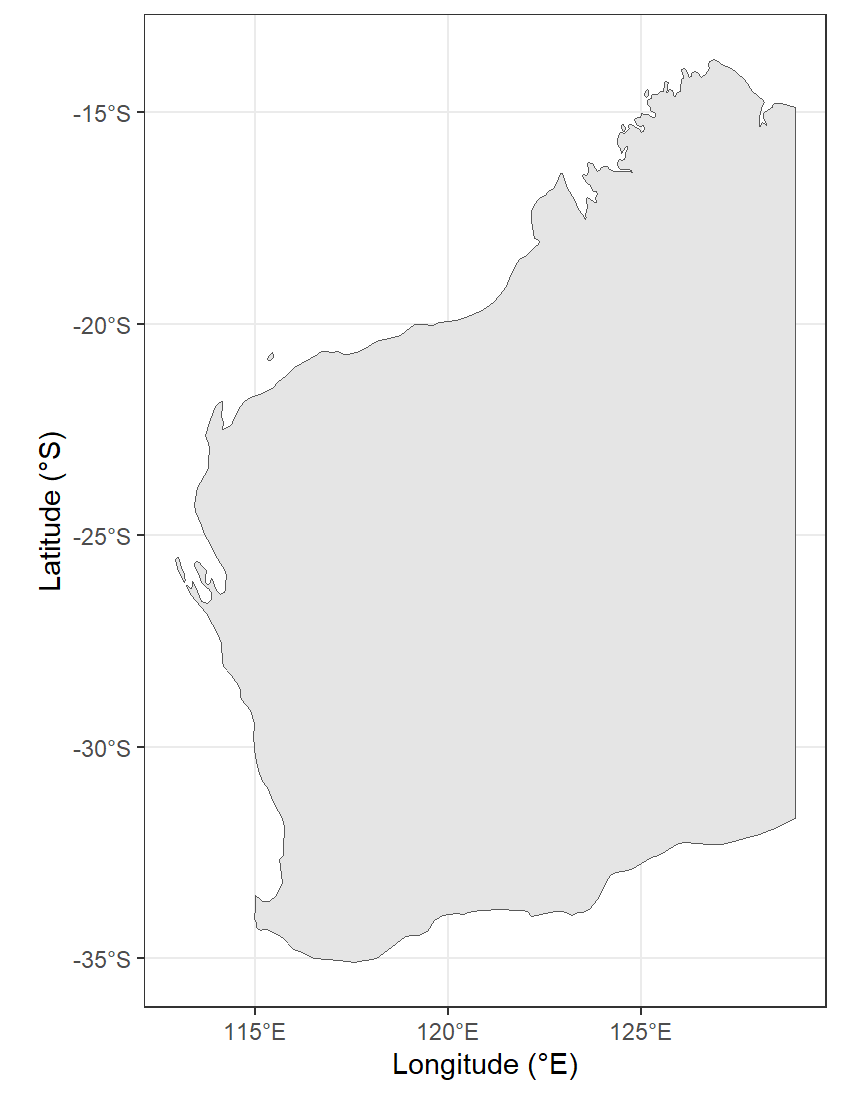
Figure 2: Map of Western Australia (rectangular Long-Lat projection) as
a simple alternative base map for spatial analyses. Generated using the
maps, sf, and ggplot2 R packages.
We won't proceed much further with this simple map approach, but the
ggmap R package can be used to generate
tile-based maps based on ggplot2 plot syntax.
Plot some data points on a base map
A map can be thought of as a 2-dimensional scatter plot with a background of map features in raster format (i.e. tiles). This is useful since we can then simply use the coordinates in our data to plot additional information on our base map, given that the coordinate systems of the map and data are matched.
The simplest example of doing this would be to plot the locations of samples in the NGSA data (Figure 3):
par(oma=c(3,3,1,1), mar=c(4,4,1.5,1.5), mgp=c(1.4,0.3,0),
    lend=2, ljoin=1, tcl=0.3)
plot(WAtiles) ; box()
axis(1, at=pretty(par("usr")[1:2]),
     labels=paste0(pretty(par("usr")[1:2]),"\u00B0E"))
mtext(side=1, line=1.6, text="Longitude", font=2, cex=1.2)
axis(2, at=pretty(par("usr")[3:4]),
     labels=paste0(-1*pretty(par("usr")[3:4]),"\u00B0S"))
mtext(side=2, line=1.6, text="Latitude", font=2, cex=1.2)

points(st_coordinates(ngsaWAsf)[,1:2], pch=3)
legend("topleft", bty="n", legend="Sample locations for\nNGSA data in WA",
       pch = 3)
addnortharrow(pos="topright", border=1, lwd=1, text.col=1, padin=c(0.2,0.2))
legend("bottom", bty="n",
       legend = c("Omitting scale bar, as scale on map varies by\nmore than 5%, so scale bar may be inaccurate\n \n "),
       y.intersp=0.9)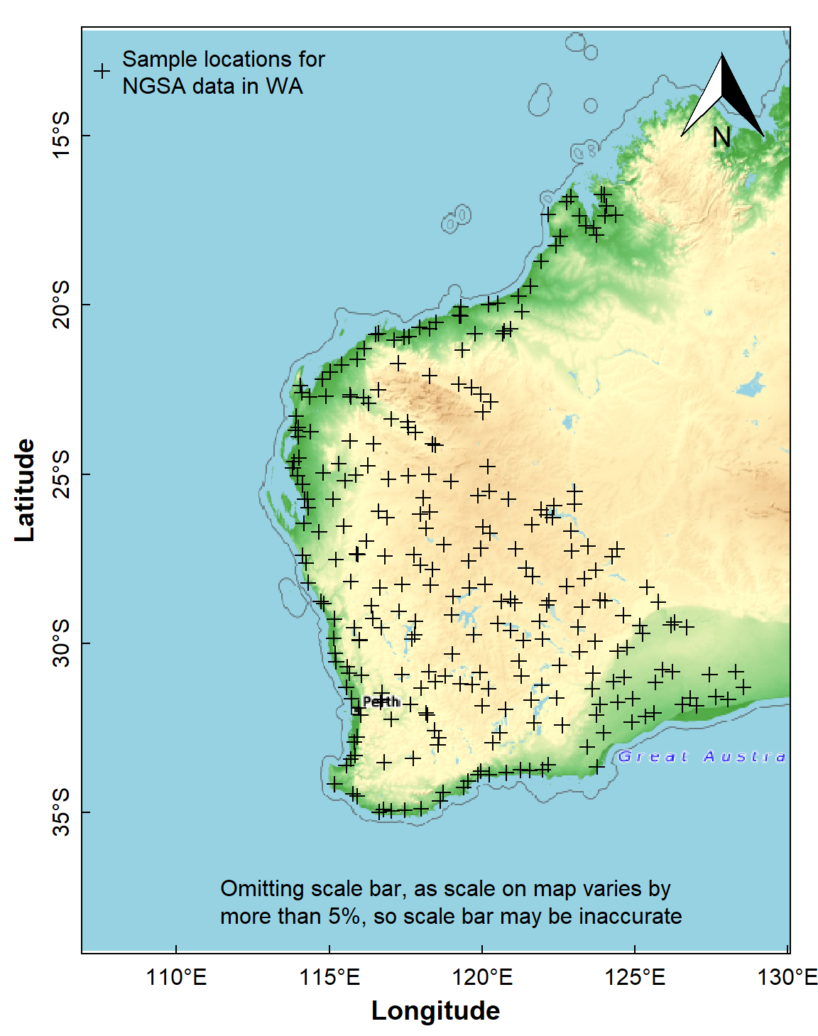
Figure 3: Sample locations for the Western Australia subset of the NGSA
data plotted over a maptiles raster background.
We can also use ggplot/ggmap to plot the
data using geom_sf(). In the example in Figure 4, we also
add information on soil pH by including aes(col=pH) and
scale_colour_viridis_c() in the code.
xlabs = seq(115,125, 5)
ylabs = seq(-35, -15, 5)
ggplot() +
  geom_sf(data=wa_sf, fill="grey80") +
  geom_sf(data=ngsaWAsf, aes(col=pH, size=2)) +
  labs(y="Latitude", x = "Longitude") +
  scale_colour_viridis_c(option="H", direction=-1) +
  scale_x_continuous(breaks = xlabs, labels = paste0(xlabs,'°E')) +
  scale_y_continuous(breaks = ylabs, labels = paste0(-1*ylabs,'°S')) +
  theme_bw() +
  theme(axis.text=element_text(size=14, color="black"),
        axis.title=element_text(size=16,face="bold"),
        legend.title=element_text(size=16),
        legend.text=element_text(size=14),
        legend.key.height=unit(2.4, units="cm")) +
  guides(col=guide_colourbar(title="Soil\npH"), size="none")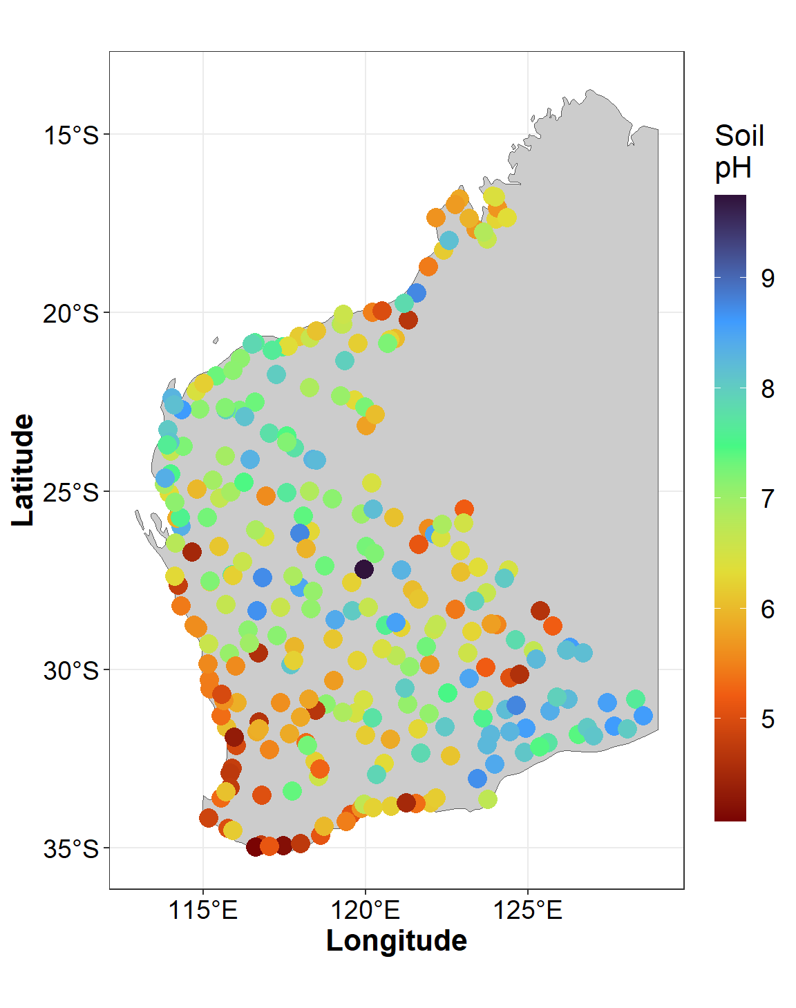
Figure 4: Sample locations and soil pH for the Western Australia subset
of the NGSA data plotted usiing ggmap over a simple
background.
Plot a map with range-class symbols
First we make a simple features spatial data object:
As.AR_sf <- st_as_sf(ngsaWA[,c("LONGITUDE","LATITUDE","As.AR")],
                     coords = c("LONGITUDE","LATITUDE"),
                     crs = LongLat)
Identifying each point as belonging to a range, if suitable ranges are chosen, is a convenient and relatively simple way to explore the spatial distribution of values of a variable. In this example we use the Tukey boxplot thresholds as these are specifically designed for exploratory data analysis and can easily identify potentially unusual values (outliers). Percentile classes can also be used, and there is a good discussion of the options in Chapter 5 of Reimann et al. (2008). In this example we log10-transform As concentration, as its untransformed distribution has a substantial positive skew.
par(oma=c(4,4,1.5,1.5), mgp=c(1.4,0.3,0), lend=2, ljoin=1, tcl=0.3)
plot(WAtiles)
axis(1)
mtext(side=1, line=2, text="Longitude (\u00B0 E)",
      font=2, cex=1.2)
axis(2, mgp=c(2, 0.5, 0), cex.axis = 1.3)
mtext(side=2, line=2, text="Latitude (\u00B0 S)",
      font=2, cex=1.2)
addnortharrow(pos="topleft", border=1, lwd=1, text.col=1,
              padin=c(0.2,0.2), scale=1.2)
legend("bottomright", bty="n",
       legend = c("Omitting scale bar, as scale","on map varies by more than 5%",
                  "so scalebar may be inaccurate"),
       y.intersp=0.9)
# construct and plot range classes in Tukey boxplot thresholds
As.AR_sf$As.log <- log10(As.AR_sf$As.AR)
As.AR_sf$tukey <- cut(As.AR_sf$As.log,
    breaks = c(-999999,boxplot.stats(As.AR_sf$As.log)$stats,999999),
    labels = c("-outliers","loWx-LQR","LQR-med","med-UQR","UQR-upWx","+outliers"))
polygon(NGSAWA_border$Long.est, NGSAWA_border$Lat.est, lty=3, lwd=2,
        border="gray")
points(st_coordinates(As.AR_sf), pch = 21,
       cex=(c(.5,.65,.85,1,1.4,1.8)*2)[As.AR_sf$tukey],
       bg=seq(2,7)[As.AR_sf$tukey])

legend("bottomleft", legend = rev(c("-outliers","loWx-LQR","LQR-med",
                                "med-UQR","UQR-upWx","+outliers")),
       cex = 1.2, pch=21, pt.cex=rev(c(.5,.65,.85,1,1.4,1.8))*2, inset = 0.07,
       bty="n", y.intersp=1.2, pt.bg=seq(7,2,-1), x.intersp = 1.)
text(par("usr")[1], par("usr")[3]+(0.38*(par("usr")[4]-par("usr")[3])),
     labels=expression(bold("TOS -2mm\nAs.AR ranges")), pos = 4, cex = 1)
box()
par(new=TRUE, fig=c(0,0.1,0.12,0.31), mar=c(0,0,0,0)+0.1,
col.lab=1, col.axis=1, mgp=c(.9,0.2,0), xaxt="n", yaxt="n", bty="n", ann=F) 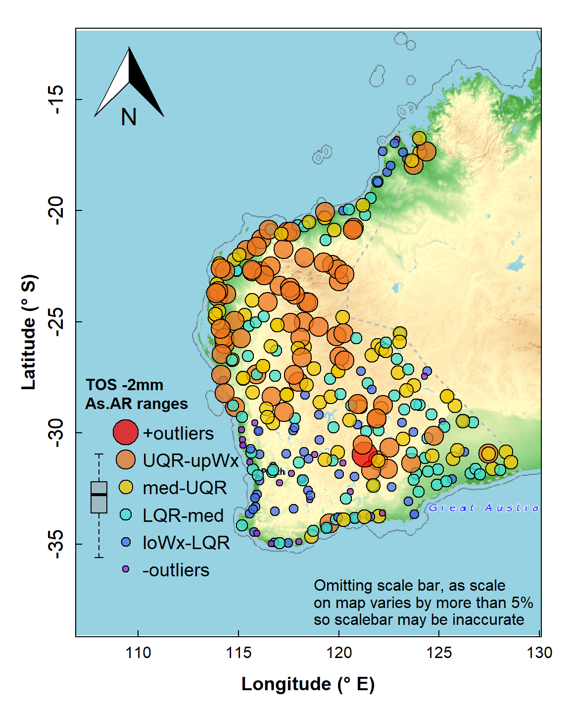
Map of arsenic (As) concentrations expressed as symbols for concentration ranges (UQR is 75th percentile, upWx is upper whisker, med is median, LQR is 25th percentile, loWx is lower whisker). Data are from from the WA subset of the NGSA data, -2mm tosoil fraction.
The map's symbol classes in Figure 4 are separated by the standard Tukey box plot thresholds (minimum, lower-hinge, median, upper-hinge, maximum) – the legend is roughly aligned with the relevant box plot. We see a wide range of As concentration, with greater As probably associated with iron-rich rocks in the Pilbara (northwest WA) and central Yilgarn (central south WA).
Spatial Autocorrelation
Whether samples are spatially related or not, in terms of a particular measured variable, is expressed by the spatial autocorrelation or Moran's I (Zhang et al., 2008). The Moran's I statistic is based on comparison of the values of a variable at one point with a specified number (or within a specified distance) of neighbouring points. A positive Moran I autocorrelation suggests that locations with similar values of the variable considered tend to cluster together. A Moran's I close to zero suggests no autocorrelation (values of the variable considered are randomly located), and a larger negative Moran's I suggests that similar values of the variable considered tend to be further apart than expected from a random spatial distribution. The Moran's I statistic is tested against the null hypothesis of no spatial autocorrelation, and will vary with the number of neighbouring points in the calculation, with more points giving weaker autocorrelations (Kalogirou, 2019).
The basic Moran's I is a global autocorrelation, across the whole spatial dataset being analysed. The Local Moran's I can also be calculated, and shows the extent of significant spatial clustering of similar values (of the variable considered) around each observation.
Spatial autocorrelation statistics, usually Moran's I, can be
calculated using various GIS and statistical software, including several
packages which add functionality to R (we use the spdep
package).
Calculate Global Moran's I
The subset of the National Geochemical Survey of Australia (NGSA)
data we are using is in the object ngsaWAsf.
We first use the knearneigh() function from the
spdep R package to create a matrix with the row numbers of
points belonging to the set of the k nearest neighbours of each other.
We don't actually save the output but use the native R
pipe operator |> to run the output through (1) the
knn2nb() function to convert to an object of class
nb which includes neighbour region numbers, then (2) the
nb2listw to create a list of weights (we can see what these
look like by running str(ngsaWA_nbwt), or
print(ngsaWA_nbwt) for a summary).
Next we use the moran.test() function to generate our
Moran's I statistic. The null hypothesis is that the observations are
random with no spatial correlation.
ngsaWA_nbwt <- knearneigh(x=ngsaWAsf, k=8) |> knn2nb() |> nb2listw()
ngsaWAsf$As.log <- log10(ngsaWAsf$As.AR)
(mI <- moran.test(ngsaWAsf$As.log, ngsaWA_nbwt)) # ; str(mI) # if needed
##
## Moran I test under randomisation
##
## data: ngsaWAsf$As.log
## weights: ngsaWA_nbwt
##
## Moran I statistic standard deviate = 17.055, p-value < 2.2e-16
## alternative hypothesis: greater
## sample estimates:
## Moran I statistic Expectation Variance
## 0.4604199496 -0.0032894737 0.0007392565The Expectation in the output is the estimated value of
Moran's I if the null hypothesis is correct. We can try running the test
with different numbers of neighbour points, or use a distance-based
criterion for defining neighbours.
Calculate local Moran's I
In this example we use the localmoran() function from
the spdep R package. Once again we use the
knearneigh() function to define which points are neighbours
(with k=4 this time), and convert these to weights.
It's easy to modify the code to calculate Local Moran's I for another
variable, by editing the text string which is assigned to
var0. For a list of variables in the original data subset
we could run names(ngsaWA).
To make it easier to extract and map the output, we combine our data
coordinates st_coordinates(ngsaWAsf) with two extracts of
our local Moran's I output object lmi_As:
as.data.frame(lmi_As), which contains the values of local Moran's I (Ii), expectedIiif H0 is true (E.Ii), variance in Ii (Var.Ii), the standard normal score forIi(Z,Ii), and the p-value (Pr(z != E(Ii)));attributes(lmi_As)$quadr, which contains the Local Indicators of Spatial Association (LISA) categories ('quadrants') for each observation.
var0 <- "As.log"
lmi_data <- na.omit(ngsaWAsf[,var0])
# lmi_data$As.log <- log10(lmi_data$As.AR)
lmi_wts <- knearneigh(ngsaWAsf,k=4) |> knn2nb() |> nb2listw()

lmi_As <- localmoran(lmi_data$As.log, lmi_wts)
lmiDF_As <- cbind(st_coordinates(ngsaWAsf),as.data.frame(lmi_As), attributes(lmi_As)$quadr)
colnames(lmiDF_As) <- c("Longitude","Latitude",
                        "Ii", "E.Ii", "Var.Ii", "Z.Ii", "Pvalue",
                        "mean", "median", "pysal")
print(head(lmiDF_As[,3:10]), digits=3)
## Ii E.Ii Var.Ii Z.Ii Pvalue mean median pysal
## 1 0.0478 -2.43e-05 0.00183 1.116 0.2646 High-High Low-High High-High
## 2 1.1874 -5.32e-03 0.39918 1.888 0.0591 High-High High-High High-High
## 3 1.0937 -3.13e-03 0.23538 2.261 0.0238 High-High High-High High-High
## 4 -0.2016 -3.50e-04 0.02641 -1.238 0.2156 High-Low High-Low High-Low
## 5 -0.2630 -3.99e-04 0.03008 -1.514 0.1300 Low-High Low-High Low-High
## 6 0.7082 -2.10e-02 1.55425 0.585 0.5586 Low-Low Low-Low Low-LowPlot local Moran's I
We only want to display points having significant local Moran's I, so
we subset the results data frame from above using the
which() function. We subset these data further into
positive and negative values of local Moran's I (using the
subset() function), since the symbols()
function cannot input negative values. Symbols are plotted with
sqrt() values since human perception compares areas better
than diameters.
lmi_signif <- lmiDF_As[which(lmiDF_As$Pvalue <= 0.05),c(1:3,7,9)]

par(oma=c(0,0,0,0), mar=c(4,4,1.5,1.5), mgp=c(1.4,0.3,0),
    lend=2, ljoin=1, tcl=0.3, tcl = 0.5, lwd = 1, font.lab=2)
wa_outline <- subset(st_coordinates(wa_sf)[,c(1:2)],
                     st_coordinates(wa_sf)[,4]==5) # subset omits islands
plot(wa_outline, asp=1.05, pch=".", col="grey", xlim=c(110,129), ylim=c(-38,-13),
     xlab="Longitude (\u00b0E)", ylab="Latitude (\u00b0S)",xaxs="i")
polygon(rbind(wa_outline,wa_outline[1,]), col="grey88", border = "grey")
points(st_coordinates(ngsaWAsf),pch=3,col="grey60",cex=0.6)
neg_lmi <- subset(lmi_signif, lmi_signif$Ii<0)
pos_lmi <- subset(lmi_signif, lmi_signif$Ii>=0)
symbols(pos_lmi[,1:2], inches=F, circles=sqrt(pos_lmi$Ii*0.4), add=T,
        fg="blue3", bg="#0000FF40")
symbols(neg_lmi[,1:2], inches=F, circles=sqrt(neg_lmi$Ii*-0.4), add=T,
        fg="tan", bg="#FFE00080")
addnortharrow(pos="topright", border=1, lwd=1, text.col=1,
              padin=c(0.1,0.1), scale=0.5)
textMI=paste0("Global Moran's I = ",signif(mI$estimate[1],4))
legend("topleft", cex=0.9, bg="grey88", box.col = "grey", inset=0.02,
       legend=c("Local Moran's I \u2265 0","Local Moran's I < 0",
                "Sample locations"),
       pch=c(21,21,3), col=c("blue3","tan","grey60"),
       pt.bg=c("#0000FF40","#FFE00080",NA),
       pt.cex=c(3,3,0.5), title = textMI)
legend("bottomright", bty="n", inset = 0.01,
       legend = c("Not plotting scale bar as scale",
                  "on map varies by more than 5%,",
                  "so scalebar may be inaccurate"),
       y.intersp=0.9, cex = 0.8, text.col = "grey60")
box()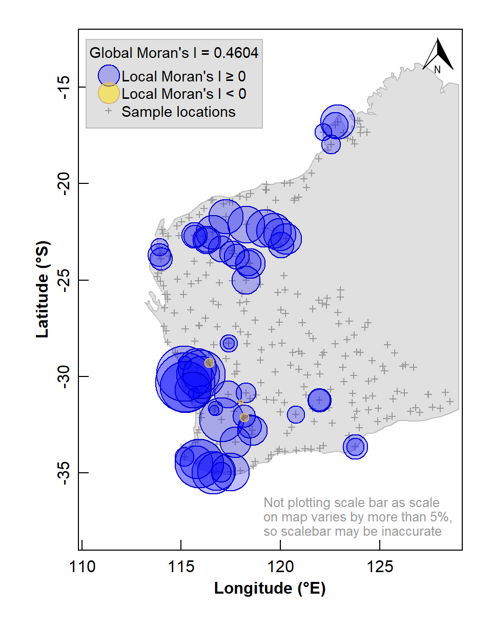
Figure 5: Map of Local Moran's I for arsenic (As) concentrations in the WA subset of the NGSA data, -2mm tosoil fraction. The Global Moran's I parameter is also shown above the legend.
The map in Figure 5 shows numerous sample locations having positive Local Moran's I for the selected variable, and a significant global spatial autocorrelation (Moran's I ≅ 0.46, with a very low p-value).
We can also use the information stored in our local Moran's I data frame to plot a map of local indicators of spatial association (LISA; see Table 2).
LISA quadrant | Variable valuea | Local Moran's I |
Low-Low | < median | positive |
High-Low | > median | negative |
Low-High | < median | negative |
High-High | > median | positive |
aLISA quadrants can also be defined relative to the mean. | ||
lmi_signif <- lmiDF_As[which(lmiDF_As$Pvalue <= 0.05),]
palette(c("black",RColorBrewer::brewer.pal(7,"RdBu")))
par(oma=c(0,0,0,0), mar=c(4,4,1.5,1.5), mgp=c(1.4,0.3,0),
    lend=1, ljoin=0, tcl=0.3, tcl = 0.5, lwd = 1, font.lab=2)
wa_outline <- subset(st_coordinates(wa_sf)[,c(1:2)],
                     st_coordinates(wa_sf)[,4]==5) # subset omits islands
plot(wa_outline, asp=1.05, pch=".", col="grey", xlim=c(110,129), ylim=c(-38,-13),
     xlab="Longitude (\u00b0E)", ylab="Latitude (\u00b0S)",xaxs="i")
polygon(rbind(wa_outline,wa_outline[1,]), col="grey88", border = "grey")
points(st_coordinates(ngsaWAsf),pch=3,col="grey60",cex=0.6)
with(lmi_signif,
     points(Longitude, Latitude, lwd=2,
            pch=c(25,22,25,22)[median],
            col=c(8,8,2,2)[median],
            bg=c(7,3,7,3)[median],
            cex = c(1,1.2,1,1.2)[median])
     )
addnortharrow(pos="topright", border=1, lwd=1, text.col=1,
              padin=c(0.1,0.1), scale=0.5)
legend("topleft", cex=0.9, bg="grey88", box.col = "grey", inset=0.02,
       legend=levels(lmi_signif$median), title="LISA Quadrants",
       pch=c(25,22,25,22), col=c(8,8,2,2),
       pt.bg=c(7,3,7,3), pt.cex = c(1,1.2,1,1.2))
legend("bottomright", bty="n", inset = 0.01,
       legend = c("Not plotting scale bar as scale",
                  "on map varies by more than 5%,",
                  "so scalebar may be inaccurate"),
       y.intersp=0.9, cex = 0.8, text.col = "grey60")
box()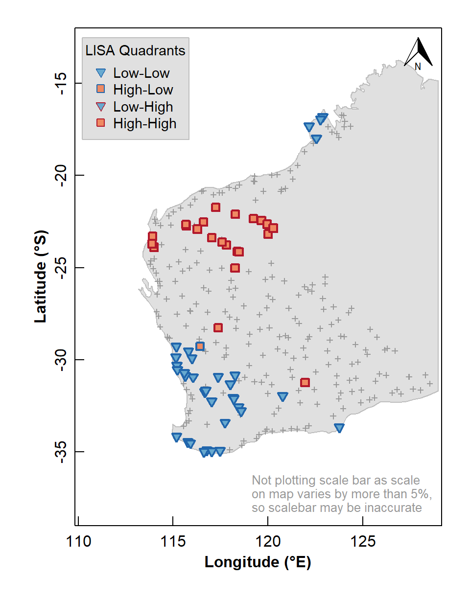
Figure 6: Map of Local Indicators of Spatial Association (LISA) relative to median for arsenic (As) concentrations in the WA subset of the NGSA data, –2 mm topsoil fraction.
The LISA map enables us to identify localized map regions where values of the chosen variable in or data are strongly positively or negatively associated with one another, that is, different spatial clusters. Usually locations having significant Low-High or High-Low association are isolated and less common, as we see in Figure 6.
Using the gstat package for Geostatistics: variograms, kriging, and visualization
Make a 'Simple Features' spatial data object from a data frame
In this example (as for Moran's I) we log10-transform our variable as its distribution is highly positively skewed. (Using the untransformed variable would result in too many apparent upper outliers.)
As.AR_sf$As.log <- log10(As.AR_sf$As.AR)
summary(As.AR_sf)
## As.AR geometry As.log tukey
## Min. : 0.050 POINT :305 Min. :-1.30103 -outliers:23
## 1st Qu.: 0.800 epsg:4326 : 0 1st Qu.:-0.09691 loWx-LQR :56
## Median : 1.600 +proj=long...: 0 Median : 0.20412 LQR-med :74
## Mean : 2.869 Mean : 0.15464 med-UQR :76
## 3rd Qu.: 3.300 3rd Qu.: 0.51851 UQR-upWx :75
## Max. :50.200 Max. : 1.70070 +outliers: 1Plot the spatial object for checking
To quickly check our data, we use the function bubble()
from the sp package to make a bubble map (Figure
7) of our variable, where the symbol area is proportional to
the variable value (in this case, log10 arsenic
concentration). We use the as_Spatial() function to convert
our sf object to an sp object, so we can use
sp::bubble().
As.AR_sp <- as_Spatial(As.AR_sf)
bubble(As.AR_sp, "As.log", col=c("#ff000088", "#0000ff88"), main = "",
       scales = list(draw = TRUE), xlab = "Longitude", ylab = "Latitude")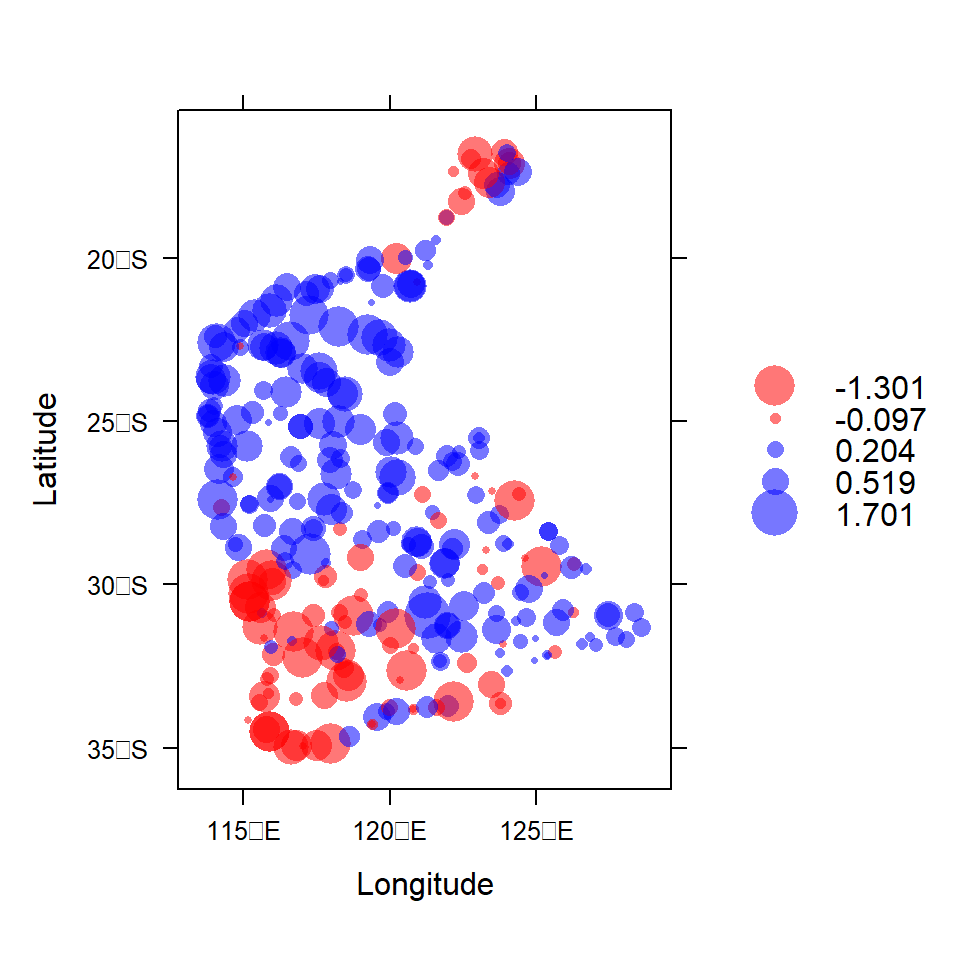
Figure 7: Visualization of spatial point data object for log10-transformed arsenic (As) concentrations in the WA subset of the NGSA data. Negative log10-values are red, positive blue.
Variograms and Kriging
The variogram, simplistically, is the relationship between the variance between sample points, and the distance separating those sample points. In many instances, it is desirable to predict a variable or measurement at locations where samples have not been taken, and this requires some assumption(s), usually a mathematical model, about how that variable varies with distance. This information is actually provided by the variogram. In many cases the form of the variogram relationship can be simulated adequately with a mathematical function. The variogram function can then be used to interpolate between points – a process known as kriging (after the originator of the method and pioneer of geostatistics, Professor Danie Krige). Variograms and kriging are summarised expertly by Oliver and Webster (2014) and Reimann et al. (2008). Webster and Oliver (1993) argue that at least 100 observations (and preferably more) are needed for kriging interpolation, based on variogram analysis to establish the relationship between sample points as a function of separation distance. The United States Environmental Protection Agency (USEPA, 2002) reports that, for variograms and kriging, stratified sampling can have a lower sample number requirement than a simple grid, but that kriging accuracy is similar for all sampling designs.
Figure 8 shows some of the key concepts of variogram analysis. In practice, the large number of points representing all possible distances between pairs of locations are 'binned' into distance ranges, and the mean square variance in each 'bin' is used as the estimated semivariance for each bin distance. There is some semivariance that exists even for samples which are very closely-spaced (tending to zero distance), and this is called the nugget. This semivariance increases with increasing distance between samples to a limiting value called the sill. At some distance there is no increase in semivariance (which then approaches the variance of the complete dataset), and this distance is called the range, the value of which depends on the mathematical model used to describe the semivariance-distance relationship. The practical range, the distance at which samples are independent, is related to the model range by a factor dependent on the model equation.
The practical range, rε, is defined as the distance at which semivariance is 95% of the sill. It is related to the model range a by:
- For an exponential model, rε = 3 × a
- For a Gaussian model, rε = √3 × a
- For a spherical model, rε ≅ 0.8 × a
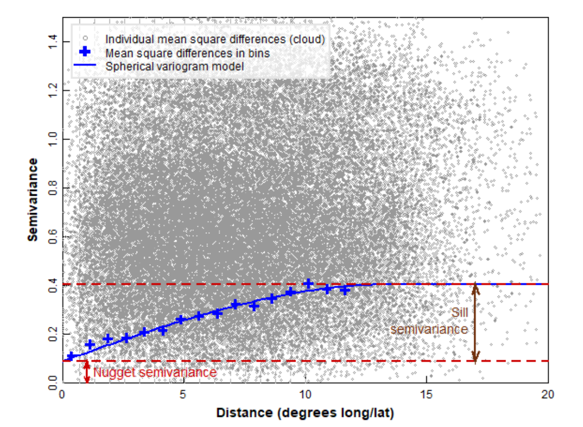
Figure 8: Some of the key concepts of variogram analysis (see text for definitions).
Make a binned simple variogram object
We calculate the semivariance within bins (distance
intervals) which combine the mean square difference within a set of
intervals of sample separation distances (Figure 9). This allows both
visualization of the trend in semivariance with distance, and fitting of
a model variogram equation to the semivariance–distance relationship.
The number of bins can be determined "automatically" by an algorithm, or
can be specified by the user. We usually constrain the maximum
separation distance (max.dist) to be less than the maximum
spatial extent of the data – Reimann et al. (2008) suggest that
the maximum distance for the variogram should be ≈ 40% of the maximum
dataset distance, which for these data is 19.66 ° longitude or
latitude.
par(mar = c(3,3,1,1), mgp = c(1.7,0.3,0), font.lab=2, tcl=0.3)
variog_As.log <- variogram(As.log~1, As.AR_sf) # , cressie = TRUE
plot(variog_As.log, xlab = "Distance (km)", pch=19, col="blue2")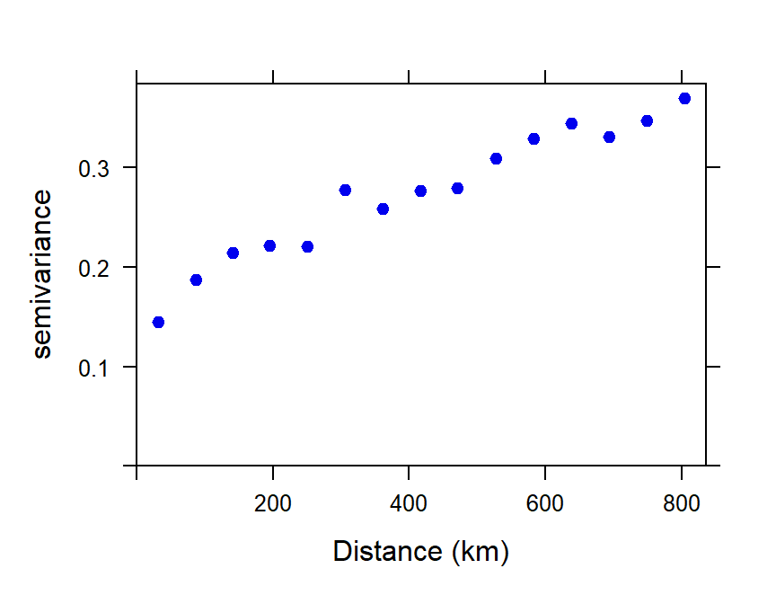
Figure 9: Plot of experimental binned variogram for arsenic (As) in the WA subset of the NGSA data, -2mm tosoil fraction.
The experimental variogram and variogram models
From the experimental (or 'empirical') variogram, we can generate a
variogram model by fitting a function to the binned
semivariance-distance relationship. Common variogram model functions
include exponential, spherical, and Gaussian, and there are numerous
others (run vgm() for a list).
Fit a variogram model using weighted least squares
We need to choose the type of model (e.g. exponential, spherical, etc.), and make decisions about whether to include a nugget. In Figure 10 we show a model with a fitted value for the nugget semivariance.
The exponential model we use is defined by:
γ = b + C0 × (1 −
e−x/a), where:
- γ = semivariance
- x = distance (as defined by the binned values)
- b = nugget (Nug in gstat; also called τ2 (tau squared))
- C0 = partial sill (psill in gstat; also called σ2 (sigma squared))
- a = range (also called φ (phi); a is NOT the 'practical range')
vmodel_As.log <- fit.variogram(variog_As.log,
                              model = vgm(psill = NA, model = "Exp",
                                          nugget = 0.1,
                                          cutoff = max(variog_As.log$dist)))
vmodel_As.log
## model psill range
## 1 Nug 0.1299945 0.000
## 2 Exp 0.2480348 407.132with(variog_As.log, plot(dist, gamma, ylim = c(0, max(gamma)), cex.lab=1.2,
lwd=2, xlab = "Distance (km)",
ylab = expression(bold(paste("Semivariance (",gamma,")")))))
# plot model
x0 <- variog_As.log$dist
y0 <- vmodel_As.log$psill[1] +
vmodel_As.log$psill[2]*(1 - exp(-1*x0/vmodel_As.log$range[2]))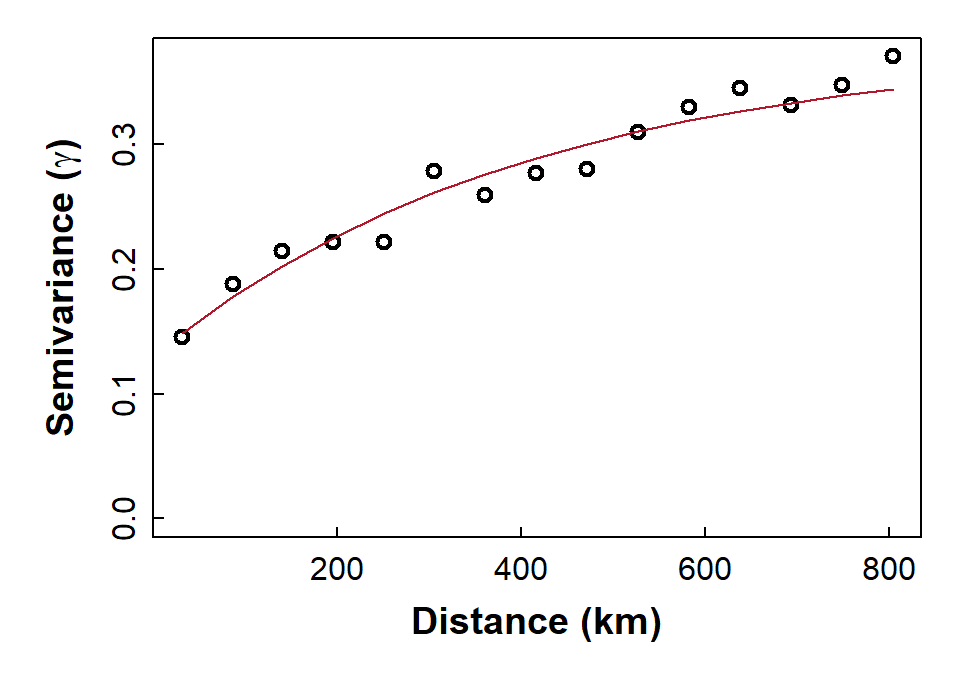
Figure 10: Plot of experimental binned variogram, and exponential variogram model, for arsenic (As) in the WA subset of the NGSA data, -2mm topsoil fraction.
Perform kriging interpolation
Now that we have a variogram model, we can use it in the kriging
interpolation process to make a map of predicted values of our variable,
as shown later in Figure 13. To perform an interpolation, we need to
provide a grid of locations that we want to predict values at. This is
done using the expand.grid() function from base
R – we are using ≈ 0.2 degree increments, but these can
be changed (e.g., larger increments for a coarser grid).
So, the first step is to make the grid of locations at which to make
our kriging predictions. Starting with a rectangular grid using the
st_make_grid() function from the sf package,
we restrict this grid to only the points in the NGSA sampling area,
using the st_intersection() function from
sf.
ngsa_poly <- st_polygon(list(as.matrix(NGSAWA_border[c(1:91,1), 1:2])))
ngsaWA_poly <- st_multipolygon(list(ngsa_poly)) |> st_sfc()
st_crs(ngsaWA_poly) <- LongLat
grid_big <- st_make_grid(ngsaWA_poly,
                         cellsize = c(0.2,0.2),
                         offset = st_bbox(ngsaWA_poly)[c("xmin", "ymin")],
                         what = "centers")

# # use `st_intersection()` function from `sf` package to mask initial grid
NGSAgrid <- st_intersection(ngsaWA_poly, grid_big)

cat("Prediction grid:\n"); NGSAgrid
## Prediction grid:
## Geometry set for 3500 features
## Geometry type: POINT
## Dimension: XY
## Bounding box: xmin: 113.4034 ymin: -34.96724 xmax: 128.8034 ymax: -16.76724
## Geodetic CRS: WGS 84
## First 5 geometries:We then use the krige() function from gstat
to make predictions of our variable and its variance at the grid
locations, based on our variogram model. (Note: if we do not specify a
model, krige() will make predictions using inverse
distance interpolation, which does not allow estimation of
variance.) Here we use the idw() function so we can specify
the inverse distance weighting parameter idp =.
kriged_As.log <- krige(formula = As.log~1, locations = As.AR_sf,
                      newdata = NGSAgrid, model = vmodel_As.log)
summary(kriged_As.log)
cat("_____________________________________________________________________\n\n")
idpower <- 3.0
idw_As.log <- idw(formula = As.log~1, locations = As.AR_sf,
                  newdata = NGSAgrid, idp = idpower) # idp = 2 is the default
summary(idw_As.log)
## [using ordinary kriging]
## var1.pred var1.var geometry
## Min. :-0.95613 Min. :0.1575 POINT :3500
## 1st Qu.:-0.04899 1st Qu.:0.1720 epsg:4326 : 0
## Median : 0.23887 Median :0.1763 +proj=long...: 0
## Mean : 0.20047 Mean :0.1777
## 3rd Qu.: 0.48836 3rd Qu.:0.1816
## Max. : 1.01392 Max. :0.2311
## _____________________________________________________________________
##
## [inverse distance weighted interpolation]
## var1.pred var1.var geometry
## Min. :-1.30100 Min. : NA POINT :3500
## 1st Qu.:-0.04223 1st Qu.: NA epsg:4326 : 0
## Median : 0.23489 Median : NA +proj=long...: 0
## Mean : 0.19457 Mean :NaN
## 3rd Qu.: 0.49809 3rd Qu.: NA
## Max. : 1.68300 Max. : NA
## NA's :3500Simple plot of kriging output
We can then us the spplot() function from
sp to visualise the kriging predictions and variance, but
without a background map (Figure 11).
png(file="krigpred.png", width = 600, height=600)
plot(kriged_As.log[1], pch=15, cex=1.2, main="Kriging predictions",
     breaks = pretty(kriged_As.log$var1.pred,10),
     pal = viridis(length(pretty(kriged_As.log$var1.pred,10))-1),
     cex.main=2)
dev.off()
png(file="krigvar.png", width = 600, height=600)
plot(kriged_As.log[2], pch=15,cex=1.1, main="Kriging variance",
     breaks = pretty(kriged_As.log$var1.var,10),
     pal = cividis(length(pretty(kriged_As.log$var1.var,10))-1),
     cex.main=2)
dev.off()
par(oma=c(0,0,0,0),mar=c(0,0,0,0))
p1 <- readPNG("krigpred.png")
plot(c(0,1),c(0,1), axes=F, type="n",xaxt="n", yaxt="n",ann=F)
addImg(p1, x = 0.25, y = 0.5, width = 0.5)
p2 <- readPNG("krigvar.png")
addImg(p2, x = 0.75, y = 0.5, width = 0.5)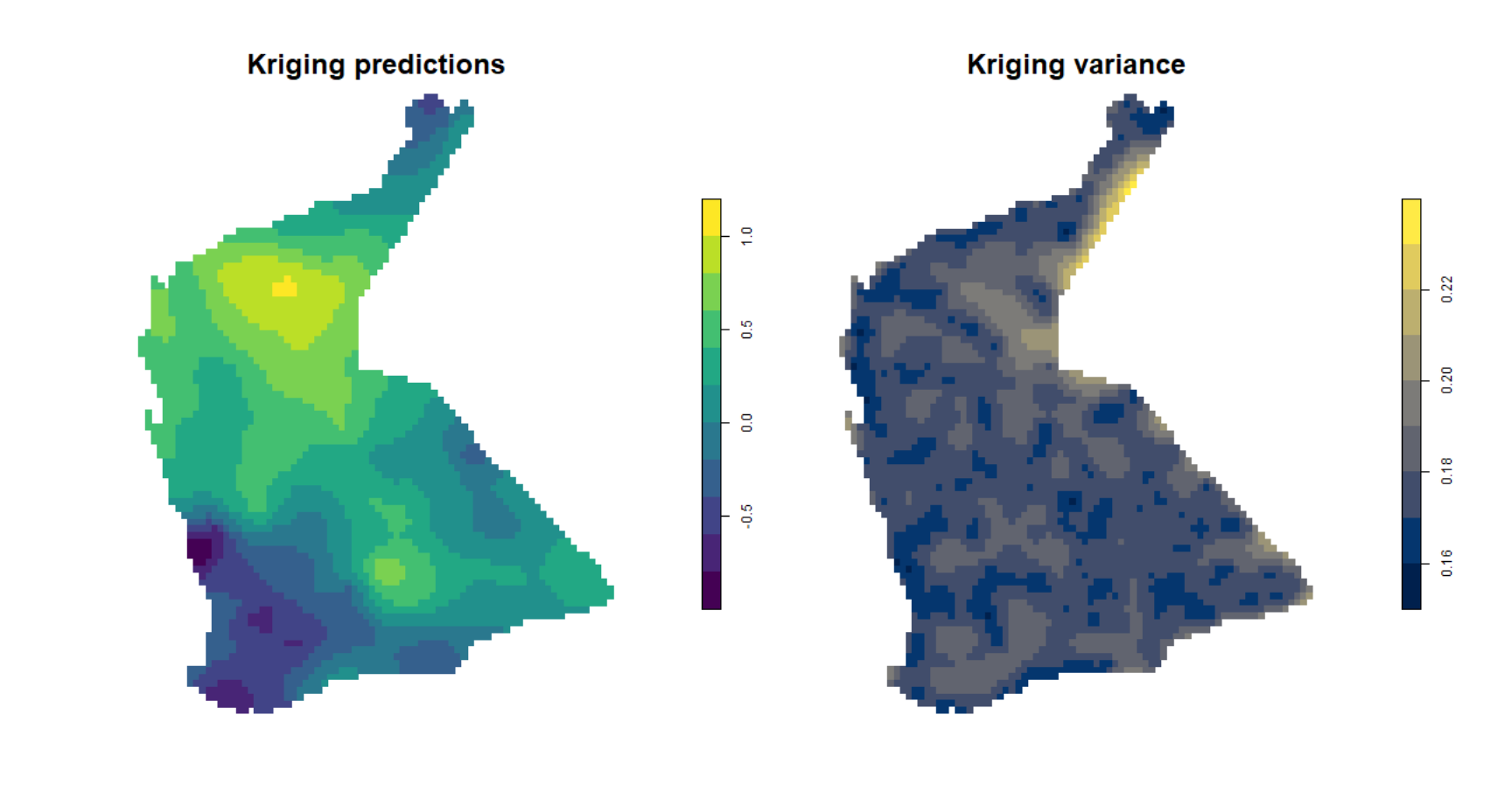
Figure 11: Plots of simple kriging predictions (left) and variance (right) for log-transformed arsenic (As) in the WA subset of the NGSA data, -2mm topsoil fraction.
Compare Figure 11 with the output from inverse distance weighted
(IDW) interpolation (Figure 12). The kriged prediction shows a
'smoother' spatial pattern, but note that the IDW interpolation can be
smoothed differently by changing the weighting parameter
idp = ... in the idw() function (see relevant
code above).
plot(idw_As.log[1], pch=15,
     pal = magma(length(pretty(idw_As.log$var1.pred))-1),
     main = paste("Inverse Distance Weighting (IDW) power =", idpower),
     font.main=1, cex.main=0.85)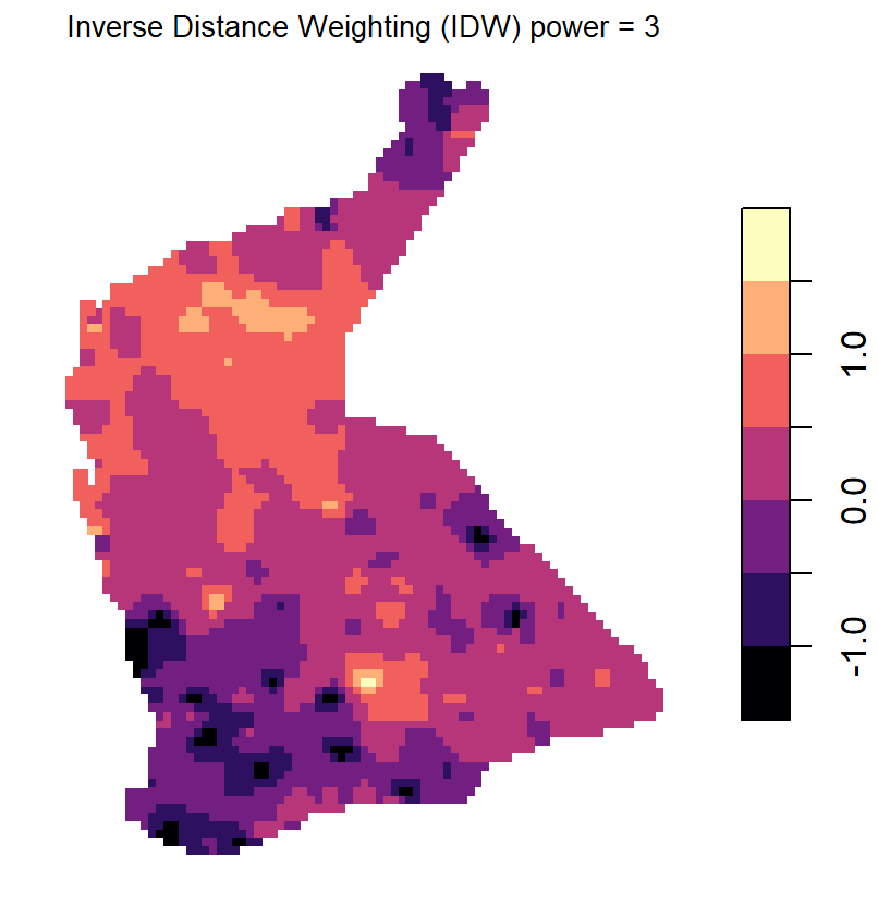
Figure 12: Plots of inverse distance weighted (IDW) interpolation predictions for log-transformed arsenic (As) in the WA subset of the NGSA data, -2mm topsoil fraction.
Plot a map with overlay of the kriging predictions
We use the base map created before, and plot the kriging predictions
over this (Figure 13a). Since the locations for kriged predictions are
no longer a rectangular grid (we trimmed off locations not in the NGSA
sampling area), we need to use the quilt.plot() function
from the fields package to plot from an irregular grid. We
set the options for the colour-scale legend based on the options in the
image.plot() function, also from fields.
The fields package also contains the function
bubblePlot(), which is also useful for mapping data from
irregular grids with a smooth colour gradient, such as that used here
from the viridis package.
The second part of the code creates a map of the estimated variance
at each point on our interpolation grid, so the code is very similar,
except that we specify …data[,2] instead of
…data[,1].
Note: The output of the krige()
function is an object of classes sf and
data.frame, essentially a list which includes vectors
$var1.pred, containing the interpolated predictions, and
$var1.var which contains the estimated variance, at each
interpolated point on the grid (the grid is saved in the
$geometry column of the output object).
par(mfrow=c(1,2), oma=c(4,4,1.5,1.5), mgp=c(1.4,0.3,0), lend=2, ljoin=1, tcl=0.3)
plot(WAtiles)
axis(1, mgp=c(2, 0.5, 0), cex.axis = 1.3)
mtext(side=1, line=2, text="Longitude (\u00B0 E)",
      font=2, cex=1.6)
axis(2, mgp=c(2, 0.5, 0), cex.axis = 1.3)
mtext(side=2, line=2, text="Latitude (\u00B0 S)",
      font=2, cex=1.6)
addnortharrow(pos="topleft", border=1, lwd=1, text.col=1,
              padin=c(0.2,0.2), scale=1)
axtx <- c(0.01,0.02,0.05,0.1,0.2,0.5,1,2,5,10,20,50,100)
quilt.plot(st_coordinates(NGSAgrid)[,1],
           st_coordinates(NGSAgrid)[,2],
           kriged_As.log$var1.pred,
           add = T, horizontal=T, col = viridis::viridis(64),
           legend.lab = expression(bold(paste(log[10],"(As.AR)"))),
           legend.mar = 4, legend.cex = 1.2, legend.line = 1.5,
           axis.args = list(mgp=c(1.5,0.2,0)))
addnortharrow(pos="topleft", border=1, lwd=1, text.col=1,
              padin=c(0.2,0.2), scale=1)
box(); mtext("(a)",3,-2,font=2,cex=1.5)
# start plot of kriging variance
plot(WAtiles); axis(1, mgp=c(2, 0.5, 0), cex.axis = 1.3)
mtext(side=1, line=2, text="Longitude (\u00B0 E)", font=2, cex=1.6)
addnortharrow(pos="topleft", border=1, lwd=1, text.col=1,
              padin=c(0.2,0.2), scale=1)
quilt.plot(st_coordinates(NGSAgrid)[,1],
           st_coordinates(NGSAgrid)[,2],
           kriged_As.log$var1.var,
           add = T, horizontal=T, col = viridis::viridis(64,alpha = 0.75),
           legend.lab = expression(bold(paste("Variance in ",log[10],"(As.AR)"))),
           legend.mar = 4, legend.cex = 1.2, legend.line = 1.5,
           axis.args = list(mgp=c(1.5,0.2,0)))
addnortharrow(pos="topleft", border=1, lwd=1, text.col=1,
              padin=c(0.2,0.2), scale=1)
points(st_coordinates(As.AR_sf), pch=3, col = "white", cex = 0.7)
box(); mtext("(b)",3,-2,font=2,cex=1.5)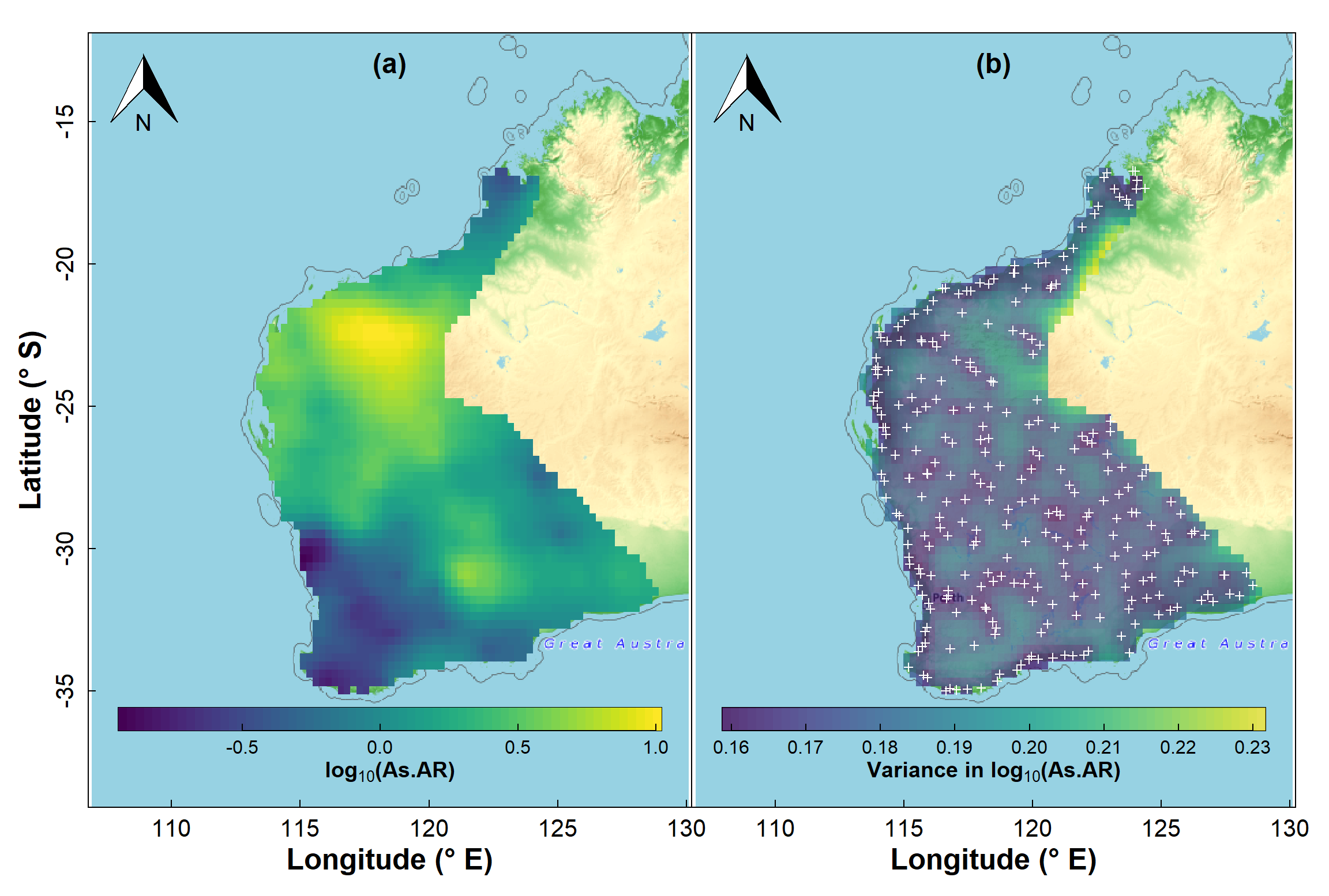
Figure 13: Map showing kriging predictions for arsenic (As) in the WA subset of the NGSA data, -2mm topsoil fraction.
It's also useful to map the estimated variance at each point on our prediction grid, and we can see the output of such a map in Figure 13b. You should notice that the low variance (darker colours) is close to the actual sample points, and greater variance (lighter colours) is in locations further from sample points. As we would expect, predictions are more precise the closer we are to locations having actual measurements!
We can perform a similar set of procedures for a variable which does not show significant spatial autocorrelation (example in Figure 14 on the last page). In this case, we have (i) an experimental variogram which has high intrisic variance (i.e., a high nugget) with low spatial variance (partial sill), and (ii) greater kriging variance relative to kriging predictions. Try it!
Additional Issues for Variograms and Kriging
the semivariance distance relationship may not be the same in all directions (anisotropic). In such cases we need a directional variogram – in
gstatthis can be done with parameters in thevariog()function (see also http://www.leg.ufpr.br/geoR/geoRdoc/geoRintro.html#exploratory).The mean value of our mapping variable may show a systematic variation across our sampling area, such as a linear trend. This is a lack of "stationarity", and such a trend should be incorporated into a variogram model to apply universal kriging (see http://www.leg.ufpr.br/geoR/geoRdoc/geoRintro.html#estimation).
In most natural systems, the variable of interest will not just change from place to place, but will also be dependent on on or more other variables. In these cases, we need to use more advanced interpolation methods such as co-kriging (see http://chris35wills.github.io/geostats/ for some good explanations).
References and R Package Citations
Caritat, P., Cooper, M., 2011. National Geochemical Survey of Australia: The Geochemical Atlas of Australia. GA Record 2011/20 (2 Volumes). Geoscience Australia, Canberra, 557 pp.
Dunnington, D. 2017. prettymapr: Scale Bar, North Arrow, and Pretty Margins in R. R package version 0.2.2. https://CRAN.R-project.org/package=prettymapr
Garnier, Simon, Noam Ross, Robert Rudis, Antônio P. Camargo, Marco Sciaini, and Cédric Scherer (2021). viridis - Colorblind-Friendly Color Maps for R. R package version 0.6.2.
Giraud T (2021). maptiles: Download and Display Map Tiles. R package version 0.3.0, https://CRAN.R-project.org/package=maptiles.
Gräler B., Pebesma E., Heuvelink G., 2016. Spatio-Temporal Interpolation using gstat. The R Journal 8(1), 204-218.
Kalogirou, S., 2019. Spatial Autocorrelation, Vignette for R package 'lctools', https://cran.r-project.org/web/packages/lctools/vignettes/SpatialAutocorrelation.pdf
Kalogirou, S. 2020. lctools: Local Correlation, Spatial Inequalities, Geographically Weighted Regression and Other Tools. R package version 0.2-8. https://CRAN.R-project.org/package=lctools
Nychka D., Furrer R., Paige J., Sain S. (2021). fields: Tools for spatial data. R package version 13.3, https://github.com/dnychka/fieldsRPackage.
Oliver, M.A., Webster, R., 2014. A tutorial guide to geostatistics: Computing and modelling variograms and kriging. Catena, 113: 56-69, https://doi.org/10.1016/j.catena.2013.09.006.
Pebesma, E., 2018. Simple Features for R: Standardized Support for Spatial Vector Data. The R Journal 10 (1), 439-446, https://doi.org/10.32614/RJ-2018-009. (package sf)
Pebesma, E.J., R.S. Bivand, 2005. Classes and methods for spatial data in R. R News 5 (2), https://cran.r-project.org/doc/Rnews/. (package sp)
Pebesma E, Bivand R (2023). Spatial Data Science With Applications in R. Chapman & Hall. https://r-spatial.org/book/. (package spdep)
Reimann, C., Filzmoser, P., Garrett, R.G., Dutter, R., 2008. Statistical Data Analysis Explained: Applied Environmental Statistics with R. John Wiley & Sons, Chichester, England, 343 pp.
USEPA, 2002. Guidance on Choosing a Sampling Design for Environmental Data Collection for Use in Developing a Quality Assurance Project Plan. EPA QA/G-5S, United States Environmental Protection Agency, Washington, DC.
Webster, R., Oliver, M.A., 1993. How large a sample is needed to estimate the regional variogram adequately? Geostatistics Troia '92. Vol. 1: 155-166.
Zhang, C., Luo, L., Xu, W., Ledwith, V., 2008. Use of local Moran's I and GIS to identify pollution hotspots of Pb in urban soils of Galway, Ireland. Science of the Total Environment, 398: 212-221, https://doi.org/10.1016/j.scitotenv.2008.03.011.
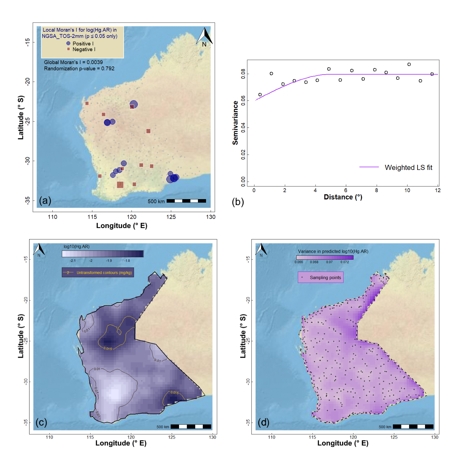
Figure 14: Geostatistics for Hg (mercury) in the WA subset of the NGSA data: (a) spatial autocorrelation, (b) experimental (binned) and model variograms, (c) kriging predictions, and (d) kriging uncertainties.
CC-BY-SA • All content by Ratey-AtUWA. My employer does not necessarily know about or endorse the content of this website.
Created with rmarkdown in RStudio using the cyborg theme from Bootswatch via the bslib package, and fontawesome v5 icons.