R basics

This guide gets you started with reading data into R (in the RStudio environment) from a file, and checking that the data have been read in correctly.
If you need or would like a more basic
introduction to R, you could first read our
Guide to R and RStudio for
absolute beginners.
Reading the data
We use the read.csv() function to read data which is
stored in a csv (comma-separated
values) file. When using this function, R
expects that:
- each line in the
csvfile is a row, except the first line which contains the column names; - commas separate the values to go in each column (like each 'cell' in Excel).
hubbard <- read.csv(file = "hubbard.csv", stringsAsFactors = TRUE)
# ... and do a quick check
is.data.frame(hubbard) # check that it worked
## [1] TRUEThese data are from the Hubbard Brook Experimental Forest near Woodstock in New Hampshire, USA (Figure @ref(fig:hubbard-pix)).
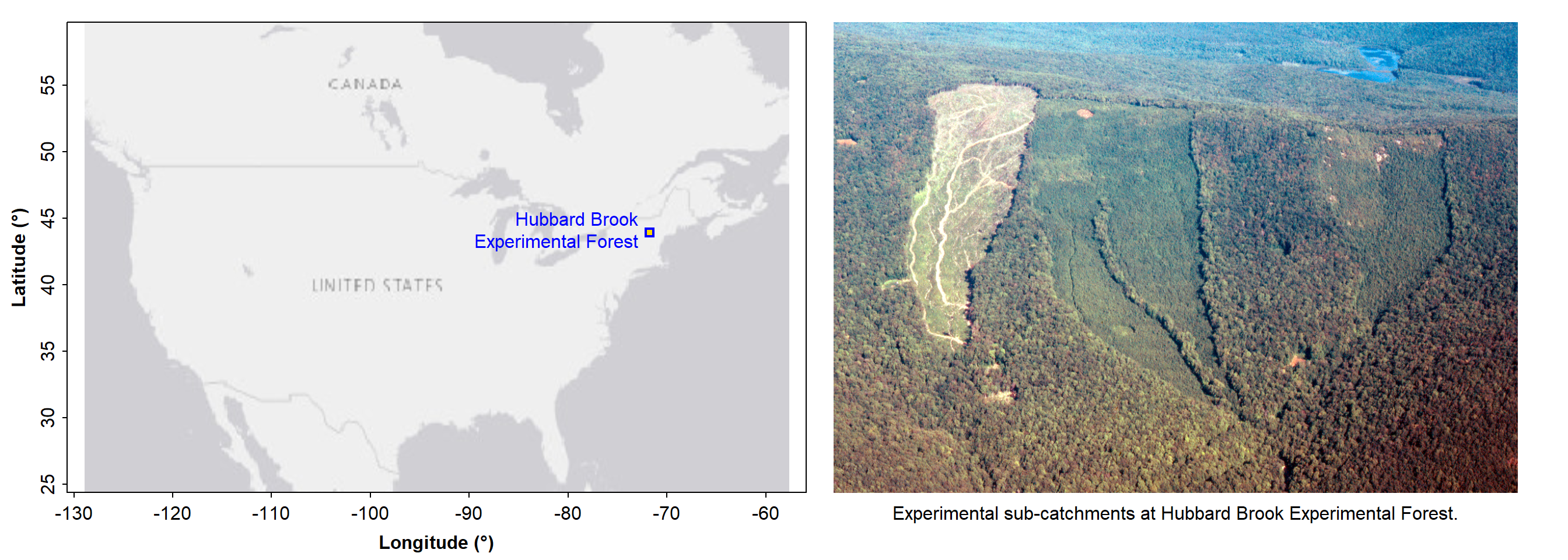
Location of the Hubbard Brook Experimental Forest in New Hampshire, USA. The data used in this workshop were generated at this site.
First proper check - summarise some of the data
summary(hubbard[,1:10]) # just the first 10 columns## PLOT Rel.To.Brook Transect UTM_EASTING UTM_NORTHING PH MOISTURE.pct
## Min. : 1.0 North:135 E278000:44 Min. :276000 Min. :4866300 Min. :2.510 Min. : 0.510
## 1st Qu.:126.8 South:125 E277000:43 1st Qu.:277000 1st Qu.:4867800 1st Qu.:4.168 1st Qu.: 3.068
## Median :254.5 E280000:37 Median :279000 Median :4869000 Median :4.350 Median : 4.131
## Mean :249.2 E276000:35 Mean :278996 Mean :4868769 Mean :4.322 Mean : 5.367
## 3rd Qu.:392.2 E279000:34 3rd Qu.:281000 3rd Qu.:4869700 3rd Qu.:4.503 3rd Qu.: 6.324
## Max. :460.0 E282000:25 Max. :283000 Max. :4871100 Max. :4.870 Max. :26.262
## (Other):42
## OM.pct Cd Cu
## Min. : 2.240 Min. :0.0980 Min. : 1.783
## 1st Qu.: 9.188 1st Qu.:0.3070 1st Qu.: 9.866
## Median :11.162 Median :0.6350 Median :13.004
## Mean :12.009 Mean :0.7426 Mean :13.531
## 3rd Qu.:13.582 3rd Qu.:1.1310 3rd Qu.:16.553
## Max. :50.177 Max. :1.8890 Max. :30.757
## NA's :167 NA's :64The summary() function creates a little table for each
column - note that these little tables do not all look the same. Integer
or numeric columns get a numeric summary with minimum, mean
etc., and sometime the number of missing (NA)
values. Categorical (Factor) columns show the number of samples (rows)
in each category (unless there are too many categories). These summaries
are useful to check if there are zero or negative values in columns, how
many missing observations there might be, and if the data have been read
correctly into R. # [Note: we could have specified
something like hubbard[1:10,] which would have worked on
the first 10 rows (also called 'observations' or 'samples), or
hubbard[1:20,6:10] which would have used only the first 20
rows of columns 6 to 10.]
Final checks of the data frame
Usually we would not restrict the output as done below with
[,1:20]. We only do it here so we're not bored with pages
of similar-looking output. You should look at structure for the whole
data frame using str(hubbard) (or substitute
hubbard for whatever your data object is called).
str(hubbard[,1:20]) # 'str' gives the structure of an object## 'data.frame': 260 obs. of 20 variables:
## $ PLOT : int 1 2 3 5 6 7 8 9 10 11 ...
## $ Rel.To.Brook: Factor w/ 2 levels "North","South": 1 1 1 1 1 1 1 1 1 1 ...
## $ Transect : Factor w/ 8 levels "E276000","E277000",..: 5 5 5 5 5 5 5 5 5 5 ...
## $ UTM_EASTING : int 280000 280000 280000 280000 280000 280000 280000 280000 280000 280000 ...
## $ UTM_NORTHING: int 4868400 4868500 4868700 4869000 4869100 4869300 4869400 4869600 4869700 4869900 ...
## $ PH : num 4.29 4.66 4.23 4.15 4.49 4.79 4.11 4.52 4.51 4.43 ...
## $ MOISTURE.pct: num 4.74 7.47 5.55 3.77 4.82 ...
## $ OM.pct : num 12.2 10.46 14.88 9.14 12.01 ...
## $ Cd : num 0.498 0.207 1.359 0.913 0.099 ...
## $ Cu : num 22.1 27.1 18.6 7 17 ...
## $ Ni : num 12.25 20.5 14.43 8.72 10.62 ...
## $ Cr : num 21.1 28.2 19.6 21.3 22.8 ...
## $ Co : num 14.4 17 13.1 11.1 11.4 ...
## $ Zn : num 47.6 63.1 47.5 18.2 31.9 ...
## $ Mn : num 490 453 578 261 335 ...
## $ Ca.pct : num 0.295 0.321 0.247 0.158 0.237 0.411 0.463 0.325 0.433 0.383 ...
## $ Ca : int 2945 3205 2471 1579 2373 4109 4628 3249 4333 3834 ...
## $ Mg.pct : num 0.298 0.502 0.331 0.163 0.218 0.237 0.292 0.255 0.288 0.171 ...
## $ Mg : int 2989 5024 3311 1637 2184 2372 2926 2558 2880 1711 ...
## $ Al.pct : num 4.41 4.33 4.82 3.16 3.48 ...We can see that some columns are integer (int) values
(e.g. PLOT, UTM_EASTING), some columns contain
Factor values i.e. in fixed categories
(e.g. Rel.To.Brook, Transect), and some columns are numeric
(num) (e.g. PH, OM.pct, Ni). Applying the
str() function to a data object is always
a good idea, to check that the data have read correctly into R. [NOTE
that other variable types are possible such as character
chr, date (Date or POSIXct),
logical, etc.]
"Data is like garbage. You'd better know what you are going to do with it before you collect it."
--- Mark Twain
Base R plotting: x-y plot using plot()
We can use either plot(x, y, ...) OR
plot(y ~ x, ...)
In R the ~ symbol means
'as a function of', so ~ indicates a formula.
In R we need to tell the program which 'object' our variables are in.
We've just made a Data Frame (a type of data object) called
hubbard.
The following 3 styles of code do exactly the same thing:
- Specifying the data frame using
with()syntax -- (we recommend this one!)
with(hubbard,
     plot(EXCH_Al ~ PH)
)
...which can just be written on a single line:
with(hubbard, plot(EXCH_Al ~ PH))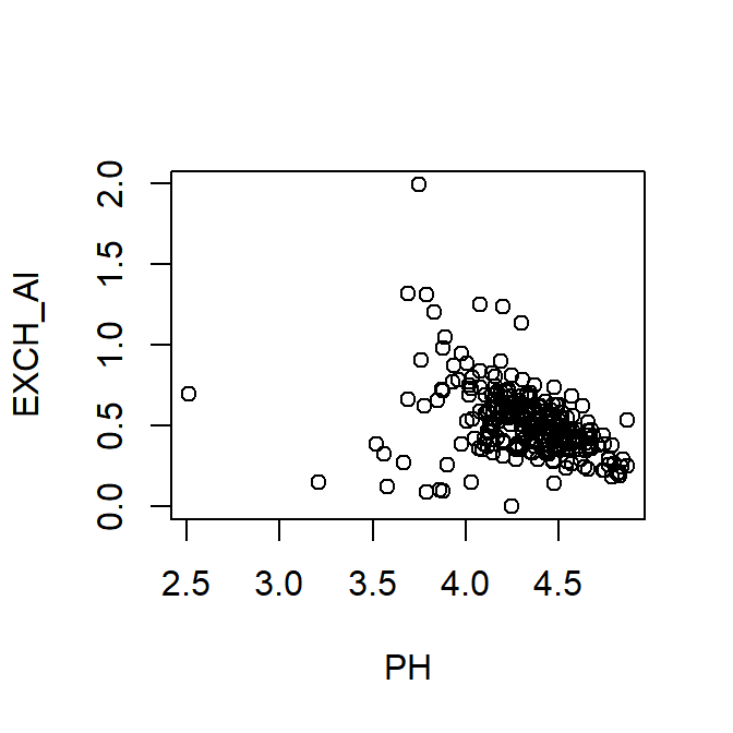
Plot of exchangeable Al vs. pH using with() to specify the data frame.
- Specifying the data frame using the dollar-sign operator
plot(hubbard$EXCH_Al ~ hubbard$PH) # look at axis titles!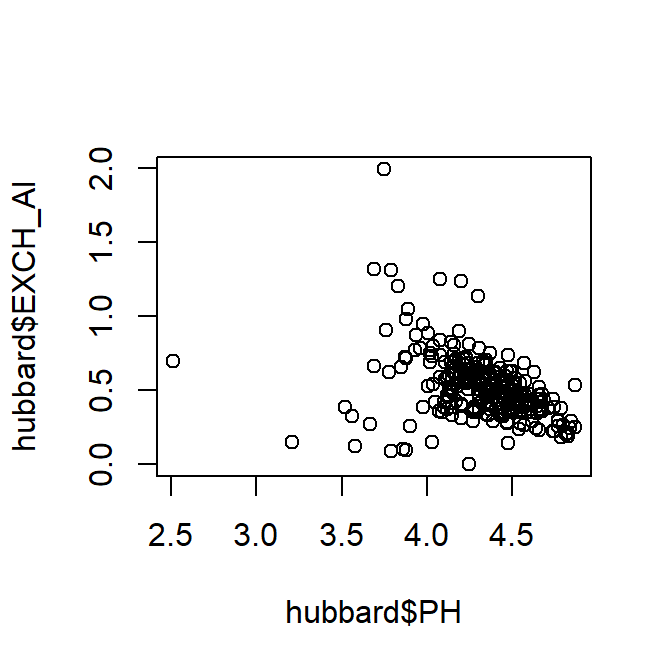
Plot of exchangeable Al vs. pH using dollar-sign syntax to specify the data frame. Notice the axis titles!
- Specifying the data frame using
attach()anddetach()(not recommended)
attach(hubbard)
plot(EXCH_Al ~ PH)
Plot of exchangeable Al vs. pH using attach() to specify the data frame.
detach(hubbard)Without changing any of the (numerous) options or parameters in the
plot() function, the plot is not very attractive
(e.g. axis titles!).
We can also change the overall plot appearance by using the function
par() before plotting; par() sets graphics
parameters. Let's try some variations:
Setting some overall graphics parameters using
par()
mar=sets margins in 'lines' units:c(bottom,left,top,right)mgp=sets distance of text from axes:c(titles, tickLabels, ticks)font.lab=sets font style for axis titles: 2=bold, 3=italic, etc.
- and within
plot(),xlab=andylab=set axis titles
- and within
par(mar=c(4,4,1,1), mgp=c(2,0.6,0), font.lab=2)
# We'll also include some better axis title text using xlab, ylab
with(hubbard,
     plot(EXCH_Al ~ PH,
     xlab="Soil pH",
     ylab="Exchangeable Al (proportion of CEC)")
     )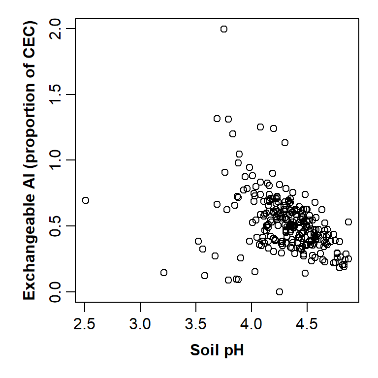
Plot of exchangeable Al vs. pH improved by changing graphics parameters and including custom axis titles.
This is starting to look a lot better!
We can still add more information to the graph; for example, by making use of the factors (categories) in the dataset. We also need to learn these graphics parameters:
col =plotting colour(s) - it's easiest to use words like "red", "darkblue" and so on
see https://www.statmethods.net/advgraphs/images/colorchart.png
or just run the R functioncolors()for a list of all 657 names!pch =plot character(s) - numbers from 0 to 24 (runhelp(points)or see this page from YaRrr).
par(mar=c(4,4,1,1), mgp=c(2,0.6,0), font.lab=2)
with(hubbard,
     plot(EXCH_Al ~ PH, xlab="Soil pH",
          ylab="Exchangeable Al (proportion of CEC)",
          pch=c(1,16)[Rel.To.Brook],
          col=c("blue","darkred")[Rel.To.Brook])
     )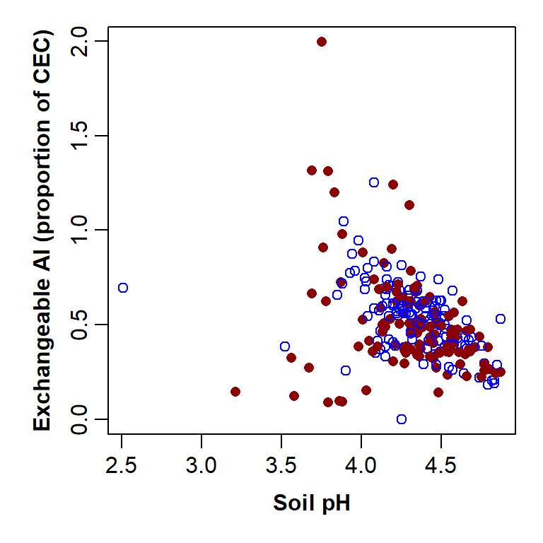
Plot of exchangeable Al vs. pH with custom graphics parameters and axis titles, improved by separating points by a Factor.
The parameter pch=c(1,16)[Rel.To.Brook] separates the
points by the information in the Factor column
Rel.To.Brook, shown inside [ ]. This column is
a 2-level factor, so can be one of two categories (North or South), and
so we need a vector with two numbers in it (pch=c(1,16)).
The code for specifying colour is very similar, except our vector has 2
colour names in it.
There is still one thing missing; a graph legend. We
can add one using the legend() function. We will use the
following options:
"topleft"position of legend -- runhelp(legend)for options, or we can use x-y coordinateslegend =a vector of names identifying the plot symbols - we have used the categories in the factor 'Rel.To.Brook',levels(hubbard$Rel.To.Brook), but we could have usedlegend=c("North","South")insteadpch =plot symbols - should be exactly the same vector as in the plot functioncol =plot colours - should be exactly the same vector as in the plot functiontitle =a title for the legend - optional
par(mar=c(4,4,1,1), mgp=c(2,0.6,0), font.lab=2)
with(hubbard,
       plot(EXCH_Al ~ PH, xlab="Soil pH",
            ylab="Exchangeable Al (proportion of CEC)",
            pch=c(1,16)[Rel.To.Brook],
            col=c("blue","darkred")[Rel.To.Brook])
       )
legend("topleft", legend=levels(hubbard$Rel.To.Brook), pch=c(1,16),
       col=c("blue","darkred"), title="Location")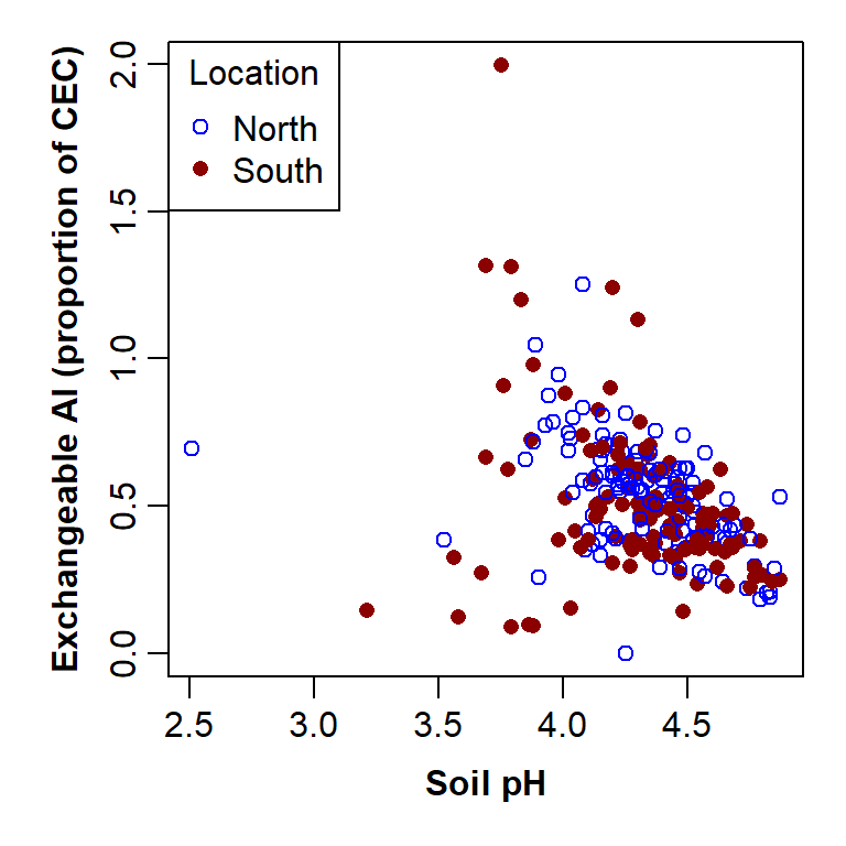
Plot of exchangeable Al vs. pH by sample location, with custom graphics parameters and axis titles, and a legend to explain the plot symbols.
Alternative to base-R plot: scatterplot() (from the
car package)
The R package car (Companion to Applied Regression) has
many useful additional functions that extend the capability of
R. The next two examples produce nearly the same plot
as in the previous examples, using the scatterplot()
function in the car package.
# load required package(s)
library(car)
# par() used to set overall plot appearance using options within
# par(), e.g.
#     mar sets plot margins, mgp sets distance of axis title and
#     tick labels from axis
par(font.lab=2, mar=c(4,4,1,1), mgp=c(2.2,0.7,0.0))
# draw scatterplot with customised options
# remember pch sets plot character (symbol);
# we will also use the parameter cex which sets symbol sizes and
#
scatterplot(EXCH_Al ~ PH, data=hubbard, smooth=FALSE,
            legend = c(coords="topleft"),
            cex=1.5, cex.lab=1.5, cex.axis=1.2)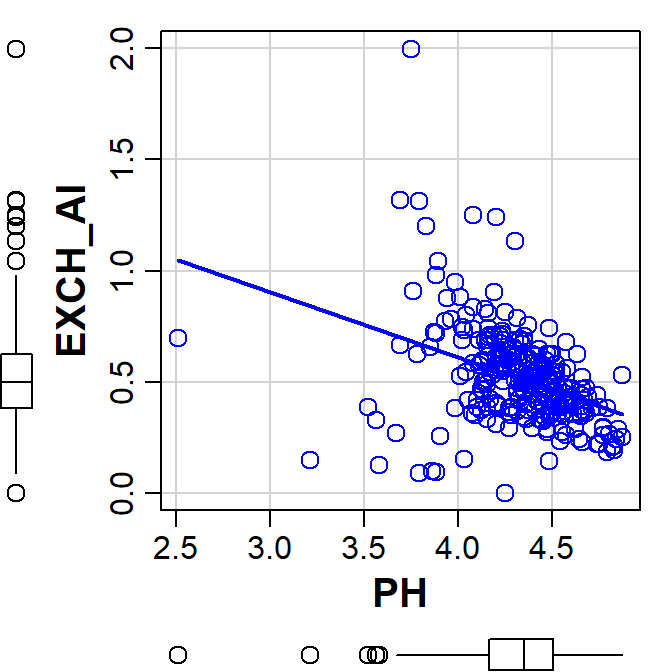
Plot of exchangeable Al vs. pH made using the car::scatterplot() function.
Note that we get some additional graph features by default:
- boxplots for each variable in the plot margins – these are useful for evaluating the distribution of our variables and any extreme values
- a linear regression line showing the trend of the relationship (it's possible to add this in base R plots, too)
We can turn both of these features off if we want - run
help(scatterplot) in the RStudio Console, and look under
Arguments and Details.
Also, we separately specify the dataset to be used as a function
argument, i.e., data=hubbard.
Scatterplot (car) with groups, Hubbard Brook soil
data
# 'require()' loads package(s) if they haven't already been loaded
require(car)
# adjust overall plot appearance using options within par()
# mar sets plot margins, mgp sets distance of axis title and tick
#   labels from axis
par(font.lab=2, mar=c(4,4,1,1), mgp=c(2.2,0.7,0.0))
# create custom palette with nice colours :)
# this lets us specify colours using numbers - try it!
palette(c("black","red3","blue3","darkgreen","sienna"))
# draw scatterplot with points grouped by a factor (Rel.To.Brook)
scatterplot(EXCH_Al ~ PH | Rel.To.Brook, data=hubbard, smooth=FALSE,
            legend = c(coords="topleft"), col=c(5,3,1),
            pch=c(16,0,2), cex=1.2, cex.lab=1.3, cex.axis=1.0)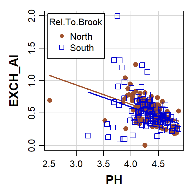
Plot of exchangeable Al vs. pH with points grouped by location, made using the car::scatterplot() function.
The scatterplot() function creates a legend
automatically if we plot by factor groupings (note the different way
that the legend position is specified within the
scatterplot() function). This is pretty similar to the base
R plot above (we can also customise the axis titles in
scatterplot(), using xlab= and
ylab= as before).
Other types of data presentation: Plot types and Tables
We'll give you some starting code chunks, and the output from them. You can then use the help in RStudio to try to customise the plots according to the suggestions below each plot!
Box plots
boxplot(MOISTURE.pct ~ Rel.To.Brook, data=hubbard)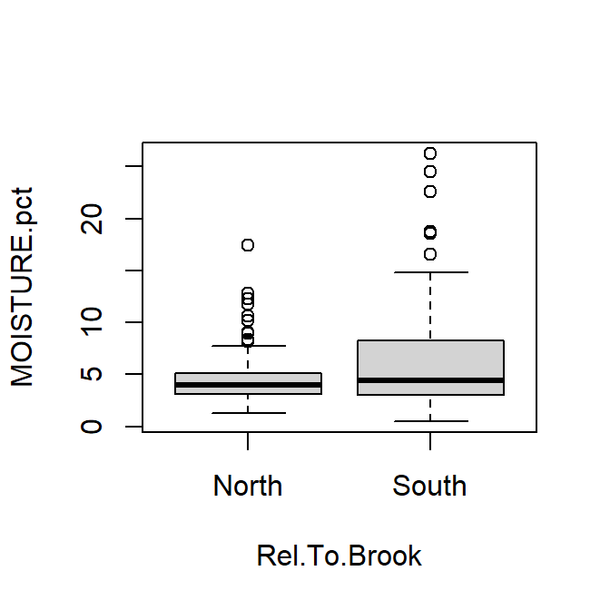
Box plot of percent soil moisture content at Hubbard Brook.
For box plots, try the following:
- include informative axis labels (titles)
- plotting boxes separated by categories in a Factor
- make boxes a different colour (all the same, and all different!)
- add notches to boxes representing approximate 95% confidence intervals around the median
- give the (vertical) y-axis a log10 scale
...and so on.
Histograms
with(hubbard, hist(MOISTURE.pct))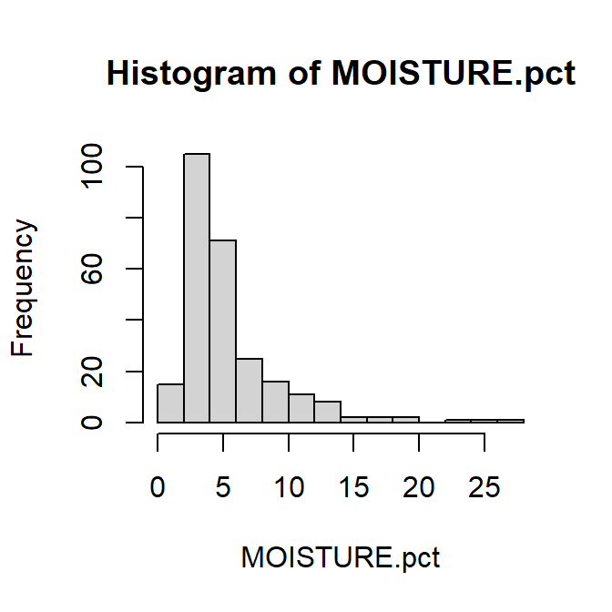
Histogram of percent soil moisture content at Hubbard Brook.
For histograms, try the following:
- add suitable axis labels (titles)
- make bars a different colour (all the same)
- change the number of cells (bars) on the histogram to give wider or narrower intervals
- log10-transform the x-axis (horizontal axis)
- remove the title above the graph (this information would usually go
in a caption)
...and so on.
Strip Charts and Plots of Means (two plots together)
We use the mfrow= or mfcol= argument in the
par() function to plot multiple graphs
require(RcmdrMisc)# needed for plotMeans() function
# use the mfrow or mfcol argument in the par() function to plot
# multiple graphs
par(mfrow=c(1,2))
stripchart(hubbard$OM.pct, main="Strip Chart")
with(hubbard,plotMeans(OM.pct, Transect, error.bars = "conf.int"))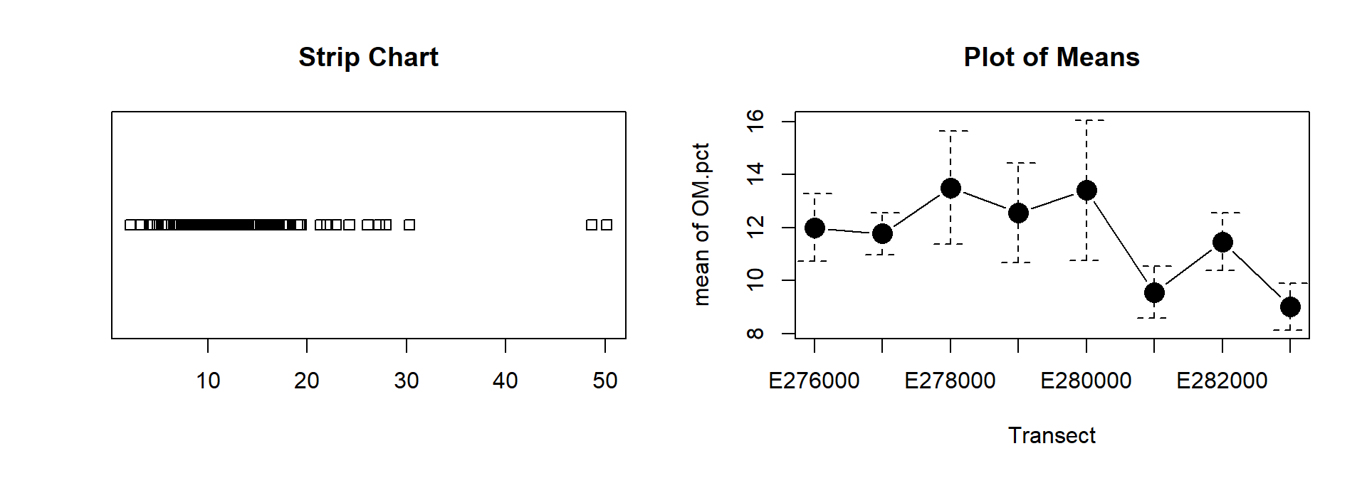
Soil organic matter content (%) at Hubbard Brook: (left) as a one-dimensional scatterplot (strip chart); (right) as mean values by sampling transect.
par(mfrow=c(1,1)) # to get back to single plotsFor one or both plots, try the following:
- add suitable axis labels (titles), in bold font;
- plotting means separated by a different factor;
- for plot of means, rotate the tick labels so that none ore omitted;
- make strip chart symbols a different shape ± colour (all the same, and all different!);
- make the strip chart vertical instead of horizontal;
- apply some 'jitter' (noise) to the strip chart symbols so that overlapping points are easier to see;
- log10-transform the numerical axis of the strip chart so that overlapping points are easier to see;
- remove the titles above the graphs (this information would usually
go in caption/s)
...and so on.
"With data collection, 'the sooner the better' is always the best answer."
--- Marissa Mayer
Tables
There are a few ways to make useful tables in R to summarise your data. Here are a couple of examples.
Using the tapply() function in base R
# use the cat() [conCATenate] function to make a Table heading
#     (\n is a line break)
cat("One-way table of means\n")
with(hubbard, tapply(X = EXCH_Ni, INDEX=Transect,
       FUN=mean, na.rm=TRUE))
cat("\nTwo-way table of means\n")
with(hubbard, tapply(X = EXCH_Ni,
       INDEX=list(Transect,Rel.To.Brook),
       FUN=mean, na.rm=TRUE))
## One-way table of means
## E276000 E277000 E278000 E279000 E280000 E281000 E282000 E283000
## 0.002588815 0.002136418 0.002827809 0.002813563 0.002528296 0.002262386 0.002221885 0.002957922
##
## Two-way table of means
## North South
## E276000 0.002652212 0.002559759
## E277000 0.002154745 0.002117219
## E278000 0.003133112 0.002360874
## E279000 0.002733461 0.002927993
## E280000 0.002176569 0.002861511
## E281000 0.002537732 0.001962009
## E282000 0.002219457 0.002224313
## E283000 0.003542597 0.002039146For tapply() tables, try the following:
- we have used the
meanfunction (FUN=mean) – try another function to get minima, maxima, standard deviations, etc. - try copying the output to Word or Excel and using this to make a
table in that software
...and so on.
Using the numSummary() function in the 'RcmdrMisc' R
package
require(RcmdrMisc)
# use the cat() [conCATenate] function to make a Table heading
#   (\n is a line break)
cat("Summary statistics for EXCH_Ni\n")
numSummary(hubbard$EXCH_Ni)
cat("\nSummary statistics for EXCH_Ni grouped by Rel.To.Brook\n")
numSummary(hubbard$EXCH_Ni, groups=hubbard$Rel.To.Brook)
## Summary statistics for EXCH_Ni
## mean sd IQR 0% 25% 50% 75% 100% n NA
## 0.002536502 0.001382344 0.001126141 0.00070457 0.001829135 0.002246775 0.002955276 0.01784169 257 3
##
## Summary statistics for EXCH_Ni grouped by Rel.To.Brook
## mean sd IQR 0% 25% 50% 75% 100% data:n
## North 0.002635924 0.001605190 0.001114533 0.001120626 0.001933342 0.002277016 0.003047875 0.017841689 132
## South 0.002431513 0.001096042 0.001170948 0.000704570 0.001719421 0.002174767 0.002890369 0.008483806 125
## data:NA
## North 3
## South 0For numSummary() tables, try the following:
- generating summary tables for more than one variable at a time
- generating summary tables with fewer statistical parameters
(e.g. omit IQR) or more statistical parameters (e.g.
include skewness)
(use R Studio Help!) - try copying the output to Word or Excel and using this to make a
table in that software
...and so on.
Tables using print() on a data frame
Data frames are themselves tables, and if they already contain the
type of summary we need, we can just use the print()
function to get output. Let's do something [slightly] fancy (see if you
can figure out what is going on here¹):
output <-
  numSummary(hubbard[,c("PH","MOISTURE.pct","OM.pct","Al.pct","Ca.pct","Fe.pct")],
             statistics = c("mean","sd","quantiles"), quantiles=c(0,0.5,1))
mytable <- t(cbind(output$table,output$NAs))
row.names(mytable) <- c("Mean","Std.dev.","Min.","Median","Max.","Missing")
# here's where we get the output
print(mytable, digits=3)
write.table(mytable,"clipboard",sep="\t")
cat("\nThe table has now been copied to the clipboard, so you can paste it into Excel!\n")
## PH MOISTURE.pct OM.pct Al.pct Ca.pct Fe.pct
## Mean 4.322 5.37 12.01 1.641 0.208 3.163
## Std.dev. 0.293 3.83 5.17 1.478 0.214 1.112
## Min. 2.510 0.51 2.24 0.155 0.002 0.497
## Median 4.350 4.13 11.16 0.970 0.139 3.168
## Max. 4.870 26.26 50.18 7.132 1.107 7.709
## Missing 0.000 0.00 0.00 60.000 62.000 60.000
##
## The table has now been copied to the clipboard, so you can paste it into Excel!If you want to take this further, we can start making really nice
Tables for reports with various R packages. I use the
flextable package and sometimes the kable()
function from the knitr package.
¹Hints: we have made two dataframe objects; t() is the
transpose function; there are also some other useful functions which
might be new to you like: row.names(),
cbind(), print(), write.table() .
. .
The following two websites can extend your basic knowledge of using R and RStudio:
A great free resource for R beginners is An Introduction to R by Alex Douglas, Deon Roos, Francesca Mancini, Ana Couto & David Lusseau.
Getting used to R, RStudio, and R Markdown is an excellent (and free) eBook by Chester Ismay which is super-helpful if you want to start using R Markdown for reproducible coding and reporting.
CC-BY-SA • All content by Ratey-AtUWA. My employer does not necessarily know about or endorse the content of this website.
Created with rmarkdown in RStudio using the cyborg theme from Bootswatch via the bslib package, and fontawesome v5 icons.