Learning maps in R
Basic maps in R with graphics elements plotted over tile backgrounds
This guide shows some of the more common and/or easy ways to make
maps in R using map-tile-based backgrounds with data
plotted over the base maps. We introduce coordinate reference
systems, four packages which allow tile-based map drawing,
a few ways of including user data, and an Appendix on simple
coordinate conversion.
The intention is to provide options
to plot informative maps, which include the type of data collected in
this unit, relatively simply. We will not cover vector-based
maps, importing GIS shapefiles, interpolation of point data, chloropleth
maps, and many other map plotting methods.
load packages needed to make maps
...also read some data we need for map annotations, make some colour palettes to use later, and set any alternative Windows fonts:
library(sp)            # older package for spatial data in R
library(sf)            # Simple Features spatial data in R
library(maptiles)      # get open-source map tiles for background maps
library(prettymapr)    # add scale bar and north arrows to maps
library(viridis)       # colourblind-friendly colour palettes
library(rosm)          # alternative open-source map tiles for background maps
library(ggmap)         # plotting spatial data with ggplot syntax
library(ggsn)          # add scale and north to ggmap maps (doesn't always work)
# only run next line if you can run it from the console without crashing R!
library(OpenStreetMap) # alternative open-source map tiles for background maps
git <- "https://raw.githubusercontent.com/Ratey-AtUWA/"
afr_map <- read.csv(file=paste0(git,"spatial/main/afr_map_v2.csv"),
stringsAsFactors = TRUE)
places <- read.csv(file=paste0(git,"learningR/main/places.csv"),
stringsAsFactors = TRUE)
taita <- data.frame(lon = c(174.967,174.9549,174.9489,174.9521),
lat = c(-41.1761,-41.1812,-41.1831,-41.1838),
name = c("Tait\u0101 College", "Tait\u0101 School",
"Fraser Park","Home")) # we need this later...
taita$name <- as.factor(taita$name) # ...and this
pal4lite <- c("black", "purple2", "blue2", "cyan4", "forestgreen",
"darkorange", "gold3", "red3", "gray80", "white")
pal4liteTransp <- c("#000000","#912CEEb0","#0000EEb0","#008B8Bb0","#228B22b0",
"#CDAD00b0", "#FF8C00b0", "#CD0000b0", "#CCCCCC", "#FFFFFF")
pal4dark <- c("white", "pink1", "orange", "khaki1", "lightgreen", "cadetblue1",
"deepskyblue", "plum", "gray80", "black")
windowsFonts(nar=windowsFont("Arial Narrow"), monosans=windowsFont("Consolas"))Code to read data from csv file on website into an R data frame:
## # afs19 <- read.table('clipboard', header=T, sep="\t", stringsAsFactors = TRUE)
# alternative code reading data from a file:
afs19 <- read.csv(file=paste0(git,"learningR/main/afs19.csv"),
                  stringsAsFactors = TRUE) # use this one
afs22 <- read.csv(file=paste0(git,"learningR/main/afs22S1.csv"),
                  stringsAsFactors = TRUE)
Preparing to make maps
First we define some commonly-used coordinate reference systems which
define the projection of our GPS data. The function
st_crs() is from the sf package (see
explanation below), and the argument for the st_crs()
function is the EPSG code for the desired projection. See https://epsg.io for more
information.
LongLat <- st_crs(4326) # uses Earth ellipsis specs from WGS84 datum
UTM50S <- st_crs(32750) # just for Zone 50, S hemisphere!
We will use these coordinate reference system objects later. For now we're going to work in UTM coordinates.
Next we'll convert our data frames to Simple Features
spatial data, using the R package sf
(Pebesma, 2018). Simple Features is a formal standard (ISO 19125-1:2004)
that describes how objects in the real world can be represented in
computers - see https://r-spatial.github.io/sf/articles/sf1.html.
We also make equivalents of these two sf-dataframes in
the longitude--latitiude coordinate system, using the
st_transform function.
afs19utm <- st_as_sf(afs19[-9,], # omitting row 9 where coordinates are missing
                     coords = c("Easting","Northing"),
                     crs = UTM50S)
afs22utm <- st_as_sf(afs22, coords = c("Easting","Northing"),
                     crs = UTM50S)
afs19ll <- st_transform(afs19utm, crs = LongLat)
afs21ll <- st_transform(afs19utm, crs = LongLat)
Alternative 1 -- Maps in R using the maptiles package
Defining the mapped area
We define the area we need for our map and save it in a simple
features object called extent.
An easy way to get bounding coordinates (in longitude, latitude) is by using Google Maps or Google Earth. Google Earth allows the option to set the coordinate system to UTM. If we generate latitude--longitude coordinates, we would need to convert our Simple Features object (see the Appendix). If our input coordinates are Longitude--Latitude, note that south latitudes (and west longitudes) are negative, and we want decimal degrees rather than degrees-minutes-seconds. Also note that coordinates from Google Maps and Google Earth (except in saved .kml files) are in the order (Latitude, Longitude); i.e. \((y,x)\), whereas \((x,y)\) (Longitude, Latitude) seems to make more sense.
For coordinates in the sf and maptiles
packages, \(x\) coordinates are
commonly Eastings or Longitudes, and \(y\) coordinates are commonly Northings or
Latitudes.
extent <- st_as_sf(data.frame(x=c(399800,400700),y=c(6467900,6468400)),
coords = c("x","y"), crs = UTM50S)NOTE: The projection we specify here will be the one the map plots in!
Getting the map tile data
We now need some functions from the maptiles package
(Giraud 2021). We're using one of the OpenStreetMap tile options, but
the following tile providers also work:
OpenStreetMap, OpenStreetMap.HOT, Esri.WorldStreetMap, Esri.WorldTopoMap, Esri.WorldImagery, Esri.WorldGrayCanvas, Stamen.Toner, Stamen.TonerBackground, Stamen.TonerHybrid, Stamen.TonerLines, Stamen.TonerLabels, Stamen.TonerLite, CartoDB.Positron, CartoDB.DarkMatter, CartoDB.Voyager
(all CartoDB... tiles have variants which work), and
OpenTopoMap
The option crop = TRUE is
included to crop the tiles to our defined area in the
extent object. If we leave it out, the map will probably
change shape as it will use only square (uncropped) map tiles.
# NOTE: projection of input object e.g. 'extent' sets map projection
aftiles <- get_tiles(extent, provider = "OpenStreetMap.HOT", crop = TRUE)
Plotting the map
The aftiles object we created is a 'SpatRaster' object
which needs the maptiles package loaded to be able to plot
it. We need to set the outer margins of the plot area (by default they
are zeros) to allow plotting of axes etc -- see Figure 1.
par(oma=c(3,3,1,1), lend="square")
plot(aftiles)

box(lwd=6,col="white") # tidies up skewness of UTM tiles a bit
axis(1, tcl=-0.2, mgp = c(1.6,0.3,0))
mtext("Easting (UTM Zone 50, m)", side = 1, line = 1.5, font=2)
axis(2, tcl=-0.2, mgp = c(1.6,0.3,0))
mtext("Northing (UTM Zone 50, m)", side = 2, line = 1.5, font=2)
box()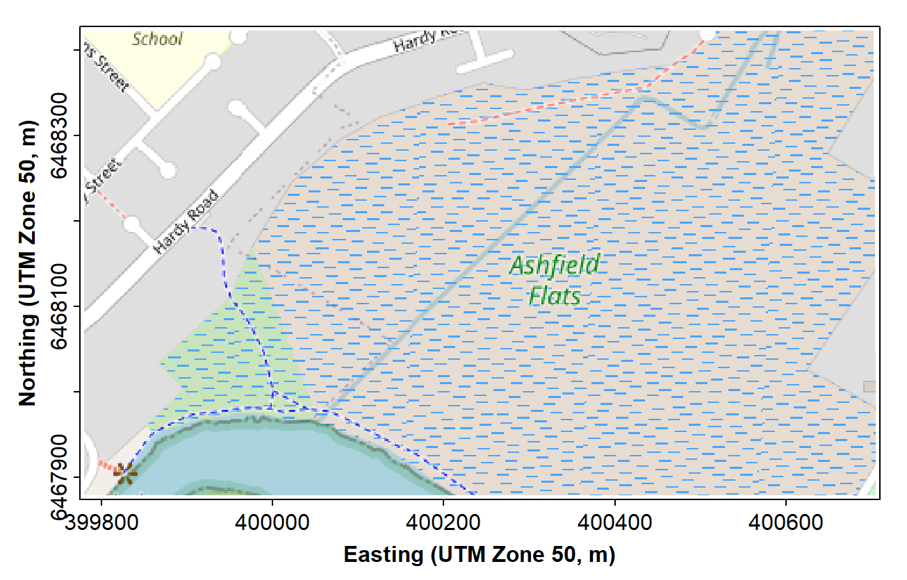
Figure 1. Map of Ashfield Flats in the UTM projection, generated using the maptiles R package, with OpenStreetMap tiles.
The next chunk of code adds the prettymapr features
shown in Figure 2. In this code, plotepsg = 32750 refers to
the EPSG code for the UTM projection in Zone 50 (EPSG 32750), which we
need to include so that the scale bar shows the correct distances.
(Long-Lat is EPSG 4326 in WGS84)
# . . . continuing previous code . . .
addnortharrow(text.col=1, border=1)
addscalebar(plotepsg = 32750, label.col = 1, linecol = 1,
            label.cex = 1.2, htin=0.15, widthhint = 0.15)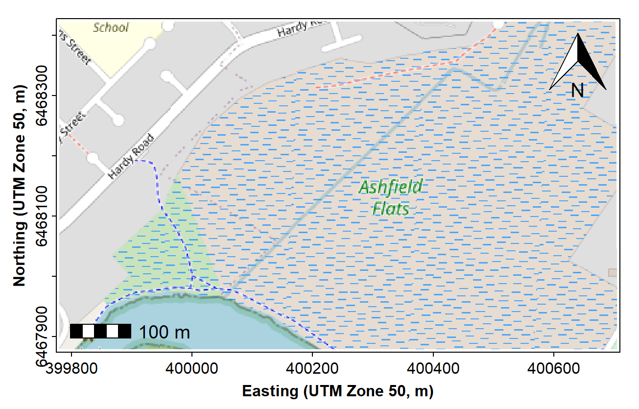
Figure 2. Map of Ashfield Flats (UTM), with added North arrow and scale bar from prettymapr, over OpenStreetMap tiles acquired using maptiles.
Adding our data and map annotations
Very often we would like to add our own information to a map, such as the location of samples, often with different sizes, shapes, or colours of symbols to represent numerical information.
Since we have a map in UTM coordinates, we can now add plots of our
data based on UTM locations (with a legend, of course -- see Figure 3).
We can plot the points from the non-spatial data frame
afs19, but here we plot the points from
afs19utm, with the add=TRUE option. We add a
legend to the plot in the usual way.
# . . . continuing from previous code . . .
clrz <- plasma(15)[6:15]
with(afs19utm, plot(geometry, add=TRUE,
                    pch = rep(21:25,2)[Group],
                    bg = clrz[Group]))
legend("bottomright", legend=levels(as.factor(afs19$Group)),
       pch = rep(21:25,2), pt.bg = clrz,
       title = "Group", inset = 0.02, ncol = 2)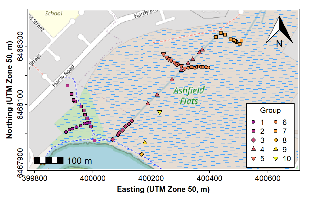
Figure 3. Map of Ashfield Flats (UTM), with added North arrow, scale bar, and user data, over OpenStreetMap tiles acquired using maptiles.
We can also add digitized map features such as wetland ponds, drains, etc., if these are not on the map tiles already. Ideally we would add these before plotting the data, to avoid the type of overplotting shown in Figure 4.
# . . . continuing from previous code . . .
with(afr_map, lines(drain_E, drain_N, col = "cadetblue", lwd = 2))
with(afr_map, lines(wetland_E, wetland_N, col = "cadetblue", lwd = 1, lty = 2))
Figure 4. Map of Ashfield Flats (UTM), with added North arrow, scale bar, user data, and additional map items, over OpenStreetMap tiles acquired using maptiles.
Finally, we would most likely want to add some text. Text labels should also be added before plotting the data. The final map is shown in Figure 5.
# . . . continuing from previous code . . .
text(c(400263, 399962, 400047), c(6468174, 6468083, 6468237),
     labels = c("Chapman Drain","Kitchener Drain", "Woolcock Drain"),
     pos = c(2,2,4), cex = 0.8, font = 3, col = "cadetblue")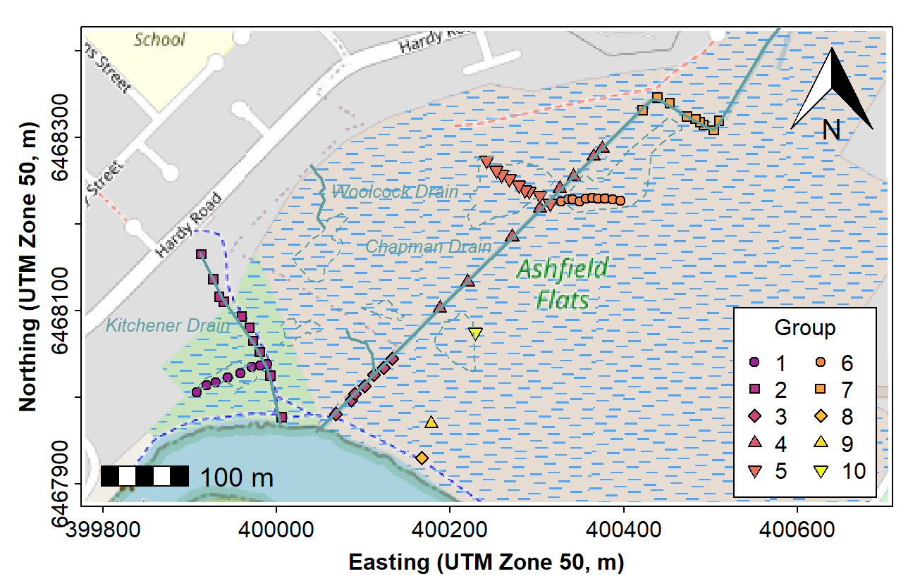
Figure 5. Map of Ashfield Flats (UTM), with added North arrow, scale bar, user data, and additional map items plus text labels, over OpenStreetMap tiles acquired using maptiles.
Making a bubble map
We use essentially the same code as for the maps above (except
plotting the annotations and data in the correct order!). Then we use
the symbols() function to make the 'bubbles', making sure
that we include the options add = TRUE so we overplot the
map, and inches = FALSE so we can manually scale the
bubbles. The factor of 0.4 used to scale the circles in the
code for bubbles and legend is found by trial-and-error (it
is possible to write a simple algorithm to estimate a scaling
factor from the data). A map like that shown in Figure 6 is a good
exploratory data analysis tool, as even without the legend it shows any
unevenness in concentrations, including where high concentrations are
located.
par(oma=c(3,3,1,1), lend="square")
plot(aftiles)
box(lwd=6,col="white") # tidies up skewness of UTM tiles a bit
axis(1, tcl=-0.2, mgp = c(1.6,0.3,0))
mtext("Easting (UTM Zone 50, m)", side = 1, line = 1.5, font=2)
axis(2, tcl=-0.2, mgp = c(1.6,0.3,0))
mtext("Northing (UTM Zone 50, m)", side = 2, line = 1.5, font=2)
box()
with(afr_map, lines(drain_E, drain_N, col = "cadetblue3", lwd = 2))
with(afr_map, lines(wetland_E, wetland_N, col = "cadetblue3", lwd = 1, lty = 2))
text(c(400263, 399962, 400047), c(6468174, 6468083, 6468237),
     labels = c("Chapman Drain","Kitchener Drain", "Woolcock Drain"),
     pos = c(2,2,4), cex = 0.8, font = 3, col = "cadetblue")
addnortharrow(text.col=1, border=1)
addscalebar(plotepsg = 32750, label.col = 1, linecol = 1,
            label.cex = 1.2, htin=0.15, widthhint = 0.15)
# plot bubbles using the symbols() function
with(afs19, symbols(Easting, Northing, add = TRUE, circles = 0.4*sqrt(Zn),
                    inches = FALSE, fg = "purple", bg = "#8000FF40"))
# manual legend
if (pretty(afs19$Zn)[1] < 0.001) {
  bublo <- pretty(afs19$Zn)[2]/2
} else {
  bublo <- pretty(afs19$Zn)[1]
}
bubhi <- pretty(afs19$Zn)[NROW(pretty(afs19$Zn))]
symbols(c(400600,400600),c(6468040,6467980), circles=0.4*sqrt(c(bublo,bubhi)), add=T,
        lwd=1, inches=F, fg = "purple", bg = "#8000FF40")
text(c(400600,400620,400620),c(6468100,6468040,6467980),
     labels=c("Zn (mg/kg)",bublo,bubhi), cex=0.85, pos = c(1,4,4))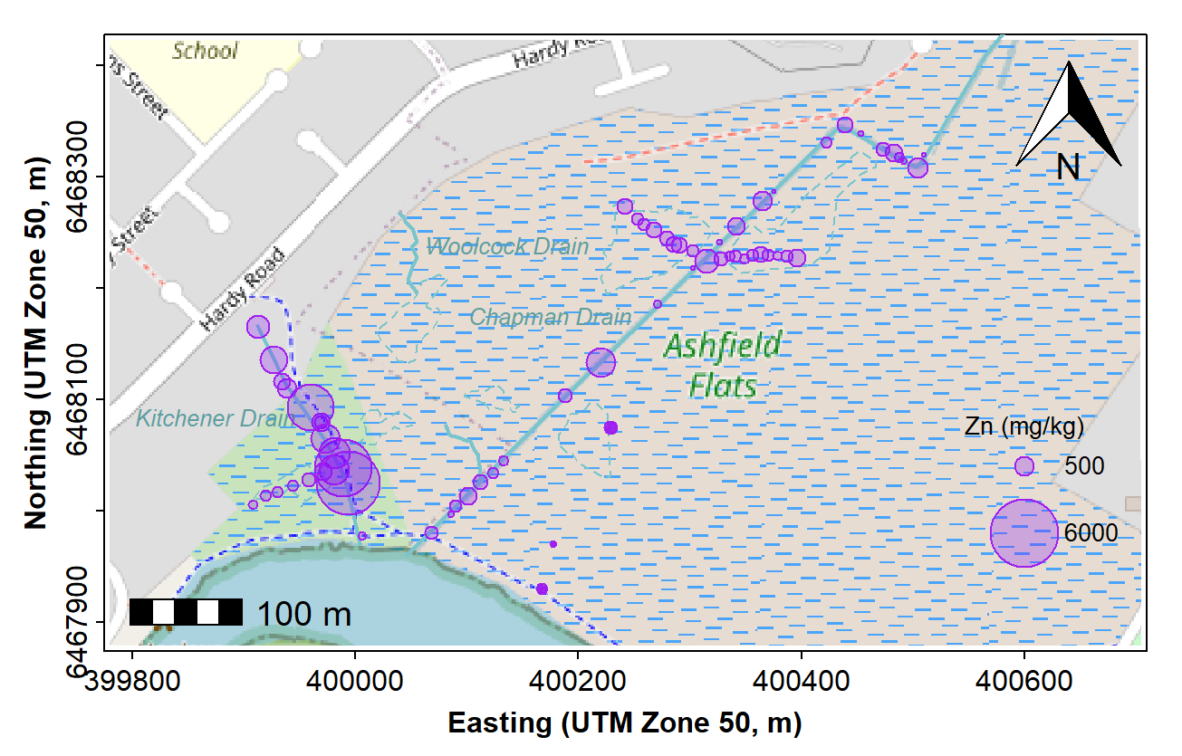
Figure 6. Bubble map of zinc concentrations in sediment and soil at Ashfield Flats in 2019, over OpenStreetMap tiles acquired using maptiles.
Categorized (e.g. percentile) bubble map
We make a new column in our data frame by cutting the measurement of
interest, in this example Zn, into percentiles. The new
column called QZn is a factor which identifies which
percentile of Zn concentration each sample is in. We then use this
factor to define symbols, sizes, and colours for each sample location.
We add a line break to text labels using \(\backslash\)n.
par(oma=c(3,3,1,1), lend="square")
plot(aftiles)
box(lwd=6,col="white") # tidies up skewness of UTM tiles a bit
axis(1, tcl=-0.2, mgp = c(1.6,0.3,0))
mtext("Easting (UTM Zone 50, m)", side = 1, line = 1.5, font=2)
axis(2, tcl=-0.2, mgp = c(1.6,0.3,0))
mtext("Northing (UTM Zone 50, m)", side = 2, line = 1.5, font=2)
box()
with(afr_map, lines(drain_E, drain_N, col = "cadetblue3", lwd = 2))
with(afr_map, polygon(wetland_E, wetland_N, col = "cadetblue2",
                      border = "cadetblue3"))
text(c(400263, 399962, 400047), c(6468174, 6468083, 6468237),
     labels = c("Chapman\nDrain","Kitchener\nDrain", "Woolcock\nDrain"),
     pos = c(2,2,4), cex = 0.8, font = 3, col = "cadetblue")
addnortharrow(text.col=1, border=1)
addscalebar(plotepsg = 32750, label.col = 1, linecol = 1,
            label.cex = 1.2, htin=0.15, widthhint = 0.15)
# percentile plot
afs19$QZn <- cut(afs19$Zn, quantile(afs19$Zn,
                 p=c(0,0.02,0.05,0.25,0.5,0.75,0.95,0.98,1),
                 na.rm=T), labels=c("Q0-02","Q02-05","Q05-25","Q25-50",
                                    "Q50-75","Q75-95","Q95-98","Q98-max"))
palette(pal4liteTransp) # use colours with semi-transparency (defined near top)
# use percentile factor column to categorize points
with(afs19,
     points(Easting, Northing,
            pch = c(22,22,22,3,4,21,21,21)[QZn],
            col = c(1,1,1,4,5,1,1,1)[QZn], bg = c(1:8)[QZn],
            lwd = c(1,1,1,2,2,1,1)[QZn],
            cex = c(0.5,0.65,0.8,1,1,1.5,2.2,3)[QZn])
     )
legend("bottomright", legend = levels(afs19$QZn), title="Zn",
       pch = c(22,22,22,3,4,21,21,21), col = c(1,1,1,4,5,1,1,1),
       pt.lwd = c(1,1,1,2,2,1,1), pt.bg = c(1:8),
       pt.cex = c(0.5,0.65,0.8,1,1,1.5,2.2,3),
       bty = "n", inset = 0.02, cex = 0.85, y.intersp = 1.2)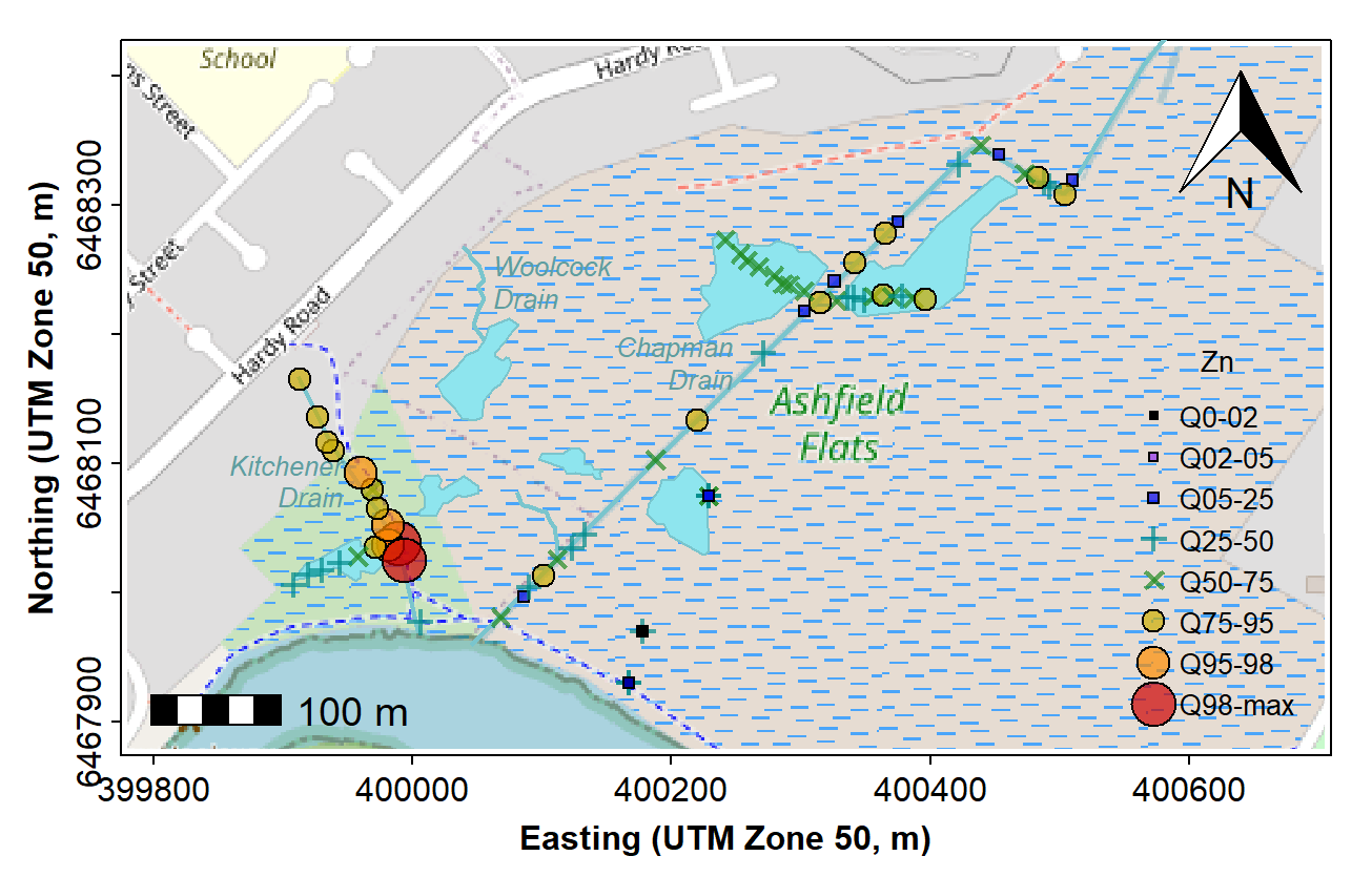
Figure 7. Map showing percentile ranges of zinc concentrations in sediment and soil at Ashfield Flats in 2019, over OpenStreetMap tiles acquired using maptiles.
palette(pal4lite) # change back to non-transparent palette (optional)
afs19$QZn <- NULL # to delete quantile column (optional; you can leave it in)
The resulting percentile bubble map (Figure 7) adds value to the
'standard' bubble map (Figure 6), as it adds some statistical meaning to
the bubble sizes. A similar map could be created by using the Tukey
boxplot thresholds instead of percentiles which could show potential
outliers (i.e. using the boxplot.stats() function
to generate categories instead of the quantile()
function.)
Alternative 2 -- Maps in R using the ggmap package
The ggmap package (Kahle and Wickham 2013) is an
extension of ggplot, so it's easier to use if you are
familiar with ggplot and the associated family of packages.
You need to register for and obtain
your own Google maps key to run this code!
First we make a ggmap object, locating the map by its
central coordinate with the extent controlled by the zoom
option:
## library(ggmap)
register_google(key = secret) # you need your own Google Maps API code
udubua.gg <- get_googlemap(center=c(115.8213,-31.98165),
                           zoom = 16, maptype = "terrain", color = "bw")
Next we plot the ggmap object using ggplot grammar. It's possible to
just plot the object (i.e. run ggmap(udubua.gg)),
but it's good to have more control over plot options
and to plot some data over the base map. In the example
in Figure 8, we use the aesthetic in geom_point() to plot
different categories with different shapes and colours, with the
categories defined by the factor Type. A range of map
styles is available by selecting a combination of one of
maptype = "terrain", "satellite", "roadmap", or
"hybrid", together with color = "color" or
"bw". Note: the ggsm package
is designed to add scale bar and north arrow to ggmaps, but it seems
buggy and we currently don't recommend it - the north arrow seems OK
though.
ggmap(udubua.gg) +
  labs(y="Latitude (\u00B0S)", x = "Longitude (\u00B0E)") +
  geom_text(aes(x = 115.825, y = -31.98, label = "Swan\nRiver",
                fontface = "italic", family="sans"),
            size = 4, vjust = 0, hjust = 0, color="gray40") +
  geom_point(aes(x = Longitude, y = Latitude, col=Type, shape=Type),
             data = places, size=3) +
  theme(axis.text=element_text(size=9, color="black"),
        axis.title=element_text(size=11,face="bold"))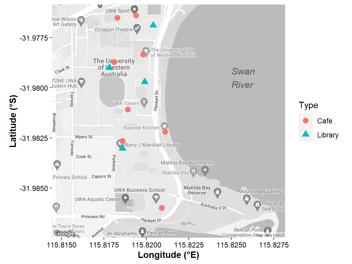
Figure 8. Map of the University of Western Australia campus at Crawley, showing the location of libraries and cafés, plotted over Google maps tiles acquired using the R package ggmap.
There are numerous possibilities with ggmap and the
features made possible by ggplot2 that are not illustrated
by Figure 8. For example, we could use size as an aesthetic
(i.e. include within aes(...) with
size = variableName), to generate something like a bubble
map. Although there is an option to set the map size (and therefore
aspect ratio) in the get_googlemap() function, we have
found that this doesn't work consistently, so we recommend leaving the
map dimensions and aspect ratio at their default values.
Other map types using ggmap
Another option currently implemented in ggmap are some
of the Stamen map tiles, accessible with the
get_stamenmap() function.
- The Stamen "terrain" tiles seem to be available up to
zoom = 13, and are good for showing maps at the scale of 1-2 suburbs or a small town (Figure 9), with 'hill shading' to show terrain. - The Stamen toner variants are minimalist maps which are good at de-emphasizing the base map background to emphasise added data (see the example in Figure 10).
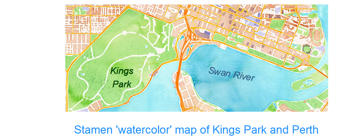
- The Stamen "watercolor" tiles are also available.
tai_Stamen <- get_stamenmap(bbox=c(left=174.9, bottom = -41.2,
                                   right = 175.0, top = -41.15),
                            zoom=13, # seems to be max zoom
                            maptype = "terrain", color = "color")
ggmap(tai_Stamen) +
  labs(y="Latitude (\u00B0S)", x = "Longitude (\u00B0E)") +
  geom_rect(aes(xmin=174.94, xmax=174.96, ymin=-41.178,ymax=-41.188),
               colour="red3", fill=NA, size=1.2) +
  geom_text(aes(x = 174.961, y = -41.183, label = "live\nplay\nschool",
                fontface = "bold", family="mono"),
            size = 5, vjust = 0.5, hjust = 0, color="red3", lineheight=0.8) +
  geom_text(aes(x = 174.91, y = -41.16,
                label = paste("(author's childhood neighbourhood,\n",
                              "Tait\u0101,","Aotearoa New Zealand)"),
                fontface = "italic", family="serif"),
            size = 4.5, lineheight=0.8, vjust = 0, hjust = 0, color="#004000") +
  geom_point(aes(x = lon, y = lat, color=name), data=taita, size = 4) +
  scale_color_manual(values = c("navy","goldenrod","darkorchid","seagreen")) +
  theme(axis.text=element_text(size=9, color="black"),
        axis.title=element_text(size=11,face="bold")) +
  theme_bw()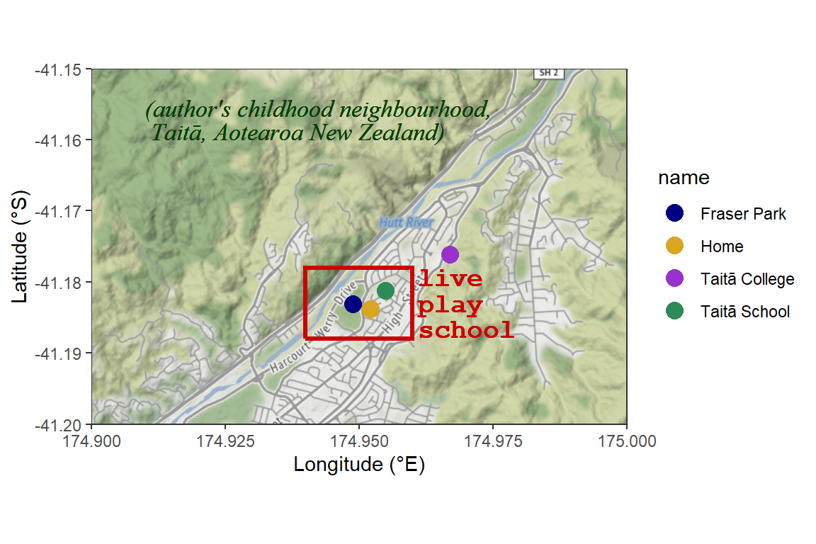
Figure 9. Map of the central Hutt Valley, New Zealand, plotted with Stamen terrain map tiles acquired using the R package ggmap.
The next example
(Figure 10) uses the simple features information in one of the data
frames we made at the beginning. The sf package introduces
a new 'geom', geom_sf() for plotting in ggmap.
We need to use the option inherit.aes = FALSE in
geom_sf(), to override the default aesthetics from the
ggmap object. We also add coord_sf to ensure
that all layers use a common CRS (Coordinate Reference
System).
Run help(geom_sf) for more
information.
afr.gg <- get_stamenmap(bbox=c(left=115.941, bottom = -31.92,
                                   right = 115.948, top = -31.916),
                        zoom=17, col = "bw",maptype = "toner-lite")
ggmap(afr.gg) +
  labs(y="Latitude (\u00B0S)", x = "Longitude (\u00B0E)") +
  geom_text(aes(x = 115.944, y = -31.918, label = "Ashfield\nFlats",
                fontface = "italic", family="sans"),
            size = 4, color="gray65", lineheight=0.8) +
  geom_text(aes(x = 115.942, y = -31.9199, label = "Swan River",
                fontface="italic", family="sans"), size=4, color="gray65") +
  geom_path(aes(x = drain_lon, y=drain_lat), data=afr_map,
            color = "slategray2", size = 1.25) +
  geom_polygon(aes(x=wetland_lon, y=wetland_lat), data = afr_map,
               color = "slategray", fill="azure3") +
  geom_sf(data = afs21ll, aes(bg=Zn, size=Zn), shape=21, inherit.aes = FALSE) +
  scale_fill_viridis_c(alpha = 0.7) +
  scale_size_area(breaks = c(30,100,300,1000,3000,5000), max_size = 9) +
  theme_bw() +
  theme(axis.title = element_text(size = 12, face = "bold")) +
  coord_sf(crs = st_crs(4326))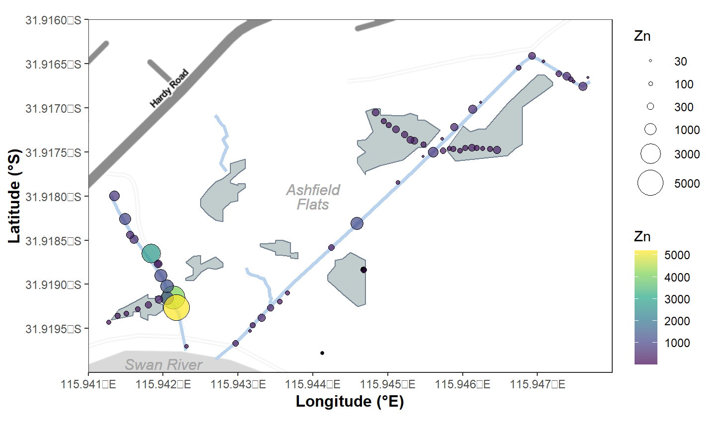
Figure 10. Zinc concentration (mg/kg) in sediment sampled in Semester 1, 2021 at Ashfield Flats, Western Australia, plotted over Stamen toner-lite map tiles acquired using the R package ggmap, with data in a simple features data frame, and with manually added wetland pond locations.
Alternative 3 -- the 'rosm' package
The rosm package (Dunnington 2022) allows users to produce background maps from several map tile providers.
The following map tile types seem to work using
osm.plot() in the rosm package:
"osm", "hotstyle", "stamenbw", "stamenwatercolor", "cartodark", "cartolight"
The following map tile types seem to work using
bmaps.plot() in the rosm package:
"Aerial", "AerialWithLabels"
par(mar = c(.1,.1,.1,.1), mgp = c(1.7,0.3,0), lend=2, ljoin=1, tcl=0.25)

# specify limits of map in order N, E, S, W
udubua.rosm <- makebbox(-31.9751,115.8284,-31.9882,115.8143)

# plot an osm-type map
osm.plot(udubua.rosm, type="cartolight", zoomin=0)

# add some points to the plot
osm.points(c(115.82, 115.8186, 115.8211, 115.8182, 115.8184),
           c(-31.9835, -31.9829, -31.9821, -31.9790, -31.9765),
           col="purple", lwd=2, pch=7, cex=1.5)
box(which = "plot")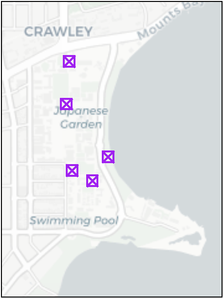
Figure 11. UWA campus map using cartolight tiles acquired using the rosm package.
The map in Figure 11 uses the cartolight map tile style
to produce a base map with light colours -- this can be useful when we
are trying to emphasise the data rather than the map features.
another option using a Bing map as background
bmaps.plot(udubua.rosm, type="AerialWithLabels", zoomin=0)
osm.points(c(115.82, 115.8186, 115.8211, 115.8182, 115.8184),
           c(-31.9835, -31.9829, -31.9821, -31.9790, -31.9765),
           col="yellow", lwd=2, pch=10, cex=1.5)
osm.text(c(115.825,115.826), c(-31.98, -31.988),
         labels = c("Matilda\nBay", "Pelican Point"),
         col = c("powderblue","honeydew"), font = 3, cex = 0.75)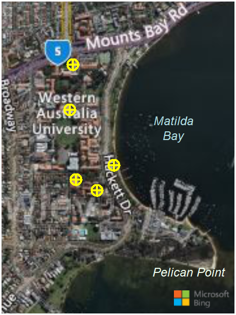
Figure 12. UWA campus map using Bing tiles acquired using the rosm package.
As shown by the output in Figure 12, the Bing map tiles are aerial photographs. Sometimes this is useful for showing features like vegetation etc. on the base map.
embedding rosm functions inside prettymap()
prettymap({
  osm.plot(udubua.rosm, type="stamenbw", zoomin = -1)
  osm.points(c(115.82, 115.8186, 115.8211, 115.8182, 115.8184),
             c(-31.9835, -31.9829, -31.9821, -31.9790, -31.9765),
             col="red", lwd=3, pch = 15, cex=1.5)
  osm.text(115.825, -31.98, labels = "Matilda\nBay",
           font = 3, col = "azure")
  osm.text(115.824, -31.9865, labels = "Pelican Point",
           font = 3, col = "navy")
},
oma = c(3,3,1,1), drawarrow = T, arrow.scale = 1,
arrow.border = "pink", arrow.text.col = "pink",
scale.htin = 0.15, scale.label.cex = 1.2, scale.label.col = "pink",
scale.linecol = "pink", scale.pos = "bottomright"
)
legend("right", legend = "Coffee is\nfound here",
       pch = 15, col = "red",
       inset = 0.02, cex = 0.9, pt.cex = 1,
       x.intersp = 0.5, y.intersp=0.7)
axis(1,tcl=-0.2); axis(2,tcl=-0.2)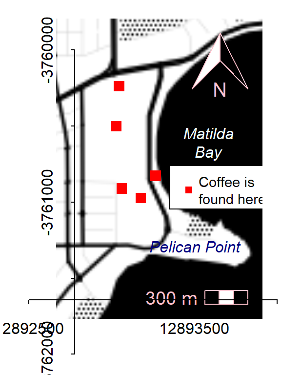
Figure 13. UWA campus map using Stamen-toner tiles acquired using the rosm package, and illustrating the axis problem.
It's helpful to include a scale and North arrow on the plot, but the axes in Figure 13, however, are in web Mercator coordinates (and are messy). This is a problem with no easy fix. Either we don't include axes (not ideal, since we should show some coordinates), figure out how to plot them, or use another R package.
Alternative 4 - use the OpenStreetMap package to make an initial map object
We can also use the OpenStreetMap R package (Fellows,
2019) to make a plot-able map object, based on the coordinates which
bound a rectangular area. We need the north-west (upper left) and
south-east (lower right) coordinates of the rectangular map we want to
plot.
(Note that the coordinates are in the order
(Latitude, Longitude); i.e. \((y,x)\), whereas \((x,y)\) seems more intuitive.)
Note that there can
be problems trying to use the
OpenStreetMap package, especially on
Mac/Apple computers. This relates to the need for a working Java
installation (Windows and Mac) and the requirement for the XQuartz app
on Mac OS. Otherwise the OpenStreetMap package can be very
useful!
UWA_osm <- openmap(upperLeft = c(-31.974, 115.812), # latitude first
                   lowerRight = c(-31.988, 115.828),
                   zoom = 16,
                   type = "osm")
plot(UWA_osm)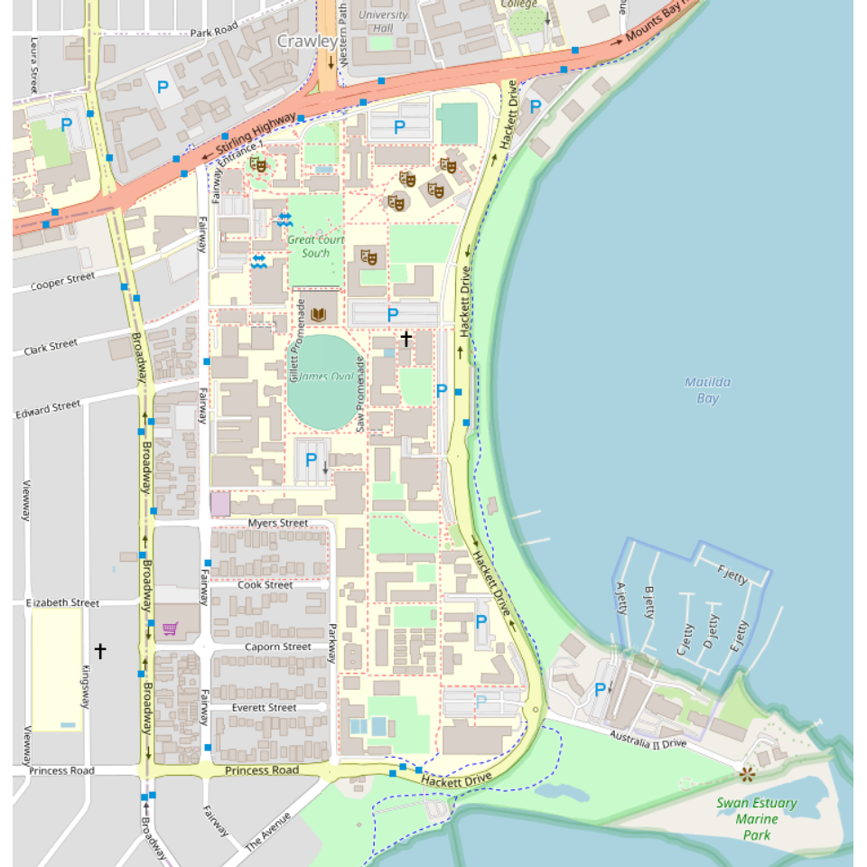
Figure 14. Map of the University of Western Australia Crawley campus using the default OpenStreetMap settings.
The map in Figure 14 needs some attention. Without some prior knowledge, we don't know where on Earth's surface this map represents, we don't know the direction it's oriented in, and we don't know the scale. We can add a north arrow to indicate direction, a scale bar to show the scale, and axes to show any coordinates which should show the location on Earth.
Plot the UWA campus map with margins, axes, and annotations
require(prettymapr)
par(mar = c(3, 3, 0.5, 0.5), mgp = c(1.6, 0.3, 0), tcl = 0.4)
plot(UWA_osm, removeMargin = FALSE)
axis(1)
axis(2)
addnortharrow()
addscalebar(plotepsg = 3857) # 3857 is EPSG code for web Mercator
box()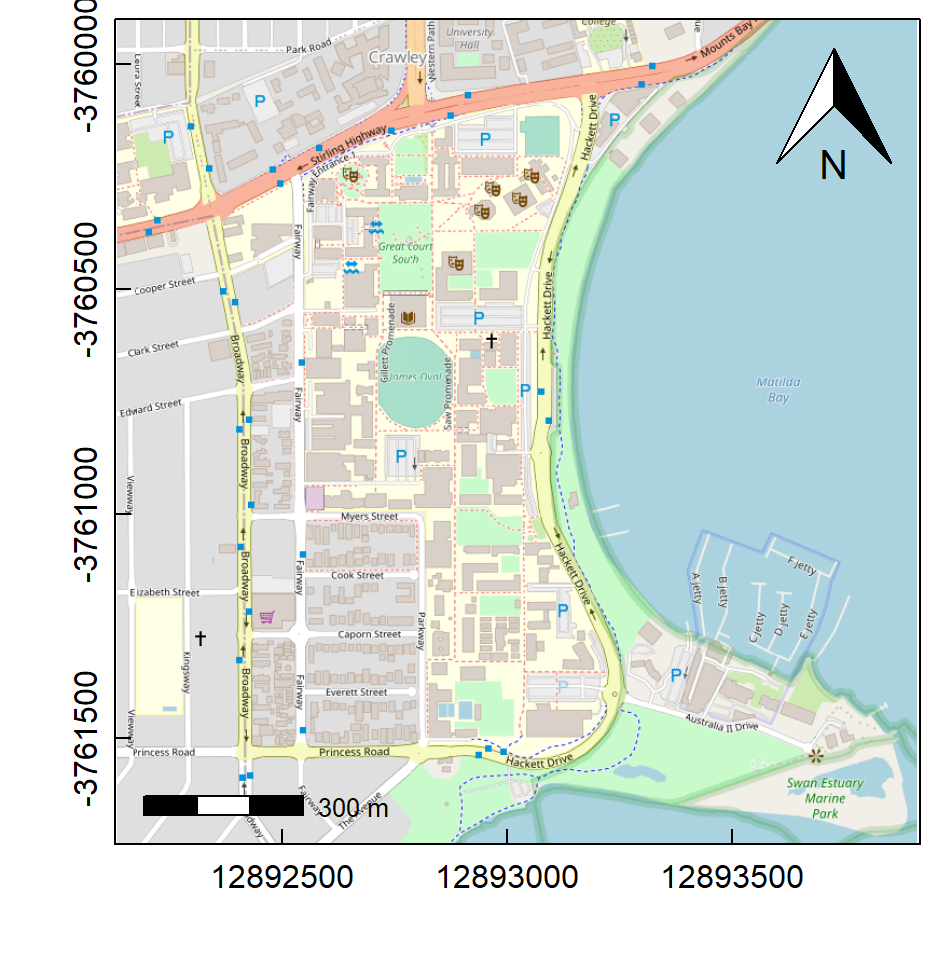
Figure 15. Map of the University of Western Australia Crawley campus showing scale, north arrow, and axes, but retaining some default OpenStreetMap settings.
The map in Figure 15 is better -- we now know scale and direction,
but finding our location on Earth is tricky because the OpenStreetMap
map projection is "Google Mercator" (a.k.a. "Web Mercator")
which is not a projection most people are familiar with. We need a map
in a commonly-used projection such as Longitude-Latitude, or Universal
Transverse Mercator (UTM). We can change projections using the
openproj() function in the OpenStreetMap package.
Plot a re-projected UWA campus map in UTM with margins, axes, and annotations
First convert the projection (we need to specify the new projection
using a 'proj4' string – for UTM Zone 50, southern hemisphere, this is
"+proj=utm +zone=50 +south") ...
require(OpenStreetMap)
UWA_utm <- openproj(UWA_osm, projection = "+proj=utm +zone=50 +south")
cat("Show upper left (p1) and lower right (p2) coordinates\n")
print(UWA_utm$bbox, digits=6) # show bounding coordinates to check
## Show upper left (p1) and lower right (p2) coordinates
## $p1
## [1] 387742 6461857
##
## $p2
## [1] 389290 6460267...then plot the map in its new projection.
# plot the map in its new projection
par(mar = c(3, 3, 0.5, 0.5), mgp = c(1.6, 0.3, 0), tcl = 0.4)
plot(UWA_utm, removeMargin = FALSE)
axis(1)
mtext("Easting (UTM Zone 50, m)", side = 1, line = 1.6, font = 2, cex = 1.2)
axis(2)
mtext("Northing (UTM Zone 50, m)", side = 2, line = 1.6, font = 2, cex = 1.2)
addnortharrow(scale = 1.2)
addscalebar(plotepsg = 32750, htin = 0.15, label.cex = 1.2)
box()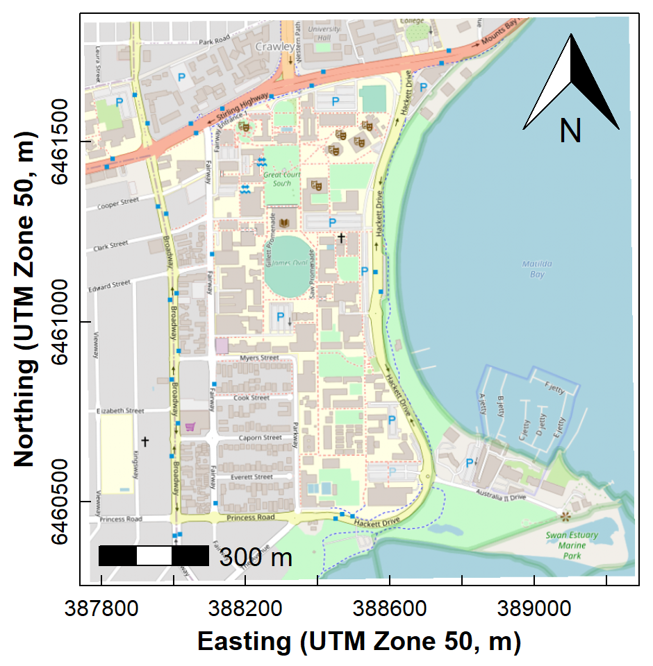
Figure 16. Map of the University of Western Australia Crawley campus showing scale, north arrow, and axes, and with the map projection changed from the OpenStreetMap default to Universal Transverse Mercator (UTM).
The map in Figure 16 is now just what we need -- we know scale and direction, and we have axes in the Universal Transverse Mercator (UTM) projection with units of metres, which we would normally set up our field GPS to show.
We could easily add data and annotations to this plot using standard
plotting functions such as points(), text(),
and legend().
Final Words
We recommend using either the maptiles or
ggmap packages to draw maps with tiled backgrounds, as they
allow use of the state-of-the-art simple features system
via the sf package.
To follow up on this material, look at the pages on:
Appendix - coordinate conversions
Converting UTM to LongLat
Make a simple features (package sf) object containing
the UTM coordinates
Example uses explicit values (as used previously to generate the
maptiles map), but the coordinates could also be obtained
from a data frame - edit to suit!
utm.temp <- st_as_sf(data.frame(x=c(399800,400700),y=c(6467900,6468400)),
                     coords = c("x","y"), crs = UTM50S)
We then use the st_transform() function from the
sf package to convert to long-lat (or another projection),
which results in another spatial object:
longlat.temp <- st_transform(utm.temp, crs = LongLat)We now have two sf spatial objects which we can use (for
instance) to define the map extent for a maptiles map:
require(sf); require(maptiles) # load packages if not done already
# using the utm object
tiles_utm <- get_tiles(utm.temp, provider = "OpenStreetMap", crop = TRUE)
# using the longitude-latitude object
tiles_longlat <- get_tiles(longlat.temp, provider = "OpenStreetMap",
                          crop = TRUE)
# . . . and so on
To extract coordinates from a data frame, for example:
(NOTE - missing coordinates are not allowed!)
afs19 <- afs19[-which(is.na(afs19[,c("Easting")])==1),] # remove rows with NAs
afs19utm <-  st_as_sf(afs19, coords = c("Easting","Northing"), crs = UTM50S)
We then use the st_transform() function from the
sf package to convert to longitude-latitude, which results
in another spatial data frame:
afs19ll <- st_transform(afs19utm, crs = LongLat)To extract just the coordinate values in non-spatial form, we use the
function st_coordinates():
# extract sf coordinates to console (can assign to object of class "matrix")
st_coordinates(afs19utm)

# extract sf coordinates to data frame
longlat.temp <- as.data.frame(st_coordinates(afs19ll))
colnames(longlat.temp) <- c("Longitude","Latitude")
References and R packages
Dunnington, Dewey (2017). prettymapr: Scale Bar, North Arrow, and Pretty Margins in R. R package version 0.2.2. https://CRAN.R-project.org/package=prettymapr.
Dunnington D (2022). rosm: Plot Raster Map Tiles from Open Street Map and Other Sources. R package version 0.2.6, https://CRAN.R-project.org/package=rosm.
Fellows, Ian and using the JMapViewer library by Jan Peter Stotz (2019). OpenStreetMap: Access to Open Street Map Raster Images. R package version 0.3.4. https://CRAN.R-project.org/package=OpenStreetMap.
Garnier S, Ross N, Rudis R, Camargo AP, Sciaini M, Scherer C (2021). Rvision - Colorblind-Friendly Color Maps for R. R package version 0.6.2. (viridis)
Giraud T (2021). maptiles: Download and Display Map Tiles. R package version 0.3.0, https://CRAN.R-project.org/package=maptiles.
Pebesma, E., 2018. Simple Features for R: Standardized Support for Spatial VectorData. The R Journal 10 (1), 439-446, https://doi.org/10.32614/RJ-2018-009. (package sf)
Pebesma, E.J., R.S. Bivand, 2005. Classes and methods for spatial data in R. R News 5 (2), https://cran.r-project.org/doc/Rnews/. (package sp)
CC-BY-SA • All content by Ratey-AtUWA. My employer does not necessarily know about or endorse the content of this website.
Created with rmarkdown in RStudio using the cyborg theme from Bootswatch via the bslib package, and fontawesome v5 icons.