exploring relationships: correlation and regression

Correlation & regression 1
Basic correlation analyses
Let's look at the relationship between Cd and Zn in the Smiths Lake
and Charles Veryard Reserves data from 2017.
For Pearson's
correlation we need variables with normal distributions, so first
log10-transform Cd and Zn...
sv2017 <- read.csv("sv2017_original.csv", stringsAsFactors = TRUE)
sv2017$Cd.log <- log10(sv2017$Cd)
sv2017$Zn.log <- log10(sv2017$Zn)
...and test if the distributions are normal. Remember that the null hypothesis for the Shapiro-Wilk test is that "the distribution of the variable of interest is not different from a normal distribution". So, if the P-value ≥ 0.05, we can't reject the null and therefore our variable is normally distributed.
shapiro.test(sv2017$Cd)
shapiro.test(sv2017$Cd.log)
shapiro.test(sv2017$Zn)
shapiro.test(sv2017$Zn.log)
##
## Shapiro-Wilk normality test
##
## data: sv2017$Cd
## W = 0.63001, p-value = 1.528e-12
##
##
## Shapiro-Wilk normality test
##
## data: sv2017$Cd.log
## W = 0.97272, p-value = 0.1006
##
##
## Shapiro-Wilk normality test
##
## data: sv2017$Zn
## W = 0.6155, p-value = 7.75e-14
##
##
## Shapiro-Wilk normality test
##
## data: sv2017$Zn.log
## W = 0.9828, p-value = 0.295Pearson's r changes with transformation
cor.test(sv2017$Cd, sv2017$Zn, alternative="two.sided",
         method="pearson") # is Pearson valid?
cor.test(sv2017$Cd.log, sv2017$Zn.log, alternative="two.sided",
         method="pearson") # is Pearson valid?
##
## Pearson's product-moment correlation
##
## data: sv2017$Cd and sv2017$Zn
## t = 9.8415, df = 74, p-value = 4.357e-15
## alternative hypothesis: true correlation is not equal to 0
## 95 percent confidence interval:
## 0.6353031 0.8363947
## sample estimates:
## cor
## 0.7529165
##
##
## Pearson's product-moment correlation
##
## data: sv2017$Cd.log and sv2017$Zn.log
## t = 7.696, df = 74, p-value = 4.859e-11
## alternative hypothesis: true correlation is not equal to 0
## 95 percent confidence interval:
## 0.5193717 0.7756160
## sample estimates:
## cor
## 0.6667536For the Pearson correlation we get a t statistic and
associated degrees of freedom (df), for which there is a
p-value. The null hypothesis is that there is "no
relationship between the two variables", which we can reject if p ≤
0.05. We also get a 95% confidence interval for the correlation
coefficient, and finally an estimate of Pearson's r
(cor).
A Spearman coefficient doesn't change with transformation, since it is calculated from the ranks (ordering) of each variable.
cor.test(sv2017$Cd, sv2017$Zn, alternative="two.sided",
         method="spearman") # can we use method="pearson"?
cor.test(sv2017$Cd.log, sv2017$Zn.log, alternative="two.sided",
         method="spearman") # can we use method="pearson"?
##
## Spearman's rank correlation rho
##
## data: sv2017$Cd and sv2017$Zn
## S = 25750, p-value = 2.494e-10
## alternative hypothesis: true rho is not equal to 0
## sample estimates:
## rho
## 0.6479832
##
##
## Spearman's rank correlation rho
##
## data: sv2017$Cd.log and sv2017$Zn.log
## S = 25750, p-value = 2.494e-10
## alternative hypothesis: true rho is not equal to 0
## sample estimates:
## rho
## 0.6479832For the Spearman correlation we get an S statistic and associated p-value. The null hypothesis is that there is no relationship between the two variables, which we can reject if p ≤ 0.05. We also get an estimate of Spearman's rho (analogous to Pearson's r).
Simple scatterplot by groups
We're using base R to plot - you might like to try
using scatterplot() from the car package.
Before plotting, we first set our desired colour palette (optional) and graphics parameters (optional, but useful and recommended!). We end up with the plot in Figure 1:
palette(c("black","blue","red3","darkgreen","purple",
          "darkcyan","sienna3","grey50","white"))
par(mfrow=c(1,1), mar=c(3,3,1,1), mgp=c(1.5,0.3,0), oma=c(0,0,0,0), tcl=0.2,
    cex=1.2, cex.lab=1.2, cex.axis=1., lend="square", ljoin="mitre", font.lab=2)

# . . . then plot the data
plot(sv2017$Cd~sv2017$Zn, col=c(6,7,1)[sv2017$Type], log="xy",
     pch=c(16,1,15)[sv2017$Type], lwd=c(1,2,1)[sv2017$Type], cex=1.25,
     xlab="Zn (mg/kg)", ylab="Cd (mg/kg)")
abline(lm(sv2017$Cd.log~sv2017$Zn.log)) # line of best fit
legend("topleft", legend=c(levels(sv2017$Type),"Best-fit line ignoring Type"),
       cex=1, col=c(6,7,1,1),
       pch=c(16,1,15,NA), pt.lwd=c(1,2,1), lwd = c(NA,NA,NA,1),
       pt.cex=1.25, bty="n", inset=0.02,
       title=expression(italic("Sample Type")))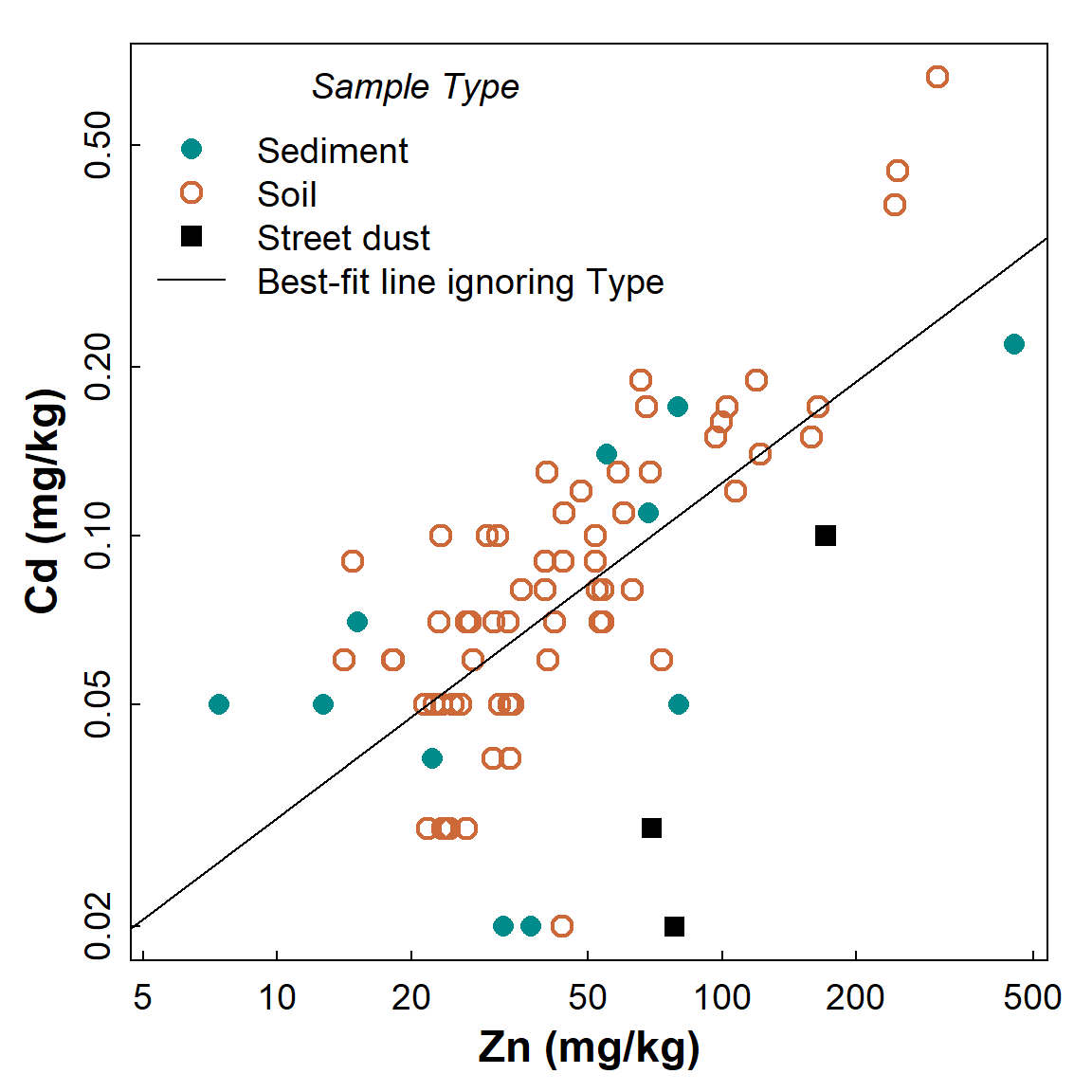
Figure 1: Scatterplot showing the relationship between Cd and Zn, with observations identified by Type but showing the regression line for all data independent of grouping.
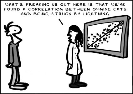
"The invalid assumption that correlation implies cause is probably among the two or three most serious and common errors of human reasoning."
Correlation matrix - two ways of doing it
We'll generate Spearman correlation matrices in these examples, but
it's easy to change the code to generate Pearson (or other) correlation
matrices.
The p-values give the probability of the observed
relationship if the null hypothesis (i.e. no relationship) is
true.
require(Hmisc) # needed for rcorr() function
corr_table <- rcorr(as.matrix(sv2017[c("pH","Al","Ca","Fe","Cd","Pb","Zn")]),
                    type="spearman")
print(corr_table)
## pH Al Ca Fe Cd Pb Zn
## pH 1.00 0.31 0.68 0.29 0.23 0.13 0.12
## Al 0.31 1.00 0.32 0.45 0.19 0.07 0.16
## Ca 0.68 0.32 1.00 0.42 0.25 0.21 0.35
## Fe 0.29 0.45 0.42 1.00 0.47 0.63 0.73
## Cd 0.23 0.19 0.25 0.47 1.00 0.69 0.65
## Pb 0.13 0.07 0.21 0.63 0.69 1.00 0.77
## Zn 0.12 0.16 0.35 0.73 0.65 0.77 1.00
##
## n
## pH Al Ca Fe Cd Pb Zn
## pH 94 87 87 87 75 87 87
## Al 87 88 88 88 76 88 88
## Ca 87 88 88 88 76 88 88
## Fe 87 88 88 88 76 88 88
## Cd 75 76 76 76 76 76 76
## Pb 87 88 88 88 76 88 88
## Zn 87 88 88 88 76 88 88
##
## P
## pH Al Ca Fe Cd Pb Zn
## pH 0.0033 0.0000 0.0068 0.0517 0.2385 0.2622
## Al 0.0033 0.0028 0.0000 0.1028 0.5000 0.1282
## Ca 0.0000 0.0028 0.0000 0.0312 0.0451 0.0008
## Fe 0.0068 0.0000 0.0000 0.0000 0.0000 0.0000
## Cd 0.0517 0.1028 0.0312 0.0000 0.0000 0.0000
## Pb 0.2385 0.5000 0.0451 0.0000 0.0000 0.0000
## Zn 0.2622 0.1282 0.0008 0.0000 0.0000 0.0000The output has three sub-tables:
- the correlation coefficients for each pair of variables (note symmetry)
- the number of pairs of observations for each relationship (some observations may be missing)
- the p values for each relationship (note symmetry)
[Note that for Pearson correlations we instead use
type="pearson" in the rcorr function.]
Since a correlation coefficient is a standardised measure of
association, we can treat it as an 'effect size'.
Cohen (1988)
suggested the following categories:
| Range in r | Effect size term | ||
| 0 < | |r| | ≤ 0.1 | negligible |
| 0.1 < | |r| | ≤ 0.3 | small |
| 0.3 < | |r| | ≤ 0.5 | medium |
| 0.5 < | |r| | ≤ 1 | large |
|r| means the absolute value of r (i.e. ignoring whether r is positive or negative)
Correlation matrix with p-values corrected for multiple comparisons
We can do this using the rcorr.adjust() function in the
RcmdrMisc package which calculates
corrected P-values. As above,the p-values give the
probability of the observed relationship if # the null hypothesis
(i.e. no relationship) is true. Corrections are to reduce the
risk of Type 1 Errors (false positives) which is
greater when multiple comparisons are being made.
We include use="pairwise.complete" in the
rcorr.adjust() function parameters, otherwise the
correlations are calculated on the number of observations for the
variable with the most missing values (try changing it after reading
help("rcorr.adjust")).
require(RcmdrMisc) # needed for rcorr.adjust() function
rcorr.adjust(sv2017[c("pH","Al","Ca","Fe","Cd","Pb","Zn")], type="spearman",
             use="pairwise.complete")
##
## Spearman correlations:
## pH Al Ca Fe Cd Pb Zn
## pH 1.0000 0.3112 0.6763 0.2884 0.2256 0.1277 0.1215
## Al 0.3112 1.0000 0.3153 0.4470 0.1886 0.0728 0.1634
## Ca 0.6763 0.3153 1.0000 0.4155 0.2474 0.2142 0.3498
## Fe 0.2884 0.4470 0.4155 1.0000 0.4739 0.6267 0.7340
## Cd 0.2256 0.1886 0.2474 0.4739 1.0000 0.6935 0.6480
## Pb 0.1277 0.0728 0.2142 0.6267 0.6935 1.0000 0.7685
## Zn 0.1215 0.1634 0.3498 0.7340 0.6480 0.7685 1.0000
##
## Number of observations:
## pH Al Ca Fe Cd Pb Zn
## pH 94 87 87 87 75 87 87
## Al 87 88 88 88 76 88 88
## Ca 87 88 88 88 76 88 88
## Fe 87 88 88 88 76 88 88
## Cd 75 76 76 76 76 76 76
## Pb 87 88 88 88 76 88 88
## Zn 87 88 88 88 76 88 88
##
## Pairwise two-sided p-values:
## pH Al Ca Fe Cd Pb Zn
## pH 0.0033 <.0001 0.0068 0.0517 0.2385 0.2622
## Al 0.0033 0.0028 <.0001 0.1028 0.5000 0.1282
## Ca <.0001 0.0028 <.0001 0.0312 0.0451 0.0008
## Fe 0.0068 <.0001 <.0001 <.0001 <.0001 <.0001
## Cd 0.0517 0.1028 0.0312 <.0001 <.0001 <.0001
## Pb 0.2385 0.5000 0.0451 <.0001 <.0001 <.0001
## Zn 0.2622 0.1282 0.0008 <.0001 <.0001 <.0001
##
## Adjusted p-values (Holm's method)
## pH Al Ca Fe Cd Pb Zn
## pH 0.0334 <.0001 0.0608 0.3158 0.7155 0.7155
## Al 0.0334 0.0305 0.0002 0.5140 0.7155 0.5140
## Ca <.0001 0.0305 0.0007 0.2498 0.3158 0.0100
## Fe 0.0608 0.0002 0.0007 0.0002 <.0001 <.0001
## Cd 0.3158 0.5140 0.2498 0.0002 <.0001 <.0001
## Pb 0.7155 0.7155 0.3158 <.0001 <.0001 <.0001
## Zn 0.7155 0.5140 0.0100 <.0001 <.0001 <.0001The output from rcorr.adjust() has a fourth
sub-table:
- the adjusted p-values for each pair of variables, which depend on the number of variables being compared
Scatter plot matrix to check correlation matrix
It's always a good idea to plot scatterplots for the relationships we are exploring. Scatter (x-y) plots can show if:
- a correlation coefficient is unrealistically high due to a small number of outliers, or because there are aligned groups of points
- a correlation coefficient is low, not because of a lack of relationship, but because relationships differ for different groups of points;
- there is a consistent relationship for all groups of observations.
require(car) # needed for scatterplotMatrix() function
carPalette(palette())
scatterplotMatrix(~pH+ log10(Al)+ log10(Ca)+ log10(Cd)+
                    log10(Fe)+ log10(Pb)+ log10(Zn) | Type,
                  smooth=FALSE, ellipse=FALSE, by.groups=TRUE,
                  col=c(6,7,1), pch=c(16,1,15), cex.lab=1.5, data=sv2017,
                  legend=list(coords="bottomleft"))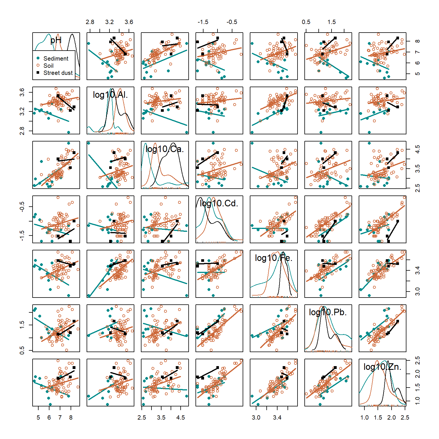
Figure 2: Scatter plot matrix for selected variables in the 2017 Smiths-Veryard sediment data, with observations and regression lines grouped by sample Type. Scatter plot matrices are a powerful exploratory data analysis tool.
In Figure 2, Pb and Zn are positively related (Pearson's r = 0.77, p<0.0001) independent of which group (Sediment, Soil, or Street dust) observations are from. Conversely, the relationship between pH and Cd is weak (r=0.23, adjusted p=0.32), but there appear to be closer relationships between observations from individual groups. Finally, the relationship between Al and Ca may be influenced by a single observation with low Al and high Ca. All issues like this should be considered when we explore our data more deeply.
Linear Regression
We will first make a simple linear regression model predicting chromium from iron.
We first create log-transformed variable columns and inspect the scatterplot (Figure 3).
par(mfrow=c(1,1), mar=c(3,3,1,1), mgp=c(1.5,0.5,0), oma=c(0,0,0,0), tcl=0.2,
    cex=1.2, cex.lab=1.2, cex.axis=1., lend="square", ljoin="mitre", font.lab=2)
carPalette(palette())
sv2017$Fe.log <- log10(sv2017$Fe)
sv2017$Cr.log <- log10(sv2017$Cr)
scatterplot(Cr ~ Fe | Type, data = sv2017,
            log = "xy", smooth = FALSE, col = c(6,7,1),
            xlab = "Fe (mg/kg)", ylab = "Cr (mg/kg)",
            legend = list(coords = "bottomright"))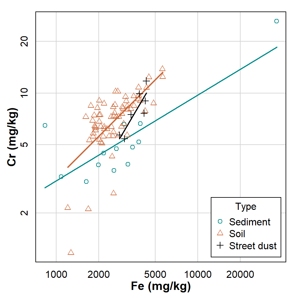
Figure 3: Scatterplot showing relationship between Cr and Fe at Smiths Lake and Charles Veryard Reserves in 2017. Observations and regression lines are separated by sample Type.
What do the ungrouped scatterplot and regression line look like?
Next use the lm() function to create a linear model
object (give it a sensible name), then summarise it:
lmCrFesimple <- with(sv2017, lm(Cr.log ~ Fe.log))
summary(lmCrFesimple)
##
## Call:
## lm(formula = Cr.log ~ Fe.log)
##
## Residuals:
## Min 1Q Median 3Q Max
## -0.55661 -0.05466 0.02879 0.08074 0.29981
##
## Coefficients:
## Estimate Std. Error t value Pr(>|t|)
## (Intercept) -1.29069 0.26753 -4.825 6.02e-06 ***
## Fe.log 0.61714 0.07795 7.917 7.78e-12 ***
## ---
## Signif. codes: 0 '***' 0.001 '**' 0.01 '*' 0.05 '.' 0.1 ' ' 1
##
## Residual standard error: 0.1428 on 86 degrees of freedom
## (7 observations deleted due to missingness)
## Multiple R-squared: 0.4216, Adjusted R-squared: 0.4148
## F-statistic: 62.68 on 1 and 86 DF, p-value: 7.781e-12The output from a linear model summary in R is quite extensive:
Call: gives the model we specified (for checking)Residuals: some summary statistics for the difference of the model from the measured values -- these differences are called the residualsCoefficients: a table showing the parameters of the line of best fit, shown by the estimates. The intercept of the line is in the first row, and the slope labelled by the predictor variable. The other columns in the sub-table give the uncertainty in the parameters (Std.Error), and the null hypothesis p-value (Pr(>|t|)) based on a t-statistic for each parameter (against H0 that there is no effect of a predictor, i.e. the slope = 0)Signif. codes: just explains the asterisks *** or ** or *- The last block of text contains information on how well the model
fits the data. We will focus on the R2 (R-squared) value,
which is equivalent to the proportion of variance in the dependent
variable (
Cr.login this example) which is explained by the predictor (Fe.login this example). We should also note the overall p-value, based on the variance ratio F-statistic, which tests H0 = no effect of any predictor.
Predicting chromium from iron using a regression model which varies by groups
Note the syntax used to separate by factor categories:
lmCrFe_byType <- with(sv2017, lm(Cr.log ~ Fe.log * Type))
summary(lmCrFe_byType)
##
## Call:
## lm(formula = Cr.log ~ Fe.log * Type)
##
## Residuals:
## Min 1Q Median 3Q Max
## -0.51934 -0.05220 0.00966 0.06412 0.36227
##
## Coefficients:
## Estimate Std. Error t value Pr(>|t|)
## (Intercept) -1.01178 0.33679 -3.004 0.00353 **
## Fe.log 0.50026 0.09695 5.160 1.69e-06 ***
## TypeSoil -0.95452 0.51248 -1.863 0.06611 .
## TypeStreet dust -3.05957 2.51208 -1.218 0.22674
## Fe.log:TypeSoil 0.32254 0.14910 2.163 0.03343 *
## Fe.log:TypeStreet dust 0.89402 0.70545 1.267 0.20864
## ---
## Signif. codes: 0 '***' 0.001 '**' 0.01 '*' 0.05 '.' 0.1 ' ' 1
##
## Residual standard error: 0.1309 on 82 degrees of freedom
## (7 observations deleted due to missingness)
## Multiple R-squared: 0.5367, Adjusted R-squared: 0.5084
## F-statistic: 19 on 5 and 82 DF, p-value: 1.676e-12This is similar output to simple linear regression in the previous
example, but the Coefficients: table is much more
complicated.
The first two rows of the Coefficients: table under the
headings give the intercept and slope for the 'base case', which by
default is the first group in the factor separating the groups. In this
example the first level of the factor 'Type' is 'sediment'
(frustratingly, the output does not show this).
The next rows,
starting with the factor name (i.e. TypeSoil and
TypeStreetDust), show the difference between the
intercepts for 'Soil' and 'Street dust' groups compared
with the base case.
Similarly, the final rows, beginning with the
predictor variable name (Fe.log:TypeSoil and
Fe.log:TypeStreet dust), show the difference
between the slopes for 'Soil' and 'Street dust' groups
compared with the base case.
Compare the two models
Sometimes models can have greater R2 but only because
we've made them more complex by grouping our observations or by adding
more predictors. We want the simplest model possible.
We compare the models using an analysis of variance with the
anova() function (where the null hypothesis is equal
predictive ability). The models compared need to be
nested, that is, one is a subset of the other.
anova(lmCrFesimple,lmCrFe_byType)## Analysis of Variance Table
##
## Model 1: Cr.log ~ Fe.log
## Model 2: Cr.log ~ Fe.log * Type
## Res.Df RSS Df Sum of Sq F Pr(>F)
## 1 86 1.7539
## 2 82 1.4049 4 0.349 5.0926 0.001026 **
## ---
## Signif. codes: 0 '***' 0.001 '**' 0.01 '*' 0.05 '.' 0.1 ' ' 1The output here shows us on the basis of an F-test that we can reject H0, so the more complex model in this case really is better at prediction, since p ≤ 0.05.
'Base R' scatter plots representing regression models
par(mfrow=c(1,2), mar=c(3,3,1,1), mgp=c(1.5,0.5,0), oma=c(0,0,0,0), tcl=0.2,
    cex=1.2, cex.lab=1.2, cex.axis=1., lend="square", ljoin="mitre", font.lab=2)
# simple scatterplot
plot(sv2017$Cr~sv2017$Fe, log="xy")
mtext(side=3, line=-1.2, text="(a)", adj=0.05, cex=1.4)
abline(lmCrFesimple, col=8, lty=2)
# grouped scatterplot
plot(sv2017$Cr~sv2017$Fe, log="xy", col=c(1,2,3)[sv2017$Type], pch=c(0,2,16)[sv2017$Type])
mtext(side=3, line=-1.2, text="(b)", adj=0.05, cex=1.4)
# use for() {...} loop to add individual regression lines
for (i in 1:NROW(levels(sv2017$Type))) {
abline(lm(log10(sv2017$Cr)~log10(sv2017$Fe),
          subset=sv2017$Type==levels(sv2017$Type)[i]), col=i, lty=2)
  }
legend("bottomright", legend=levels(sv2017$Type), col=c(1,2,3), pch=c(0,2,16),
       bty="n", inset=0.02)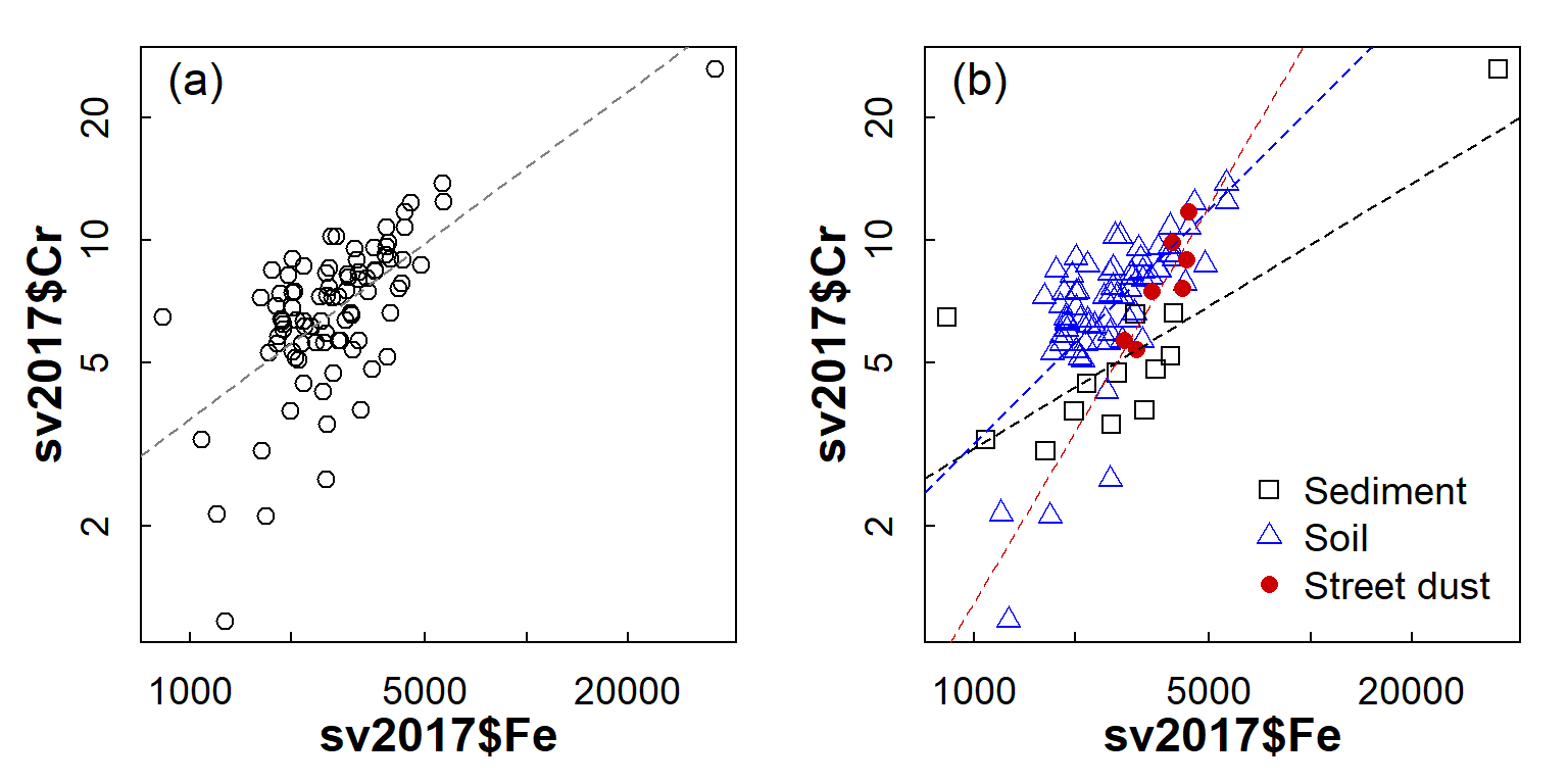
Figure 4: Scatterplot of Cr vs. Fe in the 2017 Smith's-Veryard data, showing (a) overall relationship and (b) relationship with observations grouped by sample Type.
On the basis of Figure 4, it seems likely that a grouped regression model (different slopes and intercepts for each sample Type) would better describe the Cr-Fe relationship, as the deviations from the model (the residuals) would be smaller overall.
"Begin challenging your own assumptions. Your assumptions are your windows on the world. Scrub them off every once in awhile, or the light won't come in."
--- Alan Alda
Diagnostic plots for regression
Simple linear regression, Cr ~ Fe
par(mfrow=c(2,2), mar=c(3,3,2,1))
plot(lmCrFesimple)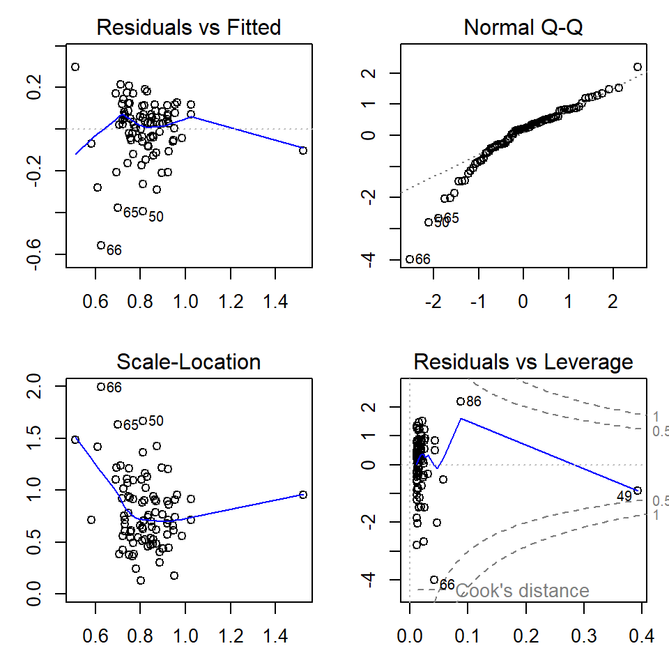
Figure 5: Regression diagnostic plots for Cr predicted from Fe using a simple linear regression model without grouping
par(mfrow=c(1,1), mar=c(3,3,1,1))Grouped linear regression, Cr ~ Fe * Type
par(mfrow=c(2,2), mar=c(3,3,2,1))
plot(lmCrFe_byType)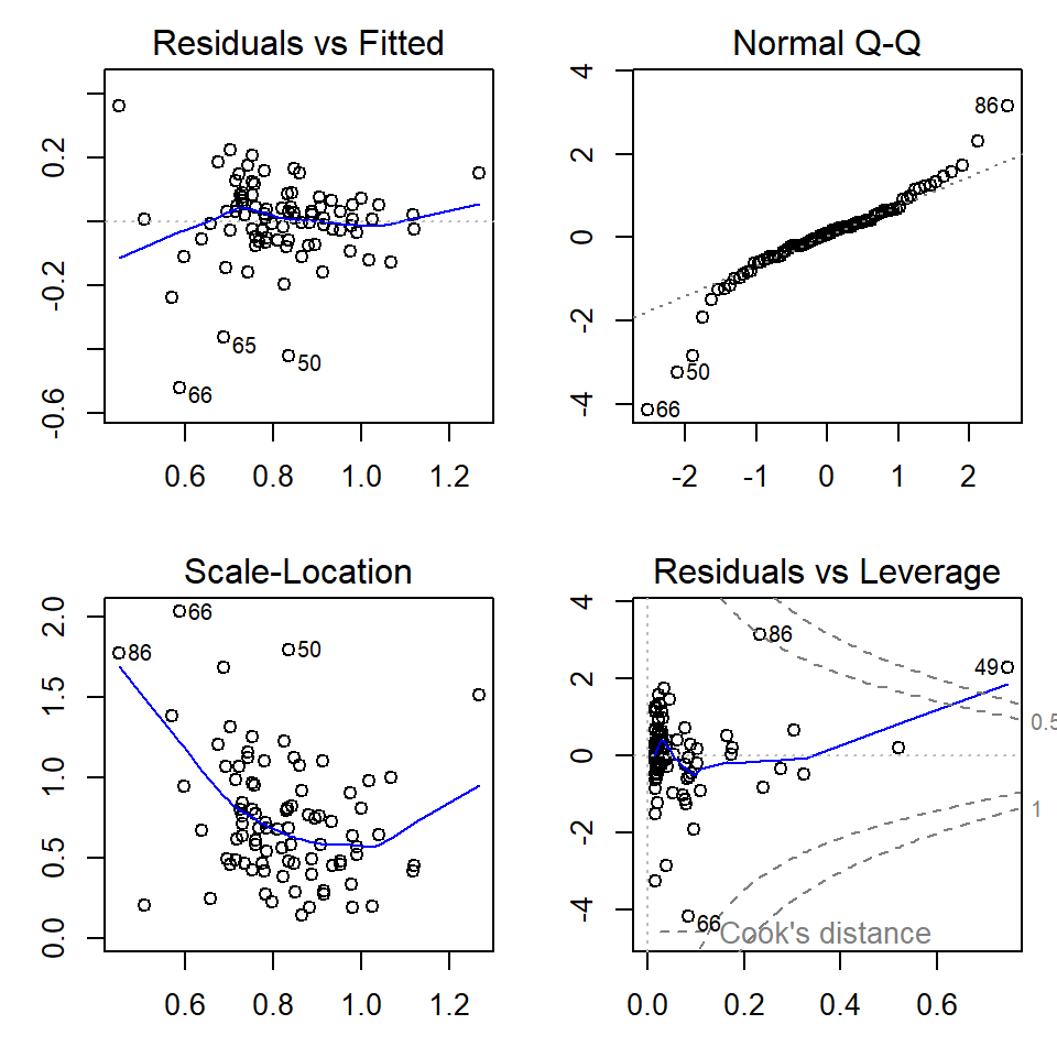
Figure 6: Regression diagnostic plots for Cr predicted from Fe using a grouped linear regression model with different parameters for each sample Type
par(mfrow=c(1,1), mar=c(3,3,1,1)) # change back to 1 plot at a timeThe diagnostic plots (Figures 5 and 6) are a visual test of some of
the assumptions of linear regression models, which relate mainly to the
residuals.
[An alternative from the car package is
influenceIndexPlot(yourModelName)].
The top left and bottom left plots in Figures 5 and 6 allow us to assess the assumption of homoscedasticity, that is, the residuals should be of similar absolute magnitude independent of the value of the dependent variable (actual or predicted). The top left plot also helps us to decide if the residuals are independent. In both the top left and bottom left plots, residuals should appear randomly distributed with a near-horizontal smoothed (blue) line.
The top right plot in Figures 5 and 6 is a Q-Q plot which tests another assumption of regression; that the residuals should be normally distributed. The points should lie along (or close to) the theoretical (dotted) line.
Finally the bottom left plot in Figures 5 and 6 tests whether any observations have an unusual influence on the regression statistics (the assumption is that they do not).
We can test all of these assumptions with formal statistical tests
using the car and lmtest packages.
The Breusch-Godfrey test is for residual autocorrelation; H0 is that residuals are not autocorrelated (i.e. observations probably independent)
require(lmtest)
bgtest(lmCrFe_byType) # autocorrelation (independence)
##
## Breusch-Godfrey test for serial correlation of order up to 1
##
## data: lmCrFe_byType
## LM test = 2.2568, df = 1, p-value = 0.133The Breusch-Pagan test is for heteroscedasticity; H0 is that residuals are homoscedastic (i.e. variance independent of value of variable).
bptest(lmCrFe_byType) # homoscedasticity##
## studentized Breusch-Pagan test
##
## data: lmCrFe_byType
## BP = 12.407, df = 5, p-value = 0.02962The Rainbow test is to test the assumption of linearity; H0 is that the relationship is linear.
raintest(lmCrFe_byType) # linearity##
## Rainbow test
##
## data: lmCrFe_byType
## Rain = 0.68614, df1 = 44, df2 = 38, p-value = 0.8859The outlierTest() function in the car
package implements the Bonferroni outlier test; H0 is that
all residuals are from the same population (i.e. no outliers).
H0 is tested with the Bonferroni (NOT
unadjusted) p-value. If no Bonferroni p-value is≤ 0.05, so we cannot
reject H0, the function outputs the largest residual(s).
require(car)
outlierTest(lmCrFe_byType) # influential observations (outliers)
## rstudent unadjusted p-value Bonferroni p
## 66 -4.633419 1.3569e-05 0.0011941More things to try (Correlation & regression Week 1)
Try str(lm_object) and/or ls(lm_object) to
see what is stored in regression results. You might be able to use the
contents of a lm object to:
- plot calculated values (from the regression model) vs. measured values
- add a 1:1 relationship to the plot in 1. above
- find out if any regression residuals are unusual
...and so on.
Steps in running a multiple regression model
Multiple regression models predict the value of one
variable (the dependent variable) from two or more
predictor variables (or just 'predictors'). They can be very
useful in environmental science, but there are several steps we need to
take to make sure
that we have a valid model.
In this example we're going to develop a regression model to predict copper (Cu) concentrations from several predictors. It makes sense to choose predictors that represent bulk soil properties that could plausibly control trace element concentrations. So, we choose variables like pH, EC, organic carbon, cation exchange capacity, and the major elements as predictors (but NOT other trace elements, as their concentrations are probably too low to control the concentration of anything else!)
Since we don't have organic carbon or cation exchange capacity in this dataset, and there are many missing values for EC, our initial predictors will be Al, Ca, Fe, K, Mg, Na, pH, and S. Both the predictors and dependent variable need to be appropriately transformed before we start!
Also, some of our initial predictors may be highly correlated (co-linear) with each other. In multiple regression, we don't want to include co-linear predictors, since then we'll have two (or more) predictors which effectively contain the same information – see below.
Read input data
sv2017 <- read.csv("sv2017_original.csv")
print(sv2017[1:5,2:11], row.names = FALSE)
## Group Sample Type Easting Northing Longitude Latitude pH EC Al
## 1 1 Soil 391064 6466753 115.8476 -31.92992 7.14 215.1 2112
## 1 2 Soil 391074 6466745 115.8477 -31.92999 6.71 224.1 2136
## 1 3 Soil 391148 6466744 115.8485 -31.93001 5.99 143.0 2145
## 1 4 Soil 391134 6466729 115.8483 -31.93014 6.00 216.0 2375
## 1 5 Soil 391211 6466740 115.8492 -31.93005 5.91 74.3 2345Assess collinearity between initial set of predictors
First we inspect the correlation matrix. It's useful to include the dependent variable as well, just to see which predictors are most closely correlated.
(We try to generate a 'tidier' table by restricting numbers to 3
significant digits, based on the smallest r value in each column. We
don't need to use rcorr() or rcorr.adjust(),
since we're not so interested in P-values for this purpose.)
Note that all variables are appropriately
transformed!
You will need to do this
yourself...
cor0 <-
  cor(sv2017[,c("Al.pow","Ca.pow","Fe.pow","K.log","Mg.log","Na.pow","pH","S.pow","Cu.pow")],
   use="pairwise.complete")
print(cor0,digits=3)
## Al.pow Ca.pow Fe.pow K.log Mg.log Na.pow pH S.pow Cu.pow
## Al.pow 1.0000 0.337147 0.666 0.497 0.340 0.398 0.281 0.052639 0.200
## Ca.pow 0.3371 1.000000 0.354 0.382 0.852 0.510 0.646 -0.000907 0.360
## Fe.pow 0.6656 0.353504 1.000 0.579 0.388 0.286 0.162 0.318639 0.620
## K.log 0.4974 0.381912 0.579 1.000 0.563 0.544 0.182 0.388158 0.351
## Mg.log 0.3396 0.851684 0.388 0.563 1.000 0.730 0.450 0.290523 0.458
## Na.pow 0.3982 0.510131 0.286 0.544 0.730 1.000 0.179 0.528523 0.273
## pH 0.2813 0.645961 0.162 0.182 0.450 0.179 1.000 -0.274046 0.149
## S.pow 0.0526 -0.000907 0.319 0.388 0.291 0.529 -0.274 1.000000 0.447
## Cu.pow 0.1997 0.360100 0.620 0.351 0.458 0.273 0.149 0.446677 1.000rm(cor0)The rule of thumb we use is that if predictor variables are correlated with Pearson's r ≥ 0.8 or r ≤ −0.8, then the collinearity is too large and one of the correlated predictors should be omitted. In the correlation table above this applies to the correlation between [transformed] Ca and Mg, with r=0.85. In this example we will run two versions of the model, one keeping both Ca and Mg, and one omitting Mg.
In either case, whether we run the model with or without omitting predictors, it's a good idea to calculate Variance Inflation Factors on the predictor variables in the model (see below) which can tell us if collinearity is a problem.
Generate multiple regression model for Cu (co-linear predictors NOT omitted)
We first delete any observations (rows) with missing
(NA) values, otherwise when we reduce the number of
predictors we may not have the same number of observations for all
models, in which case we can't compare them.
# make new data object containing relevant variables with no missing values
sv2017_multreg <- na.omit(sv2017[c("Cu.pow","pH","Al.pow","Ca.pow","Fe.pow",
                                   "K.log","Mg.log","Na.pow","S.pow")])
# run model using correctly transformed variables
lm_multi <- lm(Cu.pow ~ pH + Al.pow + Ca.pow + Fe.pow + K.log + Mg.log +
               Na.pow + S.pow, data=sv2017_multreg)
summary(lm_multi)
##
## Call:
## lm(formula = Cu.pow ~ pH + Al.pow + Ca.pow + Fe.pow + K.log +
## Mg.log + Na.pow + S.pow, data = sv2017_multreg)
##
## Residuals:
## Min 1Q Median 3Q Max
## -0.19359 -0.06366 -0.01116 0.06602 0.26154
##
## Coefficients:
## Estimate Std. Error t value Pr(>|t|)
## (Intercept) -0.168281 0.436815 -0.385 0.7011
## pH 0.018789 0.017599 1.068 0.2890
## Al.pow -0.005742 0.002674 -2.147 0.0349 *
## Ca.pow -0.254957 0.508472 -0.501 0.6175
## Fe.pow 19.021831 3.391486 5.609 2.98e-07 ***
## K.log -0.101394 0.061911 -1.638 0.1055
## Mg.log 0.205248 0.089255 2.300 0.0241 *
## Na.pow -0.678065 0.503062 -1.348 0.1816
## S.pow 1.325708 0.504003 2.630 0.0103 *
## ---
## Signif. codes: 0 '***' 0.001 '**' 0.01 '*' 0.05 '.' 0.1 ' ' 1
##
## Residual standard error: 0.09043 on 78 degrees of freedom
## Multiple R-squared: 0.5705, Adjusted R-squared: 0.5264
## F-statistic: 12.95 on 8 and 78 DF, p-value: 1.098e-11Note that the null hypothesis probability Pr(>|t|)
for some predictors is ≤ 0.05, so we can't reject the null hypothesis –
that this predictor has no effect on the dependent variable.
Calculate variance inflation factors (VIF) for the predictors in the 'maximal' model
To calculate variance inflation factors we use the function
vif() from the car package. The input for
vif() is a lm object (in this case
lm_multi).
require(car)
{cat("Variance Inflation Factors\n")
vif(lm_multi)}
## Variance Inflation Factors
## pH Al.pow Ca.pow Fe.pow K.log Mg.log Na.pow S.pow
## 1.968627 2.333083 6.410154 2.486039 2.014962 7.272626 3.442307 2.302179A general rule of thumb is that if VIF > 4 we need to do some further investigation, while serious multi-collinearity exists requiring correction if VIF > 10 (Hebbali, 2018). As we probably expected from the correlation coefficient (above), VIFs for both Ca and Mg are >4 in this model, which may be OK, but we will try a model which omits Ca or Mg (we'll choose Mg)...
Generate multiple regression model for Cu, omitting co-linear predictors
# make new data object containing relevant variables with no missing values
sv2017_multreg <- na.omit(sv2017[c("Cu.pow","pH","Al.pow","Ca.pow","Fe.pow",
                                   "K.log","Mg.log","Na.pow","S.pow")])
# run model using correctly transformed variables (omitting co-linear predictors)
lm_multi2 <- lm(Cu.pow ~ pH + Al.pow + Ca.pow + Fe.pow +
                  K.log + Na.pow + S.pow, data=sv2017_multreg)
summary(lm_multi2)
##
## Call:
## lm(formula = Cu.pow ~ pH + Al.pow + Ca.pow + Fe.pow + K.log +
## Na.pow + S.pow, data = sv2017_multreg)
##
## Residuals:
## Min 1Q Median 3Q Max
## -0.19308 -0.05483 -0.00613 0.05965 0.31834
##
## Coefficients:
## Estimate Std. Error t value Pr(>|t|)
## (Intercept) 0.627352 0.273779 2.291 0.02460 *
## pH 0.014878 0.017985 0.827 0.41058
## Al.pow -0.006750 0.002709 -2.492 0.01481 *
## Ca.pow 0.628179 0.342172 1.836 0.07014 .
## Fe.pow 19.225647 3.481123 5.523 4.13e-07 ***
## K.log -0.059303 0.060728 -0.977 0.33178
## Na.pow -0.188612 0.468023 -0.403 0.68804
## S.pow 1.434614 0.515210 2.785 0.00671 **
## ---
## Signif. codes: 0 '***' 0.001 '**' 0.01 '*' 0.05 '.' 0.1 ' ' 1
##
## Residual standard error: 0.09286 on 79 degrees of freedom
## Multiple R-squared: 0.5413, Adjusted R-squared: 0.5007
## F-statistic: 13.32 on 7 and 79 DF, p-value: 3.18e-11Note that again the null hypothesis probability
Pr(>|t|) for some predictors is >0.05, so we can't
reject the null hypothesis -- that this predictor has no effect on the
dependent variable.
Calculate variance inflation factors (VIF) for the model omitting co-linear predictors
require(car)
{cat("Variance Inflation Factors\n")
vif(lm_multi2)}
## Variance Inflation Factors
## pH Al.pow Ca.pow Fe.pow K.log Na.pow S.pow
## 1.950249 2.270458 2.753381 2.484341 1.838836 2.826085 2.281852With the co-linear variable(s) omitted (on the basis of
|Pearson's r| > 0.8), we now have no VIFs > 4. So we can
move on to stepwise refinement of our [new] 'maximal' model...
[BUT note that in this case, with no VIF > 10, we
could have simply skipped omitting Mg and moved on to the next step
below.]
Stepwise refinement of maximal multiple regression model (omitting co-linear predictors)
We don't want to have too many predictors in our model -- just the predictors which explain significant proportions of the variance in our dependent variable. In addition, our data may be insufficient to generate a very complex model; one rule-of-thumb suggests 10-20 observations are needed to calculate coefficients for each predictor. Reimann et al. (2008) recommend that the number of observations should be at least 5 times the number of predictors. So, we use a systematic stepwise procedure to test variations of the model, which omits unnecessary predictors.
lm_stepwise <- step(lm_multi2, direction="both", trace=0)
summary(lm_stepwise)
##
## Call:
## lm(formula = Cu.pow ~ Al.pow + Ca.pow + Fe.pow + S.pow, data = sv2017_multreg)
##
## Residuals:
## Min 1Q Median 3Q Max
## -0.19595 -0.06213 -0.01212 0.06451 0.31295
##
## Coefficients:
## Estimate Std. Error t value Pr(>|t|)
## (Intercept) 0.624948 0.141354 4.421 2.99e-05 ***
## Al.pow -0.007697 0.002343 -3.285 0.00150 **
## Ca.pow 0.644119 0.220434 2.922 0.00449 **
## Fe.pow 18.990226 2.975412 6.382 9.82e-09 ***
## S.pow 1.059291 0.366512 2.890 0.00493 **
## ---
## Signif. codes: 0 '***' 0.001 '**' 0.01 '*' 0.05 '.' 0.1 ' ' 1
##
## Residual standard error: 0.09236 on 82 degrees of freedom
## Multiple R-squared: 0.529, Adjusted R-squared: 0.506
## F-statistic: 23.02 on 4 and 82 DF, p-value: 8.931e-13require(car)
{cat("==== Variance Inflation Factors ====\n")
vif(lm_stepwise)}## ==== Variance Inflation Factors ====## Al.pow Ca.pow Fe.pow S.pow
## 1.716931 1.154967 1.834424 1.167152In the optimised model, we find that the stepwise procedure has
generated a new model with fewer predictor variables. You should notice
that the p-values (Pr(>|t|)) for intercept and
predictors are all now ≤ 0.05, so we can reject the null hypothesis for
all predictors (i.e. none of them have 'no effect' on Cu). Our
VIFs are now all close to 1, meaning negligible collinearity between
predictors.
It's always a good idea to run diagnostic plots (see Figure 7 below) on a regression model (simple or multiple), to check for (i) any systematic trends in residuals, (ii) normally distributed residuals (or not), and (iii) any unusually influential observations.
Regression diagnostic plots
par(mfrow=c(2,2), mar=c(3.5,3.5,1.5,1.5), mgp=c(1.6,0.5,0), font.lab=2, font.main=3,
    cex.main=0.8, tcl=-0.2)
plot(lm_stepwise)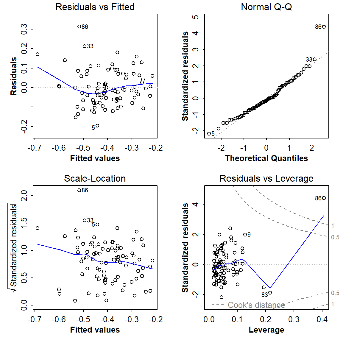
Figure 7: Diagnostic plots for the optimal multiple regression model following backward-forward stepwise refinement.
par(mfrow=c(1,1))The optimal model is
Cu.pow ~ Al.pow + Ca.pow + Fe.pow + S.pow, where suffixes
.pow and .log represent power- and
log10-transformed variables respectively. The point labelled
86 does look problematic...
require(lmtest)
require(car)
cat("------- Residual autocorrelation (independence assumption):")
bgtest(lm_stepwise) # Breusch-Godfrey test for autocorrelation (independence)
cat("\n------- Test of homoscedasticity assumption:")
bptest(lm_stepwise) # Breusch-Pagan test for homoscedasticity
cat("\n------- Test of linearity assumption:")
raintest(lm_stepwise) # Rainbow test for linearity
cat("\n------- Bonferroni Outlier test for influential observations:\n\n")
outlierTest(lm_stepwise) # Bonferroni outlier test for influential observations
## ------- Residual autocorrelation (independence assumption):
## Breusch-Godfrey test for serial correlation of order up to 1
##
## data: lm_stepwise
## LM test = 2.8767, df = 1, p-value = 0.08987
##
##
## ------- Test of homoscedasticity assumption:
## studentized Breusch-Pagan test
##
## data: lm_stepwise
## BP = 27.533, df = 4, p-value = 1.551e-05
##
##
## ------- Test of linearity assumption:
## Rainbow test
##
## data: lm_stepwise
## Rain = 2.1033, df1 = 44, df2 = 38, p-value = 0.01057
##
##
## ------- Bonferroni Outlier test for influential observations:
##
## rstudent unadjusted p-value Bonferroni p
## 86 5.002624 3.2263e-06 0.00028069Multiple regression effect plots
require(effects)
plot(allEffects(lm_stepwise, confidence.level=0.95))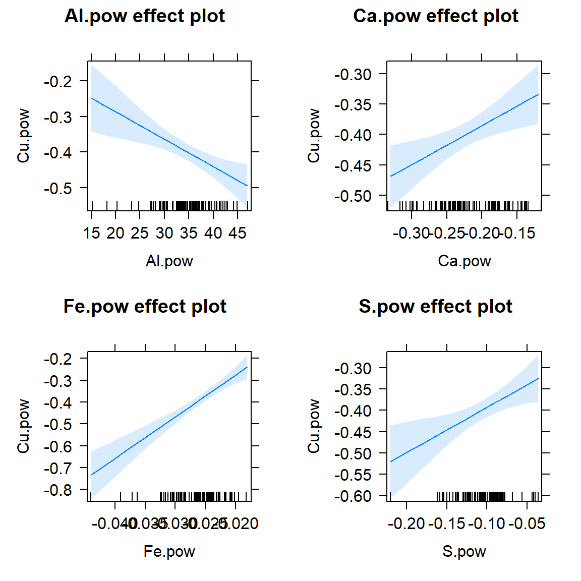
Figure 8: Effect plots for individual predictors in the optimal multiple regression model following backward-forward stepwise refinement. Light blue shaded areas on plots represent 95% confidence limits.
Scatterplot of observed vs. fitted values
An 'observed vs. fitted' plot (Figure 9) is a way around
trying to plot a function with multiple predictors (i.e.
multiple dimensions)! We can get the fitted values since these are
stored in the lm object, in our case
lm_stepwise in an item called
lm_stepwise$fitted.values. We also make use of other
information stored in the lm object, by calling
summary(lm_stepwise)$adj.r.squared.
par(mar=c(4,4,1,1), mgp=c(2,0.5,0), font.lab=2, cex.lab=1.2,
    lend="square", ljoin="mitre")
plot(sv2017_multreg$Cu.pow ~ lm_stepwise$fitted.values,
     xlab="Cu.pow predicted from regression model",
     ylab="Cu.pow measured values", pch=3, lwd=2,
     cex=0.8, col="blue3")
abline(0,1, col="red", lty=2, lwd=2)
legend("topleft", legend=c("Observations","1:1 line"), col=c("blue3","red"),
       text.col=c("blue3","red"), pch=c(3,NA), lty=c(NA,2), pt.lwd=2, lwd=2,
       box.col="grey", box.lwd=2, inset=0.02, seg.len=2.7, y.intersp=1.2)
mtext(side=3, line=-5.5, adj=0.05, col="blue3",
      text=paste("Adjusted Rsq =",signif(summary(lm_stepwise)$adj.r.squared,3)))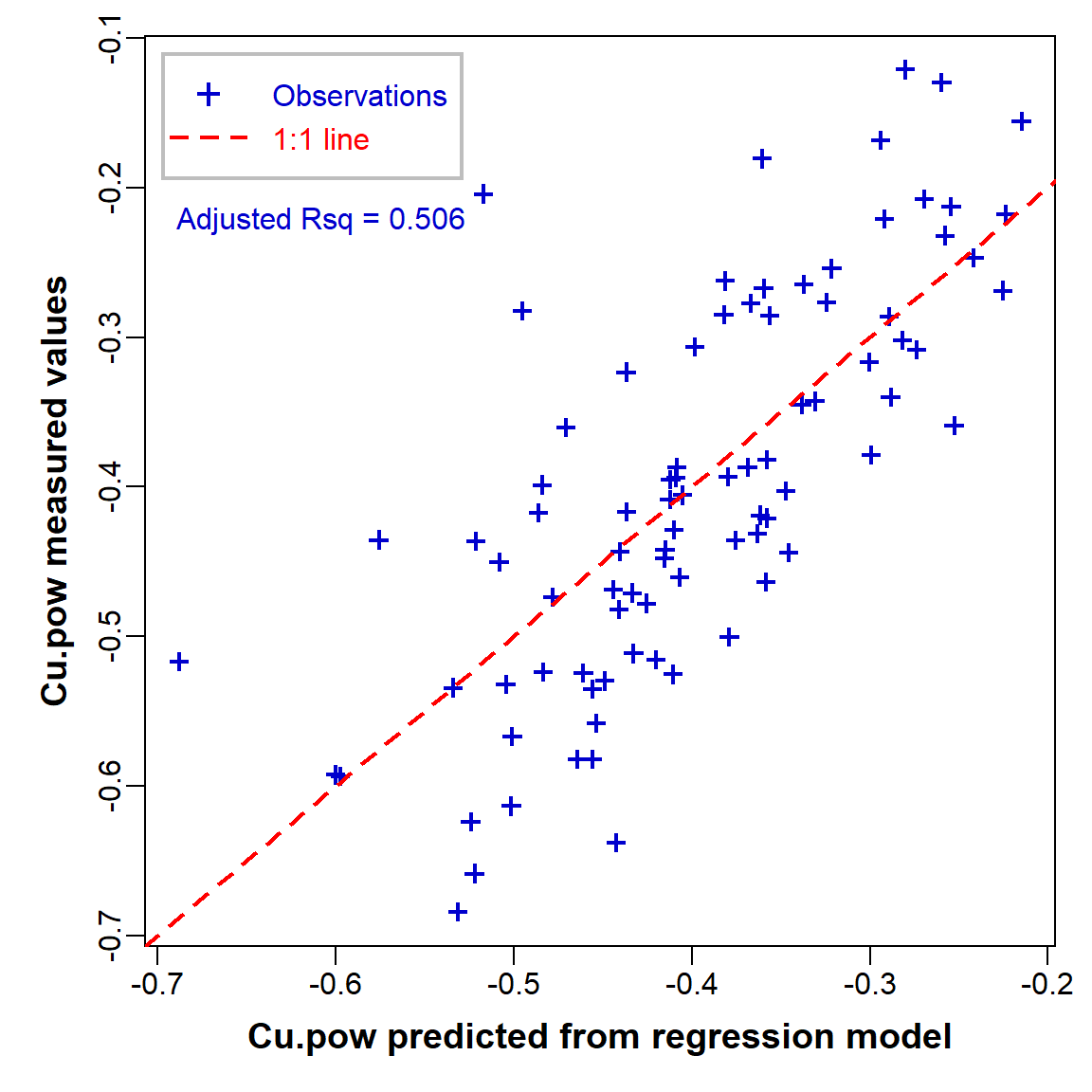
Figure 9: Measured (observed) vs. predicted values in the optimal multiple regression model.
Some brief interpretation
- The adjusted R-squared value of the final model is 0.506, meaning that 50.6% of the variance in Cu is explained by variance in the model's predictors. (The remaining 49.4% of variance must therefore be due to random variations, or 'unknown' variables not included in our model.)
- From the model coefficients and the effect plots we can see that Cu increases as Ca, Fe, and S increase, but Cu decreases as Al increases. This doesn't necessarily correspond with the individual relationships; Cu IS positively correlated with Ca, Fe, and S, but actually has no significant relationship with Al (you can check this!).
- Although we can't attribute a causal relationship to correlation or regression relationships, the observed effects in our model are consistent with real phenomena. For example, copper is positively related to iron (Fe) in soils at the continental scale; see Hamon et al. (2004) and Caritat and Rate (2017).
References
Caritat, P. and Rate, A. W. (2017). Detecting anomalous metal concentrations in the regolith using cross-compositional detrending. Paper presented at the Goldschmidt Conference 2017, Paris, France. https://whiteiron.org/uploads/conferences/27/abstracts/finalPDFs/2017002103-20170327183746.pdf
Cohen, J. 1988. Statistical Power Analysis for the Behavioral Sciences, Second Edition. Erlbaum Associates, Hillsdale, NJ, USA.
Hamon, R. E., McLaughlin, M. J., Gilkes, R. J., Rate, A. W., Zarcinas, B., Robertson, A., Cozens, G., Radford, N. and Bettenay, L. (2004). Geochemical indices allow estimation of heavy metal background concentrations in soils. Global Biogeochemical Cycles, 18(GB1014), http://dx.doi.org/10.1029/2003GB002063.
Hebbali, A. (2018). Collinearity Diagnostics, Model Fit and Variable Contribution. Vignette for R Package 'olsrr'. Retrieved 2018.04.05, from https://cran.r-project.org/web/packages/olsrr/vignettes/regression_diagnostics.html.
Reimann, C., Filzmoser, P., Garrett, R.G., Dutter, R., (2008). Statistical Data Analysis Explained: Applied Environmental Statistics with R. John Wiley & Sons, Chichester, England (see Chapter 16).
CC-BY-SA • All content by Ratey-AtUWA. My employer does not necessarily know about or endorse the content of this website.
Created with rmarkdown in RStudio using the cyborg theme from Bootswatch via the bslib package, and fontawesome v5 icons.