basic solute transport animation
This was a project to help me learn gganimate -- and do something useful for teaching the UWA unit ENVT5503 'Remediation of Soil and Groundwater'.
First we need to load the required R packages. Obviously we need gganimate (which also loads ggplot2). We use the reshape2 package to convert our data from timesteps-as-columns to timesteps-as-single-factor format. We need the gifski package to render a ggplot2 object to an animated gif file.
npts <- 500 # number of points to represent solute pulse
nd <- 11 # number of depths to simulate
ds <- data.frame(d=seq(1,96,l=nd), # data frame with d = list of depths,
                 s=seq(0.3,6,l=nd)) #    s = standard deviation at each depth
x0 <- runif(npts)  # spread the x values across a nominal range
y0 <- rnorm(npts,ds$d[1],ds$s[1]) # calculate y for each x
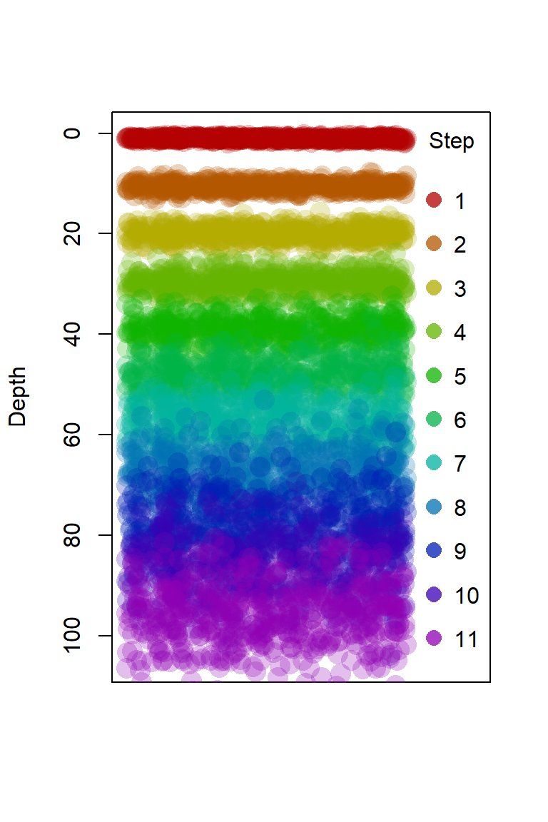
plot(x0, y0, xlim = c(0,1.25), ylim=c(105,0),pch=16, xaxt="n", xlab="",
     ylab = "Depth", cex = 2,
     col = rainbow(nd, v=0.7, end=0.8, alpha=0.25)[1]) # plot first depth
for(i in 2:nd) { # plot remaining depths
  points(x0, rnorm(npts, ds$d[i], ds$s[i]), cex = 2,
         pch = 16, col = rainbow(nd, v=0.7, end=0.8, alpha=0.25)[i])
}
legend("right", legend=seq(1,nd), pch =16, title = "Step", bty = "n",
       col = rainbow(nd, v=0.7, end=0.8, alpha=0.75),
       pt.cex = 1.5, y.intersp = 1.6)
Figure 1. Plot to show our simulated dataset.
pulse <- data.frame(x0 = runif(npts))
for(i in 0:(nd-1)) {
  pulse[,paste0("time_",i)] <- rnorm(npts, ds$d[i+1], ds$s[i+1])
}
str(pulse)
## 'data.frame': 500 obs. of 12 variables:
## $ x0 : num 0.309 0.356 0.14 0.573 0.724 ...
## $ time_0 : num 1.131 1.054 1.056 0.796 0.863 ...
## $ time_1 : num 11.48 9.99 11.25 9.85 11.29 ...
## $ time_2 : num 19.6 18.3 19.3 19 19 ...
## $ time_3 : num 30.1 31.6 30.1 30.3 29 ...
## $ time_4 : num 38.4 35 39.9 41.9 38.7 ...
## $ time_5 : num 49.4 45.7 45.2 49.3 42.4 ...
## $ time_6 : num 60.6 55.3 54.3 59.8 58.8 ...
## $ time_7 : num 66.6 68.5 63.8 75.7 71.9 ...
## $ time_8 : num 75.8 72.7 77.4 68.4 82.9 ...
## $ time_9 : num 82.6 85.1 87 92.4 79.3 ...
## $ time_10: num 106.9 90.7 90.8 103.9 90.7 ...The data we have created has time steps as separate columns. We actually want a single column factor column with the time steps as levels. For this we use the melt() function in the reshape2 package, which does this seamlessly if we get the options correct:
pulseFact <- melt(pulse, measure.vars=2:ncol(pulse),
                     variable.name = "Timestep", value.name = "Particles")
str(pulseFact)
## 'data.frame': 5500 obs. of 3 variables:
## $ x0 : num 0.309 0.356 0.14 0.573 0.724 ...
## $ Timestep : Factor w/ 11 levels "time_0","time_1",..: 1 1 1 1 1 1 1 1 1 1 ...
## $ Particles: num 1.131 1.054 1.056 0.796 0.863 ...Make the animation
The animation is based on a standard ggplot:
ggplot(pulseFact, aes(x=x0, y=Particles)) +
  scale_y_reverse() +
  geom_point(size=4, shape = 16, color="#0000B040") +
  theme_bw() +
  theme(legend.position="none",
        axis.ticks.x = element_blank(),
        axis.text.x = element_blank(),
        title = element_text(size=18, face = "bold", colour = "blue3"),
        axis.title = element_text(size = 22, face = "bold", colour="black"),
        axis.text = element_text(size = 18),
        panel.border = element_rect(colour = 1,fill=NA)) +
labs(y="Depth (cm)", x = "") 
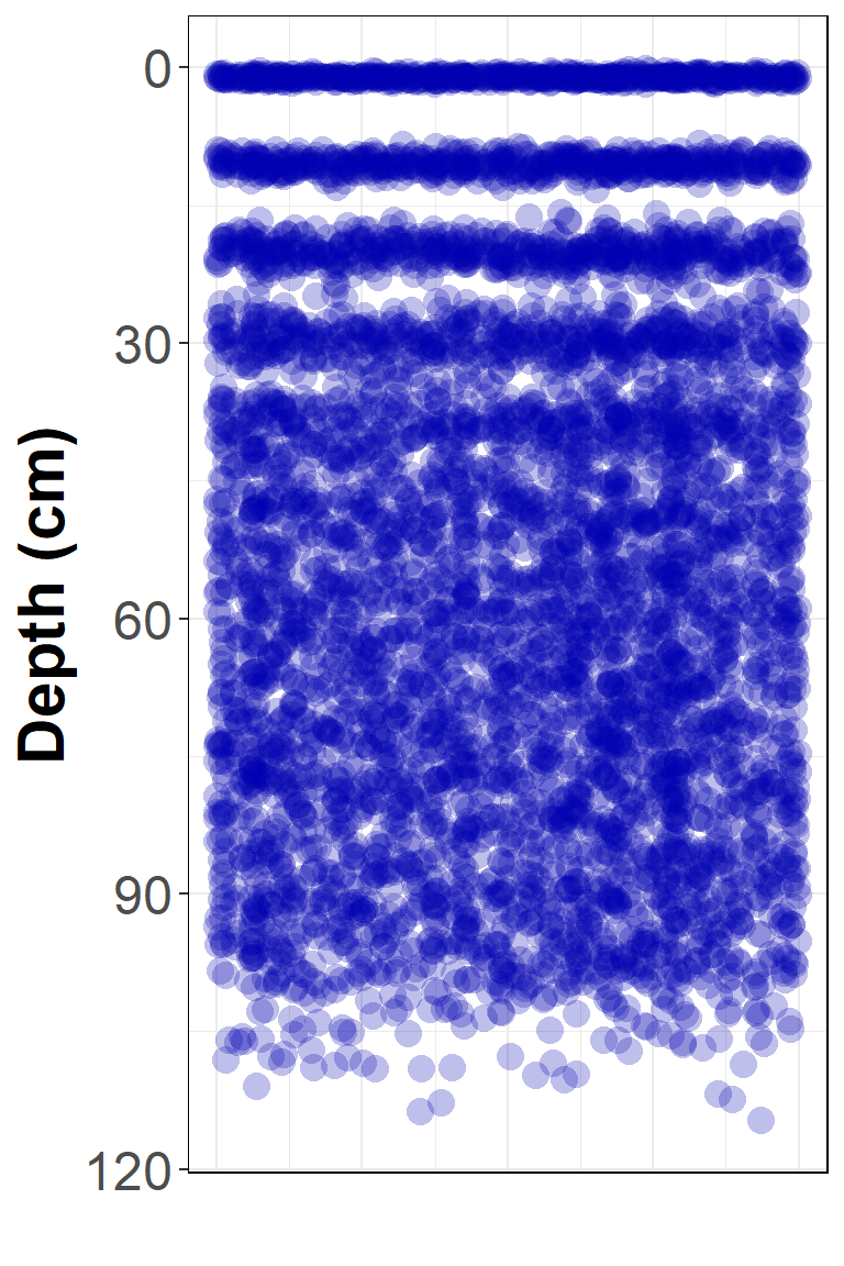
Figure 2. Simulated solute distribution at all time steps at once!
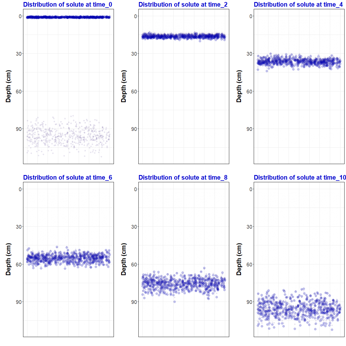
We can see that this just plots all our data at once, which is missing the point! We use the transition_states() function in gganimate to animate timestep by timestep, with some other options to control how the animation works.
pulseAnim <- ggplot(pulseFact, aes(x=x0, y=Particles)) +
  scale_y_reverse() +
  geom_point(size=4, shape = 16, color="#0000B040") +
  theme_bw() +
  theme(legend.position="none",
        axis.ticks.x = element_blank(),
        axis.text.x = element_blank(),
        title = element_text(size=18, face = "bold", colour = "blue3"),
        axis.title = element_text(size = 22, face = "bold", colour="black"),
        axis.text = element_text(size = 18),
        panel.border = element_rect(colour = 1,fill=NA)) +
  labs(y="Depth (cm)", x = "") +
  transition_states(pulseFact$Timestep,
                    transition_length = 1,
                    state_length = c(3,rep(0,10),3),
                    wrap = FALSE) +
  enter_fade() +
  exit_fade() +
  shadow_wake(wake_length = 0.05, size = T, colour="#60606040") +
  ggtitle("Distribution of solute at {closest_state}")
Now that we have made a gganimate object, we can save it as an animated gif file using the anim_save() function from the gifski package:
require(gifski)
options(gganimate.dev_args = list(width = 400, height = 600))
anim_save("pulseAnim.gif", animate(pulseAnim, renderer = gifski_renderer(),
                                  duration = 12))
Here's another example of a
gganimate project, just for fun.
CC-BY-SA • All content by Ratey-AtUWA. My employer does not necessarily know about or endorse the content of this website.
Created with rmarkdown in RStudio using the cyborg theme from Bootswatch via the bslib package, and fontawesome v5 icons.